Page MenuHomePhabricator

Dialog: Enable removal of body padding and gap styles
Open, Needs TriagePublic

Description

Currently, the header and footer of the dialog can be completely overridden with slots. If this is done, no layout styles will be provided for the header or footer, and the dev user can completely customize the styles.

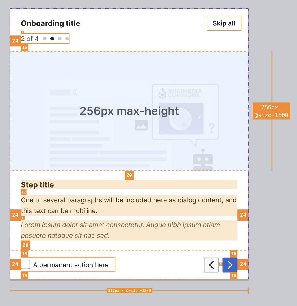
However, this does not exist for the default slot, the body of the dialog. This is causing issues with the OnboardingDialog (T332767). Initially, we assumed that the image in this dialog could be part of the header, but this makes it difficult to change the image along with the rest of the content of the step when going to the next step, especially with regards to the transition animation. Instead, the growth team included the image in the default slot and had to override padding and gap styles (see demo). (It's also worth noting that the image makes more sense semantically in the body.)

The padding and gap styles exist on the body to support basic use cases where no custom styling is needed, and the user just wants some space around their text. However, we should consider making it possible to remove these default styles when the user wants to fully customize the body layout. Perhaps we could add a boolean removeBodySpacing prop?

Captura de pantalla 2023-05-09 a las 16.01.34.png (686×896 px, 78 KB)
Captura de pantalla 2023-05-09 a las 16.01.30.png (1×1 px, 153 KB)
Dialog component paddingsOnboardingDialog pattern paddings

  • Consider how to support customization of the body layout without requiring dev users to override Codex styles
  • Implement any needed changes in the Codex Dialog

Event Timeline

Restricted Application added a subscriber: Aklapper. · View Herald Transcript

@Sgs @VYanez-WMF please feel free to edit the description to add more details!

The padding and gap styles exist on the body to support basic use cases where no custom styling is needed, and the user just wants some space around their text.

I think a default padding for the content is ok but we should allow to modify it easily. Even not providing any default padding should be fine since consumers could add their own classes to the passed content since text should ways be wrapped in some element for semantic reasons.

Perhaps we could add a boolean removeBodySpacing prop?

If using boolean props as flags to customize styles is gonna be used as an API across components I think we should try to make them as conventional as possible.

imo removeBodySpacing is hard to reuse across because it's substractive to a particular default. Also it's not working to affect each axis separately. I understand having a prop alter both axis gutter together fits the use case and makes the visual result of dialogs more consistent across usages but I wonder if we can solve this problem in a more generic way, allowing both consistency and customization.

Some libraries (eg: antd modal props ) use properties like <slotname>Class="myClass" or <slotname>Style={ 'padding-right': 0 } to allow customization of a component internal element. Others provide a standard set of "style props" (like chakra ui style props) to all components to allow these levels of customization to all components.

nitpick: The fact the content vertical spacing comes from a gap property while the horizontal is set with padding is a bit counterintuitive if using the <slotname>Class approach, although still achievable.

Do we want removeBodySpacing as a prop that the user provides, or do we want the gap spacing to automatically go away when header/footer slot content is provided?

In the short term the OnboardingDialog component could also just override the default cdx-dialog styles, ex: .onboarding-dialog .cdx-dialog { gap: 0 }. But I understand why having a more "official" solution would be desirable here.

In the short term the OnboardingDialog component could also just override the default cdx-dialog styles, ex: .onboarding-dialog .cdx-dialog { gap: 0 }. But I understand why having a more "official" solution would be desirable here.

Right, the idea is to raise a flag when a Codex consumer overrides a Codex style as a way to provide feedback. This is not a blocker and can be low priority. In T336270: Implement a prototype of OnboardingDialog pattern latest spec we will proceed with your suggested solution .onboarding-dialog .cdx-dialog { gap: 0 } and we can refine this in the future.

@Sgs the idea of style props is really interesting, thank for sharing those examples. I agree that a boolean prop is not ideal here and that we should think about a pattern that we could use for cases like this throughout the library.

After changes in the Cdx-dialog styles in T332124, we are currently setting the following overwrites in the OnboardingDialog:

  • to avoid padding in the body and display the full bleed image
&.cdx-dialog--dividers,
&.cdx-dialog--has-custom-header,
&.cdx-dialog--has-custom-footer {
	.cdx-dialog__body {
		padding: 0;
		}
	}
  • to keep the same header and footer padding when the dialog has scrollable content
	&.cdx-dialog--dividers {
		.cdx-dialog__header {
			padding-bottom: 0;
		}

		.cdx-dialog__footer {
			padding-top: 0;
		}
	}