Page MenuHomePhabricator

[M] Create onboarding screen for Image Recs
Open, LowPublic

Description

Create onboarding flow according to Figma reference
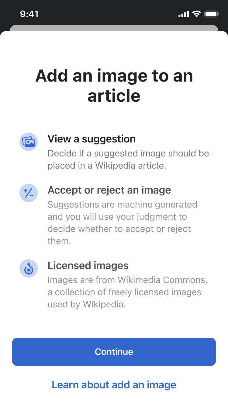
image.png (1×750 px, 99 KB)

Requirements

Event Timeline

HNordeenWMF renamed this task from [S] Create onboarding for Image Recs to [S] Create onboarding screen for Image Recs.Mar 5 2024, 3:02 AM
HNordeenWMF updated the task description. (Show Details)
Tsevener renamed this task from [S] Create onboarding screen for Image Recs to Create onboarding screen for Image Recs.Mar 5 2024, 9:03 PM
Tsevener renamed this task from Create onboarding screen for Image Recs to [M] Create onboarding screen for Image Recs.Mar 7 2024, 7:03 PM

Hi @Dmantena, the FAQ link in the task description was incorrect (my error), here is the correct one:
https://www.mediawiki.org/wiki/Wikimedia_Apps/iOS_Suggested_edits#Add_an_image

Hi @Dmantena, the FAQ link in the task description was incorrect (my error), here is the correct one:
https://www.mediawiki.org/wiki/Wikimedia_Apps/iOS_Suggested_edits#Add_an_image

Will update to this link in the PR.

Hi @OTichonova this is ready for design review (Wikipedia Experimental 7.4.9 (94) in TestFlight). It leverages our existing Onboarding component, and the steps to see it when Suggested Edits is turned on in your Explore feed settings are detailed here: https://github.com/wikimedia/wikipedia-ios/pull/4778

Hi @Dmantena, looking good! Couple of things:

  1. Can the area with the Button and link be sticky to the bottom and have the scroller show up when people access the page just like we have it for the Notifications onboarding page?
Notifications
IMG_3552.png (667×375 px, 46 KB)

2)The leading/line height of the text seems tall. Based on typography guidelines I think for Title 1 the leading is 34 pts and for Subhead the leading is 20 pts.
3)Looking back at the onboarding screens from the last couple of features I see that the spacing varies between title & text and between text sections. Can the spacing between title & text stay as it is and the space between text sections be 24pts?

The text "Learn about add an image" doesn't sound totally grammatical in English :)

It should probably be rephrased to one of these:

  • Learn about adding an image (if it's just a general name of an action in English)
  • Learn about "Add an image" (if it's a title of an app feature)

Or maybe something else.

HNordeenWMF added a subscriber: Tsevener.

hi @Dmantena, we discussed Amir's feedback this in slack with @Tsevener and @OTichonova.
Please update the link at bottom from Learn about add an image to Learn more about suggested edits

hi @Dmantena, we discussed Amir's feedback this in slack with @Tsevener and @OTichonova.
Please update the link at bottom from Learn about add an image to Learn more about suggested edits

@HNordeenWMF Sure thing – change in PR above.

Hi @Dmantena, looking good! Couple of things:

  1. Can the area with the Button and link be sticky to the bottom and have the scroller show up when people access the page just like we have it for the Notifications onboarding page?
Notifications
IMG_3552.png (667×375 px, 46 KB)

2)The leading/line height of the text seems tall. Based on typography guidelines I think for Title 1 the leading is 34 pts and for Subhead the leading is 20 pts.
3)Looking back at the onboarding screens from the last couple of features I see that the spacing varies between title & text and between text sections. Can the spacing between title & text stay as it is and the space between text sections be 24pts?

@OTichonova Updates to the onboarding component for review are up in Experimental build 7.4.11 build 105.

Note that this only updates our new onboarding component itself (which is used for image recs), not all previous non-component based implementations of onboarding views we've done for features in the past. Could you take a look at the image recs feature onboarding view for design feedback purposes? You might have to delete and reinstall the app to see the onboarding again.

The big change is that the button stack now stays pinned to the bottom of the view as you scroll, akin to our previous onboarding views in app and the generally accepted style of these. Also, the inter-item spacing has been updated to 24 pts and the text styles remain Title 1 for the titles and Subheadline for the body copy. Happy to adjust whatever still seems off in this latest revision.

Hi @Dmantena, updates are looking good thank you!
2 small things.

  1. The line heigh for the text still seems too big. I think the line height for subhead text is 20 pts and it looks like it is 22 pts at the moment.
  2. For consistency with notifications screen could we add the vertical scroll bar on the side to indicate that there is more content?

Thank you for updating the copy in the link!

Hi @Dmantena, updates are looking good thank you!
2 small things.

Thanks for checking it out.

  1. For consistency with notifications screen could we add the vertical scroll bar on the side to indicate that there is more content?

Currently it appears we are showing scroll indicators using the system available way for SwiftUI scroll views. If the amount of content is such that iOS decides it will span multiple vertical "screens", it enables the display of the scroll indicators in the scroll view as the user scrolls. We could artificially pad the bottom of the scroll view with more invisible content to force scroll bar visibility, but I don't think this kind of hack would be desirable behavior over the default behavior. Depending on the device size you are using and the content presented in an onboarding view, this may explain why they appear different in that regard.

  1. The line heigh for the text still seems too big. I think the line height for subhead text is 20 pts and it looks like it is 22 pts at the moment.

RE: the line height, I just want to confirm how things are laid out now so we have a shared understanding so I can precisely change the elements you'd like me to. Each onboarding "cell" has two text view elements, the element's title and the body. The titles are set in the iOS body text style with bold (17 pt) and the body in the subheadline text style (15 pt) per https://www.figma.com/file/YFtut34Eaq3vwS0lJQPbbE/iOS-Watchlist?type=design&node-id=897-17271&mode=design&t=cvQSa48ZLoHzEeXC-0. Between the title and body text view elements there's currently a default system spacing applied, but I've included an example of what it looks like expressly setting that system spacing to 0. We are not currently specifying any custom line spacing for either either of these text views, but instead rely on the text view's default behavior which it bases on the font/text style applied to the view.

oelement.png (614×1 px, 154 KB)

Hi @Dmantena,

  1. Okay thank you for writing this out, lets leave it as is.
  2. Sorry, looking again the line heigh for the longer text per section is looking good. Not sure what happened there on my end. Moving this ticket along.

Thanks!