Splitting from T361324: [QA task] Community Configuration UI evaluation by @Etonkovidova.
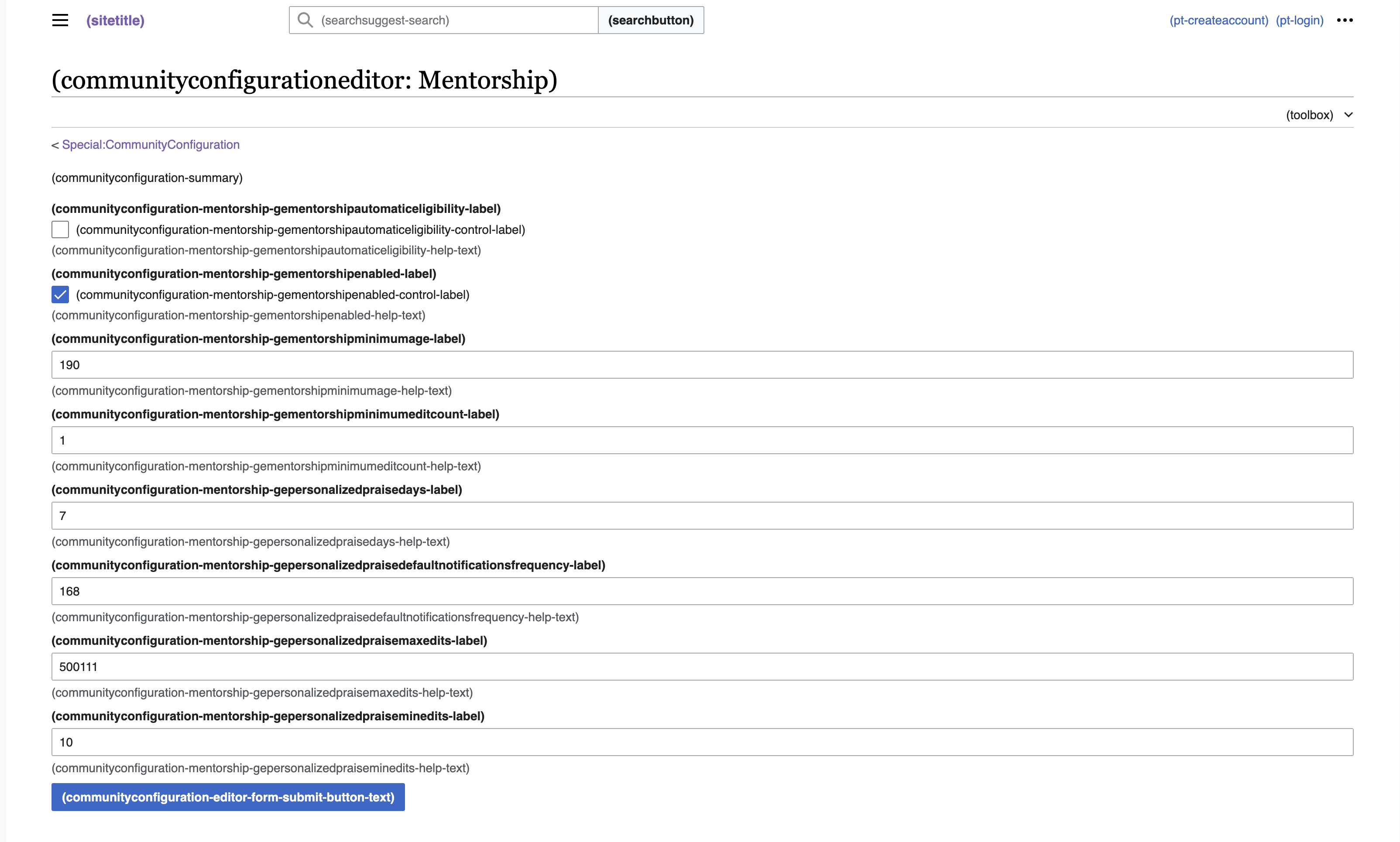
In Special:CommunityConfiguration/Mentorship, boolean controls are displayed with x next to them:
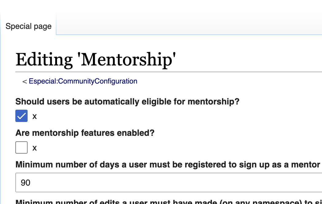
This happens, because we have communityconfiguration-mentorship-gementorshipautomaticeligibility-control-label and communityconfiguration-mentorship-gementorshipenabled-control-label set to x. This was done, because without doing so, the form looks even worse:

The Figma designs specify Yes/No radio buttons instead:

Within this task, we should do two things:
- settle on how we want to render booleans by default (a checkbox makes sense, but it likely should not have two labels, which is what results in this issue)
- in Mentorship, either use the non-standard way (WIP patch exists, also see T358663) or switch to whatever standard way we agree on