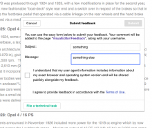
When a user leaves feedback in the related tool in VE, it may not occur to him/her that ticking the User Agent box is what will make the Submit button active. They may think that "File a technical task" is what they need to click on to save their comment, and lose everything they wrote by being sent to Phabricator instead.
Description
| Status | Subtype | Assigned | Task | ||
|---|---|---|---|---|---|
| Open | None | T29852 Wikimedia wikis need better issue reporting system | |||
| Duplicate | None | T100011 MediaWiki's feedback tool interface is confusing, and may make it unclear how to submit reports |
Event Timeline
@Elitre would you please add a screen shot? It will help us understand the problem a bit better. Thank you :)
Well, here's the screenshot. Usually in forms mandatory check boxes are marked as such (with an asterisk).
So after having written subject and message, and not paying attention to the check box, I'm inclined to click on "File a technical task" (because this is what I'm doing, I'm reporting a bug, right?)
Except that it means actually losing my report, because I'm being sent to an external site, which is something I wasn't expecting.
I think we can fix this pretty easily. Here are some suggestions.
- place "File a technical task" behind a standard blue link in the body text, rather than as a button in its own section. Put the link below "I agree to provide feedback in accordance with the Terms of Use." Perhaps something like "Found a bug? File a bug report instead." Maybe make that a target=blank link, like the other blue links on the dialog, so it opens in a new tab/window and the user doesn't lose their place. This makes it clearer that the user is exiting the current workflow in favor of another one. It also reduces the possibility that the user will be confused by two competing primary calls to action--"File a technical task" button, which you can click at any time (and lose your progress! >_<) and "Submit", which you can only click after you check a box and fill in some fields.
- Place asterisks next to the "I understand..." checkbox to signify that it is required. Standard form stuff. While you're at it, might also want to change the logic behind which fields are required. Right now, it looks like EITHER subject or message is required. That's strange. Probably it makes more sense to explicitly require "Message" (and put an asterisk next to it to signal that), and then auto-populate the subject with something ("Feedback from [username or ip]?) if that field isn't filled in.
- Place a target=blank link to the relevant section of our Data retention guidelines (perhaps this section?) behind "user agent information". Most people don't know what a user agent is, and it sounds sinister without context. That will make people hesitate to provide feedback, which we don't want.
Thanks for the suggestions @Capt_Swing, I agree with all of them. One further suggestion have is to clearly define "user agent" to people. Or, perhaps, don't even use "User agent" and say something like "I understand that my browser and operating system version (and any other information that is gathered and shared. I mean to assert that we list everything gathered here) will be shared publicly with my feedback." I think being explicit and using non jargon language is easier for people to understand and provides a context where there can more easily be trust.
I think we should definitely run the language by legal once we have a solid first draft to ensure we are using the correct language.
Also, I think we should work with a designer on this. Can we meet and make a plan to make this happen? Who would be the designer to work with? It is always a lot easier for me to understand UI when we can sketch and see things. Typing up visual changes to UI in text is confusing. (Might be just me) It is easier to see the same thing and make sure we are all on the same page.
I brought this up in the design review this morning, and @Nirzar has already been working on this.
@aripstra @Elitre
I think what i had in mind was simplifying the feedback process by introducing feedback categories
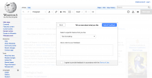
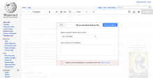
The first mockup shows the ways we can help a user who is looking for help.
the second one is about when you say you want to give feedback.
few points
- We can collect information like article which the person was editing in the background
- Same goes for user information - user agent etc. of course with the explicit checkmark
- Categorical feedback which will make it easy for someone to give feedback instead of a blank screen
- the last mockup in M80 shows how it will make it easy to give feedback. selecting features of VE from a list to give feedback
- you can imagine how other windows will look like for e.g. if you don't like something, pin pointing it would be easier by just picking it from the list of prominent features (of course that's optional)
- Filing technical bug is one of the categories here.
Note: this is bigger than the task description and the exact usability issue mentioned here but i was thinking of improving the feedback flow for a long time and i thought this task can start that conversation.
To the point of
it may not occur to him/her that ticking the User Agent box is what will make the Submit button active.
We can enable the submit feedback button by default but if you press it without checking "i Agree" then it will light up as required
Thanks @Nirzar this is great! I think this will greatly improve the experience of providing feedback. I know the text is place holder now, so let's put our heads together on how to word everything, and do any tweaks necessary. @Elitre, any feedback? Maybe the three of us could meet to discuss? It is a lot of visual info to just discuss in a phab ticket. Might be faster in a meeting in real time.
Do we know who might build this once design is done?
@aripstra this can be the epic task when we design is done. and then it will go to the VE team's backlog. I will involve James more once we have good solution.
Thanks for your comments.
So I wasn't able to understand what the editor would get after clicking on "file a technical bug".
Generally speaking, as an experienced editor I'm fine with categories, but we need to bear in mind that not all the wikis have or want to have dedicated pages to collect feedback (see for example this recent discussion re: Commons or our very own plan to centralize most of the VE feedback at mediawiki.org).
Anyway, if Nirzar's work will mean that for the "technical task" it will be clearer to understand which fields are mandatory and where one is supposed to click next, that we won't use obscure language and that editors won't lose their feedback because they clicked on the wrong button and landed on a different site they didn't mean to post to, then it LGTM.
@Elitre, @Jdforrester-WMF is this still a low priority for the editing team to build?
@Elitre and @Jdforrester-WMF what is priority for this? We need design work for this, and I think it is important for enabling users to give feedback on VE.
Well, I'd like to see centralization happen very soon, and while I agree that it is important, I don't think centralization should wait for the redesign to happen. I'll put this on the agenda for our next meeting.
@Elitre we keep re-visiting this task in our backlog, and nobody on our team seems to know whether our duties vis a vis this task have been fulfilled, and/or whether this task has been triaged and taken up by any product team. We'd like to resolve it, if our job is done, and/or if this project is not going to be executed by any teams in the near term. Any clarity you can provide would be appreciated :)
I wish we could at least figure out who should be working on this: is it a dev? a designer? someone else entirely? Here's another related report.


