Page MenuHomePhabricator

Standardize on component focus states
Closed, ResolvedPublic8 Estimated Story Points

Description

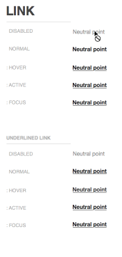
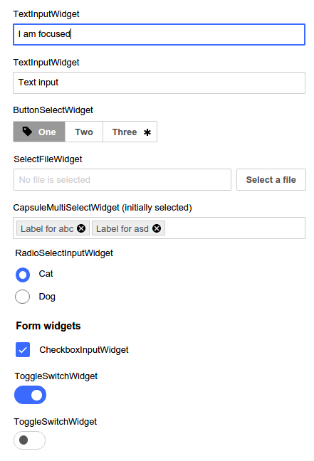
Some components are blue and it becomes difficult to distinguish which component is currently being focused on. See screenshot by Ed below, from T113225. Text field is currently in keyboard focus but the other blue components like radio button, checkbox, toggle switch that are also blue could be interpreted as being in keyboard focus.

Screenshot 2015-10-12 16.27.10.png (648×441 px, 53 KB)

Screenshot 2015-10-13 12.18.42.png (153×803 px, 18 KB)

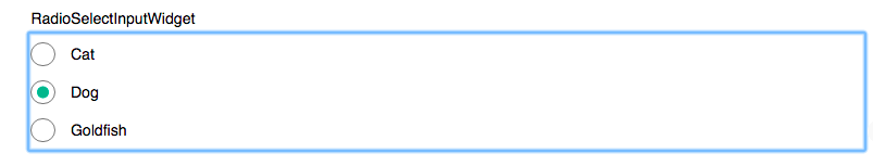
outline is not helping us here, as it's doesn't allow to be rounded.

Decisions as of 2016-04-29

  • 2px primary color focus (1px border and 1px inset box-shadow) for Input, Textarea, normal Button widgets
  • 1px white inset box-shadow for widgets with a solid background-color like primary buttons, selected ToggleSwitchWidget

Event Timeline

violetto claimed this task.
violetto raised the priority of this task from to Needs Triage.
violetto updated the task description. (Show Details)
violetto subscribed.

Adding, that :focus state of "normal link" is insufficient from accessibility standpoint in current mockup from today. I'd propose going for a close-to-browser ua stylesheet dotted border around links.

T115293_MediawikiUI_copy160120.sketch 2016-01-20 16-05-10.png (369×176 px, 19 KB)

I'm curious to hear what you all think about letting the browser take care of the focus states. From my point of view, I want to make this focus state design invisible. What that means is:

  • the experience is familiar to our users;
  • doesn't detract from the main focus of the content;
  • not an eye sore (where it becomes a distraction and defeats being invisible).

If we let browsers take care of focus states, what are some problems that come to mind. And conversely, if we do not, what are the problems that come to mind?

@violetto Not being fully sure about the necessity of invisibility, as a focussed element is normally the result of a user interaction and should therefore be distinguishable from unfocussed elements. It shows the main focus of the user's current task.

Currently we're taking care about a few :focus states in code, but not all.
I see a few problems by not taking care about the design of focus states of our widgets ourselves:

  • Our widgets are not necessarily native browser widgets, we construct them ourselves. We won't receive native browser focus on those.
  • When we are setting the focussed design on some widgets ourself and in other places, it's the browser default, we're going to confuse our users by two different outcomes, instead of guiding/helping them.
  • When a user changes from one browser to another or from one device to another the expected result learnt at former interaction might suddenly be differing.

The current focus state, which uses an inset border, carries a big technical cost and leaves behind many unfixable bugs. For example when the widget itself contains system components, such as the scrollbar in a multi line text input, or a third party z-indexed component, such as the ace editor widget, it is impossible for the border to overlap the content:

pasted_file (89×269 px, 4 KB)

On other widgets we have spent a lot of time coming up with hacks to make this work, and there is an ongoing cost to supporting this.

If we changed our focus state to just changing the border colour and not the size, we would fix these issues and save ourselves a lot of time.

That's really good to know @Esanders. Would you be able to share some of the bug tasks you mentioned?

@Volker_E, what are some non-native browser widgets that we construct ourselves?

@violetto I should have been more clear in terms.
Widget in our context is not a strictly defined term, as it includes elements (links or a href), controls (form controls, like input fields) and/or widgets (date picker) if you want to differentiate controls and widgets.
Native means the styling implemented in the user agent (browser's) stylesheet (and Shadow DOM)

Neither in mediawiki.ui, nor in OOjs UI we're leaving a lot of user agent's styles untouched. Here and there font-size or cursor, but not beyond.
In this understanding none of our widgets are native. The states in user agent styles were chosen to provide a clear visual distinction between normal, :visited in case of links, :hover, :active and :focus and disabled states. So when we're changing the other states we should provide a clear and standardized :focus state as well.

Collection of :focus states right now:

M101

  • 1px box-shadow inset white (Buttons, ToggleSwitch, Checkbox:checked, Radio:checked)
  • 2px color primary – 1px inset, 1px border (Input, Textarea)
  • Link doesn't receive :focus change (Link)

Possible issues here:

  1. Due to the different border color of buttons, inset box-shadow might not be clearly different, might not be clearly set itself apart from the previously focussed buttons (think modal dialog) or from the normal state (in quiet buttons)
  2. Link must have a clear focus state as well, for keyboard-only users that's essential. For mouse/touch users going back in history link focus give an indication where they clicked last.
  3. The RadioInputWidget/ToggleSwitchWidget :focus from the workboard seems technically wrong. The inactive state should follow the look of the :normal, same with active state.
  4. T115293#1989449 box-shadow inset might lead due to the architecture of OOjs UI to browser issues.

OOjs UI (as in v.0.16.4)

  • 2px color – 1px border, 1px inset with 3 different colors: (ButtonWidget normal)
    • normal (grey, but also on ButtonWidget frameless progressive, warning, destructive),
    • progressive-focus,
    • destructive-focus (also on invalid TextInputs)
  • Default browser focus (ButtonSelectWidget, RadioSelectWidget, RadioSelectInputWidget, DropdownWidget)
  • 2px color – 1px border, 1px inset (CheckboxInputWidget, RadioInputWidget)
    • darker grey
  • 1px border progressive (ToggleSwitchWidget, CapsuleMultiSelectWidget labels)
  • no change (CapsuleMultiSelectWidget)
  • wrong focus on NumberInputWidget as child of CapsuleMultiSelectWidget

As comparison I would like to also add Apex Theme (v.0.16.4):

  • slight border-color change to darker shade of grey/progressive/destructive (ButtonWidgets), problematic to identify on progressive/constructive
  • browser default focus (DropdownWidget, DropdownInputWidget, ButtonSelectWidget, ToggleSwitchWidget), complete different focus representation depending on browser
    • RadioInputWidget, CheckboxInputWidget, but browser default is different in Chrome (just outline)
  • no change (ButtonWidget frameless, CapsuleMultiSelectWidget)
  • border-color: #a7dcff; box-shadow: 0 0 0.3em #a7dcff, 0 0 0 white (TextInputWidget), invalid one stays the same when focussed
  • 1px border dark blue (Label in CapsuleMultiSelectWidget)

We should probably reconsider the adaption of the focus state to the colors of the buttons or invalid input elements. Having one focus color seems to align better with users' known mental model of being focussed from browsers default.
Together with being careful of using inset box-shadow, although I personally like the animated change of the focus state and the inwards-looking box-shadow as it resembles and INput better from my experience, we should be able to come up with (a) clear focus recommendation(s) across widgets.

cc: @Pginer-WMF

Change 285411 had a related patch set uploaded (by VolkerE):
MediaWiki theme: Standardize :focus states of ButtonWidgets

https://gerrit.wikimedia.org/r/285411

Change 285411 merged by jenkins-bot:
MediaWiki theme: Standardize :focus states of ButtonWidgets

https://gerrit.wikimedia.org/r/285411