Page MenuHomePhabricator

Add time indicators to RevisionSlider
Open, MediumPublic8 Estimated Story Points

Description

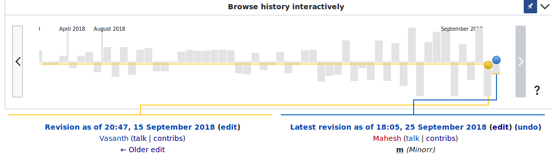
Problem: Sometimes articles are changed a lot of times within a short time frame. In that case, people want to know easily which are the revisions that belong to that time frame, to just look at those.
While this is possible to define this in the history view, the revision slider does not offer any help about it just yet.

Solution:
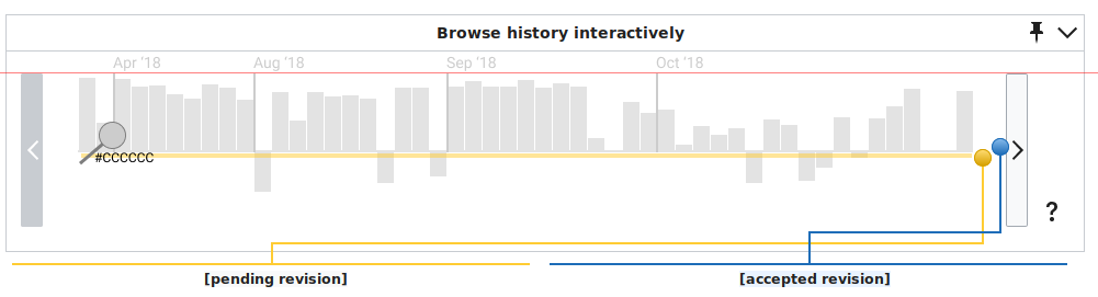
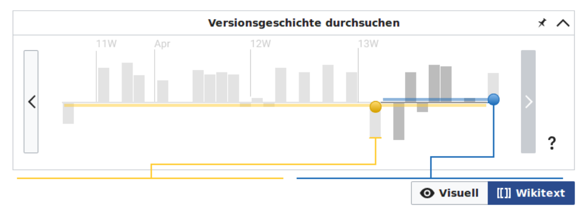
On the revision slider, ever xth bar has a label indicating the date of the change. The idea is to have between 4 and 7 labels on the screen, with the most fitting subunit (Time, Day, Month, Year).

Format: For Time and Date, please use (part?) of the usual date format in media wiki. For month, use the month name, and for year, the 4-digit format ("2018").

Warning We are not 100% sure what the best parameters are. This is something we need to discuss once there is something that can be seen and felt. Please discuss the result with WMDE-Design before merging, since we might need to adapt it.

Rough mock:


Bildschirmfoto 2018-08-02 um 10.50.54.png (432×1 px, 61 KB)

new figma file

Background: This is part of adding the revision slider to the revision diff page. The revision slider is a feature that adds a visualization of all revisions to the compare screen.
The revision slider was originally prototyped by the WMF Community Tech team and then handed over to the WMDE TCB team, as it is also a solution to fulfill a wish of the German Community Wishlist: https://de.wikipedia.org/wiki/Wikipedia:Umfragen/Technische_W%C3%BCnsche_2015/Artikel#Anzeige_aller_Bearbeitungskommentare_im_Diff

Event Timeline

Lea_WMDE renamed this task from Add time labels to revision bars MOCK NEEDED to Add time labels to revision bars MOCK NEEDED IF REALIZED.May 24 2016, 4:58 PM
Lea_WMDE removed a project: Design.

@Danny_B thanks for looking after the tickets. However, right now we don't even know if they will ever be realized, so I think it's better to ping the design teams once we reached the stage of knowing that :)

The idea reported here was more to highlight different days, like it can be done sometimes on some calendars, where the week-end days are in a different color.

A similar request in the problem field was reported in https://www.mediawiki.org/wiki/Topic:Uafmytgypbuj7qjg and should be evaluated if we deal with that task.

A similar request in the problem field was reported in https://www.mediawiki.org/wiki/Topic:Uafmytgypbuj7qjg […]

At that URL, see also the quick sketch I made of what a solution (just slightly different from the one stated in the task description) might look like.

CiteMe changed the task status from Open to Stalled.May 18 2018, 2:52 AM
CiteMe assigned this task to Lea_WMDE.
CiteMe subscribed.

All other decisions in this matter including another re-assignment, if she so wishes, goes to Lea. Also let anyone know with former interest know that she is now assigned. Please email me if there is anything at all you further need of me.

Lea_WMDE renamed this task from Add time labels to revision bars MOCK NEEDED IF REALIZED to Add time indicators to RevisionSlider.Aug 2 2018, 11:31 AM
Lea_WMDE changed the task status from Stalled to Open.
Lea_WMDE triaged this task as Medium priority.
Lea_WMDE updated the task description. (Show Details)

I was reading and understanding the problem statement. I have a question. Are we showing the labels on the basis of a pre-defined time frame (say, a month) or is it based on the number of contributions? From what I understand, it is based on the number of contributions within a particular time frame. Well, this will make it a much wider problem because there are articles that have more than 30 changes in a particular day. Check this for example: Revision History of Helicopter 66
So, we need to take into account the number of contributions within a time frame and that time frame can be anything. It can be a day, a couple of days, a week, a month, few months, an year.
Is there something that I am missing?
Please correct me if I am wrong somewhere.

Are we showing the labels on the basis of a pre-defined time frame (say, a month) or is it based on the number of contributions? From what I understand, it is based on the number of contributions within a particular time frame. Well, this will make it a much wider problem because there are articles that have more than 30 changes in a particular day. Check this for example: Revision History of Helicopter 66
So, we need to take into account the number of contributions within a time frame and that time frame can be anything. It can be a day, a couple of days, a week, a month, few months, an year.

Yeah, the idea would be not to have a fixed timeframe. As you said, the revisions per time unit can vary a lot depending on the article. My rough idea here would be:

  • look at a certain set of revisions ( eg. the number of revisions that is currently visible )
  • get the delta what time has passed from the first revision to the last revision in your set
  • depending on that delta have a fixed set of applicable scales e.g.:
    • if the time between rev first and rev last is a year have a scale with maybe months
    • if the time between rev first and rev last is a day have a scale with hours
    • etc...
  • then iterate over the revisions and apply markers where the selected scale units are hit

:-)

This makes things quite clear. Thank you Christoph! :)

Instead of showing the text above the marker, what if we show it as a tooltip?

It will not work on desktop version of mobiles

It will not work on desktop version of mobiles

I don't see why it won't work. Could you please elaborate?

Most of them do not have tooltips, because hover works differently, or does not work at all.

This tooltip will not be triggered on hover. It will be shown as a "tooltip" permanently. It will not be triggered on an event such as hover etc.

Hi @wassan.anmol117 , I'm not sure how you imagine a permanent tooltip to look like. Could you elaborate or provide a quick sketch?

Hi @Charlie_WMDE, I tried but the tooltip doesn't automatically show on render. I will upload a [WIP] patch to show a basic structure.

Change 456205 had a related patch set uploaded (by Wassan.anmol; owner: Anmol Wassan):
[mediawiki/extensions/RevisionSlider@master] [WIP] Add time indicators to RevisionSlider

https://gerrit.wikimedia.org/r/456205

Hi @wassan.anmol117 please let me know when it has been merged so I can have a look on beta.

Sure! @Charlie_WMDE. However, you can download the patch and test it locally and let me know how can we make it better.

Hi @wassan.anmol117 I do not have my own testing environment so I can only test things that have been deployed to the test wiki.

Hi @wassan.anmol117 I do not have my own testing environment so I can only test things that have been deployed to the test wiki.

@Charlie_WMDE lets look at it together! :-)

So, I thought of a different approach for this task which creates a better UI

The approach would be like:

  1. Adding a toggle button previous/next to "Pin" icon. The toggle button will toggle the visibility of time indicators.
  2. The revision on which a time marker should be displayed will have a tooltip displayed.
  3. Hovering on bars when Time indicators toggle is ON, will cause the time indicators toggle turn off and the actual tooltip will be displayed.

Working on the same. Suggestions/Feedbacks are welcome. :)

Hi @wassan.anmol117 sorry for not hearing from this side for so long. Is the original patch on beta now? Please stay with the original proposal for now. One reason why we want to see time indicators in the background, is that this gives some permanent help to users to orient themselves. They should not have to think "I want to know when this happened", but just roughly know when things happened, all the while they are hovering over the bars to get more information. This is why we are aiming for a solution that is visible all the time - while at the same time not too intrusive. I know this is a tricky task, but I'm sure we can master it together. Maybe @SrishtiSethi or @Gopavasanth have an idea how your original patch can be improved?
Thanks for all your hard work!
Lea

Hi @Lea_WMDE. Thank you for your feedback. Based on your suggestions, I have amended my current patch and updated it taking into account different parameters (days, months etc). You can check the patch 2 here: Patch 2.

Let me know how can we improve it further.

Hi, did anyone test the latest patch? :)

Hi, did anyone test the latest patch? :)

Hello Anmol testing your patch, I found when the Revision height is maxed the month and year is getting overlap with the revision as shown in this below Image.
Eg: In this below Image September 2018 is getting overlap with the revision height.

Selection_018.png (322×1 px, 19 KB)

Hi @wassan.anmol117 i'm really sorry for the late reply. I have this on my schedule for next week and will post the mocks here when I have them. Thank you for your work so far!

Hi @wassan.anmol117,

I've updated the mocks to better show how i imagine the time stamps:

This is how i think it should look

mockForDates.png (271×1 px, 12 KB)

and this is the same mock with specifications

mockForDatesSpecs.png (271×1 px, 14 KB)

the red line is to show how high the time stamp lines should go. they should be as high as the back and forth buttons of the revision slider itself.

The month names should be abbreviated and the year as well.

The color should be different for the month and year as well as the line. it is #CCCCCC

I hope this helps! Let me know if you run into any other trouble

Just a question. Sorry if it was already asked. Why do we need at all the current year? What's wrong in "Apr 17 - Oct 17 - Apr - Oct"?

That's a good question. I think it helps give perspective in all cases, not only when the page has been around for several years and even then there's an argument to be made for having the year everywhere.

Lets presume we have an article that has been created in 2018. All timestamps for it would have no year on it. If a person is new to the revision slider it would not be clear to them from looking at it what year this article is from. Maybe it's a few years old and hasen't been touched since then. You could say: but when the people hover over a revision they'll see the year immediately, or when people scroll back beyond 2018 they'll see that suddenly there's years so they'll have context for the earlier revisions.

That's all true but I think for simplicity and consistency and for not creating question marks in people's heads for even a few seconds it makes sense to me to add the year at every stamp.

You could say: but when the people hover over a revision they'll see the year immediately

No, I can't, because of mobiles. But I can say: everyone sees the tool for the first time only once in their life. In all the rest uses they already know how does it work.

No, I can't, because of mobiles. But I can say: everyone sees the tool for the first time only once in their life. In all the rest uses they already know how does it work.

Oh true, you're right! Even more reason to have the year displayed all the time.

And for the second part I think it's important to remember, that people also use features with gaps in between uses, so it's not a given, that they'll remember this forever.

Can I ask you what concern you have with displaying the year at all times? If it interferes with an existing workflow or we have not thought of an edge case where it would cause problems, I'd love to hear about it!

Can I ask you what concern you have with displaying the year at all times? If it interferes with an existing workflow or we have not thought of an edge case where it would cause problems, I'd love to hear about it!

Just a matter of place. I believe that all redundant parts should be removed, so it will be less messy.

Hi, sorry everyone. I was busy organizing hackathon and also preparing for a MediaWiki workshop. @Charlie_WMDE thanks a lot for sharing the mockup. I will work on it and change the UI accordingly.

Cheers!

Removing task assignee due to inactivity, as this open task has been assigned to the same person for more than two years (see the emails sent to the task assignee on Oct27 and Nov23). Please assign this task to yourself again if you still realistically [plan to] work on this task - it would be welcome.
(See https://www.mediawiki.org/wiki/Bug_management/Assignee_cleanup for tips how to best manage your individual work in Phabricator.)

Change 456205 abandoned by WMDE-Fisch:

[mediawiki/extensions/RevisionSlider@master] [WIP] Add time indicators to RevisionSlider

Reason:

Just cleaning up. This is blocked on a product decision and has a very low priority. It's unclear if we'll come back to this issue but at least not in the foreseeable future.

https://gerrit.wikimedia.org/r/456205