Page MenuHomePhabricator

Improve the reading experience of footer sections of articles
Closed, ResolvedPublic

Description

Problem
Users in previous studies have found it unclear that the 'Read more' related articles are short article recommendations rather than actual articles due to the large size of the card thumbnails, and the length and prominence of the lead paragraph.

Specifically on Android - there are also the following issues:

  • Missing the Wikipedia word mark branding in the footer
  • [BUG] 'Read more' section has a nested scroll
    Screenshot_20161110-190916.png (1×1 px, 255 KB)

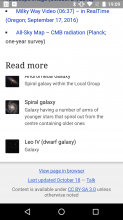
Solution – From parent ticket (cross-platform footer design T164105):

  • Update the design for a more compact presentation of 'Read more' articles (with Android-specific styling applied)
  • Standardize legal copy and wordmark placement - including addition of the 1dp divider below the wordmark
    • Move "View page in browser" to sit below the legal copy (per the shared page-library task T172746)

New 'About this article' footer menu design specific to Android (see task T116841):

  • Move Last updated <date> link moved to become a new footer menu item
  • Talk page link moved to become a new footer menu item
  • Addition of "Available in <#> languages" as a footer menu item
  • Addition of "View on a map" as a footer menu item, if this metadata exists for an article.

Mock:
Updated Aug 8 2017

Light mode
Article bottom - Light.png (2×720 px, 227 KB)
Dark mode
Article bottom - Dark.png (2×720 px, 244 KB)

Mock in Zeplin

Asset:

Event Timeline

RHo lowered the priority of this task from High to Medium.Aug 19 2016, 11:19 AM
RHo created this task.
JMinor renamed this task from Improve the reading experience of footer sections of Articles to Improve the reading experience of footer sections of articles on iPad.Sep 2 2016, 12:14 AM
RHo renamed this task from Improve the reading experience of footer sections of articles on iPad to Improve the reading experience of footer sections of articles.Nov 2 2016, 3:29 PM

@RHo

I added a parent task so when we migrate the iOS footer JS transforms (for the menu, read more, and legal footer) to the wikipedia-page-library, we can then have Android take a stab at using it as well.

Sharing this transform code means it would be nice if we could keep the platform designs fairly similar, but as I mentioned in the comment here we can already fairly easily customize the bits you asked about.

Here's how the transforms presently look on iOS:
(Tap image for animation)

ios.mov.gif (720×400 px, 1 MB)

To be clear, once T164137 is merged Android *could* choose to use the design you see in the image above as-is (with the tweaks you mentioned here) at almost no cost - the menu, read more, and footer transforms are all completely functional.

@Niedzielski hmm it's unclear to me what decisions product has made around consolidating these presentations.

@Niedzielski ...but I guess that could wait until the Android integration task?

Estimation of this task must occur at least after the initial consolidation and perhaps after Android integration has started. Work early on in integration with Rita. We don't think the customizations requested will be too tricky.

RHo removed RHo as the assignee of this task.Oct 13 2017, 11:35 AM
RHo moved this task from Design Doing to Needs Triage on the Wikipedia-Android-App-Backlog board.

Design work is done on this ticket.

Change 386832 had a related patch set uploaded (by Dbrant; owner: Dbrant):
[apps/android/wikipedia@master] Overhaul bottom content.

https://gerrit.wikimedia.org/r/386832

Change 386832 merged by jenkins-bot:
[apps/android/wikipedia@master] Overhaul bottom content.

https://gerrit.wikimedia.org/r/386832