Page MenuHomePhabricator

Show globe icon 🌐 next to all <maplinks> links
Closed, ResolvedPublic

Description

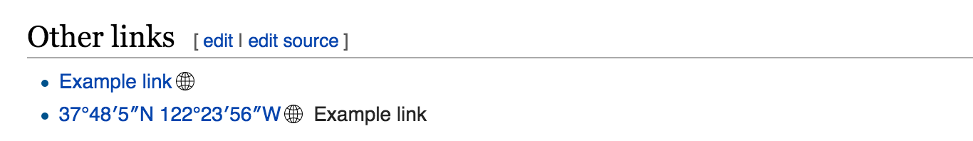
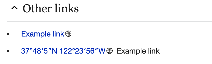
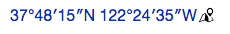
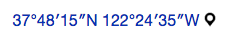
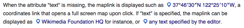
In order to highlight that the link text is not a regular link, I think we should show a globe symbol 🌐 (unicode) to highlight that the link will open a map rather than a page.

  • There should be a way for users to hide it (css class?)
  • It should behave very similar to the "external link" indicator (should not be selectable)
    • external link uses a background-image css
  • We should be careful not to break existing Wikivoyage links which do not need an extra globe

Event Timeline

There are a very large number of changes, so older changes are hidden. Show Older Changes
Restricted Application added a subscriber: Aklapper. · View Herald Transcript

Unicode symbol likely has problematic levels of support. I think that an SVG just like external link icons is the way to go.

Change 309997 had a related patch set uploaded (by JGirault):
Show globe icon next to all <maplinks> links

https://gerrit.wikimedia.org/r/309997

Awesome! @JGirault what changes will the WV community need to make (or can already make) so that when this goes live, it doesn't break their links?

Screenshots of above patch:

desktopmobile
desktop.png (198×1 px, 34 KB)
mobile.png (270×894 px, 31 KB)

The icon used is https://github.com/driftyco/ionicons/blob/master/src/ios-world-outline.svg. It can be replaced by a WMF icon once we have one.

This is not a blocker (can be fixed later), but should the globe be the same color as the link? External links also follow this rule.

Awesome! @JGirault what changes will the WV community need to make (or can already make) so that when this goes live, it doesn't break their links?

Locally, it doesn't change WV maplinks (the autostyled color box) at all.
Anyhow, if it does appear on WV links, or one wants to hide the icon, it can be done with some Mediawiki:Kartographer.js or common.js` with:

$( '.mw-kartographer-link' ).addClass( 'no-icon' );

It can be done with custom CSS too.

This is not a blocker (can be fixed later), but should the globe be the same color as the link? External links also follow this rule.

If we (slightly) edit the original SVG, yes we can (and maybe we should, but it can be done later).

I merged it to make sure it makes the train, but we might would revisit:

  • Why "ios-..." filenames? Shouldn't we remove that prefix?
  • Shouldn't we use the #06f color instead? Seems the same as external link, the lighter version

Change 309997 merged by jenkins-bot:
Show globe icon next to all <maplinks> links

https://gerrit.wikimedia.org/r/309997

I merged it to make sure it makes the train, but we might would revisit:

... If you're not sure it's ready then wait until next week. This is a highly visible change and so having it change on a weekly basis does not look good. There's no reason to rush things.

From gerrit:
Esanders
We have some other globe icons. Let's run this past design.

Yurik
@Esanders, I would like this patch to make the train to make it less of a breaking visual change later, once the maplinks are more widely used. I agree that we should revisit it for the visual aspects and possibly change the icon itself, colors, etc.

Having the UI change more frequently is a worse experience for users and makes us look like we don't know what we're doing. Also shipping a version of the product that you know is substandard is rarely a good idea.

Did you run this past the reading or editing design teams?

@Esanders, I am very sure we need an icon in that place, very similar to the "external link" icon. I am totally ok with that icon changing over time - like a different globe being shown, or the design team decides to show an icon of a map instead of the globe. But we need to make sure the icon is already there from the start. Going from not having it to having it is a much bigger visual breaking change, and I would rather avoid it. I think delaying it would cause bigger disruption than adding it early and adjusting its look later.

Change 310043 had a related patch set uploaded (by JGirault):
Rename globe icon

https://gerrit.wikimedia.org/r/310043

I agree with @Esanders, that we should be sensible with introducing UI elements, when we're already clear, that it won't be the final direction.
The globe metaphor is relatively close to maps functionality and appearance, but extensively used for many years as hyperlink icon and learnt by users to not resemble maplinks.
Without a lot of research, the map pin might meet user expectations and learnt behaviour better as map-specfic metaphor.

But, and here it gets interesting from an UX perspective, for me it's not clear if the icons are even needed at all: Do they help users or just add to the cognitive load (to refer to a very popular theory)? The link position and description should already be clear enough without an icon. Also special icons for links were in-depth discussed and removed in T56604.

But, and here it gets interesting from an UX perspective, for me it's not clear if the icons are even needed at all

Yes, and if we come to this conclusion then adding and removing the icon will be far more disruptive. I suggest we back this out of this week's release.

Change 310043 merged by jenkins-bot:
Rename globe icon

https://gerrit.wikimedia.org/r/310043

@Volker_E thanks for your perspective. The popup links tend to serve a very different function than regular links - instead of navigating to a new place, they offer a popup map that gets closed with an X or escape. At some point it might not even be a full screen. As such, I feel there should be a visual indicator to differentiate it from the regular page links.
I am ambivalent about the actual icon - it could be a pushpin or a semi-folded map or anything else. If you have strong suspicions that the icon should not be there and that it should be discussed, we should disable it. But if your concern is mostly with what icon to show, I think we should keep it and gradually change it. What does the rest of the team think?

Change 310206 had a related patch set uploaded (by Yurik):
Revert "Show globe icon next to all <maplinks> links"

https://gerrit.wikimedia.org/r/310206

Change 310206 merged by Yurik:
Revert "Show globe icon next to all <maplinks> links"

https://gerrit.wikimedia.org/r/310206

I agree that some kind of indicator is needed: these links work more like buttons, doing something instead of taking users somewhere.

Change 310208 had a related patch set uploaded (by Yurik):
re-enable "Show globe icon next to all <maplinks> links"

https://gerrit.wikimedia.org/r/310208

My notes from the discussion during the Design Review meeting yesterday:, involving mainly @pau, @Volker_E, @RHo and I:

PROs for having an icon on map links

  • Unless the link is surrounded with explicit text that helps identify it as a map link rather than an hypertext (e.g. See the Fisherman's Wharf on a map.), there can be confusion and conflicts between a link pointing to an article (such as [[Fisherman's_Wharf,_San_Francisco]]) and a <maplink text="Fisherman's_Wharf,_San_Francisco">.
  • To differentiate a hyperlink from a "maplink", we can't simply replace the anchor by a button, because of the inline use case. (a map link can be inserted as text in the middle of a paragraph).
  • Some users have been used to seeing a globe icon next to a GeoHack link (see screenshot below). As a user, it helps me to identify map-related data in an article very quickly. It's valuable because the amount of knowledge behind such links is otherwise invisible unless the user dares to click on it. However, it is important to note that this existing geohack behavior is different from the one we're discussing here:
    • In the existing; the globe icon and the map link (coordinates) are 2 different links, the globe opens an interactive map in a popup, while the coordinates link sends the user to wmflabs geohack.
    • In the proposition: the text and the icon are one and only one link. Clicking on the text or the icon both open an interactive map in a dialog.
Screen Shot 2016-09-14 at 4.11.57 PM.png (246×1 px, 93 KB)
The same as above, but replaced with <maplink>s. Editors can replace the coordinates fallback with actual text, and are likely to do so, so that's why I replaced the second map link with some text.
  • In addition to external links, there are already other links having an icon, such as PDF links, because they may be disruptive for the user, and/or because they may involve a lot of data to download.

CONs:

  • Lack of guidelines for hyperlinks that should contain an icon.
    • Generally speaking, map links are not different from any link that open a popup instead of a document, so any link opening a popup could apply for an icon (as it provides a valuable indicator of what to expect when clicking).
    • We want to avoid the proliferation of such links-with-icons. How to define the boundaries, i.e. what makes a link require an icon?
  • Depending on too many icons (and having to download them) for rendering a page is something that has already been pointed out and discussed, so generally speaking introducing a new icon for links is not seen as a good practice.

Change 310716 had a related patch set uploaded (by VolkerE):
ComboBoxInputWidget: Hide dropdown indicator when there is no dropdown

https://gerrit.wikimedia.org/r/310716

Wrong task number entered. Patch above applies to different task. Sorry!

Screen Shot 2016-09-14 at 4.11.57 PM.png (246×1 px, 93 KB)
The same as above, but replaced with <maplink>s. Editors can replace the coordinates fallback with actual text, and are likely to do so, so that's why I replaced the second map link with some text.

I think this is the strongest argument for the use of a differentiating map link icon, as users would likely be annoyed they have been taking to an unexpected place (since a plain link inline text on Wikipedia links to another article).

This is also due to the fact that there are so many precedents set where we already use a supplemental icon to highlight when there the context switch, whether that is a link to an external site, or downloading a PDF, or a media file.

Sidebar: We should probably raise a separate issue to standardize presentation of the existing icon+text links since they are all fairly different.

Additional examples of current inline links with icons
Telephone
tel: icon link  (39×442 px, 12 KB)
Sound
sound file icon link (39×435 px, 10 KB)
PDF, External link, External HTTPS link
inline icon links (98×314 px, 23 KB)

We already have a folded map icon “Map” and a pushpin “MapPin” under “Icons - Location”.

While it might be good to have the same icon in both the "insert map" VE and right after the link, I find the folded map icon without the pushpin by itself is not very intuitive. Should we revise it to have the pushpin?

Ah I had wanted to avoid discussing what icon until It is decided there should be an icon at all. But since it has been raised, I'd advocate for using just the pin icon which is a commonly used indicator of place, is used in the new maps UI, and is a simple shape recognizable even at small icon size.

As the discussion moves towards which icon, is someone still against having an icon at all?

My naive attempt:

  • desktop
    Screen Shot 2016-10-25 at 5.27.02 PM.png (26×203 px, 7 KB)
  • mobile
    Screen Shot 2016-10-25 at 5.27.19 PM.png (34×230 px, 8 KB)

It's trying to be a mix of map-ltr.png (put in perspective) and mapPin.png.

It gives an idea, but I'm far from being an experienced icon designer... If one feels inspired, I would love some help there :)

In much bigger size, it looks like:

Screen Shot 2016-10-25 at 5.37.36 PM.png (381×382 px, 23 KB)

The proposed icon is good and can be used in other places, but in this context the size will be really small (the size of a text character). For this context, I'd consider using just one shape (e.g., the pin icon).

+1 - agree that using the pin works better due to the small size of the icon here.
But this map+pin combo may work well for a logo elsewhere...

To illustrate the suggestion above:

  • desktop:
    Screen Shot 2016-10-26 at 10.54.36 AM.png (37×200 px, 7 KB)
  • mobile:
    Screen Shot 2016-10-26 at 10.54.31 AM.png (46×242 px, 8 KB)

+1 to the pin solution.
One minor question, why behind the link? We're featuring accompanying icons before the link everywhere else…

+1 to the pin solution.
One minor question, why behind the link? We're featuring accompanying icons before the link everywhere else…

Good question :)
We're not really displaying accompanying icons before the link everywhere else... see:

Screen Shot 2016-10-26 at 12.51.38 PM.png (165×450 px, 54 KB)

Well, good point for you (confused them in memory). But I've got a response as well:

Icon position in links - Wikimedia Office 2016-10-26.png (221×420 px, 32 KB)

(and another point for UI guidelines)

To give a quick update: I will try to get a decision on Tuesday's Design Review meeting for :

  • The icon to use
  • The position of the icon: icon + text vs text + icon

@Volker_E I think we use "icon-after-text" everywhere in the article content, and "icon-before-text" everywhere in the user interface (either at the top or at the bottom). For consistency, I think we should do "icon-after-text", since <maplink> is content.

I really like @JGirault's proposed icon, much more than the pushpin - not intuitive IMO. Could we get more opinions on that one? Of course if everyone is strongly against it, so be it, but lets at least get more than 5 votes :)

pasted_file (62×450 px, 20 KB)
I am about to run these two samples by the Facebook straw poll.

The community has spoken, pushpin by itself is a clear winner...

47°48′0″N 13°02′0″E 📌
47°48′0″N 13°02′0″E 📍
47°48′0″N 13°02′0″E 🖈
:)

The pushpin seems ambiguous to me. I appreciate the traditionality of it, but it seems complicatedly skeumorphic (?) for a digital map. It's an allusion which many users won't be familiar with.


There's a reasonable case for using the globe icon that we're currently using in template:coord etc.
https://commons.wikimedia.org/wiki/File:Erioll_world.svg and https://commons.wikimedia.org/wiki/File:WMA_button2b.png
Pros:
(1) Familiar to editors and readers;
(2) Noticeable/discoverable, if someone is specifically looking for it
Cons:
(1) Is it bad to re-use an icon from a different software feature? Perhaps not, if the original is being replaced (phased-out);
(2) another icon to download, vs unicode (although unicode icons are unreliable - I get tofu (on my laptop but not desktop) for the 4 unicode icons suggested so far - F4675234)


The Location icon also seems good to me.
It's what we use in OOUI: https://doc.wikimedia.org/oojs-ui/master/demos/#icons-mediawiki-ltr
It's what we had in wikifont: https://www.mediawiki.org/wiki/Design/WikiFont#/media/File:MapPin.svg
It matches the "location" icon in Android status-bar and Google-search-results.[ 1 ]


The Dewiki Coord template mentions (translated):

The special characters or symbols, '⊙ ', '▼' or '[globe icon above]' are output with the values "ICON0", "ICON1" or "ICON2" with linking to the Geohack. They thus associate a location specification without interrupting the read flow when using the flow text.

So '⊙ ' and '▼' and similar might be worth considering.


Other alternatives are the "folded map" as used in Android and elsewhere.[ 1 ]
Or the "diagonal pointing compass arrow" as used in iOS status-bar and elsewhere. [ 2 ] [ 3 ] (or other compass variant)


@Volker_E I think we use "icon-after-text" everywhere in the article content, and "icon-before-text" everywhere in the user interface (either at the top or at the bottom). For consistency, I think we should do "icon-after-text", since <maplink> is content.

I was going to agree, but then all coordinate-template examples I checked seem to place the globe icon to the left of the text, e.g.

I think this is considered standard, because the result is so different from navigation to a page. I'd recommend sticking with that.

(Sidenote: I've been experimenting with a flip in my global.css for other external link icons, and I'm finding it very disconcerting and unhelpful, so far.)

@Quiddity Are you agreeing on the pushpin, your first sentence is contradicting your paragraphs further down in your comment?
Advantages of pushpin or Location MapPin from OOjs UI

  • icons are one of a kind and are widely used as Location icons like you've pointed out (Google Maps, Android system-wide),
  • the metaphor is also quite common,
  • it is still identifiable and unique on very small scale (16x16px), which is not true for the globes linked above.
  • it carriages the meaning of one specific location (geoposition) better than a globe icon IMO. Or do maplinks also feature other data?

I'm concerned that an ad hoc survey which was run on Facebook for less than 24 hours (starting on a Friday night and ending Saturday morning) is not enough of a sample size to make a good decision on this issue.

I ran Facebook straw poll to see if the community would agree with the designers, so I think we are can move forward with it, and it seems they do by a wide margin. Running polls on even bigger sample size seems a bit overreaching for something this small.

The bigger question is -- before or after the text )))

Hi @Quiddity – I think we are all in agreement that the map pin on its own is the icon we want to use. Ie., the following upside down teardrop with hole in the middle:

pasted_file (894×848 px, 80 KB)

Perhaps we can all try to to refer to this icon as a map pin or location pin, since 'pushpin' could be confused with a different icon to do with pinning/bookmarking.

@JGirault @Volker_E – As for placement before or after the co-ordinates, considering examples from an earlier comment.

Additional examples of current inline links with icons
Telephone
tel: icon link  (39×442 px, 12 KB)
Sound
sound file icon link (39×435 px, 10 KB)
PDF, External link, External HTTPS link
inline icon links (98×314 px, 23 KB)

As a general rule, the few cases where the icon is place afterwards is only for opening a doc (html page or pdf) as a kind of 'heads up' about the link behavior but user will still be reading a doc in the browser window.
Whereas opening a media type such as sound file or telephone link, the icon has been placed before to highlight that this clicking on it will actually do something beyond opening a link, since it often requires the user to have access to something else besides the browser, eg. playing a sound file requires them to have speakers and sound on in their device, and clicking on the telephone link requires access to a telephone network.

I would argue that opening the map is a context switch different enough to place it in front of the text so that it is clear they will be opening a map view of the location. Let's consider the example when written inline with the co-ordinates replaced with the specific location name:

Icon before
icon before.png (246×1 px, 82 KB)
Icon after
icon after.png (246×1 px, 82 KB)

IMHO, having the icon after 'Porte de Castellan' introduces ambiguity that the icon and link are two different actions, as in first here's an article link for "Porte de Castellan", followed by an icon that will open a map view.

@RHo In OOjs UI's icon repo it's already called MapPin. Jfyi further icon naming discussions are currently under way at T141801

Yes, the "mapPin" or "location icon" is one of the options I support: https://doc.wikimedia.org/oojs-ui/master/demos/dist/themes/mediawiki/images/icons/mapPin.svg - I didn't realize it was meant to abstractly represent a "pin"!
Above, I was just objecting to the unicode "pins", 📌, 📍, 🖈. :-)

I'm glad to see (in the example above) that the icon will be colored linktext-blue. That seems like a good compromise for replacing the high-visibility globe, which might otherwise be strongly missed.

Change 319247 had a related patch set uploaded (by JGirault):
Show MapPin icon next to all <maplinks> links

https://gerrit.wikimedia.org/r/319247

Change 319247 had a related patch set uploaded (by JGirault):
Show MapPin icon next to all <maplinks> links

https://gerrit.wikimedia.org/r/319247

During the design review this morning, a consensus was found with OOjs UI's mapPin.svg icon, on the left of the link.

Screenshots:

DesktopMobile
Screen Shot 2016-11-01 at 4.36.49 PM.png (94×807 px, 44 KB)
Screen Shot 2016-11-01 at 4.37.22 PM.png (197×375 px, 43 KB)

A technical question is remaining, because the above patch duplicates the icon from OOjs UI's repository to Kartographer's repository, instead of using a single location (/cc @Volker_E ). In the meantime, I think we can announce this to the community (/cc @CKoerner_WMF ).

Edit: Same screenshots, minus the typo.

@JGirault, from my understanding of our conversation yesterday, the design has been finalized to: a map pushpin icon in front of the link. Please confirm.

@JGirault, from my understanding of our conversation yesterday, the design has been finalized to: a map pushpin icon in front of the link. Please confirm.

True, the patch is now ready: https://gerrit.wikimedia.org/r/#/c/319247/

Change 319247 merged by jenkins-bot:
Show MapPin icon next to all <maplinks> links

https://gerrit.wikimedia.org/r/319247

Please take a look at the Location template at Commons-beta - we are showing a pushpin in front of an image. While this might be okayish, I doubt this is what the authors there invisioned, so we might have to update that template once more (2million page updates, eeek!)

Please take a look at the Location template at Commons-beta - we are showing a pushpin in front of an image. While this might be okayish, I doubt this is what the authors there invisioned, so we might have to update that template once more (2million page updates, eeek!)

I think there are a few options there:

  • Keep all the existing features, simply remove the pushpin icon. They can modify Module:Coordinates to include class="no-icon" in their add_maplink/add_maplink2 sections.
  • Revamp the template. There are lots of competing services currently: WikiMiniAtlas (added by Mediawiki:Vector.js), Geohack link, Maplink. I think it will be great if:
    • the coordinates link becomes a true maplink, as our team envision it: {pushpin + coordinates},
    • they remove WikiMiniAtlas from Mediawiki:Vector.js (make it a user-enabled feature rather than a skin-enabled feature)
    • geohack link is replaced by an icon meanwhile maplink offers competitive service.
    • In other words, switch geohack and maplink, and remove WikiMiniAtlas enabled by default in Vector.js

It might be good for us to spend some time on improving/styling Location template (in a sandbox, not actually changing the original), and propose it as an alternative to the current one, but we should participate in the discussion. Seems like some are ok with removing geohack, but we will need to coordinate/discuss it with the wider community, and address any blocking issues. At the moment they simply added the new service without engaging in the bigger discussion.

Change 310208 abandoned by JGirault:
re-enable "Show globe icon next to all <maplinks> links"

Reason:
See phab ticket for more details

https://gerrit.wikimedia.org/r/310208