Page MenuHomePhabricator

Add a help link to the Tagged Edits menu
Closed, ResolvedPublic

Description

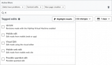
Because Tags are as somewhat obscure function, we'd intended to add a help link to inside the Tags menu once we'd updated the documentation, as per . We updated the documentation, but forgot to include the Help link.

tags - initial.png (465×799 px, 48 KB)

Event Timeline

I've updated the task description to provide a link that works with translations.

Change 381958 had a related patch set uploaded (by Petar.petkovic; owner: Petar.petkovic):
[mediawiki/core@master] Add a help button to the Tagged Edits menu

https://gerrit.wikimedia.org/r/381958

Change 381958 merged by jenkins-bot:
[mediawiki/core@master] Add a help button to the Tagged Edits menu

https://gerrit.wikimedia.org/r/381958

Checked in betalabs

Please, note:

  • there are different help link for ORES filters, 'How do these work?' which works differently - it displays a popup with a brief description and the link 'Learn more'. Would it be better to keep all user access to Help consistent?
  • in old UI 'Tag' link refers directly to https://en.wikipedia.org/wiki/Special:Tags
  • do we need @Pginer-WMF feedback on the overall design?

QA Recommendation: Product should weigh in

Please, note:

  • there are different help link for ORES filters, 'How do these work?' which works differently - it displays a popup with a brief description and the link 'Learn more'. Would it be better to keep all user access to Help consistent?
  • in old UI 'Tag' link refers directly to https://en.wikipedia.org/wiki/Special:Tags
  • do we need @Pginer-WMF on the overall design?

QA Recommendation: Product should weigh in

As I commented in T167740#3634988, I think it would be better to link directly to Special:Tags, since " go to the Special:Tags page of your wiki" can be a source of confusion (users need to realise that suddenly they are no longer in their wiki, and figure out how to reach Special:Tags).

It would be good also to tweak the icon size to avoid it being larger than the text label next to it.

! In T176661#3656629, @Pginer-WMF wrote:

As I commented in T167740#3634988, I think it would be better to link directly to Special:Tags, since " go to the Special:Tags page of your wiki" can be a source of confusion (users need to realise that suddenly they are no longer in their wiki, and figure out how to reach Special:Tags).

It would be good also to tweak the icon size to avoid it being larger than the text label next to it.

@Petar.petkovic, let's do as Pau suggests. Can you please:

  • Change the link destination to the Special:Tags page of the current wiki (meaning whatever wiki the user is currently on).
  • Reduce the icon tag a bit.

I'll change the Description above so that it specifies the new link destination.

Change 382697 had a related patch set uploaded (by Petar.petkovic; owner: Petar.petkovic):
[mediawiki/core@master] Change Tagged edits help icon

https://gerrit.wikimedia.org/r/382697

@Volker_E we need a question-mark indicator in OOUI to resolve this. It also seems to be a good idea in general seeing as we have an "alert" indicator "!" so there should also be room for a "?" indicator...?

@Petar.petkovic, I wrote a comment on the patch, but while we don't have the indicator, I'd prefer we still use the OOUI element for consistency and other design factors, and "just" make the icon smaller. It's not ideal, but hopefully we will get an indicator soon, and those are the small-sized icons we want anyways.
We're doing this type of trick (putting a specific CSS rule for the icon to be smaller) in the saved queries drop down "default" icon (pin) -- I think it should work the same way, and it will be a lighter fix without tearing out the ooui widget. Please add a "hack" comment to it, too, seeing as that's not really what we would ideally want to do but the code as it is right now is leaving us not much choice.

After looking into the accessibility and icons that we have, the icon we should be using is the 'info' indicator -- which was created for this purpose. Indicators are too small for the ? button and they also don't have the i18n fixes that we use for icons (so the ? will not flip where it needs to for arabic, for example)

I'd ask @Jdforrester-WMF to pitch in since he pointed out the accessibility issue.

I am fine approving this as a temporary hack for the moment but we need to resolve this in the design. @Pginer-WMF can we use the "i" indicator instead?

Yeah, we determined back in ~2013 that we couldn't make an accessible ? indicator in the size constraints of those images at 1:1 pixel boundaries on non-"retina" screens using a monochrome palette without fuzzing, which is why I made the i indicator (as used in the visual editor). Of course, if you can make a ? indicator without breaching the size or design rules (which is plausible, I'm not the pixel-pusher I used to be ;-)) we could do that instead.

@Mooeypoo Although I do understand the general intention of having a checkmark indicator alongside an exclamation mark one, I actually don't think that we need this as indicator:

  • The label mw-rcfilters-ui-filterMenuHeaderWidget-title that the icon will get attached to is 20px in height, same as the new icon canvas, see T177432 (task will be updated consecutively over the next couple of days). It would be better to add the checkmark as icon, it also makes it easier to use elsewhere.
  • Current “!” indicator is white on black, we would need to have both version, white on black and black on white, which seems overreaching.

After looking into the accessibility and icons that we have, the icon we should be using is the 'info' indicator -- which was created for this purpose. Indicators are too small for the ? button and they also don't have the i18n fixes that we use for icons (so the ? will not flip where it needs to for arabic, for example)

I'd ask @Jdforrester-WMF to pitch in since he pointed out the accessibility issue.

I am fine approving this as a temporary hack for the moment but we need to resolve this in the design. @Pginer-WMF can we use the "i" indicator instead?

At the Recent Changes page, we are already using the "?" as the metaphor for help, at the right side of the page title. I think that getting help and getting additional details have different connotations, that we may want to preserve.

In this case, the icon is next to a text of a size larger than the content size, so the resulting "?" should be still recognisable. Below I compared the current state (where the icon seems more prominent than the label) with a reduced version of the icon (making the element 20px) at full-size on regular non-retina resolution:

Screen Shot 2017-10-10 at 17.27.26.png (137×304 px, 14 KB)
Screen Shot 2017-10-10 at 17.25.47.png (137×304 px, 14 KB)

Moving back into QA. I just merged the patch that changes the link url and the icon size.

Change 382697 merged by jenkins-bot:
[mediawiki/core@master] Change Tagged edits help icon

https://gerrit.wikimedia.org/r/382697

Checked in 1.31.0-wmf.3 (hewiki) - the size of the help icon is adjusted.

Screen Shot 2017-10-11 at 5.58.23 PM.png (262×718 px, 37 KB)

QA Recommendation: Resolve