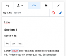
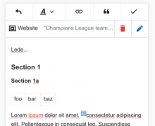
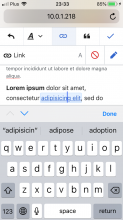
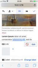
Currently we position all mobile contexts at the top of the screen to avoid them being hidden by the virtual keyboard on iOS:
This has a couple of problems:
- There is limited space to show information, so we only show the most basic information (target for a link, title for citations).
- The page jumps down when the context is show, which can be frustrating if you are trying to adjust your selection.
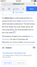
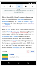
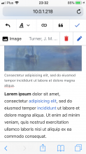
However most inspectors are for focusable nodes, where the virtual keyboard is not shown [1]:
It may make sense to design contexts around this more common case, and use the fact that we can attach contexts to the bottom of the screen if the keyboard is not shown, such designs were proposed in T93325:
It was also proposed at that time that link inspectors would trigger this same behaviour and hide the keyboard, showing an inspector that has an "edit label" button, however I think this would be frustrating for the user as they are probably as likely (or more likely) to want to edit the link label.
Note 1:
Contexts shown with the keyboard present:
- Link
- LanguageAnnotation (v. rare)
Contexts shown without the keyboard:
- References
- Templates
- Images
- Galleries
- Other extesnsion (Math, Maps, etc.)
- Comments
