Page MenuHomePhabricator

Redesign rank icons for better visibility
Open, Needs TriagePublic

Assigned To
None
Authored By
MichaelSchoenitzer
Oct 6 2018, 12:50 PM
Referenced Files
F31857948: order_hidedefault.png
Jun 8 2020, 2:10 PM
F31857942: backgroundcolor-mark2.png
Jun 8 2020, 2:07 PM
F31857916: order.png
Jun 8 2020, 2:04 PM
F31857914: newicons.png
Jun 8 2020, 2:04 PM
F31857927: new icons hide default.png
Jun 8 2020, 2:04 PM
F31857920: combi.png
Jun 8 2020, 2:04 PM
F31857906: colors.png
Jun 8 2020, 2:04 PM
F31857903: jetzt.png
Jun 8 2020, 2:04 PM
Tokens
"Like" token, awarded by Kristbaum."Like" token, awarded by Tkarcher."Love" token, awarded by MichaelSchoenitzer.

Description

The current rank icons are very unobtrusive and are all looking very similar. This leads to several problems:

  • It's impossible to see at first glance what ranks are set. It's very hard and troublesome to see which values have different ranks if there are a lot of statements. Example: Look at this item and try to find all the versions which have different rank than normal. And these are only 39 values, some items have a few hundred values.
  • Most (new) users don't notice the ranks at all. I have dozens of edits of users on my watchlist where users add statements without the correct rank, remove statements instead of setting the rank to deprecated or remove statements already deprecated. I also often get questions why Wikipedia shows the wrong statement.
    • This leads to quality problems and extra work (by hand) for other Wikidata-editors
    • This leads to missing data (because removed and never reverted)
    • This leads to rumors about Wikidata containing wrong data

I use css since a few years to make the rank icons colored:

ranks.png (33×53 px, 6 KB)

This works well for me, but we really need a global solution for this. And we need it as soon as possible.

Please redesign the rank icons or do other changes to the UI to defuse the problem.

See also T115112 T87327 T198907

Event Timeline

@Lydia_Pintscher I'm not sure if this is a duplicate of T139081. Where that ticket speaks only about the rank-selector in edit-mode, my concern is also/mostly about the rank-icon in viewing mode. If you close this ticket, you might at least integrate the additional aspects into the other ticket.

Useful solution from Nikki: add in your common.css:

/* from [[User:Nikki/common.css]] */

.wb-preferred { background-color: lavender }
.wb-deprecated { background-color: mistyrose }

Thanks, @Pintoch!
Could someone who already has it set up make a quick screenshot for everyone else here to see what it looks like?

Voila:

1.png (193×742 px, 9 KB)

3.png (268×746 px, 18 KB)

There's a little bug with sources, but that's easy to fix.

2.png (378×736 px, 27 KB)

By talking to other wikidata-editors and looking at other commons.css-files it seems that quite a lot of people have this issue and use CSS-Hacks to work around it, one more reason to solve it at it's core. I identified the following possible solutions:

  • Change the color of the rank icons (my original proposal)
  • Change the rank icons to be different to each other
  • Change the background of the whole statement (as suggested by Nikki/@Pintoch)
  • Add a wathermark to the statement
  • Sort the statements according to their rank

Some of these could be combined.

What is the protocol to go forward on this? Should we hold a RFC on-wiki to let people choose among the possible solutions above?

What is the protocol to go forward on this? Should we hold a RFC on-wiki to let people choose among the possible solutions above?

I think the next step should be to create mockups of all variants to make sure everyone understands them equally.

I think the next step should be to create mockups of all variants to make sure everyone understands them equally.

Yeah that sounds like a good idea.

Yes please! And while you're at it, please also consider adding a warning ("Your new value is not the preferred value yet") or even adding a checkbox ("Set this entry as the new preferred entry") when entering new values (as suggested here: https://de.wikipedia.org/wiki/Wikipedia:Technische_W%C3%BCnsche/Wunschparkplatz#Hinweis_auf_Bedeutung_der_R%C3%A4nge_bei_der_Wikidata-Eingabe)

@Lydia_Pintscher: Can we please push this a little more? According to this Grafana chart, use of preferred+deprecated rank together went up significantly during the past year from ~720,000 claims (June 2019) to ~15,000,000 claims (June 2020). My personal impression is that use of ranks are much more often discussed controversially in recent months, as many users for instance prefer to remove deprecated claims as the deprecation is barely recognizable for many users.

I think when many users make problematic editorial decisions due to a poor UI, it is about time to fix it.

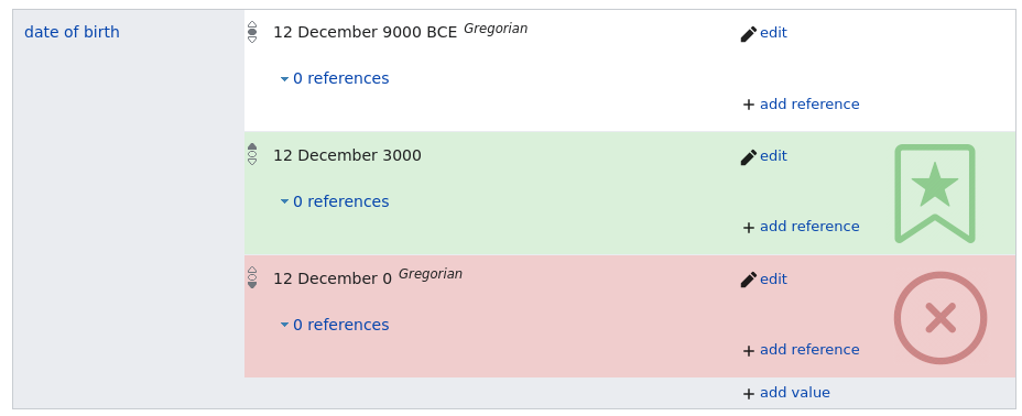
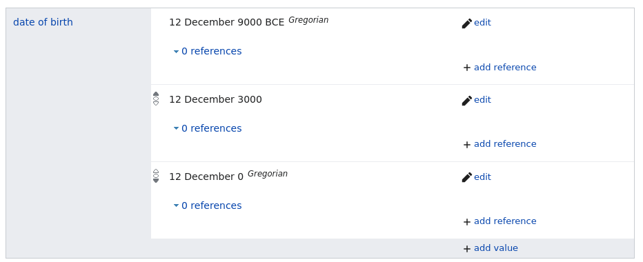
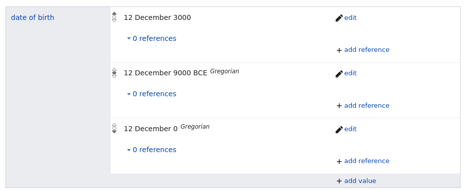
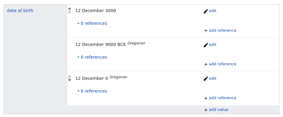
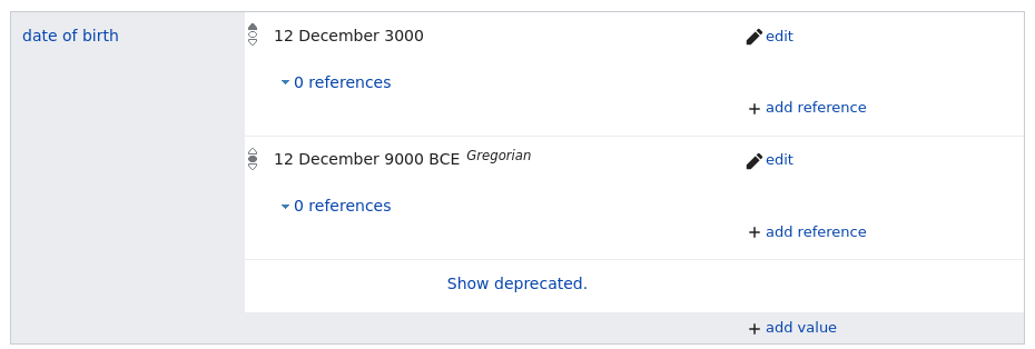
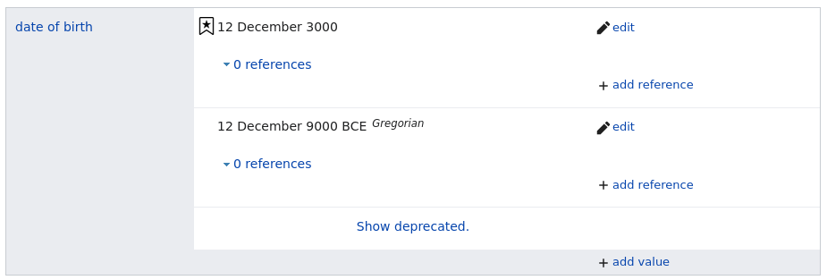
I created some rough mookups. All icons and colors are just rough ideas and not final designs.

Current state:

jetzt.png (385×928 px, 25 KB)

Color icons:

colors.png (384×929 px, 25 KB)

Color the background:

backgroundcolor.png (378×928 px, 24 KB)

Add watermarks:

backgroundicon-post.png (389×933 px, 45 KB)

Color the background & add watermarks:

backgroundcolor-mark2.png (378×928 px, 41 KB)

Hide Icon for default rank:

hide_default.png (380×932 px, 24 KB)

Different icons:

newicons.png (385×935 px, 26 KB)

Another Idea for a new Icon-design: colored meter

Different icons & hide Icon for default rank:

Only in edit mode there would also be an icon for statements with default rank, allowing to change the rank.

new icons hide default.png (388×944 px, 25 KB)

Order by rank:

order.png (383×930 px, 25 KB)

Order by rank & don't show icon for default rank:

Only in edit mode there would also be an icon for statements with default rank, allowing to change the rank.

order_hidedefault.png (387×936 px, 24 KB)

Order by rank & hide deprecated:

A click on "show deprecated" would toggle the visibility of deprecated statements.

ordered_hidden.png (314×930 px, 20 KB)

Order by rank & hide deprecated & change icons & don't show icon for default rank:

A click on "show deprecated" would toggle the visibility of deprecated statements. Only in edit mode there would also be an icon for statements with default rank, allowing to change the rank.

combi.png (313×925 px, 20 KB)

Hello everybody ! Mattia here, from the UX team .
The UX team was asked to take a look at this request and how to improve upon the problems mentioned in the ticket as well as to assess which changes would not worsen other parts of the UI and its usability : to say this upfront, it is a pretty tricky issue to solve, as our space in the UI is limited and since there are very many ways to model items on Wikidata. After some conversations and evaluation of the different proposed solutions, the best start from our perspective would be changing the order of items.

We think that the suggestion of ordering the statements by rank would be a good way to start with.

The advantages are clearly that this introduces no new elements in the UI (so it would be more feasible to implement) and we could potentially build upon the sorting (e.g. add any collapsing of deprecated statements or the like later, if needed).

Solutions based on new icons or color are sadly difficult to deal with, for some specific reasons:
• Use of color is a frequent to-do-solution for highlighting various things, so it can easily have a lot of different meanings if used a lot and not very consistently.
• Use of color is prone to accessibility issues as many people do have weaknesses in color perception.
• Use of color easily makes the UI look cluttered

Thus, as UX designers, we try to avoid the use of color except for one color for preferred actions and one color for system errors or destructive actions – like suggested in the OOUI.

Similarly, icons are not very easy:
• Most users are not familiar with newly introduced icons , unless we would be using icons that are very standardized (e.g. the save icon or the undo arrow).
• It is hard to convey that different icons refer to the same issue (item rank) but in different manifestations (item rank of deprecated, normal, preferred): trying to overlay different icons is really hard to do well in small space.

While we know that this is not the solution which is as great as we hope for initially, we think that starting with ordering statements by rank is the approach that most likely increases usability and maintains consistency of the UI with the smallest cost in terms of implementation and iterations.

I would like to see the ordering being implemented and I share the doubts on the use of colors. But I want to point out that just sorting the values by rank will only solve half of this problem. It will make it easier for people to see which statements have the highest/lowest ranks – but the other (in my opinion bigger) problem is new/sporadic editors and data users often don't know about the existence of ranks and don't notice the small, hardly different, icons and therefore wrongly remove or modify data. In my opinion the ordering will likely not improve this situation.

I see also an UX related potential issue with the sorting coming up: so far the order of the elements is from oldest (top) to newest (bottom) added values. This results that in most cases the values are sorted from the oldest on top to the newest at the bottom. There are also a few scripts which change the order to ensure this sorting. On the other end, I would assume that implementing this sorting by rank would put the items with the highest rank to the top and the values with the lowest rank at the bottom. This would create an inconsistent order.
Example:
We currently have the following values:
1 2 3 4 5 6 7 8
where bold means higher rank. The new order would be:
7 8 1 2 3 4 5 6

Disclaimer: This is my private opinion as a member of the Wikidata community and not related to my employment at WMDE.

Hello. I want to make you aware of the solution proposed by ChristianKl in the project chat here:
https://www.wikidata.org/w/index.php?title=Wikidata%3AProject_chat&type=revision&diff=1271399554&oldid=1271369787

Basically it involves:

  • bolding the item name of every statement with preferred rank
  • using strikethrough for deprecated statements
  • leaving the normal rank as it is

In my opinion it is a more simple and accessible solution than the ones proposed so far.

Ordering is generally useful (but can create issues as pointed out by @MichaelSchoenitzer) but it doesn't help a user to understand the concept of deprecated statements and why we have wrong data on Wikidata that we mark as deprecated.
The ordering issues could be worked out by allowing ordering to order statements with higher point in time over statements with lower point in time. I'm unsure about whether it makes sense to program a new ordering solution that only takes in account ranks but not qualifiers (and a syntax that allows Wikidata users to specify which qualify should affect the ranking in what way).

Intuitively, I don't think using color to express the ranks is a good idea. The watermarks also don't look good to me.

Bolding/normal text/strike-through seems to me like it would be easily understood by new users. Using strikethrough to mark deprecation is an existing UX pattern that Intellij already uses and even users who don't understand it in the formal meaning as deprecation can easily understand that Wikidata doesn't claim that a statement is true when it gets shown with strikethrough.

I do think we need an icon even for the default rank because clicking on the icon is necessary to change the rank. If there's no icon it's harder to discover how to change the rank.

I have doubts that the icons that we have are ideal. I think it would be great to have usability tests with new users to see whether the alternative icons proposed by Michael could be an improvement about the status quo (of course other icon sets could be even better).

If I were to choose, I would deprecate the watermarks solution ;)
Color on backgound + color on classic button icon would be great enough!
Besides, I don't understand the third icon on this image "https://phab.wmfusercontent.org/file/data/5cc6pk4joa6am4fsgveh/PHID-FILE-tlokwlhid5iovljxqhp7/new_icons_hide_default.png.
Would it be possible to add a better tooltip when mouse over on the rank button (eg "Preferred rank, means this is a more true value than the other statements" // "Deprecated rank, means this is less true than the other statements and should not be visible on query results" or something alike) ?

To weigh in :

  • Agree with the UX criticisms of colour and icon use for this.
  • I don't agree with the tooltip content suggested above since it does not accurately explain ranking. However, I do agree with the sentiment that discoverability of ranking could somehow be improved directly from preferred/deprecated statements (in the same way that constraint violations provide an explanation to the user).
  • Strike through for deprecated seems like a well afforded meaning that's also consistent with general use. However, it could introduce an element of annoyance when you actually want to work with deprecated statements.
  • Bold for preferred is not the most obvious connection, but does afford importance.
  • I think sorting is an excellent suggestion, any further sorting could occur within the 3 subgroups. This also would help to highlight rank issues in the data since sorting by rank would override any other sorting and be more obvious when unexpected.