Disable zoom on form elements in iOS.
Description
Description
Details
Details
Customize query in gerrit
| Status | Subtype | Assigned | Task | ||
|---|---|---|---|---|---|
| Resolved | MMiller_WMF | T206711 [EPIC] Growth: help panel | |||
| Resolved | Etonkovidova | T212505 Help Panel: Disable zoom on form elements in iOS | |||
| Resolved | kostajh | T212967 Help panel: textarea not visible when editing in VE mode on mobile |
Event Timeline
Comment Actions
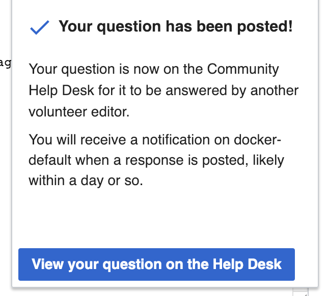
Checkmark and success text should be on the same line.
This is how the line breaks when there is not enough horizontal space ( taking padding and margin into account ). What device is it on the screenshot?
Comment Actions
Change 481183 had a related patch set uploaded (by Sbisson; owner: Sbisson):
[mediawiki/extensions/GrowthExperiments@master] Help panel: fix cog menu on mobile
Comment Actions
Change 481183 merged by jenkins-bot:
[mediawiki/extensions/GrowthExperiments@master] Help panel: fix cog menu on mobile
Comment Actions
A couple things from light testing:
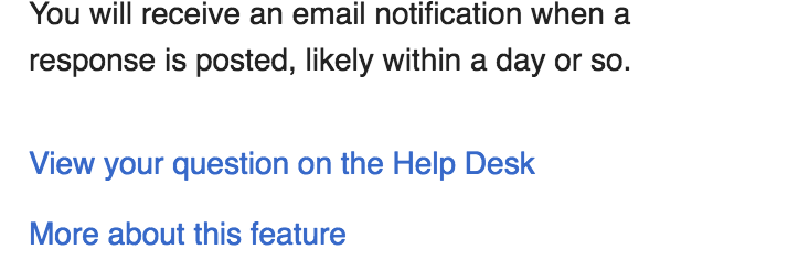
- When I click into the "Your question" box, Safari automatically zooms into that box. Then I click Continue, and the next screen (the confirmation page) stays zoomed in. When the screen changes, I think it should zoom back out to normal. If this is unclear, let me know, and I'll post a video.
- I think "View your question on the Help Desk" should have greater affordance. It's currently a blue link in the same font as the paragraph above it, and it isn't spaced away from that paragraph. I'm imagining it being larger, bolder, and distinct from the black text above it. Good question for @RHo.
Comment Actions
When I click into the "Your question" box, Safari automatically zooms into that box. Then I click Continue, and the next screen (the confirmation page) stays zoomed in. When the screen changes, I think it should zoom back out to normal. If this is unclear, let me know, and I'll post a video.
Hmm, I don't see this behavior on Safari on the latest iOS 12.1.2.
Comment Actions
@kostajh -- I'm on that same iOS version. Here's a video of my experience: https://drive.google.com/drive/folders/0AByrz2v0cc5AUk9PVA
Comment Actions


In the design the link appears as a new paragraph as the first of 2 links
I thought we're just doing a single link, and "More about this feature" is going to live under the settings cog?
We can make the view question link bold:
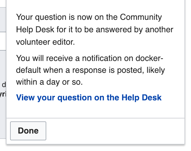
We could add another empty line if you want although IMO the extra space looks off:
We could also replace "Done" with "View your question on the Help Desk" (the spacing around this can be adjusted)
Comment Actions
- @MMiller_WMF can weigh in but I think it would be good to more explicitly provide information to users about this experimental feature here as well.
We can make the view question link bold:
+1 - think this is as much as is needed if it is a single link below the submission text.
Comment Actions
Change 481948 had a related patch set uploaded (by Kosta Harlan; owner: Kosta Harlan):
[mediawiki/extensions/GrowthExperiments@master] Help Panel: Make view question link bold
Comment Actions
Change 481948 merged by jenkins-bot:
[mediawiki/extensions/GrowthExperiments@master] Help Panel: Make view question link bold
Comment Actions
(Actual link to video: https://drive.google.com/open?id=1oxkqKWwg9XddTKUUkM5JiY6xrJxcmssv )
Comment Actions
@MMiller_WMF having trouble reproducing this. Can you confirm that the problem still occurs for you on beta?
Comment Actions
Change 482393 had a related patch set uploaded (by Catrope; owner: Catrope):
[mediawiki/extensions/GrowthExperiments@master] Help panel: Prevent iOS from zooming in on text input
Comment Actions
Change 482393 merged by jenkins-bot:
[mediawiki/extensions/GrowthExperiments@master] Help panel: Prevent iOS from zooming in on text input