Page MenuHomePhabricator

Tweak the mockups legal message placement to account for keyboard being up
Open, Needs TriagePublic

Assigned To
None
Authored By
iamjessklein
Jul 31 2019, 2:42 PM
Referenced Files
F30177898: legal@2x.png
Aug 31 2019, 11:41 AM
F30154813: legal@2x.png
Aug 29 2019, 4:04 PM
F29990618: Image-1 2.jpeg
Aug 7 2019, 6:46 PM
F29930777: Screen Shot 2019-08-01 at 8.11.48 AM.png
Aug 1 2019, 12:18 PM
F29920046: Screen Shot 2019-07-31 at 10.41.14 AM.png
Jul 31 2019, 2:42 PM

Description

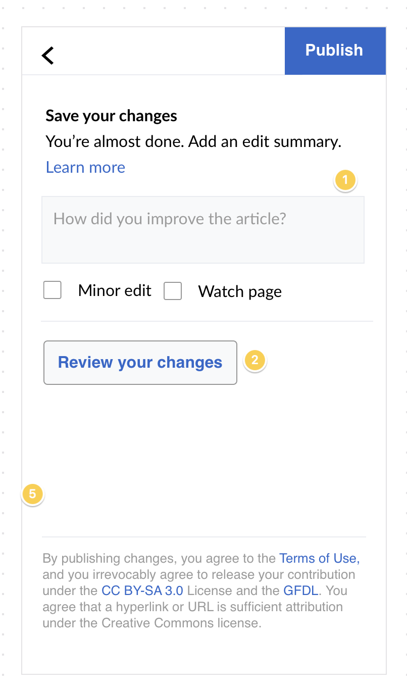
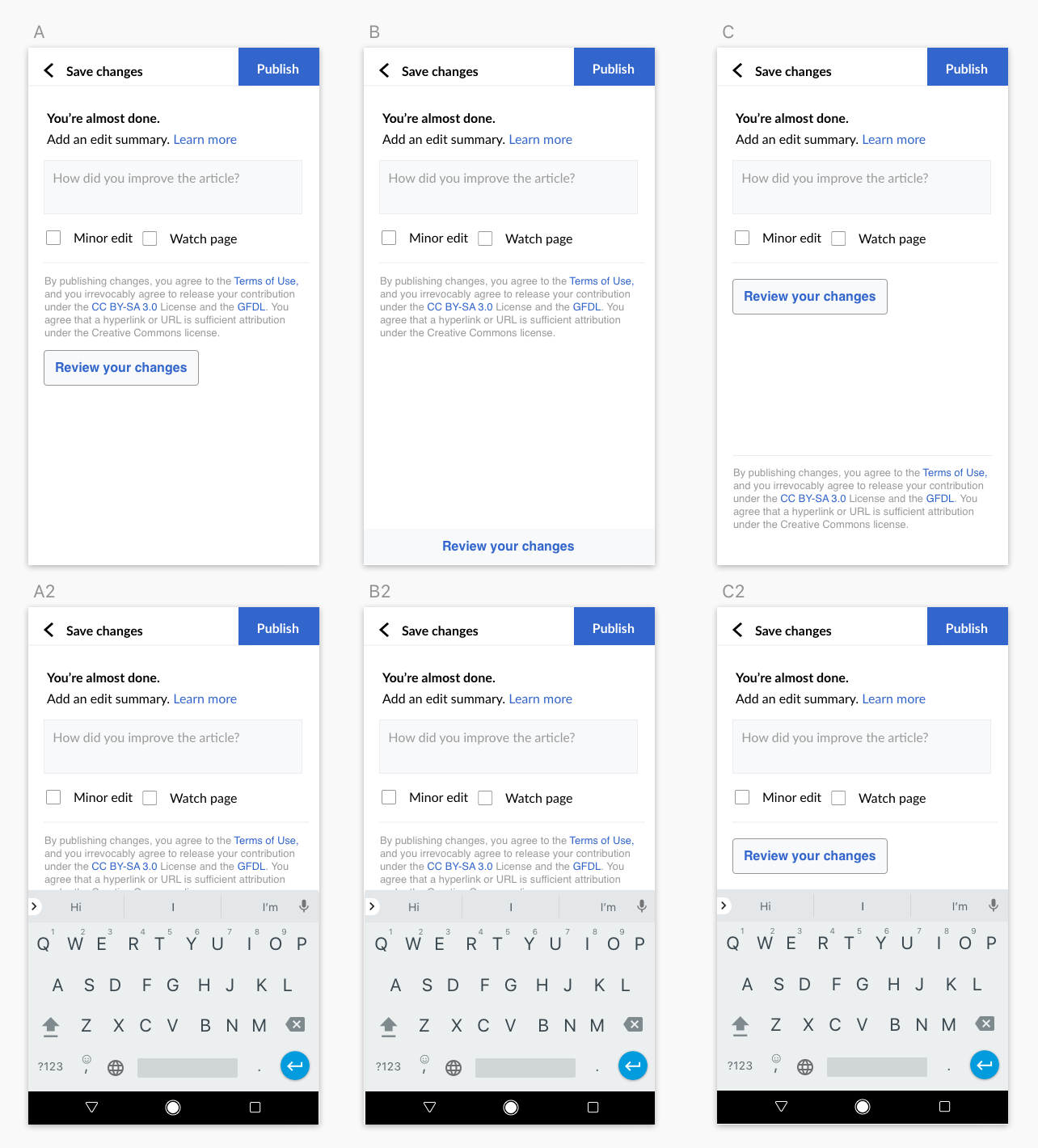
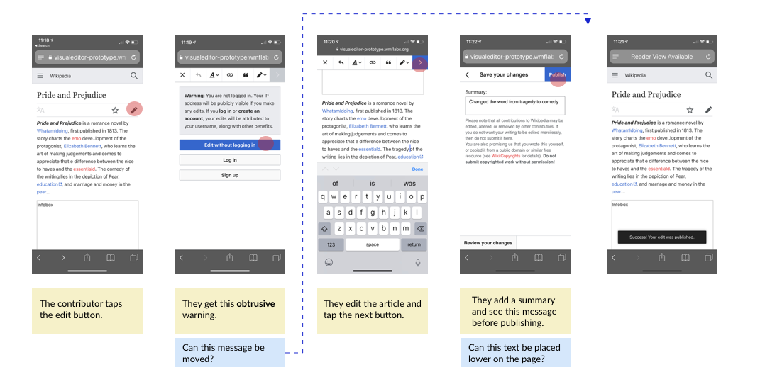
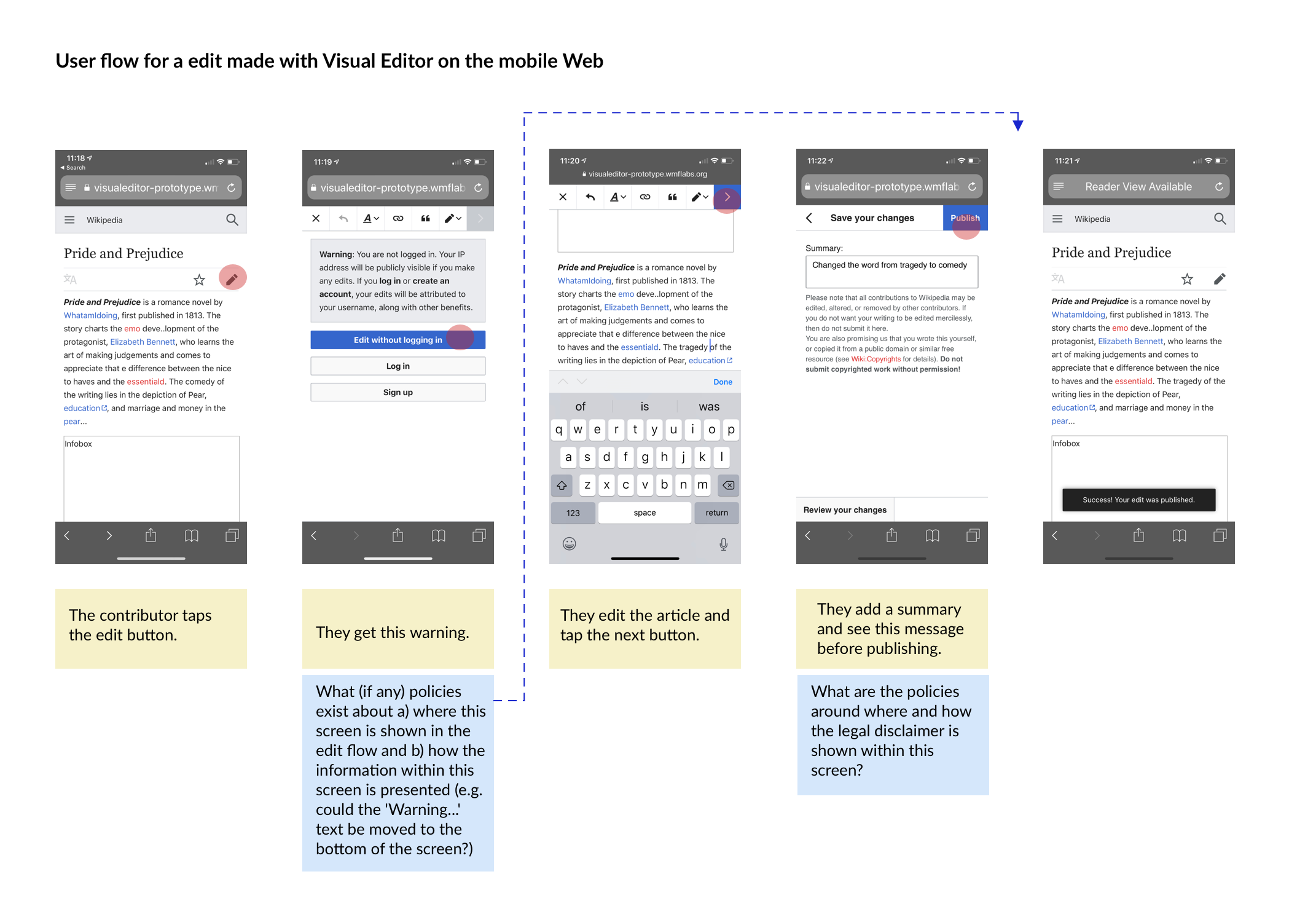
As @Esanders said in Zeplin "Currently we focus the edit summary text box when opening this page, which means the keyboard is visible, so we should reconsider what it means to bottom-align this."

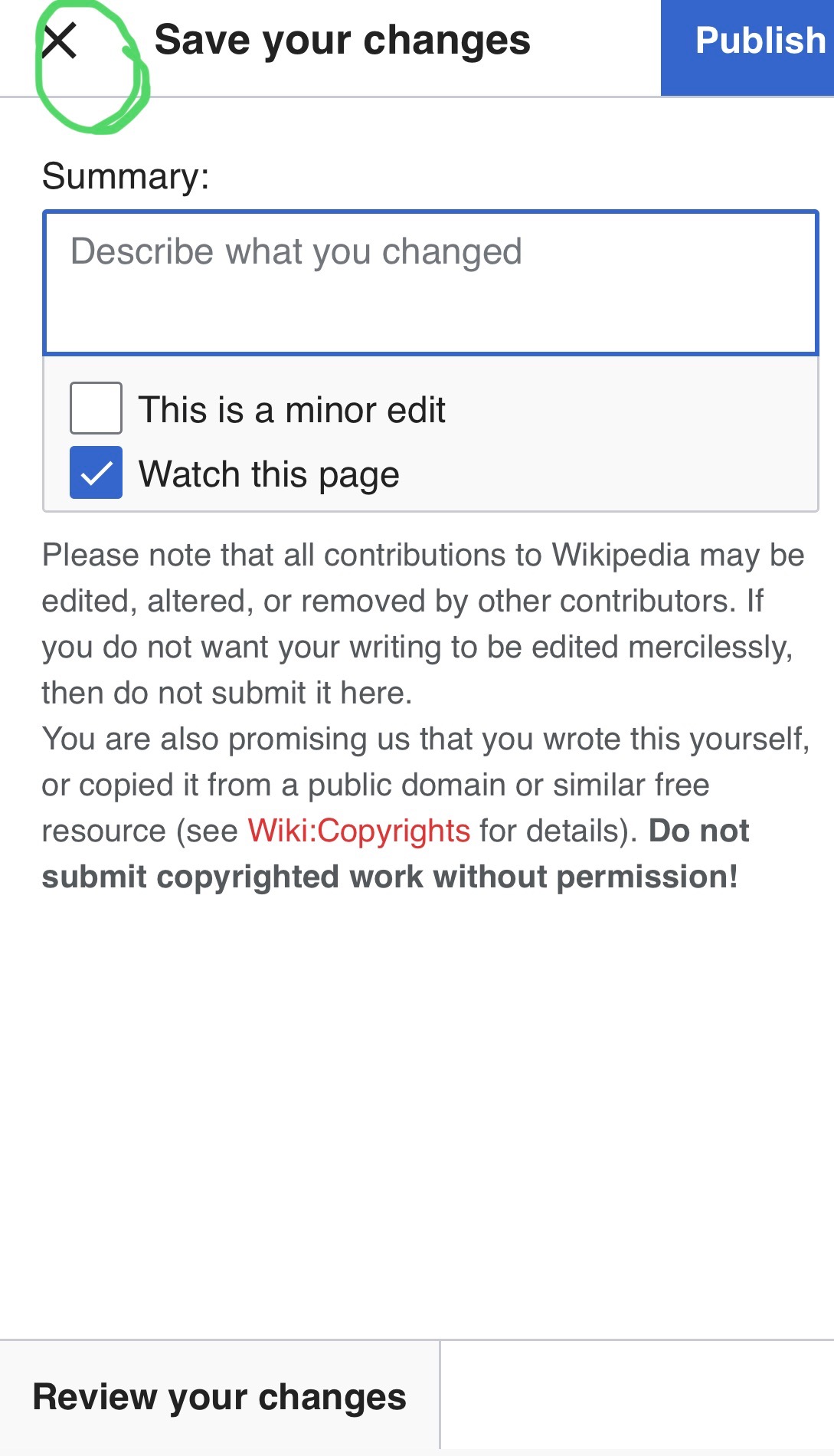
Note: before we implement any changes to how/where the "legalese" is presented, we should get legal's approval. See: T229462

Screen Shot 2019-07-31 at 10.41.14 AM.png (1×806 px, 124 KB)

Event Timeline

I mocked up a few different options for discussion purposes (on Invision, copying here for documentation)

Screen Shot 2019-08-01 at 8.11.48 AM.png (1×1 px, 210 KB)

Question: @iamjessklein, under what circumstances does a contributor landing on the Save dialog see the keyboard by default?

...I ask this considering each time I've landed on the mobile VE "Save dialog" the keyboard has not been visible to me by default. See videos: logged in and logged out.

As it relates to the "Review your changes" button placement, of the approaches shown in T229428#5384174, "A)" or "C)" makes sense to me considering:

  • i. They make it more obvious to contributors they can review their changes
  • ii. The behavior @matmarex pointed out in T212159#5215550 about how buttons at the bottom of pages on iOS + Safari require two taps to be interacted with [1].
  • iii. We do not yet know whether showing the visual diff differ by default is feasible. [2]

  1. "When the page is in "fullscreen mode" (the menu bar is minimized; see screenshots below), tapping near the bottom of the screen will display the menu bar at the top and some tools at the bottom. But the way it works is that there are no events fired for touches that begin in that [bottom of the screen] area. So we can't prevent the scroll if the user starts by touching that part of the screen." Full context: T212159#5215550
  1. Feasibility of showing visual diff differ by default. Task: T229467

During this morning's planning meeting, we confirmed that we will not be making any changes to the save dialog in v1 because we first need to hear back from legal about what constraints we need to comply with. That work is happening in this task: T229462

In the meantime, we would like to replace the "X" icon in the Save dialog [1] with a "<" icon to more clearly communicate to contributors they are taking a step "back" in the edit flow, not exiting out of it completely. This work is happening in this task: T230058

cc @DLynch + @iamjessklein


  1. Save dialog

Image-1 2.jpeg (1×1 px, 229 KB)

We should also note that in iOS we don't auto-focus after opening the dialog because it is impossible. We do currently auto-focus on Android though.

Does this mockup represent the issues that we need to address with legal:

legal@2x.png (549×1 px, 190 KB)

This mockup is great, @iamjessklein.

Copying over comments I'd posted in a different ticket: T229462#5453281

Mock up of edit flow for legal courtesy of @iamjessklein: https://wikimedia.invisionapp.com/freehand/document/fnYrvswNb

This flow looks great, Jess. I made a couple of suggestions about the wording of the questions (borrowed from this task's description) in the invision (also pasted below).

Comments

Log in prompt

  1. Can we remove the word "obtrusive" from the yellow box? Thinking: IMO, this dialog provides valuable information and actions. Whether these "actions" and "information" are a) presented in the best way and/or b) at the right point in the edit flow are TBD, but I don't think we can assume it doesn't have any value.
  2. Can we rephrase the question to read: "What – if any – policies exist about a) where this screen is shown in the edit flow and b) how the information within this screen is presented (e.g. could the 'Warning...' text be moved to the bottom of the screen?)?"

Save dialog

  1. Can we rephrase the question to read: "What are the policies around where and how the legal disclaimer is shown within this screen?"

cc @JTannerWMF

Updated the flow here and on Freehand.

legal@2x.png (1×2 px, 591 KB)

cc/ @ppelberg

Updated the flow here and on Freehand.

Looks great 👍

JTannerWMF moved this task from To Triage to Freezer on the VisualEditor board.

We no longer have time to work on the edit summary screen so we will depriortize this.

Removing task assignee due to inactivity, as this open task has been assigned for more than two years. See the email sent to the task assignee on February 06th 2022 (and T295729).

Please assign this task to yourself again if you still realistically [plan to] work on this task - it would be welcome.

If this task has been resolved in the meantime, or should not be worked on ("declined"), please update its task status via "Add Action… 🡒 Change Status".

Also see https://www.mediawiki.org/wiki/Bug_management/Assignee_cleanup for tips how to best manage your individual work in Phabricator.