- move EventEmittingButton to shared repo
- use primaryprogressive modification of the button
Notes
| • Pablo-WMDE | |
| Aug 12 2019, 11:02 AM |
| F30229847: Bildschirmfoto von 2019-09-05 16-15-36.png | |
| Sep 5 2019, 2:18 PM |
Notes
| Status | Subtype | Assigned | Task | ||
|---|---|---|---|---|---|
| Resolved | Lydia_Pintscher | T224833 first client edit for simple typo | |||
| Resolved | Lydia_Pintscher | T226999 Save Wikidata edit when submitting client edit modal | |||
| Resolved | • Pablo-WMDE | T230326 Reuse EventEmittingButton from termbox |
That EventEmittingButton component uses a link (<a>) with href="#" and styled as a button. This is an anti-pattern and poses accessibility issues. If we need a button, then let's use a semantically correct element and use links if we actually want to link to something.
This will also make our component simpler.
After consulting with @Jakob_WMDE the motivation to use an <a> tag in termbox was that there is apparently one situation where there SSR needs to render an actual link, which should then act as a js-button in the frontend.
We don't have these circumstances here, so we can use a button straight away.
Change 530865 had a related patch set uploaded (by Michael Große; owner: Michael Große):
[mediawiki/extensions/Wikibase@master] bridge: Create reusable button component
Change 531963 had a related patch set uploaded (by Matthias Geisler; owner: Matthias Geisler):
[mediawiki/extensions/Wikibase@master] bridge: Modify EventEmittingButton
Change 531727 had a related patch set uploaded (by Matthias Geisler; owner: Matthias Geisler):
[mediawiki/extensions/Wikibase@master] bridge: copy EventEmittingButton
Change 532292 had a related patch set uploaded (by Matthias Geisler; owner: Matthias Geisler):
[mediawiki/extensions/Wikibase@master] bridge: Aligments with OOUI
Change 532293 had a related patch set uploaded (by Matthias Geisler; owner: Matthias Geisler):
[mediawiki/extensions/Wikibase@master] bridge: button tag switch
Apologies for popping in unsolicited, but it looks like this task and its patches took a strange turn.
The original idea was to start sharing the component with Termbox (says so in the title/description), which I think is great. Then, based on the a tag vs button tag difference the idea of reuse was quickly discarded. Arguably slightly different requirements, fine.
Now there are patches up copying the Termbox component into the Bridge code base, changing it so that it fulfills requirements from both Termbox and Bridge (afaict), then further improving it. What's the point?
There are two options that make sense to me:
a) Don't use the Termbox component, have a Bridge button component that strictly does what's needed for Bridge
or
b) Reuse and share the component between the code bases as planned when this task was written.
What's there at the moment looks like a lose-lose situation: unused code from Termbox in Bridge, double the maintenance, Termbox not benefiting from the improvements.
As written above, I think trying to generalize the Termbox EventEmittingButton to be used everywhere in Bridge is an approach that is flawed in its premises. This creates an overly complex component that does multiple jobs (Link and pure Button) and tries to conform to multiple conflicting styles (Termbox and Bridge/OOUI).
IMHO, the better approach is to incrementally implement a reusable button in bridge that follows the OOUI design correctly and for the use-cases where we need it. That currently means the Publish button, later we will add the Cancel button and likely more. This button component could be extracted into a component library, when such a thing exists.
Termbox can then reuse this button if they have a use for a button with these OOUI styles. (That might be the case for the publish button, based on the storybook).
Meta note: To be honest I do not like, how this discussion is now starting – putting somewhere a -2 and start a discussion without a appropriate pointing on the concrete thing where you see the problems.
| As written above, I think trying to generalize the Termbox EventEmittingButton to be used everywhere in Bridge is an approach that is flawed in its premises. This creates an overly complex component that does multiple jobs (Link and pure Button) and tries to conform to multiple conflicting styles (Termbox and Bridge/OOUI). |
Why you think it's flawed in its premises? Where do you see the growing complexity? (It would be very helpful where you think it's to much in the code, so we might fix that [together]. I do not think it's fair just to say it and not point on it) Or do try to say in a sneaky way Termbox did a bad job?
To the concrete points:
| IMHO, the better approach is to incrementally implement a reusable button in bridge that follows the OOUI design correctly and for the use-cases where we need it. That currently means the Publish button, later we will add the Cancel button and likely more. This button component could be extracted into a component library, when such a thing exists. |
I do not get this, because those buttons existing already in the EventEmittingButton of Termbox (and more things). Why to get rid of them to reimplement them and make then the library unusable for Termbox?
| Termbox can then reuse this button if they have a use for a button with these OOUI styles. (That might be the case for the publish button, based on the storybook). |
I guess, I pointed out why this not working with the current suggestion.
My suggestion for this: we can go with corrected EventEmttingButton of https://gerrit.wikimedia.org/r/#/c/mediawiki/extensions/Wikibase/+/532292/ or we going all the way up to https://gerrit.wikimedia.org/r/#/c/mediawiki/extensions/Wikibase/+/531963/ . I like to pitch the 2nd one of course (since it gives us much more button types) but I can live actually with both.
Maybe my post above was a bit too concise, so here is a longer version of my reasoning. Also, some update.
I think we should not try to extract a single component that replaces all usages of the EventEmittingButton component in Termbox.
From my point of view there were two main reasons for that:
1. Termbox and WikidataBridge/OOUI use significantly different styles for the conceptually same elements (which is fine!)
Example 1:
The Termbox cancel button has different hover behavior and click/active styles than a frameless, icon only ButtonWidget
Example 2:
The Termbox framelessProgressive button has different hover behavior and click/active styles than a frameless, icon only ButtonWidget
Example 3:
The Termbox publish button uses a different icon than from what is available in OOUI
Termbox and OOUI seem to share styles for the primaryProgressive button.
2. Termbox uses links as buttons in order to be able to create a Link in SSR which is then overloaded by client-side js.
The understanding I got from conversation was that there is a single instance where that functionality was used.
But apparently these buttons are also used as true links (i.e. regardless of SSR) in the AnonEditWarning
Conclusion
Based especially on reason 1, I think we should not try to replace all buttons in Termbox with a shared one, because that would require us to integrate two styles for the same conceptual button into one component.
Also, in order to keep the component simple we should not switch between two so conceptually different HTML tags as <button> and <a> but use one consistently.
Since we will apparently not get around using these "buttons" as links, it makes most sense to use <a> tags for this component and to look to OOUI for how to make "buttons" with them that are still accessible.
Further we should focus on what is needed for the current story, that is the publish button, i.e. primary progressive button.
That is why I suggest adjusting the I55c95b7d3e6a5c594139c228a083c4c69fa2c0ed patch as described above and to proceed incrementally as we pass through the stories.
Example 1:
The Termbox cancel button has different hover behavior and click/active styles than a frameless, icon only ButtonWidgetTermbox cancel button: https://tools-static.wmflabs.org/wikibase-termbox-storybook/?path=/story/eventemittingbutton--cancel OOUI frameless, icon-only ButtonWidget: https://doc.wikimedia.org/oojs-ui/master/demos/?page=widgets&theme=wikimediaui&direction=ltr&platform=desktop#ButtonWidget-frameless-icon-only
True (this count for Example2 as well) and therefore is a patch (https://gerrit.wikimedia.org/r/#/c/mediawiki/extensions/Wikibase/+/532292/), which I mentioned above, because the original EventEmittingButton is wrong here in general. He should be stick to the OOUI schema there.
Example 3:
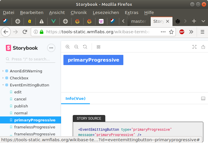
The Termbox publish button uses a different icon than from what is available in OOUITermbox publish button: https://tools-static.wmflabs.org/wikibase-termbox-storybook/?path=/story/eventemittingbutton--publish
OOUI Icons: https://doc.wikimedia.org/oojs-ui/master/demos/?page=icons&theme=wikimediaui&direction=ltr&platform=desktop
Publish is actually the special case, since it was just invented for Termbox. I ask already @Charlie_WMDE about that. But I do not see this in our department, what to do with it. I think the decision is here is done by UX.
- Termbox uses links as buttons in order to be able to create a Link in SSR which is then overloaded by client-side js.
The understanding I got from conversation was that there is a single instance where that functionality was used.
But apparently these buttons are also used as true links (i.e. regardless of SSR) in the AnonEditWarning
Indeed, it is a link and according to OOUI it should be. And as I mentioned earlier, I have no problem if it stays as <a>
Conclusion
Based especially on reason 1, I think we should not try to replace all buttons in Termbox with a shared one, because that would require us to integrate two styles for the same conceptual button into one component.
Also, in order to keep the component simple we should not switch between two so conceptually different HTML tags as <button> and <a> but use one consistently.
Since we will apparently not get around using these "buttons" as links, it makes most sense to use <a> tags for this component and to look to OOUI for how to make "buttons" with them that are still accessible.Further we should focus on what is needed for the current story, that is the publish button, i.e. primary progressive button.
I do not see a good argument to split this component on a tag level from Termbox or OOUI (aka button vs a), even if we can have a context aware variant of it( aka button and a). If this context awareness is not wished I would like more to stay close then to OOUI and Termbox (where, if I see it correctly, we agree?). This whole was more playing your direction of have a 'better' semantic button.
I do not get the point to reimplement stylessheets, which are already there. Especially not when the new ones have a different behavior then those of OOUI (please see code review of https://gerrit.wikimedia.org/r/#/c/mediawiki/extensions/Wikibase/+/530865/ for that). Another thing we have now to take into account is also, that actually we can have all basic button types, which may aids UX. That does mean in my eyes, a vote of UX( aka @Charlie_WMDE) here is highly needed.
I agree that should focus to get it done.
I still have my problems https://gerrit.wikimedia.org/r/#/c/mediawiki/extensions/Wikibase/+/530865/ , which I mentioned on Monday in that mail to you as well as yesterday in the specific code review. To repeat the biggest tow concerns here again:
Also: I still not exactly understand your problems to permute over the styles (https://gerrit.wikimedia.org/r/#/c/mediawiki/extensions/Wikibase/+/531963/), in a very similar way like OOUI. Intentionally I was also ment to play in your wish to align more with OOUI. The side effect of is this, that to implement a fully new button takes very short amount of time. (for example when @Charlie_WMDE ask me for the trash button it tooks me maybe 5 minutes, to have all done)
hello everyone, after getting some help from @Matthias_Geisler_WMDE in understanding this i must say, i think this is mainly a tech decision as well as product @Lydia_Pintscher would you take a look at this?
I think the implication for UX/product would be that the permutation-option allows for quicker button creation in the future (which is good since we'll definitely need more buttons and different kinds of buttons) and from my perspective that also means, i can look at the finished product quicker. The other thing that comes to mind is that we don't have to maintain the "same" buttons in two places which makes things easier as well, and I don't need to specify which of the "same" type of button i mean.
I don't claim to understand all of the implications of doing it one way or the other, so there is no judgement on that from my side. This is simply my preference, judging from what this would mean for my work.
But overall, as long as the look, feel and functionality in the end is as specified by me, I don't mind too much where the buttons come from and what went into developing them. I want things we do to be reusable and sustainable, but ultimately the details on the implementation are of a technical nature and as long as the result is the same this should be a engineering/product decision imo.
Hope this helps somewhat.
I do not understand what is meant by this paragraph or to what it refers. Could you elaborate?
Side note: OOUI has two general classes for buttons. In both, a tag name is configurable, but [ButtonWidget](https://doc.wikimedia.org/oojs-ui/master/js/#!/api/OO.ui.ButtonWidget) is for general, client-handled buttons (<span> by default), whereas [ButtonInputWidget](https://doc.wikimedia.org/oojs-ui/master/js/#!/api/OO.ui.ButtonInputWidget) is for forms (<button> by default).
To be honest, I’ve lost track of the different types of buttons we’re discussing here, so I can’t judge if all their needs could/should be served by one implementation. Which ones are we talking about?
My understanding was that [[https://doc.wikimedia.org/oojs-ui/master/demos/?page=widgets&theme=wikimediaui&direction=ltr&platform=desktop#ButtonWidget-normal | ButtonWidget ]] uses an <a tabindex="0"> as the clickable element, wrapped in a <span> for styling purposes. But I think it is quite possible that I missed something or misunderstood some functionality. How would I change the tag name?
whereas [ButtonInputWidget](https://doc.wikimedia.org/oojs-ui/master/js/#!/api/OO.ui.ButtonInputWidget) is for forms (<button> by default).
To be honest, I’ve lost track of the different types of buttons we’re discussing here, so I can’t judge if all their needs could/should be served by one implementation. Which ones are we talking about?
Right now we are talking buttons based on a <a>, i.e. something similar to ButtonWidget. While I still maintain that it would be best to have button based on <button> as the general default, we are going to need one based on <a> to implement the buttons in Anon edit warning and I'm too exhausted to have this exact discussion again when the time for implementing that component comes. That is why I'm fine with having only one component for now that is based on a <a>.
In the longer term future we are going to need both, as a Button based on a clickable <a> or <span> cannot submit a form. But neither Termbox nor bridge will submit forms without js, so it doesn't matter for now.
But I think the main issue of the discussion is whether this button we are implementing here should be conceptually based OOUI's ButtonWidget or Termbox' EventEmitingButton. I outlined above my reasoning as to why I think it should be based on ButtonWidget. I just renamed that button in my patch to make this more clear, though I would want to wait with investing more time into implementing the review comments until we decided whether we actually want to go with this approach.
The tagName config property (or static property) controls the tag name of the surrounding <span>; you can also pass in a custom $button in the config to override the default <a>. (The tagName is processed by the Element base class, the $button by the ButtonElement mixin.)
I'll try. I was trying to write down the impact this decision might have, purely from a UX perspective (i.e. without considering any other aspects). What I am saying here is that, being able to reuse buttons seems to me to have more advantages than the other option (again, purely from my/UX perspective) or at least I do not see the downsides. If there are any for UX, please do let me know. Hope this helps.
Had a brief chat with @Lydia_Pintscher @Charlie_WMDE - the following may (or may not) be considered obvious but I'm making the expressed mutual understanding explicit to eliminate other interpretations. Given the task of this ticket and to reduce complexity, focus is limited to the "primaryprogressive" button as an example.
The consequence of this would be: discrepancies between the shared "primaryprogressive" button and OOUI specification be detected (now and in the future) and fixed, these changes would then apply to both termbox and bridge alike. From the dev point of view this is perceived as something desirable, from the product and UX side it still seems open for debate apparently.
@Charlie_WMDE wants to clarify that with @Hanna_Petruschat_WMDE. The concrete question: were any of the discrepancies between the termbox "primaryprogressive" button and its OOUI equivalent intentional or are they unintentional and merely a result of an imperfect copy job by dev?
The outcome of this determines if this component can really be reused and shared or not.
Specimen
@Pablo-WMDE Thank you for the overview. I have still not understood for the specific case you mentioned, is there a discrepancy between the OOUI primary progressive button and the one that was implemented for termbox?
@Charlie_WMDE at this particular one there is very tiny difference in the active-focus behavior.
Thanks for following up on this @Charlie_WMDE
is there a discrepancy between the OOUI primary progressive button and the one that was implemented for termbox?
I would not know but I heard rumors there are. The good thing is it does not really matter and for the sake of argument let's assume that yes (effectively anticipating such a situation in the future), because it helps illustrate the gravity of the decision.
What we really want to find out is if the premise described in bullets #1 and #3 are factually correct and if consequently it is at developers' discretion to declare this one and the same component.
Despite the inconveniencing nature of such demand it would really be of great value for us to reach a definite verdict on this for it determines which technical approaches to take are valid ones.
@Pablo-WMDE From my perspective bullet 1 is definitely correct. I can not speak for bullet 3. That is probably in the heads of the termbox devs and @Hanna_Petruschat_WMDE Depending on the correctness of bullet 3, we would have an answer to this question
if consequently it is at developers' discretion to declare this one and the same component.
Despite the inconveniencing nature of such demand it would really be of great value for us to reach a definite verdict on this for it determines which technical approaches to take are valid ones.
I agree. anything else from my side to help move this further?
Talked with @Hanna_Petruschat_WMDE ragarding "bullet 3", i.e. the reasoning back when during termbox. She confirmed that the "primaryprogressive" button implemented for termbox is indeed supposed to follow the OOUI specification and all discrepancies can be considered unintended (and consequently bugs to some extend).
Hanna however was kind enough to point a key difference between the "primaryprogressive" button as used in termbox and the one we can observe in the bridge spec and the related OOUI demo for "process dialog": the "primaryprogressive" itself exhibits rounded corners (border-radius: 2px) but these are removed from the element when used as a part of a header ("processDialog actionWidget" in OOUI terminology) as intended in bridge.
We now have clarity on the requirements' side but face a bit of a technological challenge. OOUI implements this by implementing a selector specific to this case (button inside dialog). For our vue components we, so far, followed the BEM approach and the component's appearance are organized in so-called modifications ("primaryprogressive" is an example of this) and we usually refrain from influencing these modifications' styles from the outside but rather create a new component modification. Parents typically call for one concrete modification of a component. So how do we tackle this?
I finally got the time to pay attention to this task. I'm apparently too late to the party, for which I deeply apologize, esp. to @Pablo-WMDE and @Matthias_Geisler_WMDE who did ping me before in person to have a look, which I failed to do for reasons
tl;dr Our goal is to not not create a delay for bridge hike on this technical matter as well as maximize the outcome of the discussions started here about sharing components in the future across hikes. So let's copy-paste and modify the component for the hike for now, and in-parallel put this/new task in Trailblazing-Exploration board to research and experiment with sharing components across projects.
After reading all the comments, I will follow up on this from where @Pablo-WMDE has left it, with much appreciated effort to collect feedback and clarify the ambiguous with @Charlie_WMDE and @Hanna_Petruschat_WMDE. The conclusions, as far as the appear to the reader, are:
From engineering side, options I can see are one of two:
Option 2 seems to have much higher initial cost and decision making efforts for the following reasons:
both risks mentioned in 2 are quite small .. though their impact on lost effort due to high initial cost of setting up things for it can be big.
For bridge hike, option 1 is recommended for now as it:
This is relevant for the story overall, though unrelated to the different considerations underlying the two approaches discussed above. It seems to me that this modification, while affecting the button, is conceptually more part of the header component. While we could add a configuration option for the styling of each corner to the button, I'm not sure that adding the overhead of this interface is worth it, especially since this would amount to the parent writing direct CSS into the child. In this case, I find it to be more simple and honest to leave this just to the parent component's CSS and to utilize the cascade there. I found some discussion about this issue, but nothing authoritative. There seems to also be the approach of adding an extra class, but I'm not sure that this approach works with our setup.
Change 536016 had a related patch set uploaded (by Pablo Grass (WMDE); owner: Matthias Geisler):
[mediawiki/extensions/Wikibase@master] bridge: copy EventEmittingButton
Change 536137 had a related patch set uploaded (by Pablo Grass (WMDE); owner: Pablo Grass (WMDE)):
[mediawiki/extensions/Wikibase@master] bridge: mend EventEmittingButton per OOUI
Change 536138 had a related patch set uploaded (by Pablo Grass (WMDE); owner: Pablo Grass (WMDE)):
[mediawiki/extensions/Wikibase@master] bridge: add squary option to EventEmittingButton
Change 536139 had a related patch set uploaded (by Pablo Grass (WMDE); owner: Pablo Grass (WMDE)):
[mediawiki/extensions/Wikibase@master] bridge: vertically align EventEmittingButton text
Change 536225 had a related patch set uploaded (by Michael Große; owner: Michael Große):
[mediawiki/extensions/Wikibase@master] bridge: Make EventEmittingButton accessible if used as button
Change 536016 merged by jenkins-bot:
[mediawiki/extensions/Wikibase@master] bridge: copy EventEmittingButton
Change 536137 merged by jenkins-bot:
[mediawiki/extensions/Wikibase@master] bridge: mend EventEmittingButton per OOUI
Change 536138 merged by jenkins-bot:
[mediawiki/extensions/Wikibase@master] bridge: add squary option to EventEmittingButton
Change 536139 merged by jenkins-bot:
[mediawiki/extensions/Wikibase@master] bridge: vertically align EventEmittingButton text
@Charlie_WMDE
Two UX related things that came up during working on this:
thanks for bringing this up @Michael
- OOUI buttons look different when they are clicked with the mouse or activated by the enter or space key. We are not entirely sure whether this is actually intended by the people of OOUI, but we are currently implementing that nonetheless.
@Matthias_Geisler_WMDE already talked to me about this quickly. As I understood it, you are currently not sure whether this is a bug or intended, right? Maybe @Volker_E
can shed some light on this. Since we don't expect this behavior to appear in our feature anyway because there can be no previous state of clicking the primaryProgressive button and then tabbing back to it, I suggested to neglect that state for now until we can verify that it is indeed an intended behavior. (I hope i understood correctly what this is about)
- Not relevant right now, but it might be worth to keep the tab order in mind. That is the order in which the elements are selected by pressing the tab key on the keyboard. The default order is determined by how the elements appear, but that order doesn't necessarily need to be the order deem best.
That is a good point and on my list of things to figure out. thank you
@Charlie_WMDE Another topic that came up is the question of which effect pressing the space bar should have, if the button is an overloaded or a pure link.
This is not needed for the current use-case, but it is likely to come up in the future. (An example of the button being a pure link would be the primary progressive "Login-Button" in the Termbox anon edit warning.)
Normally, pressing the space bar on a link doesn't trigger the link but only scrolls the page down half a screen. Normally, pressing the space bar on a button triggers the button.
The standard OOUI ButtonWidget, which we are imitating here, can act as a link as well if it is provided with an URL. However, it is unclear how it behaves in this case if space bar is pressed as, unfortunately, there doesn't seem to be an example on https://doc.wikimedia.org/oojs-ui/master/demos/.
Change 536225 merged by jenkins-bot:
[mediawiki/extensions/Wikibase@master] bridge: Make EventEmittingButton accessible if used as button
Change 530865 abandoned by Michael Große:
bridge: Create reusable button component
Reason:
a different chain has been merged
Change 532293 abandoned by Tonina Zhelyazkova:
bridge: button tag switch
Reason:
does not apply anymore
Change 532292 abandoned by Tonina Zhelyazkova:
bridge: Aligments with OOUI
Reason:
Not applicable anymore
Change 531727 abandoned by Tonina Zhelyazkova:
bridge: copy EventEmittingButton
Reason:
Not applicable anymore
Change 531963 abandoned by Tonina Zhelyazkova:
bridge: Refactor EventEmittingButton
Reason:
Not applicable anymore