Page MenuHomePhabricator

Consider removing toolbar borders
Closed, ResolvedPublic

Assigned To
Authored By
Esanders
Sep 2 2019, 1:16 PM
Referenced Files
F30986374: preview-image.png
Nov 4 2019, 2:14 PM
F30239497: image.png
Sep 6 2019, 8:18 PM
F30237643: Screen Shot 2019-09-06 at 1.32.53 PM.png
Sep 6 2019, 5:34 PM
F30236816: image.png
Sep 6 2019, 12:22 PM
F30236814: image.png
Sep 6 2019, 12:22 PM
F30222572: background - f8f9fa@2x.png
Sep 4 2019, 2:23 PM
F30200346: image.png
Sep 2 2019, 4:42 PM
F30200343: image.png
Sep 2 2019, 4:42 PM

Description

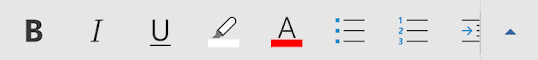
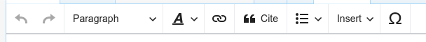
At some point a few years WMUI added vertical borders between toolbar buttons, which on desktop looks okay where the buttons are at least square or wider:

image.png (61×608 px, 5 KB)

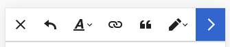
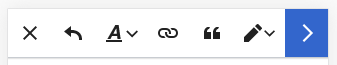
With our new toolbar on mobile we are squeezing in more tools, making them narrow on some devices:

image.png (66×336 px, 3 KB)

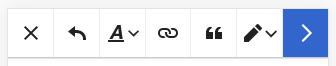
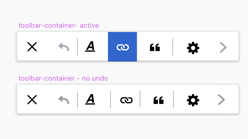
It may look less cramped if we just remove the borders:

image.png (64×334 px, 2 KB)

Doing this highlights the uneven spacing between the icons due to the dropdown icons, although this can be tweaked by giving the dropdowns slightly more space (flex:1.2) like they have on desktop:

image.png (65×337 px, 2 KB)

Comparison at different widths:

320
image.png (66×336 px, 3 KB)
image.png (65×337 px, 2 KB)
360
image.png (66×377 px, 3 KB)
image.png (66×375 px, 3 KB)

(n.b. 320 is the smallest device we support but is far less common than 360 and above)

Event Timeline

Restricted Application added a subscriber: Aklapper. · View Herald Transcript

Comparative analysis:

Google docsMS WordDropbox paper
image.png (80×566 px, 5 KB)
image.png (63×540 px, 5 KB)
image.png (51×536 px, 5 KB)
image.png (60×538 px, 7 KB)
image.png (66×540 px, 2 KB)
image.png (69×539 px, 9 KB)

+1 @Esanders all of the latest iterations that I have been working on in relation to T229030 have no borders! I think this is a simple way to reduce visual clutter.

background - f8f9fa@2x.png (1×720 px, 193 KB)

Change 534466 had a related patch set uploaded (by Esanders; owner: Esanders):
[VisualEditor/VisualEditor@master] Remove toolbar borders from mobile

https://gerrit.wikimedia.org/r/534466

Updated the prototype with more compact dropdown indicators (75%):
320px:

image.png (69×335 px, 2 KB)

360px:
image.png (70×376 px, 3 KB)

What would it look like if we:

  1. remove the chevron's completely from the type dropdown?
  1. replace the VE/Wikitext dropdown icon with a cog?
  1. add light borders with top and bottom padding for smaller sizes to differentiate the buttons?
  1. cleaned up the shadow on the toolbar?

A proposal might look something like this:

Screen Shot 2019-09-06 at 1.32.53 PM.png (452×804 px, 34 KB)

  1. The down indicators are a signifier for a different user activity result (a dropdown opens), it's a better idea to take consistency between mobile, tablet and desktop into account and not introduce special cases for mobile that might lead to confusion when switching devices and/or user expectations.
  2. Same as above. Setting seems insufficient description to the switcher.
  3. Those borders would result in additional programming effort and would also deviate from our consistent border treatment across products, that have been put into place to sufficiently provide support for active, focus (and keyboard focus) appearance.
  4. Can't speak to toolbar shadow as the provided screenshot doesn't show a difference for me.

On a note on the example in T231815#5471168: The smaller indicator could result in an accessibility issue as well, 12px from default size seems like minimum recognizable size, 9px seems problematic from users with visual impairments

This would be my take, without amending icon sizing (reducing possible design pitfalls) and in proximity to dialog title bar designs.

image.png (578×680 px, 45 KB)

The weakest point in this representation possibly remains the edit pencil with its indicator.

JTannerWMF subscribed.

In Triage we determined to move this to Design Review since the patch is done and @ppelberg is okay with this change. Once @iamjessklein puts her final seal of approval on this we can deploy.

  1. I'd agree that the indicators set up a useful expectation of the tool being a menu. I think the reduced sized indicators remove a lot of the clutter.
  2. Either way I don't think this should be part of this ticket. This icon for the switcher is used in a lot of other places, so to change it we should discuss that separately.
  3. I agree with Volker, half borders would be messy to implement and I don't think would resolve the visual clutter issue.
  4. Also not seeing the difference. Perhaps there's some confusion from my screenshots which were taken on desktop in mobile simulator mode, but the toolbar touches the top, left and right edges of the screen, so the shadow only appears beneath it.

Re: Volker's proposal to have a separator after the 'X': I could take it or leave it. On the one hand I like the cleanness of no separators. On the other hand I see the value in separating 'close' (and next) from the other edit tools.

Assigning over to @iamjessklein to express what she thinks the final treatment should be.

Once Jess has weighed in with her opinion on what – if any – changes should be made to the toolbar, this can be QA'd (provided no changes need to be made to the version currently live on the prototype server) and then deployed.

Let's move forward with the proposal that @Volker_E has put forth. It's clean and achieves our goal of reducing complexity.

preview-image.png (187×220 px, 17 KB)

Change 534466 merged by jenkins-bot:
[VisualEditor/VisualEditor@master] Remove toolbar borders from mobile

https://gerrit.wikimedia.org/r/534466

Change 548484 had a related patch set uploaded (by Jforrester; owner: Jforrester):
[mediawiki/extensions/VisualEditor@master] Update VE core submodule to master (8cba52aa6)

https://gerrit.wikimedia.org/r/548484

Change 548484 merged by jenkins-bot:
[mediawiki/extensions/VisualEditor@master] Update VE core submodule to master (8cba52aa6)

https://gerrit.wikimedia.org/r/548484

Ryasmeen subscribed.

Checked the change using iPhone 5s and iPhone 6s. Looks good.