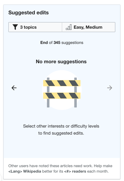
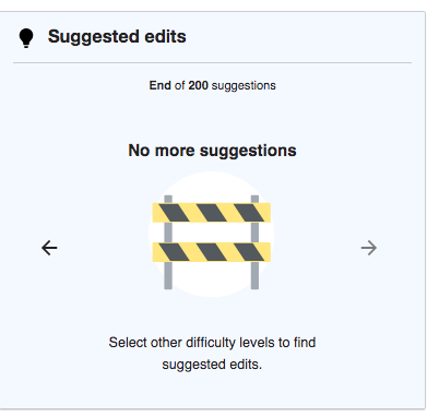
- When the user gets to the last card in the list, they can click the right arrow one more time, and then they see an area that says something like, “Change the filter settings to find more tasks.” along with a graphic. Mockup here.
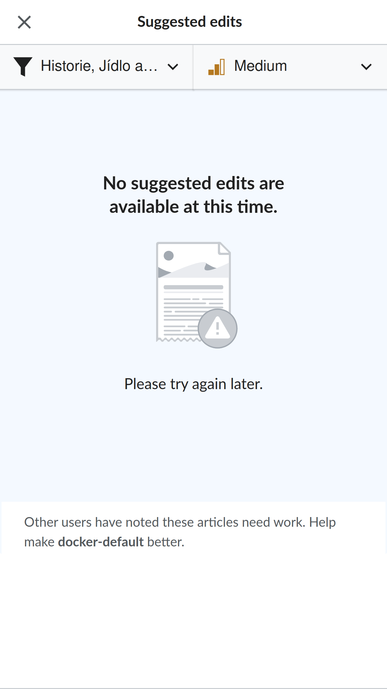
- If there is some kind of error and no edit suggestions can be displayed, the text should say, (heading) "No suggested edits are available at this time." (text) "Please try again later." These are the graphics:
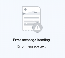
- Here is the asset as PNG@4x and SVG:
Description
Description
Details
Details
Customize query in gerrit
| Status | Subtype | Assigned | Task | ||
|---|---|---|---|---|---|
| Resolved | MMiller_WMF | T227728 [EPIC] Growth: Newcomer tasks 1.0 | |||
| Resolved | kostajh | T232423 Newcomer tasks: suggested edits module | |||
| Invalid | kostajh | T235043 Newcomer tasks: "No more suggestions" card widget |
Event Timeline
Comment Actions
Change 542900 had a related patch set uploaded (by Kosta Harlan; owner: Kosta Harlan):
[mediawiki/extensions/GrowthExperiments@master] Newcomer tasks: "No more suggestions" card widget
Comment Actions
Change 542900 merged by jenkins-bot:
[mediawiki/extensions/GrowthExperiments@master] Newcomer tasks: "No more suggestions" card widget
Comment Actions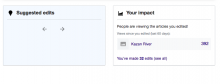
@kostajh - is it still a work in progress? In betalabs I see Suggested edits module that looks somewhat incomplete

Comment Actions
@Etonkovidova it's because we don't have beta labs fully configured yet. The API response is The TaskSuggester has not been configured! See StaticTaskSuggester or $wgGENewcomerTasksRemoteApiUrl.
@RHo @MMiller_WMF do we want to have a generic error card that we can show in this and other error circumstances? Maybe we could reuse the graphic from "No more suggestsions" but have wording indicating that an error occurred, and to try again later.
Comment Actions

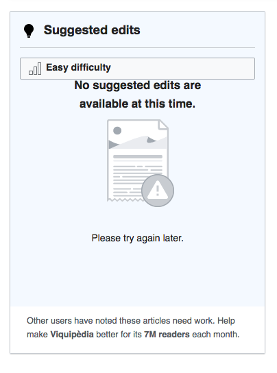
How about we use this instead as the generic error graphic:

Here is the asset as PNG@4x and SVG:

Comment Actions
@kostajh - the mockup link goes to ""No more suggestions" card. So there should be two cards - one for "No more suggestions" and for a general error?
"No more suggestion card" - do not see any problems with the card itself.
| mockup | betalabs implementation |
 |  |
There is some UI jumpiness when switching from the last card to "No more suggestions" -which also affects Impact module (click on the animated gif below):

"General error" card - any ideas how to display it?
Comment Actions
Hey @Etonkovidova, didn’t add the general error card yet but will do that soon and ping you when it’s done.
Comment Actions
Change 546336 had a related patch set uploaded (by Kosta Harlan; owner: Kosta Harlan):
[mediawiki/extensions/GrowthExperiments@master] (wip) Suggested edits: Error card widget
Comment Actions
Change 546336 merged by jenkins-bot:
[mediawiki/extensions/GrowthExperiments@master] Suggested edits: Error card widget
Comment Actions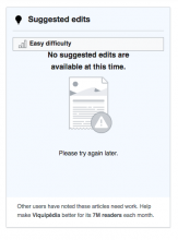
@kostajh The text seems to be placed too close to the filter button (can be seen in cawiki betalabs
Comment Actions
Change 548960 had a related patch set uploaded (by Kosta Harlan; owner: Kosta Harlan):
[mediawiki/extensions/GrowthExperiments@master] Suggested Edits: Adjust spacing for error/end-of-queue/no-results
Comment Actions
Change 548960 merged by jenkins-bot:
[mediawiki/extensions/GrowthExperiments@master] Suggested Edits: Adjust spacing for error/end-of-queue/no-results
Comment Actions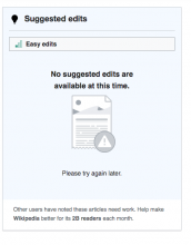
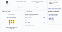
Checked in betalabs - the patch fixed the placement of the label:

Moving for Design Review.
Comment Actions
hi @Catrope - I am unable to get this error to show up but can you please advise whether the position is as per my comment on this task T235043#5662071 ?
Happy to leave in Design-review for now but think the same feedback applies here, and for the "End of suggestions card"...
cc @MMiller_WMF in case you prefer to make all of these fit into a single SE module UI fixes card or have another suggestion on how to break this work up.
Comment Actions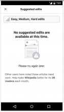
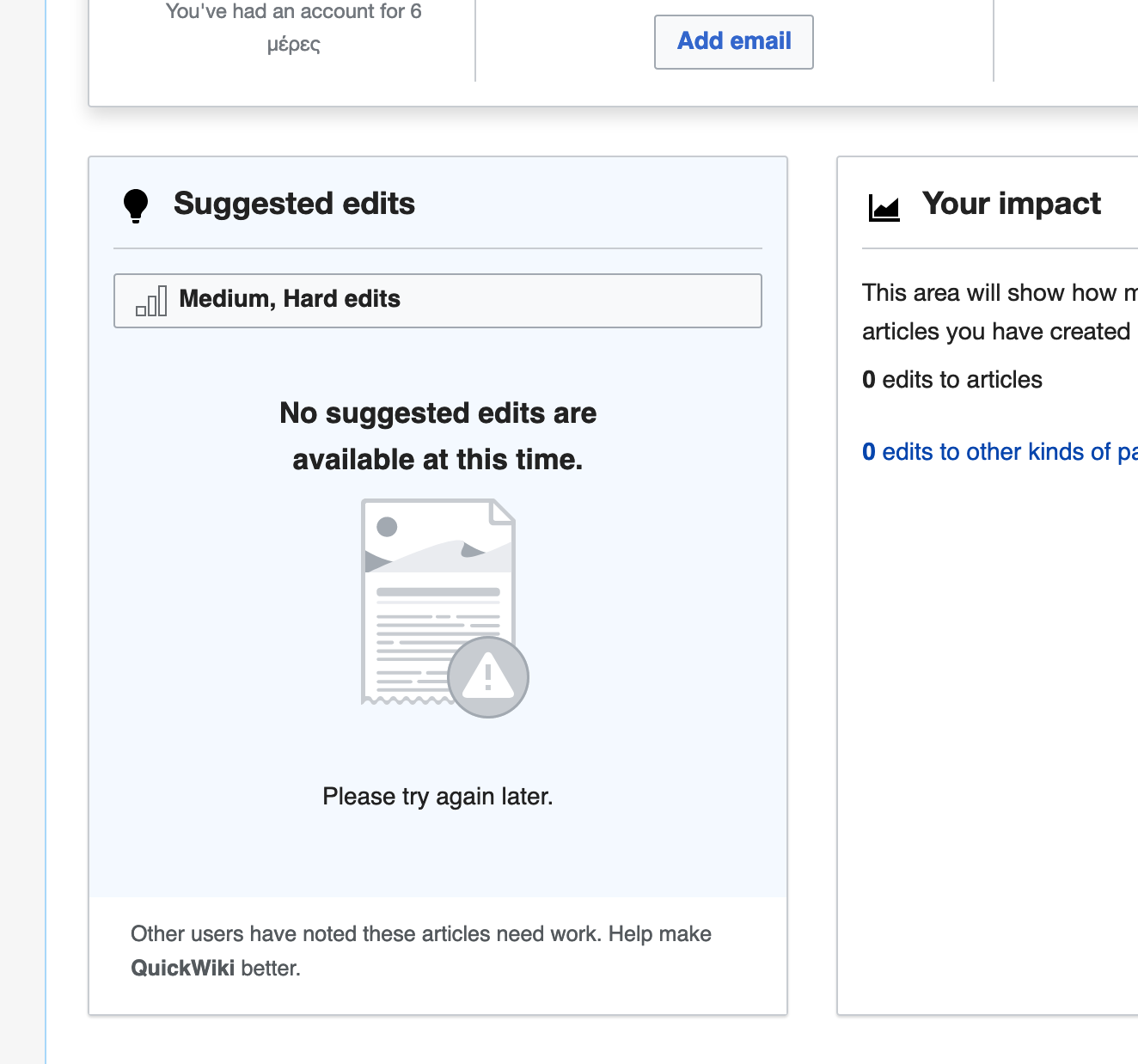
hi @Catrope @kostajh - looks like some regression has occurred?

Some new items:
- Font-size of text should be smaller
- There should be more spacing between image and "No suggested..." subheader text
- There should be a light blue background-color: rgba(234, 243, 255, 0.5) on the main part of the suggested edits module
- "Other users..." text should be in the footer.