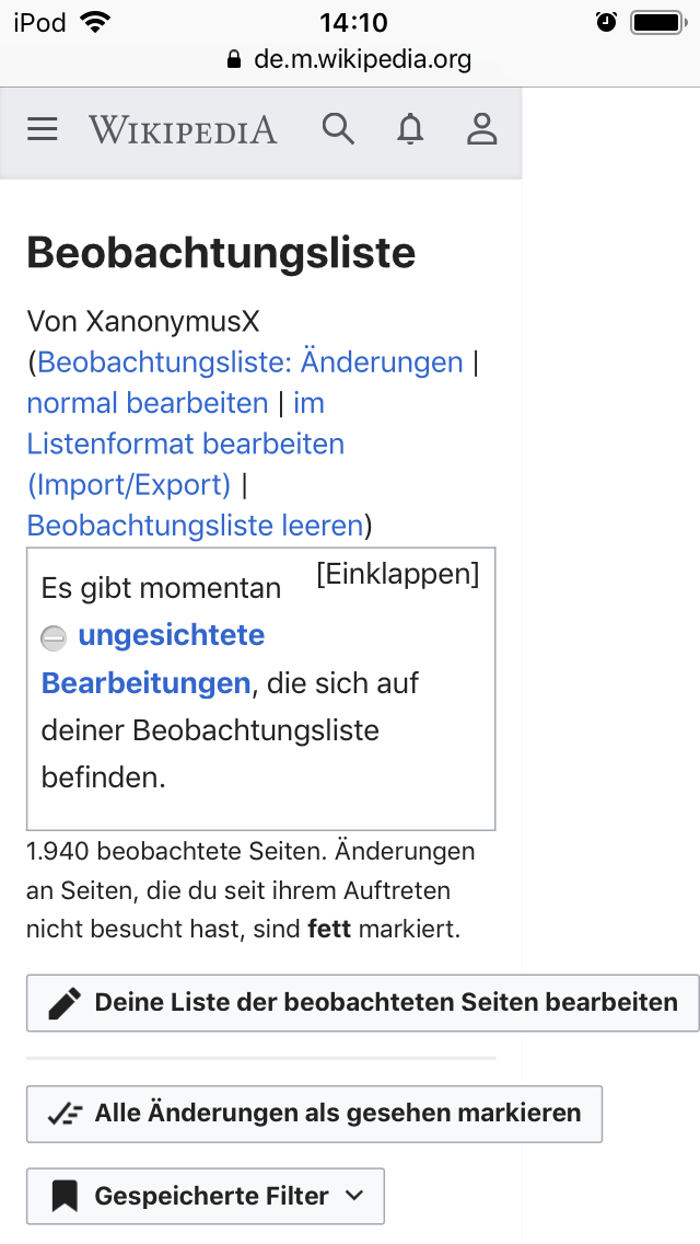
As already mentioned in T235414, it looks like in the new AMC watchlist the (language-dependent) size of the initial buttons can break the screen width.
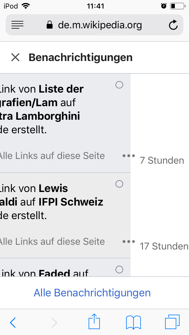
I experience the same thing on the notification page, where the buttons are aligned next to each other, which makes the whole thing way too large.
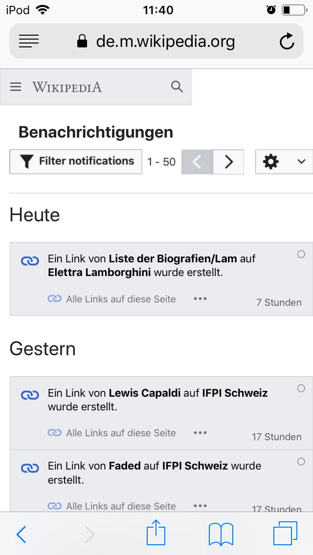
With new notifications there’s another issue, apparently the “time stamp” is always hidden outside the right window border; however, here at least the screen size isn’t affected, so you can scroll sideways to see all.
The last two issues can be experienced in normal mobile view as well, so it might be a general problem; however, it has definitely become more visible now with AMC, since that’s basically my landing page.
I’m using Safari on the last version of iOS, testing it with smallest screen size (iPod touch). Language setting is always German.


