Page MenuHomePhabricator

New Filters for Edit Review: UI displays poorly when the window is narrow
Closed, ResolvedPublic

Description

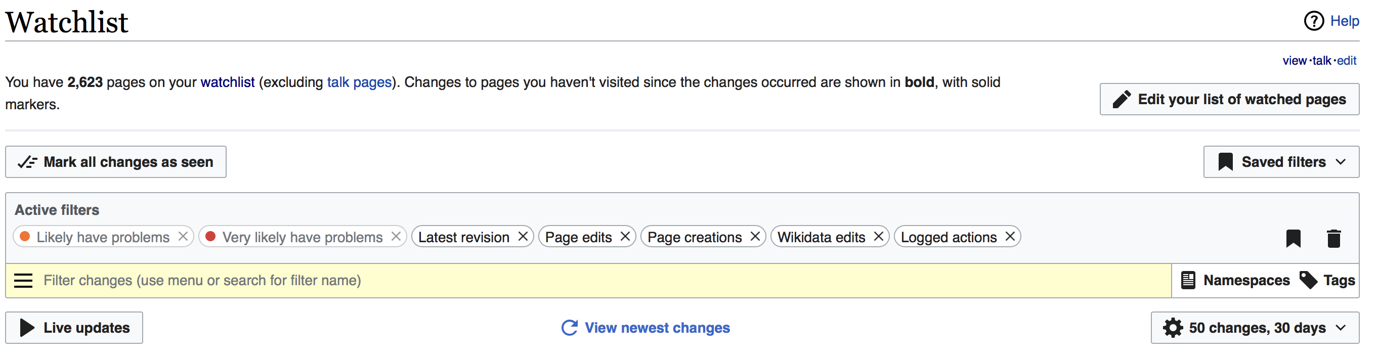
The UI for the new edit filters displays poorly and when the browser window is narrow, i.e. on mobile devices. See screenshot below. Specifically:

  • The "xxx pages on your watchlist" message is very narrow, with lots of whitespace to the right
  • The buttons are too wide and go over the edge of the screen
  • The "Filter changes..." input box is too narrow -- the full message can't even be displayed. Namespaces and Tags should probably be on the next line.
  • The "View newest changes" link, when it appears, pushes the cog wheel button (number of changes/days) almost completely off the screen

Here's a screenshot with Timeless skin (using Chrome on Windows 7):

new filters non-responsive ui.png (791×377 px, 36 KB)

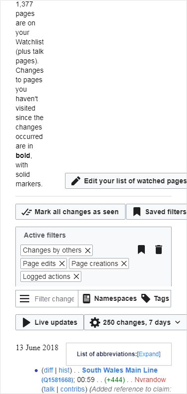
Presumably the responsive version of Monobook, when it is deployed, will have the same issues.

Event Timeline

For now, the only two skins supported are Vector and Monobook without responsive.
One of the current limitations on Recent changes is that they are not available on the mobile version.

@Trizek-WMF Thanks for your reply.

For now, the only two skins supported are Vector and Monobook without responsive.

Can you clarify whether this would be something the team would look at (at some point in the future), or would this be a patch-welcome task?

One of the current limitations on Recent changes is that they are not available on the mobile version.

Yes, such limitations are one reason editors such as myself prefer using the desktop site on mobile devices.

This feels like something that should be fixed with some flexbox magic. ;)

It's actually bothering me, because i use vector in responsive mode, so i might get around to it at some point ;)

@Trizek-WMF Thanks for your reply.

For now, the only two skins supported are Vector and Monobook without responsive.

Can you clarify whether this would be something the team would look at (at some point in the future), or would this be a patch-welcome task?

The latter. IT needed to be fixed by people working on monobook responsive.

One of the current limitations on Recent changes is that they are not available on the mobile version.

Yes, such limitations are one reason editors such as myself prefer using the desktop site on mobile devices.

Get the filters on mobile wasn't scheduled on the initial plan. I hope you will get a fix soon.

It's actually bothering me, because i use vector in responsive mode, so i might get around to it at some point ;)

That would be nice! :)

JTannerWMF subscribed.

Only fix the part about the top message, not all the other less-than perfect aspects.

Some minor bootstrap like changes:

        /* equal cells which wrap, with 1em of space in between */
	.mw-rcfilters-ui-row {
		display:flex;
		flex-wrap: wrap;
		justify-content: space-between;
		margin: 0 -0.5em;
	}
	.mw-rcfilters-ui-cell {
		flex: 1 1;
		padding: 0 0.5em;
	}
        /* overrides */
	.mw-rcfilters-ui-watchlistTopSectionWidget-watchlistDetails {
		min-width: 20em;
	}
	.mw-rcfilters-ui-watchlistTopSectionWidget-editWatchlistButton,
	.mw-rcfilters-ui-filterTagMultiselectWidget-cell-save,
	.mw-rcfilters-ui-filterTagMultiselectWidget-cell-reset,
	.mw-rcfilters-ui-filterTagMultiselectWidget-views-select,
	.mw-rcfilters-ui-watchlistTopSectionWidget-savedLinks,
	.mw-rcfilters-ui-itemMenuOptionWidget-highlightButton,
	.mw-rcfilters-ui-itemMenuOptionWidget-excludeLabel,
	.mw-rcfilters-ui-rcTopSectionWidget-savedLinks{
		align-self: flex-end;
		flex: 0 1;
	}
	.mw-rcfilters-ui-filterTagMultiselectWidget-views-select {
		padding-left: 0;
	}
	.mw-rcfilters-ui-filterTagMultiselectWidget-views-input {
		padding-right: 0;
	}
	.mw-rcfilters-ui-filterTagMultiselectWidget-views-select {
		/* This a bug in the current styling ? */
		width: auto;
	}
	.mw-rcfilters-ui-watchlistTopSectionWidget-editWatchlistButton .oo-ui-buttonWidget {
		margin-left: 0;
	}

Screen Shot 2018-06-27 at 09.57.10.png (708×2 px, 187 KB)

same style, without even using media queries to further optimize
Screen Shot 2018-06-27 at 09.53.05.png (924×800 px, 162 KB)

Vvjjkkii renamed this task from New Filters for Edit Review: UI displays poorly when the window is narrow to a5aaaaaaaa.Jul 1 2018, 1:04 AM
Vvjjkkii triaged this task as High priority.
Vvjjkkii updated the task description. (Show Details)
CommunityTechBot renamed this task from a5aaaaaaaa to New Filters for Edit Review: UI displays poorly when the window is narrow.Jul 2 2018, 1:58 PM
CommunityTechBot raised the priority of this task from High to Needs Triage.
CommunityTechBot updated the task description. (Show Details)

Some minor bootstrap like changes:

        /* equal cells which wrap, with 1em of space in between */
	.mw-rcfilters-ui-row {
		display:flex;
		flex-wrap: wrap;
		justify-content: space-between;
		margin: 0 -0.5em;
	}
	.mw-rcfilters-ui-cell {
		flex: 1 1;
		padding: 0 0.5em;
	}

Sweet! This overrides all the table views with flexbox... does it work well for everything?
If so, we should look into changing the current styles with this!

This is really cool, and it doesn't seem like an insane amount of work to implement directly in the existing styles (might be a little confusing because of the LESS structure, but shouldn't be insane)

@TheDJ I'm going to put this in my TODO list to try and implement when I have time, but I'm a little swamped at the moment. If you want to try submitting a patch, I'll happily review and do more testing.

SBisson changed the subtype of this task from "Task" to "Bug Report".Oct 16 2018, 1:10 PM
SBisson changed the subtype of this task from "Bug Report" to "Task".Oct 16 2018, 6:41 PM
SBisson edited projects, added patch-welcome; removed Collaboration-Team-Triage.
SBisson subscribed.

The Growth team can't prioritize this right now but volunteer patches are welcome.

Change 471367 had a related patch set uploaded (by VolkerE; owner: VolkerE):
[mediawiki/core@master] RCFilters: Use display: flex for better responsiveness on narrow canvas

https://gerrit.wikimedia.org/r/471367

Above patch uses mainly @TheDJ's inputs from T197065#4318238 with addition of a CSS supports query for progressive enhancement of the current, in-production proofed layout.

Change 471367 merged by jenkins-bot:
[mediawiki/core@master] RCFilters: Use display: flex for better responsiveness on narrow canvas

https://gerrit.wikimedia.org/r/471367

First patch was too optimistic, resulted in T208898.

A combination of floats over table-cell, distance (margin/padding) properties only on the right and media queries seem like a better approach to ensure a good, widely working responsive layout.

@Evad37 we've made some changes to remedy this. You can check them out on https://en.m.wikipedia.beta.wmflabs.org/wiki/Special:RecentChanges or https://en.m.wikipedia.beta.wmflabs.org/wiki/Special:RecentChanges?useskin=timeless
Possibly the bug you reported has been fixed. Is there anything still broken you would like to call out?

Jdlrobson claimed this task.

Pretty sure this is fixed but let me know if it is not.