Page MenuHomePhabricator

Enable new RC on mobile
Closed, DuplicatePublic

Description

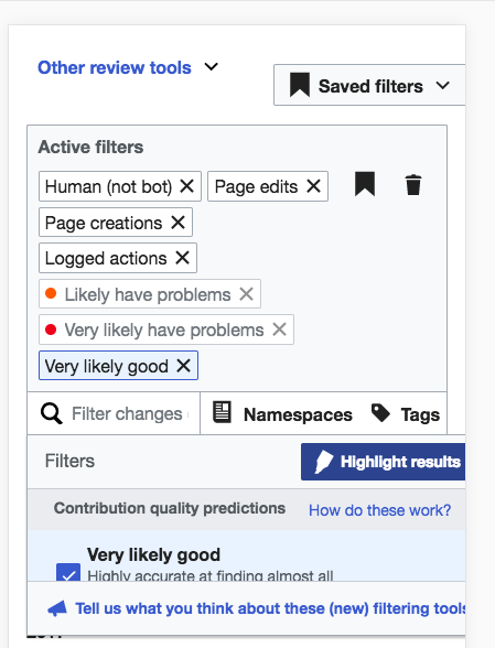
When I visit Minerva desktop I get a reasonably friendly mobile experience.

Screen Shot 2017-10-13 at 12.34.58 PM.png (595×341 px, 51 KB)

Screen Shot 2017-10-13 at 12.35.09 PM.png (464×326 px, 61 KB)

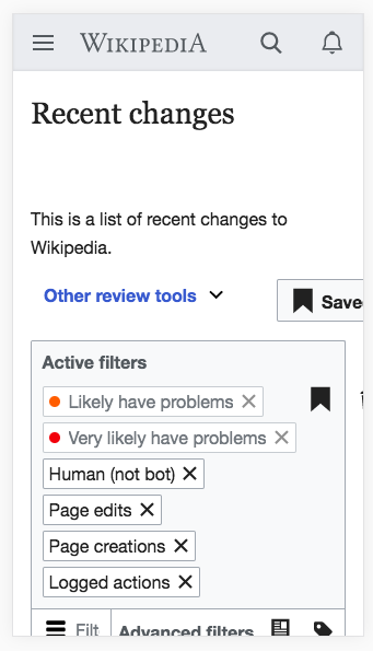
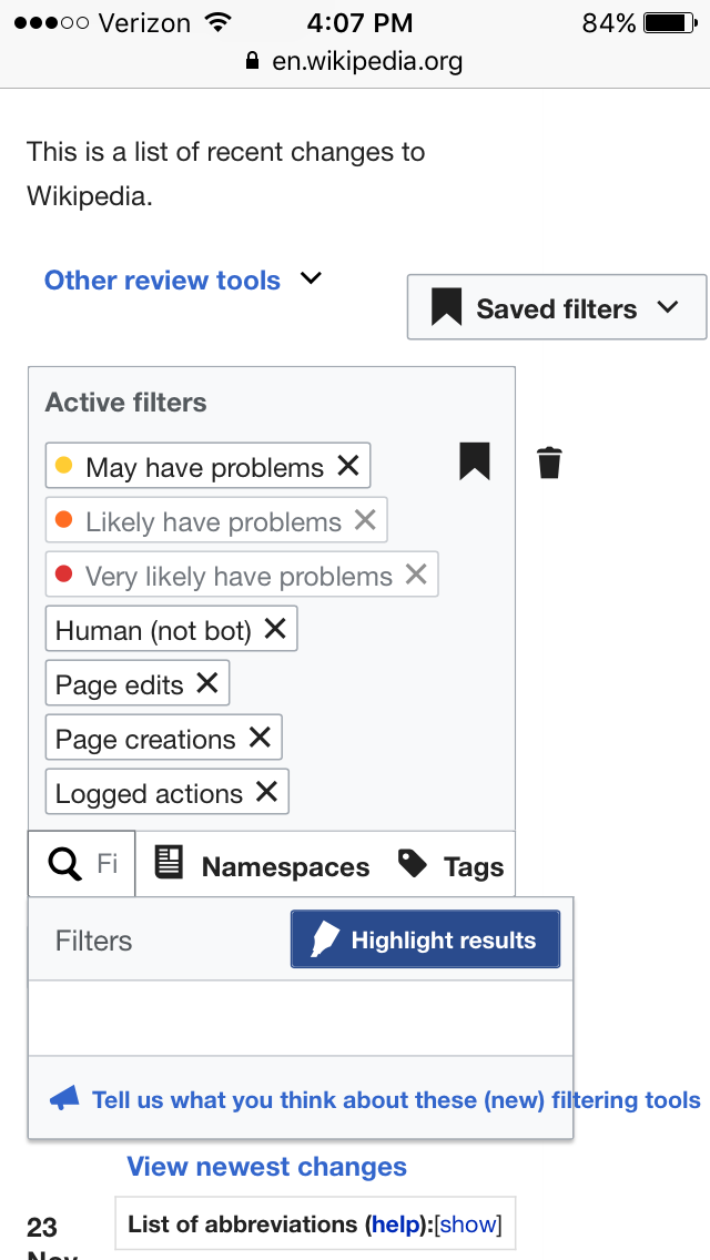
in contrast mobile this is not so good:

Screen Shot 2017-10-13 at 12.36.15 PM.png (556×310 px, 67 KB)

Screen Shot 2017-10-13 at 12.36.20 PM.png (581×314 px, 68 KB)

Screen Shot 2017-10-13 at 12.36.23 PM.png (428×350 px, 64 KB)

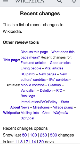
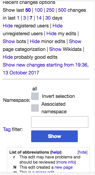
Why is the desktop experience better than the mobile experience?

There doesn't seem much reason for this to be the case. Is this just a case of adding 'targets'=>['desktop','mobile'] to some ResourceLoader definitions?

Event Timeline

Restricted Application added a subscriber: Aklapper. · View Herald Transcript

I should note there are still things that could be improved on mobile (for instance the filters are difficult to use) but it seems a lot of these improvements (for instance collapsing "other review tools" and filtering by date could be made available with very little work.

We didn't enable the new filters on mobile because we didn't think they'd work well on mobile, with the big dropdown for example. If they do work well, that would be great and we could unblock them :)

We blocked the improvements there because we figured it would not work well and we don't have time to do all the fixes given the tiny audience for this page on mobile.

So if you are saying that the New Filters works well on mobile, I'm quite surprised.

jmatazzoni added a subscriber: Etonkovidova.

@Etonkovidova, the Triage notes say we'd like you to please investigate whether, as @Jdlrobson seems to suggest, you believe that the New Filters on mobile are better than the old UX? We turned them off on mobile because we don't have the resources to fix the many problems we anticipated there would be in that environment. But if they are useable and an improvement, perhaps we can reevaluate that decision?

@jmatazzoni Minerva skin on mobile looks usable although additional adjustments need to be made.

When you switch to Minerva skin and then switch to the mobile view in a browser the RC page with filters looks like this (iPhone 6 plus)

Screen Shot 2017-11-22 at 3.46.37 PM.png (588×449 px, 68 KB)

It looks worse on a real device including some functionality not working, e.g. the filter menu list items disappear from the view if you scroll down:

IMG_3823.PNG (1×640 px, 88 KB)

I am not sure how much additional works needs to be done to adjust Minerva skin to our new RC page on mobile, so I keep the ticket in Untriaged column on our Collaboration-Team-Triage board

@Jdlrobson asks why the desktop experience is better than the mobile experience (and, implicitly, why we think it should be better)? The answer, basically, is usage:

So, a tad more than 1% of pvs to the page are on mobile. Interestingly, that figure seems to be rising rapidly. If you compare a month now to a month a year ago, pvs are up something like 80%. This is clearly something to watch. And of course, there is a chicken and egg issue here: is mobile usage low because people don't want to use mobile, or because the tool sucks? But overall, usage is low enough that we felt justified not putting the work in on the mobile version at this time.

The work of just making this non-broken on mobile is probably not small, if we judge by past experience. And if one were to try to make using RC page a good experience on mobile, as opposed to just aiming at non-broken, then the work is doubled or tripled.

The work of just making this non-broken on mobile is probably not small, if we judge by past experience

I don't doubt that, mobile development requires more work but by not doing that now the work required to rectify that later is exponentially larger (if you dont think about mobile in your designs usually youll have to rethink and reimplement them later).

Because of this, many of our older features do not work on mobile and our editors find it necessary to use the desktop site on their mobile phones to use them.

The usage numbers are low on mobile because we don't link to recent changes anywhere on the mobile interface because the experience is bad. Of course usage will be low if there is no way to get to a page. To be honest, I think this is a bad argument for not having done this.

There has been talk of enabling recent changes on mobile for logged in users (regardless of whether experience is bad). If this does indeed happen you can expect page views to get much close to desktop.

Given web is likely to be optimising popular editor workflows for mobile, we'll likely have to take this on at some point, so moving into our workflow.

@Jdlrobson I think this would be a great project to take on because the interface is recently redesigned. Meaning, you don't have to rethink everything; you just have to tweak the bits that don't work for mobile.

We are thinking about it and will reach out to in due course. Given mobile was explicitly ignored to ship this, I'm not so confident this is going to be a straightforward task. Mobile friendliness is usually something that needs to be thought of upfront not an afterthought so I'm a little pessimistic.

We are thinking about it and will reach out to in due course. Given mobile was explicitly ignored to ship this, I'm not so confident this is going to be a straightforward task. Mobile friendliness is usually something that needs to be thought of upfront not an afterthought so I'm a little pessimistic.

Yes, but on the other hand you have an interface that was designed and tested by an actual designer and testing team (multiple times) in the recent past. Which is to say an interface that makes sense and code that is solid. There are a lot of pages where you don't start anywhere near that far ahead. Also, how hard this is will depend on what you mean my "friendly." You could start by just enabling it and fixing the obvious places where things go off the screen, etc. Then look into optimizing as a second phase.

If you were going to make some small changes, I'd offer the following suggestions:

  1. Eliminate the filter descriptions: These are helpful for new users but take up a lot of space. You could probably make the menu much more compact.
  2. Make filters "hide" view the default: you might try out a proposition that on mobile, the user will mainly rely on Saved Filters. If someone were to follow the strategy of editing filters on desktop and using Saved Filters on mobile, that would probably make a lot of sense. You don't have to eliminate the ability to edit the filters, but by hiding them you immediately simplify the interface tremendously. See the screenshot below, in hide filters view (which is not mobile but gives the idea).

Screen Shot 2018-11-05 at 10.39.34 AM.png (763×422 px, 150 KB)

Yes, but on the other hand you have an interface that was designed and tested by an actual designer and testing team (multiple times) in the recent past. Which is to say an interface that makes sense and code that is solid.

I'm not concerned about the code. I suspect the code is written great and a designer informed all the process, but that doesn't mean its going to be easy to make it mobile friendly (unless explicitly the code was designed with that in mind).

Anyway, a product decision for us to work on this needs to be made first before I continue to look at this. Once that's done I'll reach out to those involved as part of a technical analysis. Thanks.

@ovasileva would it make sense to merge this into the relevant AMC task (once it exists)? I believe it's asking for what we plan to do

In T178194#5083290, @alexhollender wrote:

@ovasileva would it make sense to merge this into the relevant AMC task (once it exists)? I believe it's asking for what we plan to do

agreed - I'll set up the epic and merge this in.