Page MenuHomePhabricator

Newcomer tasks: guidance mobile peek
Closed, ResolvedPublic

Assigned To
Authored By
MMiller_WMF
Feb 6 2020, 12:49 AM
Referenced Files
F31845630: image.png
May 28 2020, 7:50 PM
F31837434: Screen Shot 2020-05-22 at 3.03.15 PM.png
May 22 2020, 10:13 PM
F31837427: Screen Shot 2020-05-22 at 3.00.52 PM.png
May 22 2020, 10:13 PM
F31837432: Screen Shot 2020-05-22 at 3.04.47 PM.png
May 22 2020, 10:13 PM
F31724539: image.png
Apr 2 2020, 8:32 PM
F31724541: image.png
Apr 2 2020, 8:32 PM
F31724534: image.png
Apr 2 2020, 8:32 PM
F31724536: image.png
Apr 2 2020, 8:32 PM

Description

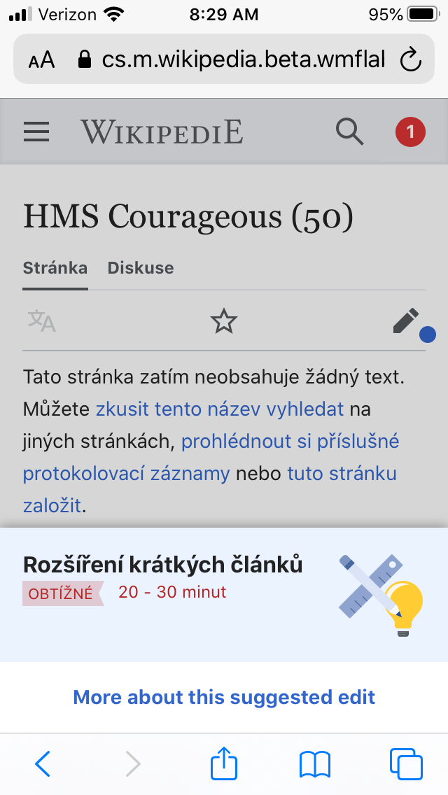
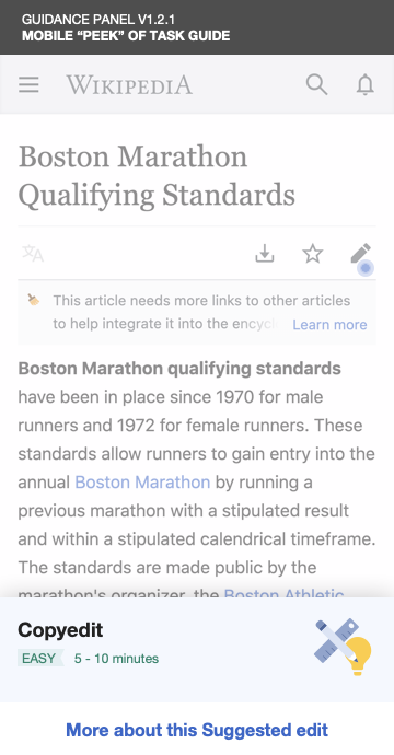
When the user first arrives on a suggested edit article on mobile, they should have the "mobile peek" experience.
This can be seen in the redlined design on the Growth Zeplin board relevant mobile peek screen tagged with "Guidance v1.2", and also in the screenshot below.

  • The article screen should have a¸transparent white layer use the same standard scrim used by the mobile drawer component.
  • The pulsing blue dot on the edit button should be visible behind the transparent white layer.
  • After the article loads with its transparent white layer, the mobile peek should animate up from the bottom of the screen. In other words, the user should notice that the mobile peek arrived -- it should not already be present when they see first see the article.
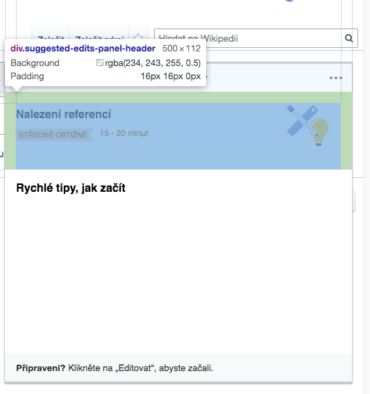
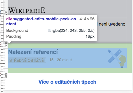
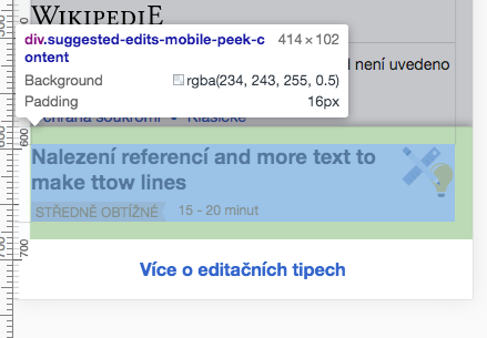
  • The mobile peek itself is a drawer with a drop shadow.
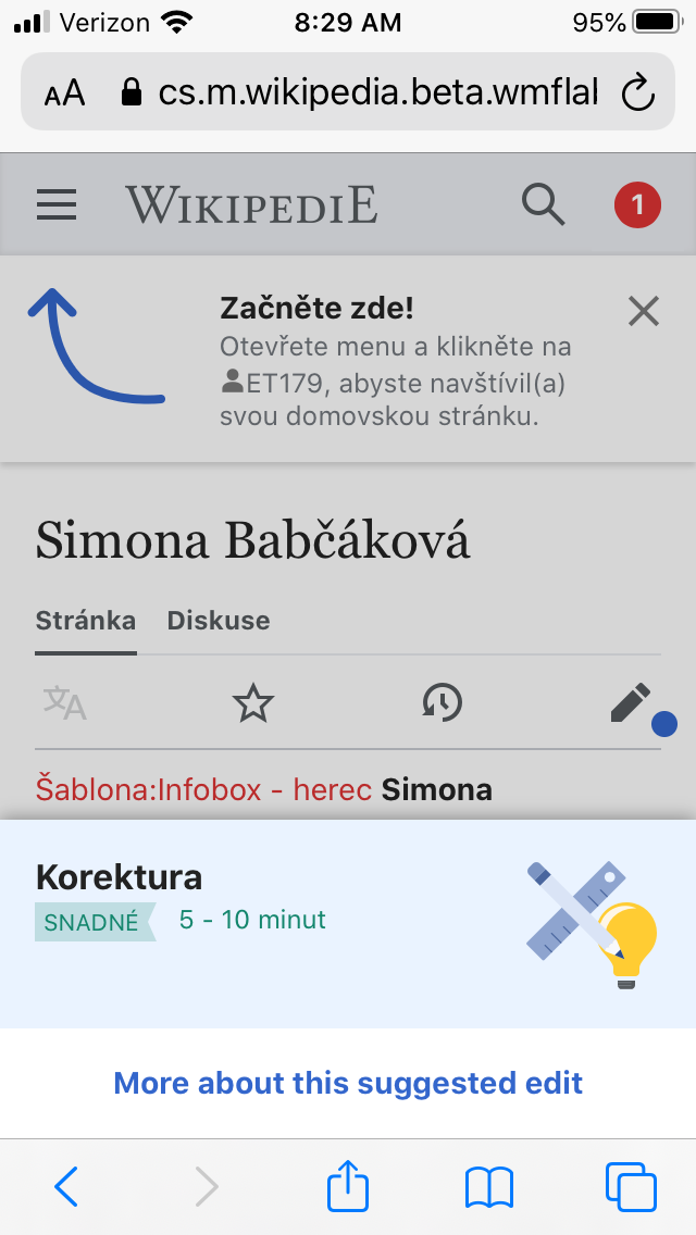
  • The mobile peek's content is identical to the "header section" content of the "suggested edit screen" (see T244541: Newcomer tasks: suggested edit screen in guidance).
  • When the user taps the mobile peek, it should animate up into the full guidance panel showing the "suggested edit screen". When they close it, it should not return to the mobile peek, but rather should return to the panel's CTA button in the lower right of the screen, with no transparent white layer.
  • If the user taps anywhere on the screen besides the mobile peek, the mobile peek should disappear into the panel's CTA button with no transparent white layer.
  • To be clear, the user only has one opportunity to see the mobile peek each time they open an article from Suggested edits. After they open or dismiss it, there is no way to return to that state.

image.png (690×360 px, 78 KB)

Instrumentation

Below are the portions of our instrumentation plan that relate to this component. See T246919: Newcomer tasks: guidance instrumentation for the full plan.

  • peek impression: we want to record that the user saw the mobile peek and which set of content it displays, in terms of which “task type” it is guiding, and whether it is showing the desktop VE, mobile VE, desktop wikitext, or mobile wikitext content.
  • tap on peek: whether the user taps the mobile peek.
  • dismiss peek: whether the user taps outside the mobile peek, which dismisses it.

Event Timeline

To be clear, the user only has one opportunity to see the mobile peek. After they open or dismiss it, there is no way to return to that state.

After the peek is closed, the user should not see the regular help panel call to action button, correct? The only remaining bit of guidance is the pulsing blue dot?

Oops, nevermind, that's answered in

but rather should return to the panel's CTA button in the lower right of the screen, with no transparent white layer

Change 575508 had a related patch set uploaded (by Kosta Harlan; owner: Kosta Harlan):
[mediawiki/extensions/GrowthExperiments@master] (wip) Guidance: Implement mobile peek

https://gerrit.wikimedia.org/r/575508

@MMiller_WMF @nettrom_WMF sorry if I've missed it; is there an instrumentation task for the guidance work? More specifically do we want to instrument tapping on the mobile peek?

@RHo is the capitalization of "Suggested" in "More about this Suggested edit" intentional?

@kostajh -- there will be instrumentation. I will be working on that today, actually! The basic theme of the instrumentation is we will want to know whenever users click/tap on anything. For the mobile peek, that will mean logging an event for if they tap the peek, and logging an event for if the tap outside the peek (thus dismissing it).

"Suggested" should not be capitalized.

@RHo and @MMiller_WMF, @Tgr and I are discussing the business rules on the patch and we have some questions

To be clear, the user only has one opportunity to see the mobile peek. After they open or dismiss it, there is no way to return to that state.

I interpreted this to mean that in the context of a single page load, you only have one chance to see it, e.g. you can't uncollapse the drawer.

My understanding is that the mobile peek is supposed to show up whenever the blue dot from guidance appears, so, once per task type on mobile, only if the user arrived from the suggested edits module, and that should always hapen until the user clicks "Edit" for a particular task type. After that, they should not see the mobile peek again for that particular task type.

@RHo and @MMiller_WMF, @Tgr and I are discussing the business rules on the patch and we have some questions

To be clear, the user only has one opportunity to see the mobile peek. After they open or dismiss it, there is no way to return to that state.

I interpreted this to mean that in the context of a single page load, you only have one chance to see it, e.g. you can't uncollapse the drawer.

Yes, this is true.

My understanding is that the mobile peek is supposed to show up whenever the blue dot from guidance appears, so, once per task type on mobile, only if the user arrived from the suggested edits module, and that should always hapen until the user clicks "Edit" for a particular task type. After that, they should not see the mobile peek again for that particular task type.

Actually the peek should not be connected to the blue dot. It should appear every time a user opens a "Suggested edit" article similar to the way the guidance panel on desktop is open by default, to help users on mobile understand that they are in the right place.
There is a task for opting out of this with rules details in this other task T246015

Actually the peek should not be connected to the blue dot. It should appear every time a user opens a "Suggested edit" article similar to the way the guidance panel on desktop is open by default, to help users on mobile understand that they are in the right place.

Got it. That's what the patch has implemented now.

Change 575508 merged by jenkins-bot:
[mediawiki/extensions/GrowthExperiments@master] Guidance: Implement mobile peek

https://gerrit.wikimedia.org/r/575508

Checked in betalabs - below are notes on the items with a green exclamation points:

  • The article screen should have a transparent white layer.
    • The layer seems to be darker than in the mockups

IMG_8777.PNG (1×640 px, 127 KB)

  • (minor) and with the arrow pointing to Homepage location it looks crowded:

IMG_8776.PNG (1×640 px, 114 KB)

  • To be clear, the user only has one opportunity to see the mobile peek. After they open or dismiss it, there is no way to return to that state.
    • every time a user clicks on an article in SE, the mobile peek will be present - there is no way to get rid of it until a user stops being a newcomer.

The layer seems to be darker than in the mockups

We are using the default styles that come with other MobileFrontend Drawer components, so if possible it would be nice to avoid overriding that for consistency with other Drawers, and to reduce custom code.

every time a user clicks on an article in SE, the mobile peek will be present - there is no way to get rid of it until a user stops being a newcomer.

Per T244434#5936978 I think this is implemented correctly.

@Etonkovidova -- when we say "the user only has one opportunity", we mean one opportunity for that newcomer task -- not for that newcomer. So that is implemented correctly.

About the arrow pointing to the homepage -- I didn't think it was possible to end up with that screenshot, because someone can't be doing a newcomer task unless they've already visited their homepage. How did you do it?

@RHo -- this is with you for review.

@Etonkovidova -- when we say "the user only has one opportunity", we mean one opportunity for that newcomer task -- not for that newcomer. So that is implemented correctly.

Makes sense.

About the arrow pointing to the homepage -- I didn't think it was possible to end up with that screenshot, because someone can't be doing a newcomer task unless they've already visited their homepage. How did you do it?

I think it's somewhat an edge case - if a user doesn't dismiss the pointing arrow intro explicitly (clicking on 'X') - it'll be present on any of SE articles.

Thanks @Etonkovidova - I've updated the description to clarify that the reflect the items you mentioned are OK. The first point about the overlay screen being dark is fine as it is to be consistent with the mobile drawer component, so I have updated the corresponding Zeplin as well. The other points @MMiller_WMF has already replied about.

However, @kostajh I did have a couple of minor design tweaks (hopefully!):

image.png (326×1 px, 111 KB)
image.png (276×748 px, 30 KB)
image.png (506×670 px, 69 KB)
image.png (388×666 px, 67 KB)
  1. Background-color should be rgba(234, 243, 255, 0.5) (Accent90 color @ 50% opacity), but is currently rgba(234, 243, 255, 1)
  2. 4px spacing expected between task title and additional description
  3. There should be 16px spacing between the task title and additional description text block and the icon
  4. There should be 16px bottom padding in suggested-edits-mobile-peek-content
  5. If the task type text goes over 1 line, the drawer should increase in height to maintain the padding:16px around suggested-edits-mobile-peek-content .

Got it, I'm incorporating these changes into T244541, where I'm making that particular component reusable.

@kostajh -- could you please review this and decide where the task needs to be?

I think these changes are all incorporated, so moving over to QA.

However, @kostajh I did have a couple of minor design tweaks (hopefully!):

@RHo - below I added screenshots to illustrate the incorporated tweaks - they all seem to be in place.

  1. Background-color should be rgba(234, 243, 255, 0.5) (Accent90 color @ 50% opacity), but is currently rgba(234, 243, 255, 1)
  2. 4px spacing expected between task title and additional description
  3. There should be 16px spacing between the task title and additional description text block and the icon
  4. There should be 16px bottom padding in suggested-edits-mobile-peek-content
desktopmobile
Screen Shot 2020-05-22 at 3.00.52 PM.png (567×533 px, 46 KB)
Screen Shot 2020-05-22 at 3.03.15 PM.png (298×428 px, 39 KB)
  1. If the task type text goes over 1 line, the drawer should increase in height to maintain the padding:16px around suggested-edits-mobile-peek-content .

Screen Shot 2020-05-22 at 3.04.47 PM.png (305×439 px, 46 KB)

I think the mobile peek turned out great.