User Job Story
When I am using guidance during editing and need to access an area obscured by the help panel,
I want to be able to quickly toggle the panel display (or otherwise move it out of the way)
So that I can easily complete the editing tasks whilst following the in-context tips.
Problem
The current design requires the user to first tap the “<“ button to return to the root screen before knowing to tap on the “X” button to minimise the dialog.
Note: This issue was introduced when we decided to “unify” the back button design (T248065) of Desktop and Mobile without due consideration of how this impacted usage of the panel during editing.
Proposed solution
- Provide the ability for users to close the go back to the root screen in the header in Suggested edits by removing the settings/options menu under the ellipsis "..." icon from the header.
- This is the proposed *short-term* solution that apples to both Desktop and Mobile versions of the help panel.
- Another task details the Desktop-only enhancement for the long-term is detailed on T255255.
- Note that all these changes apply to the help panel whether the user is in the suggested edits workflow or not.
Summary of proposed changes
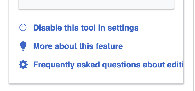
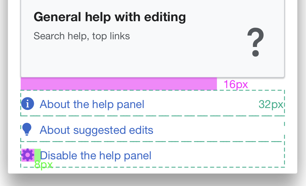
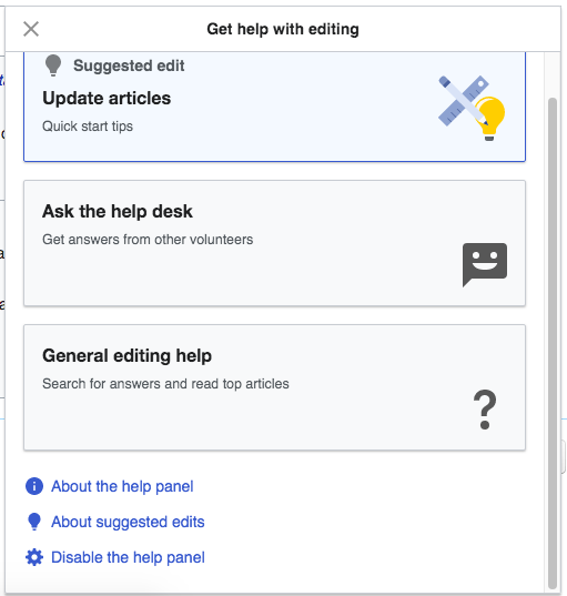
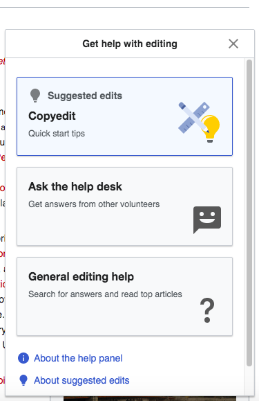
1. Remove the overflow menu from the header entirely from the help panel
- The "..." icon with menu options will no longer appear on the root screen nor any other sub-screen.
- The links that were previously shown in the menu are placed below all the tile buttons on the root screen only
Root 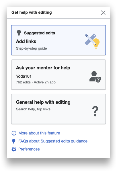 |
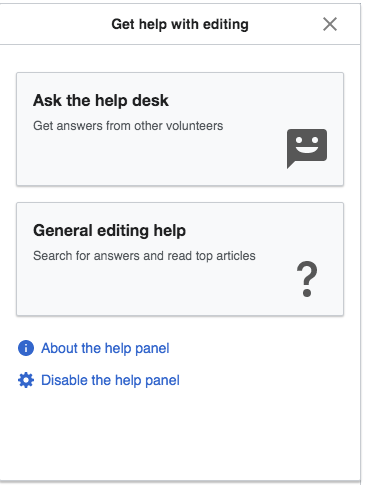
2. The close "x" icon is shown on the root, guidance, and general help screens in top right of the header.
- "X" icon already on the root screen is moved to the RHS
- Replace "..." in the General help and guidance screens with the "x" to enable closing the panel directly from these "sub-screens".
| Root | Guidance 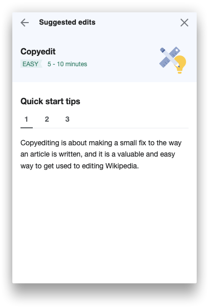 | General help 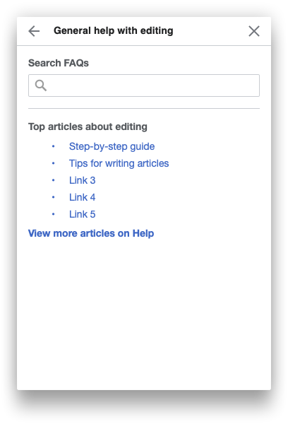 |
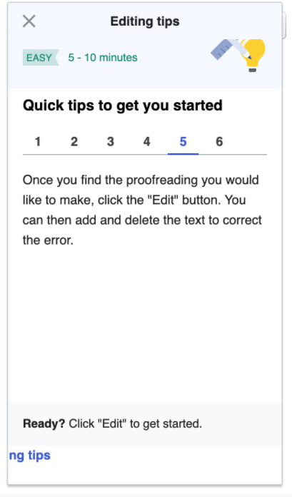
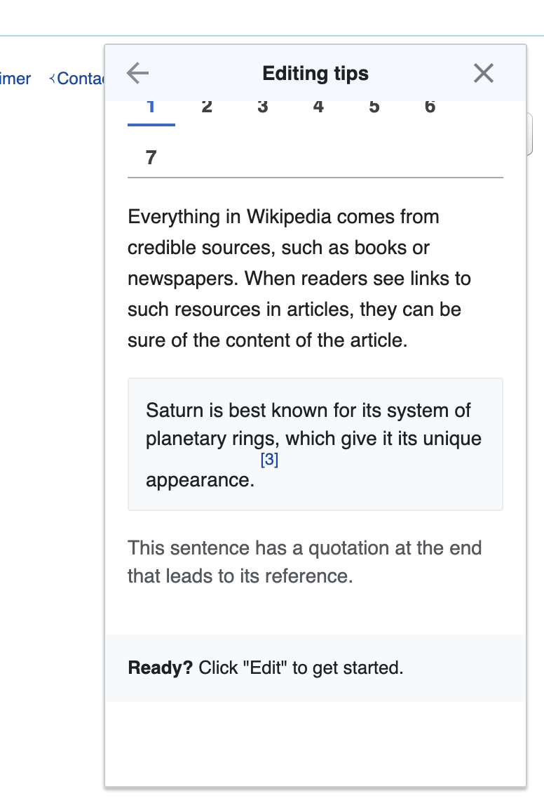
3. Update "<" left chevron ("previous") icon to use "arrowPrevious" icon instead on sub screens
The arrowPrevious icon is more apt for moving up to the root screen, as "<" is generally more utilized for previous step in a multi-step flow.
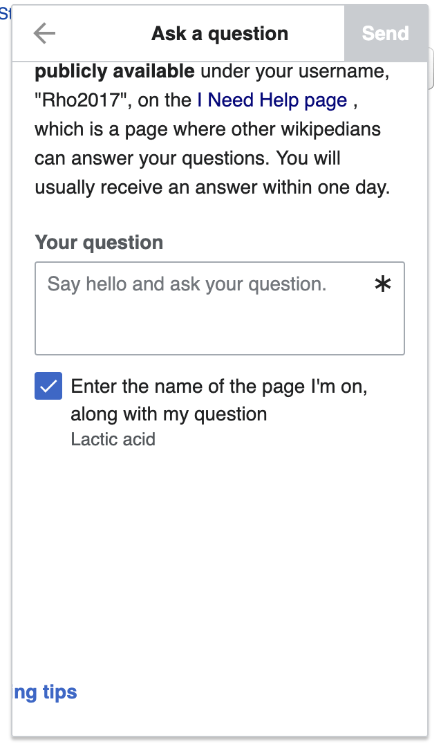
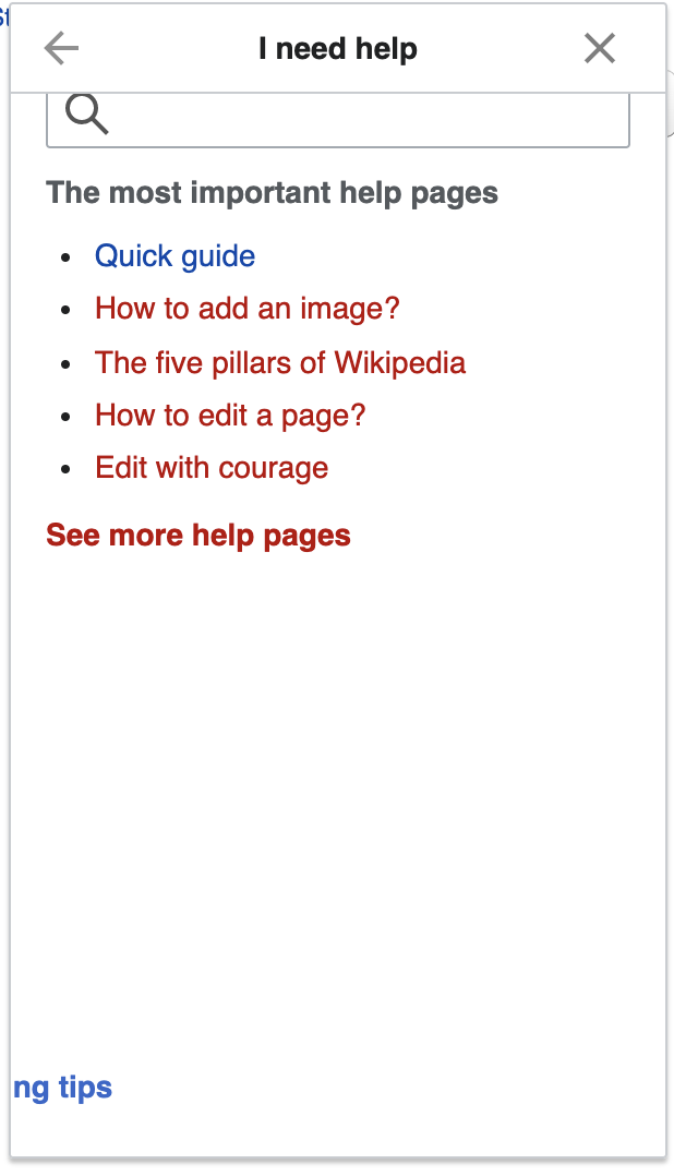
Ask a question (Post) 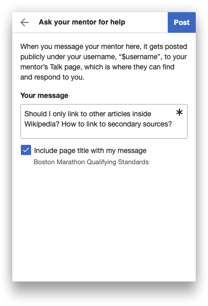 | Ask question confirmation  | Guidance | General help |
4. Select "Done" on the Ask a question confirmation screen redirects user back to the root screen
Currently after a user submits a question, the "Close" button on the top right header on the confirmation screen closes the panel, and when the panel is reopened the confirmation is still shown.
Expected behavior is that the user is returned to the root screen with the help panel still shown on selecting "Done".
| Ask question confirmation |
5. Update link labels and targets according to the following
- "Disable the help panel": should go to Special:Preferences#mw-prefsection-editing. This rewording may help the user find the correct preference even if they select this option from the suggested edits screen (which contains no mention of "help panel").
- "About the help panel": should go to https://www.mediawiki.org/wiki/Special:MyLanguage/Growth/Focus_on_help_desk/Help_panel.
- "About suggested edits": should go to https://www.mediawiki.org/wiki/Special:MyLanguage/Help:Growth/Tools/Suggested_edits. Should only be in the list of links if the user is doing a suggested edit.