Page MenuHomePhabricator

[Epic] Add Quickview feature to MediaSearch
Closed, ResolvedPublic

Description

User story: During research it became clear that users want a way to quickly see the image larger with more information instead of loading a completely new page.

We have this: Currently we link to the file page associated with the image / audio file / video.

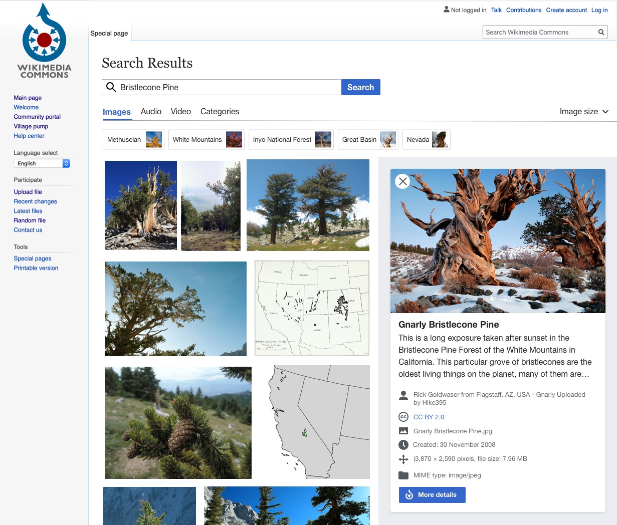
We want this: We want to explore a side panel that comes in on the right with a slight and quick transition that has a larger image and all of the information and icons that are currently found in the multimedia file viewer (e.g. author, license type, creation date, file dimensions, file type, location, etc.).

Upon clicking on a result, this side panel would rearrange the grid of results so that a user could see the expanded "quick view" while still scrolling results. The "more details" button would take the user to the file page.

Here is the current design:

quick_view.jpg (1×1 px, 410 KB)

During development, please test the following:

  • Test this feature while logged in AND logged out
  • Test this feature on at least one mobile browser
  • Test that this feature works on the file page AND the Add Data step on UploadWizard (if applicable, some features only exist on one or the other)

Event Timeline

Change 610940 had a related patch set uploaded (by Eric Gardner; owner: Eric Gardner):
[mediawiki/extensions/WikibaseMediaInfo@master] Add QuickView to search results

https://gerrit.wikimedia.org/r/610940

This feature is probably going to need a bit of "testing in production" – the data the QuickView displays comes from the File pages themselves, and content/formatting will vary widely. I assume that people will need a way to test things with real data, live on production commons, to figure out a design solution that can properly handle all the different kinds of content one may encounter "in the wild".

What's the best way to do this (aside from turning a partially-completed feature on for everyone)? One alternative to adding preferences or config-based feature-flags could be to hide the feature behind a URL parameter – while we finalize the design, users would only see the Quickview element if a certain URL param was present like &quickView=true; folks would just have to remember to add this parameter while testing. We are already parsing and monitoring URL params anyway here so it's not a huge added burden.

A URL param seems like a good solution to me. Would love others' thoughts - @Ramsey-WMF? @Cparle?

Would love some sort of URL param to start testing this! Especially to get a better handle on what we should do when there is all sorts of custom code / design that could show up in those.


Some feedback based on the screenshots @egardner posted (we can't seem to upload images to Phab currently) Here they are without quickview and with quickview

  1. I reviewed all of the new media search work with Volker yesterday in context of our design system and he had some useful feedback - We can switch all of the blue text to our black text color in the results. For example, the file names in both the video, audio, and category tabs are all currently blue. We feel that in the context of search results it is obvious these blocks are interactive and when everything is blue, it loses it's impact.
    • While removing the blue is okay, we need to make sure we have a hover state that indicates that the search result unit, card, etc. is clickable. I can't tell if we have anything in the current state from the screenshots and also can't seem to find an example from OOUI or new Vue styles. Happy to work with you on this and/or create one if a default doesn't exist.
    • We should switch the primary progressive blue button at the bottom of the quick view to a progressive button (gray with blue text) and remove the Commons icon.
    • We should update the icon to the left of the audio files (No icon there currently, I'll be working on this and don't have it ready yet so can ignore for now)
  2. Can we somehow remove File: and Category: from the names and categories we are showing? It seems redundant and not helpful as we are already separating out the file types.
  3. In the current state, the video grid has about 5 videos per row at that viewport size, Could we try 4 (3?) to allow the filename to not wrap into so many lines so it's easier to read quickly?
  4. Quickview
    • The big unsolved question here is around how to handle different types of layouts/tables/content that users can add that can get displayed into quickview. I don't have an answer to this quite yet and would love to play around with this on the prototype (URL param question).
    • Have a handful of small visual updates to the quick view. This might take a couple rounds but should help make this feel a bit more polished. You can see a screenshot of these labeled here.
    • Will probably need to adjust the audio quick view design and add a placeholder image of "audio" as there isn't much there currently and the close button / layout kind of breaks.

This is the overflow: scroll issue I'm seeing on Firefox desktop:

Screen Shot 2020-07-10 at 5.32.25 PM.png (244×940 px, 23 KB)

And here's the duplicate results:

Screen Shot 2020-07-10 at 5.43.49 PM.png (1×2 px, 599 KB)

Screen Shot 2020-07-10 at 5.43.55 PM.png (466×760 px, 51 KB)

Update! After chatting with @egardner we are going to hold off on the blue to black text change. Updated on both tickets.

egardner renamed this task from Adding a quick view feature to media search to [Epic] Add Quickview feature to MediaSearch.Jul 22 2020, 4:52 PM