Page MenuHomePhabricator

Consider the tab order for the Reply and New Discussion workflows
Closed, ResolvedPublic

Description

@Levivich recommends being able to tab easily to the edit summary field in the Reply tool. See https://www.mediawiki.org/wiki/Topic:W03i8sn6szruci5s

Behavior

Here's a screencast of the New Discussion workflow:

tabbing.gif (793×1 px, 789 KB)

Here's a screencast of the reply workflow:

tabbingreply.gif (792×1 px, 509 KB)

Problems: tabbing order, inability to tab into edit summary

Requirements

  • People need to be able to focus their browser on every clickable element within Discussiontools without having to use/depend on a mouse.

Open question

  • What tabbing path should the tool be optimized for? E.g. the path that takes people on the shortest route to publish? The path that takes people on a "tour" of all of the clickable elements within the tool prior to having their browser focus on the Add topic (New Discussion Tool) / Reply (Reply Tool) buttons?
    • Note: currently, the "tabbing order" follows the order in which the clickable elements appear within the code.

Event Timeline

The full page editor also offers Alt++B (or whatever modifiers the browser offers for access keys) to jump to the summary field from everywhere on the page. If this is implemented, it could work regardless of whether the advanced part is open (and thus offer a way to easily open it), although not a crucial feature once the tab stop works.

ppelberg updated the task description. (Show Details)
ppelberg added a subscriber: iamjessklein.

My suggestion re tabbing path: one tab to the edit window, two tabs to the publish button, i.e. edit window -> edit summary -> publish button -> everything else.

Thanks for adding this task @Whatamidoing-WMF , I actually also was thinking about it in relationship to the New Discussion tool because when you tab between the title and then the description, it takes an in between tab of going over to the edit modes, which instinctually felt wrong to me. I want to ping @Volker_E and a few accessibility folks to check in with them to make sure that we understand needs of users with different abilities and how they might perceive the experience.

For the above reason, I am going to update the task description as well.

iamjessklein renamed this task from Consider the tab order for the Reply tool to Consider the tab order for the Reply and New Discussion workflows .Jan 20 2021, 1:34 PM

I've also added some screencasts to the description showing what the experience feels like for both reply and new discussion workflows.

As a rule of thumb, with only having checked the screencast above, tab order should follow visual flow of the page, left to right, top to bottom .
Hidden elements could clearly be temporarily taken out of tab order. But I'm not fully clear about the described problem statement.

The full page editor also offers Alt++B (or whatever modifiers the browser offers for access keys) to jump to the summary field from everywhere on the page. If this is implemented, it could work regardless of whether the advanced part is open (and thus offer a way to easily open it), although not a crucial feature once the tab stop works.

It makes me think: is there a way to discover that kind of shortcut from the Mediawiki interface itself? I mean, I know a few shortcuts, because, once I saw someone use them at some Wikimedia event, and so I went to the documentation and learned them. This should be pointed to the discoverability team I think, and possibly could deserve it's own ticket. Compare that with many other user interfaces which states explicitly at user what shortcut they can use to access a function along the longer more easy to discover path that they will otherwise take. Examples are, a label which appears when one focus a button (mouse hover or keyboard tab selection), or a permanent text in menubars (in brackets or other specific way to display it).

Also note that + , which is also widely used in instant messaging tools, do send the message as one already acculturated to this shortcase might expect. Actually, after a quick check, it is already implemented with a proper accesskey and title on the button. Sorry for just making noise then. 😅

I think the ideal tab behavior is as follows: first, tabbing goes through "prioritized" controls (title, body, summary, watch and publish), and then through all remaining ones in visual order (mode switcher, preview, advanced toggle, footer links, cancel).

v2.png (794×1 px, 118 KB)

I'm proposing this to balance the efficiency of keyboard navigation, the long-term habits of users of the existing edit/add-section forms, and the needs of screen-reader users to be able to access everything in a intuitive order. It's also similar to normal behavior that would occur if the "prioritized" controls had a tabindex other than 0.

When replying, the title is obviously skipped; and when the advanced drawer is collapsed, the controls inside of it are also skipped.

I generally agree with @matmarex 's proposal above, except that "cancel" should follow "post" in tabbing order and/or you should be able to navigate from one to the other using the arrow keys.

I generally agree with @matmarex 's proposal above, except that "cancel" should follow "post" in tabbing order and/or you should be able to navigate from one to the other using the arrow keys.

I feel that a "Cancel" button usually signals the end of some interface (e.g. a form or a modal dialog), and I worry that if we put it in the middle of the tab navigation order, people using screen readers may miss the rest of the controls. I couldn't find any documentation to confirm whether that's a good practice, though.

It's fine to put primary button before Cancel. Why would you jump from primary to visual & source editing selection?

@Volker_E I'm sorry but I don't really understand what you mean, can you write more on both of these points?

Change 675855 had a related patch set uploaded (by Bartosz Dziewoński; author: Bartosz Dziewoński):
[mediawiki/extensions/DiscussionTools@master] Swap DOM order of summary and watch checkbox

https://gerrit.wikimedia.org/r/675855

Change 675856 had a related patch set uploaded (by Bartosz Dziewoński; author: Bartosz Dziewoński):
[mediawiki/extensions/DiscussionTools@master] Prioritize some fields when navigating by tabbing

https://gerrit.wikimedia.org/r/675856

Test wiki created on Patch Demo by Matma Rex using patch(es) linked to this task:

https://patchdemo.wmflabs.org/wikis/74ea52397b/w/

Test wiki on Patch Demo by Matma Rex using patch(es) linked to this task was deleted:

https://patchdemo.wmflabs.org/wikis/74ea52397b/w/

Test wiki created on Patch Demo by Matma Rex using patch(es) linked to this task:

https://patchdemo.wmflabs.org/wikis/d6f95b495b/w/

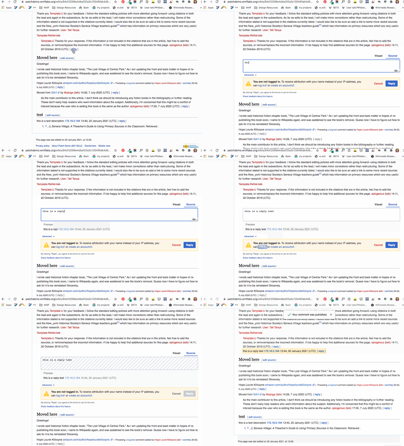
This demo implements my proposal from T271773#6934879, with the "weird" order of Reply and Cancel buttons. I am open to changing it, but I'm currently convinced that it's a good idea, so to convince me otherwise, you'll need either better arguments or more people who disagree with me ;)

If we can't agree on the perfect order, then I think we should just let it use the normal intuitive order (left to right, top to bottom), which might not be the most efficient but it is definitely understandable for everyone.

(sorry about the demo spam, I made a silly mistake in the first version and it didn't work at all)

This demo implements my proposal from T271773#6934879, with the "weird" order of Reply and Cancel buttons. I am open to changing it, but I'm currently convinced that it's a good idea, so to convince me otherwise, you'll need either better arguments or more people who disagree with me ;)

I still think a direct tab from Reply to Cancel would be good, but I haven't got any stronger arguments than already given, and I don't want perfect to get in the way of good, so I'll concede unless others come along with good arguments!

In that absence of my first preference though, being able to move between the Reply and Cancel buttons using the left and right arrows would be nice. Is that something easy to add here or does it need a new task?

first off - nice chart and patch making @matmarex

  1. Two different tabbing experiences? when I'm logged out and tab around, I go from the text input up to the formatting tools and then Left to Right. when I'm logged in and tab around I go from the text input straight up to the mode switching. This should be a consistent experience.
  1. Moving from Cancel to Mark this page as patrolled? when I tab from the text input to eventually cancel to eventually Mark page as patrolled, it felt unexpected. Similar to what @Thryduulf is sharing, I feel like here there should be a direct tab from cancel to reply. So to address this you'd need to start the flow with reply<->cancel and then essentially end it with cancel <-> reply.
  2. Tab to share feedback after reply option I think this should be the last or second to last tab in the flow.
  3. This is testable when we get it to a stable place I'd like to test it with visually impaired testers who regularly use key tabbing.

Change 675855 merged by jenkins-bot:

[mediawiki/extensions/DiscussionTools@master] Swap DOM order of summary and watch checkbox

https://gerrit.wikimedia.org/r/675855

Change 675856 abandoned by Bartosz Dziewoński:

[mediawiki/extensions/DiscussionTools@master] Prioritize some fields when navigating by tabbing

Reason:

I'm not sure anymore if this is an improvement. Maybe it's better to keep this simple.

https://gerrit.wikimedia.org/r/675856

Meta
I'm removing this task as blocking the initial deployment of the New Discussion Tool as an opt-out setting at our partner wikis.

Reasons

  1. While I appreciate this task could make it a bit easier for someone using a keyboard to focus their browser on the Reply and New Discussion Tools' edit summary field, as I understand it, the current experience enables people to do this in a relatively straightforward manner. //See: https://youtu.be/9vZWkTp7oNQ.//
  2. There does not seem to be a clear consensus on a more optimal way

...if you see holes in any of the thinking above, please comment as much.

I think we should actually close this task.

According to the task title, and the "Requirements", it is resolved:

Consider the tab order for the Reply and New Discussion workflows
People need to be able to focus their browser on every clickable element within Discussiontools without having to use/depend on a mouse.

We have considered it (and even made some changes), and people can focus every element. The current implementation is – hopefully – a good compromise between the needs of people who use keyboard navigation for efficiency, and those who use it for accessibility (leaning somewhat towards the latter).

It's not clear what the scope of this task would be outside of that. For any remaining keyboard-accessibility problems, please file separate tasks.

Test wiki on Patch Demo by Matma Rex using patch(es) linked to this task was deleted:

https://patchdemo.wmflabs.org/wikis/d6f95b495b/w/