Page MenuHomePhabricator

(MS 6) using the tooltip component in the QB
Closed, ResolvedPublic5 Estimated Story Points

Description

As a query builder I want to understand what the more specialized functions of the query builder do in order to build my queries in the best way possible.

Problem
Currently some of the functionalities require some knowledge about the Wikidata ontology. we we want the QB to also be understandable by less experienced people.

Mock-ups

image.png (863×998 px, 110 KB)

Copy
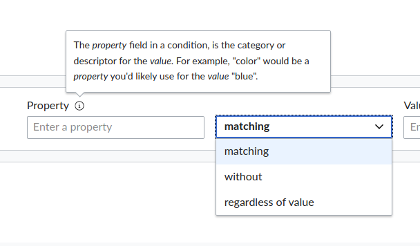
Property: The property field in a condition, is the category or descriptor for the value. For example, "color" would be a property you'd likely use for the value "blue".`
Value: The value field contains the concrete information used to describe an item. For example, "blue" is one possible value for the property "color".
References: You can further narrow your results by only showing statements with or without references.
Subclasses (this copy will likely change with T274634): Include subclasses e.g. include instances of "painting" when filtering for "work of art". Checking this box will likely result in a more complete list of results.

Position
Property: Top-end
Value: Top-end
References: Top-end
Subclasses: Bottom-start

Notes:

  • the darkened background is only in the mocks for focus. This should not be implemented in the actual product
  • the mocks show the old placement of the subclasses checkbox. the placement can be disregarded

AC

  • in RTL the tooltip direction should flip
  • Each Property, value, references field and subclasses checkbox should have an info icon which will display its respective tooltip on hover/tap/click
  • the icon needs to have role=button and tabindex=0 to be clickable/focusable

Notes

Event Timeline

Restricted Application added a subscriber: Aklapper. · View Herald Transcript
Charlie_WMDE renamed this task from tooltips for some of the UI components to [MS 6] tooltips for some of the UI components.Feb 25 2021, 10:40 AM
Charlie_WMDE updated the task description. (Show Details)
Lydia_Pintscher renamed this task from [MS 6] tooltips for some of the UI components to (MS 6) tooltips for some of the UI components.Feb 25 2021, 1:22 PM
Charlie_WMDE renamed this task from (MS 6) tooltips for some of the UI components to (MS 6) using the tooltip component in the QB.Mar 9 2021, 10:29 AM
Charlie_WMDE set the point value for this task to 5.
Charlie_WMDE updated the task description. (Show Details)
Charlie_WMDE moved this task from Backlog to Ready to pick up on the Wikidata Query Builder board.

this PR has to be merged and released first, before starting this ticket

Decided not to break it down into sub-tasks. All is done in this ticket.

Steps to do:

Ladsgroup renamed this task from (MS 6) using the tooltip component in the QB to (MS 6) 🛑 using the tooltip component in the QB.Mar 9 2021, 7:10 PM
Ladsgroup subscribed.
Ladsgroup moved this task from Ready to pick up to Doing on the Wikidata Query Builder board.

Some of it can be done :D I do that.

Ladsgroup renamed this task from (MS 6) 🛑 using the tooltip component in the QB to (MS 6) using the tooltip component in the QB.Mar 9 2021, 7:12 PM

Thanks. It needs a pre-release. I do it.

It looks like the popover trigger button is not receiving displaying focus on tab anymore.

I also noticed that the order of the keyboard navigation on the Property and Value fields should be corrected: when navigating to them, the focus is placed directly on the popover trigger (and then the input), and the fields' label is only announced after, so the tooltip's connection to the field is lost.

In the following video, you can see how the labels of the Value type and the References dropdowns are correctly announced, and how the focus then moves to the popover trigger, and lastly to the field in case the popover is not activated. If @Charlie_WMDE agrees, I'd say that that same focus order should be applied to all fields:

It looks like the popover trigger button is not receiving focus on tab anymore.

I receives focus, but no border or anything is shown. That's not ideal and we surely should fix it.

I'm pretty sure it worked before merging. Maybe broke with the new wikit? :(

behavior seems fine. the lack of border on focus and not being read by the screen reader should be fixed.

the popover should also close off-focus, right? when navigating via keyboard and selecting the popover, it stays open, even when i move on to select another component

image.png (356×608 px, 21 KB)
it only seems to close again when i move over it with my cursor.

also on mobile the tooltip gets cut off.

Screenshot_20210319-162351_Firefox.png (1×720 px, 112 KB)

is this ticket T274261 also addressing that issue?

Following up on @Charlie_WMDE 's comment:

the popover should also close off-focus, right?

sure! we decided to document the missing keyboard navigation events of the popover component in T277738

not being read by the screen reader should be fixed

I guess you're referring to the keyboard navigation order, and the fact that the input labels are not announced? But just in case: both the trigger and the content of the popover are accessible via screen readers (using Chrome Screen reader over here)

also on mobile the tooltip gets cut off. is this ticket T274261 also addressing that issue?

Yes, but it needs better design specifications. I guess I'm calling that one.

so for keyboard support and responsiveness, we have tickets in the process to be tackled. Can we call this done or should we do something else first?

amy_rc subscribed.

As we have tickets for 'keyboard support and responsiveness' , closing this ticket. 🎇