as reported by @MMiller_WMF
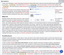
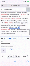
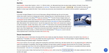
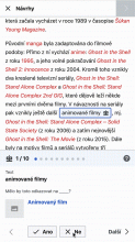
When I advance to the next link, the window only scrolls so that the link is at the very bottom of the window, hiding the link inspector. It should scroll far enough to put the whole inspector comfortably inside the window.
A similar thing applies for tapping “back” on the suggestion. It would be nice if we gave it a more comfortable margin, rather than just putting the suggested link at the very top of the window. See gif below.


