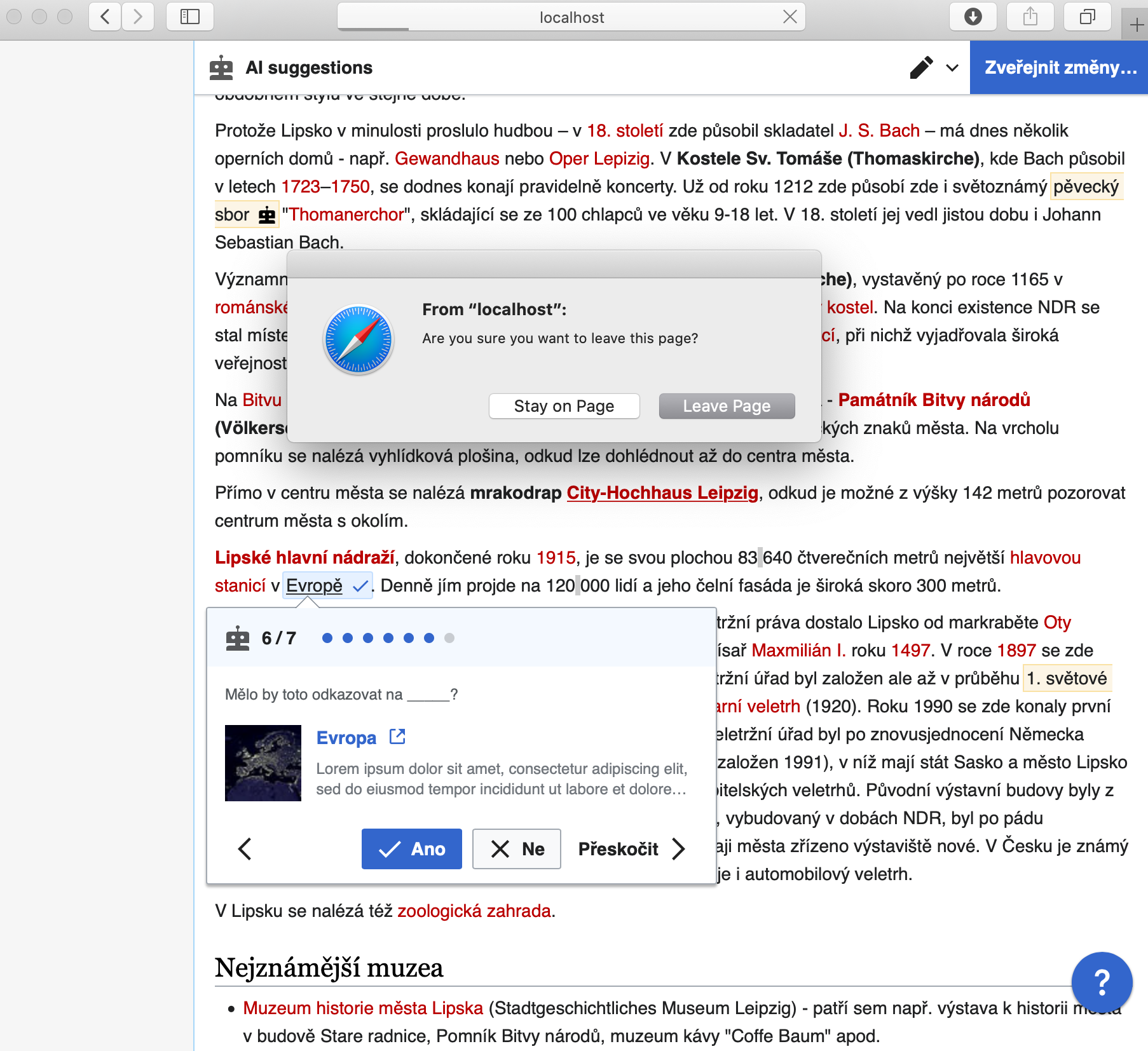
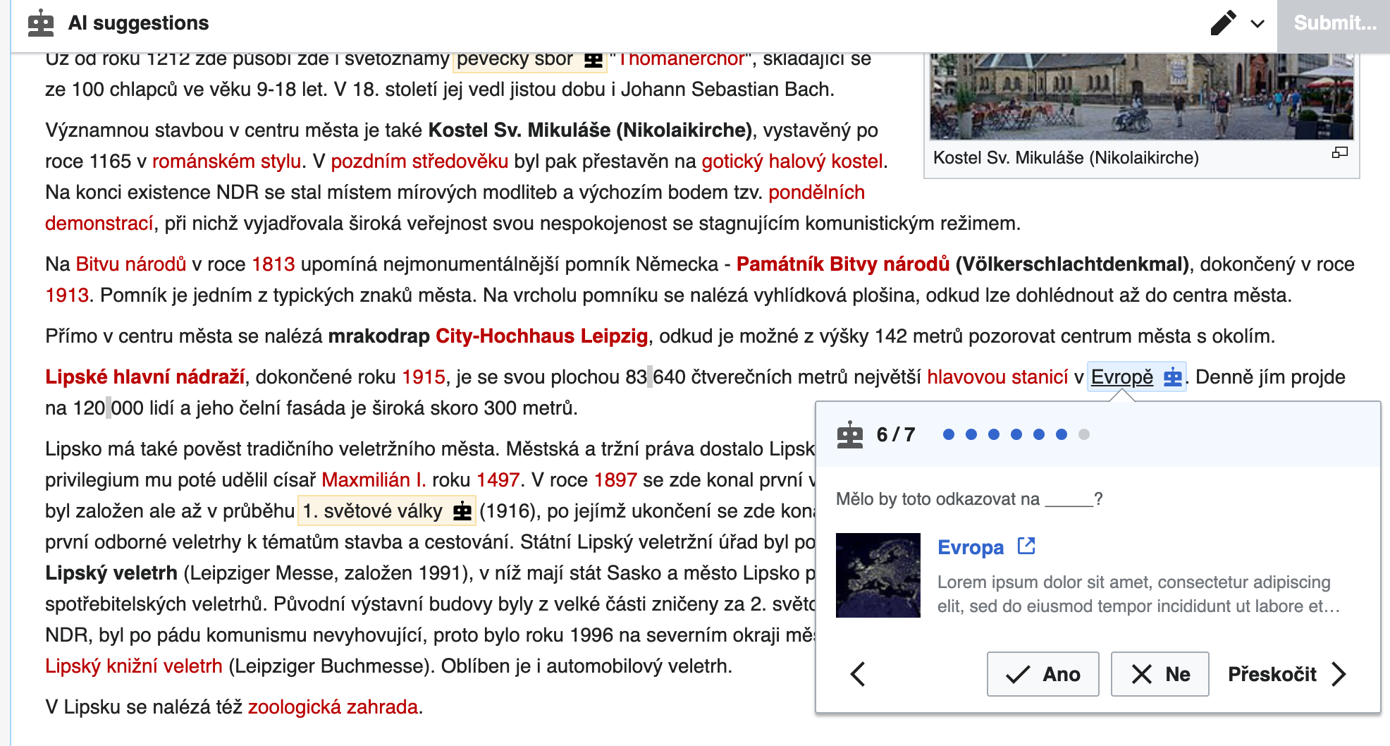
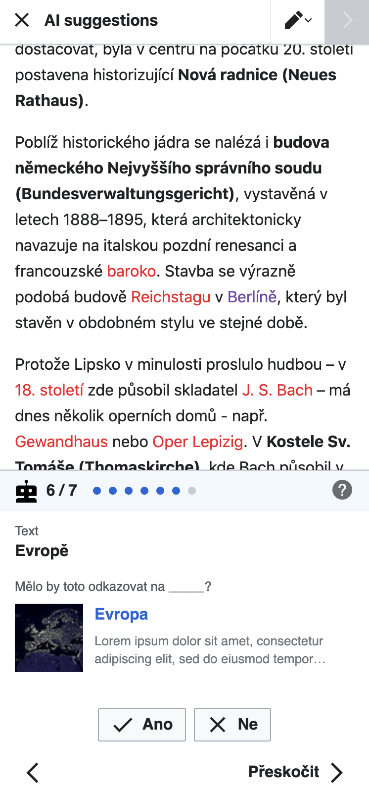
When the user is in the AI suggestions mode from T269638: Add a link: Suggestions mode, the link inspector should always be open. The link inspector is the place where the action happens of accepting, rejecting, skipping, or modifying link suggestions. There are some differences in the link inspector between desktop and mobile.
- Location
- On mobile, the link inspector is a card at the bottom of the screen.
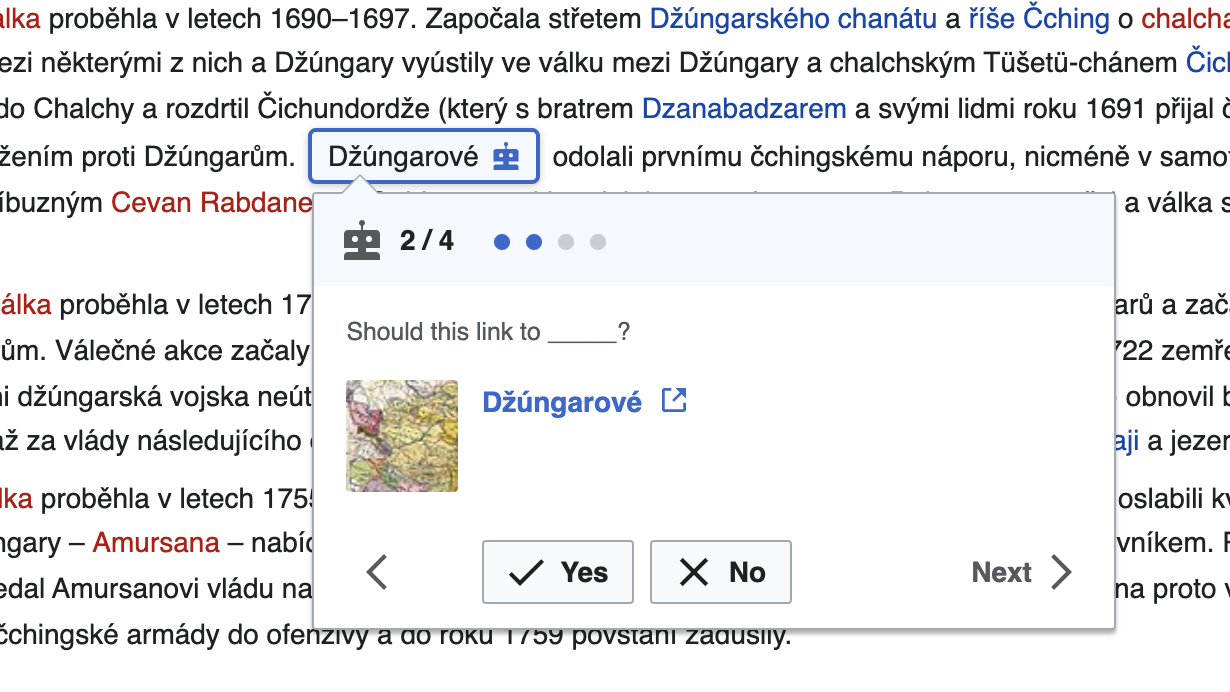
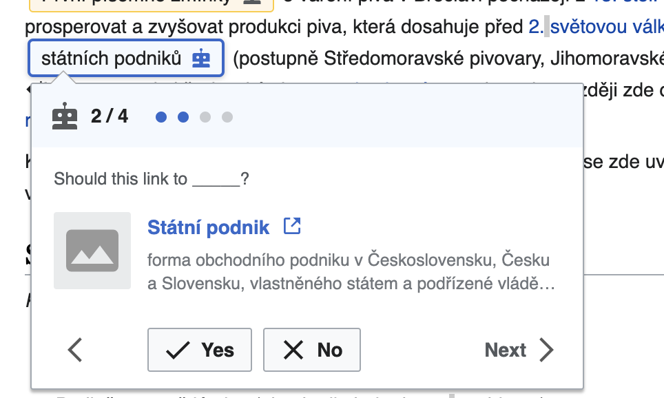
- On desktop, it is a popup over the editing surface that points to the link suggestion.
- Header
- It starts with a bot icon.
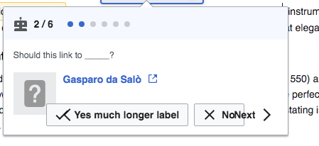
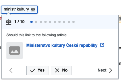
- Next is an indication of which suggestion the user is on, e.g. "1/7" or "2/10".
- Next is a series of bubbles visualizing which suggestion the user is on. If they are on suggestion 2/7, there should be 7 bubbles, and the first two should be filled in. These bubbles are not clickable/tappable.
- On mobile, the far right of the header has a "?" icon. This opens the help panel. See T269654.
- Content
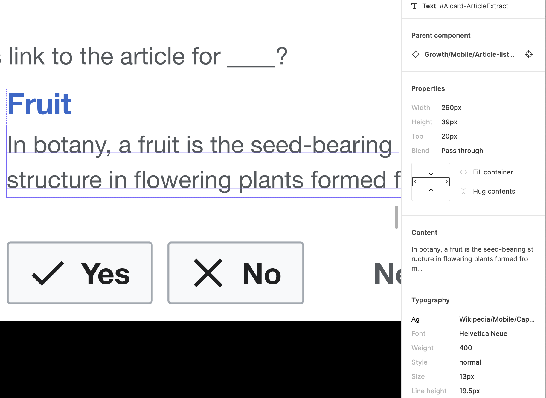
- On mobile, the context starts with the light gray sub-header "Text". Below it is the word or phrase that is the link label of the suggestion in bold Desktop does not have this part, because the word or phrase is pointed at by the link inspector.
- Next is "Should this link to the following article?" in light gray.
- Below that is a little article preview, with image, title, and article extract. The title should be a blue link that opens the article in a new tab. This should all be a fixed height, with the article title flowing into ellipses if it doesn't fit on one line, and the extract flowing into ellipses if it doesn't fit on two lines.
- Actions
- At the bottom of the card are the action buttons. On mobile, we should be careful not to put them so low that tapping on them triggers the browser's toolbar to pop up.
- Left arrow: this is always present, but disabled on the first suggestion.
- Yes: has a checkmark and the word "Yes".
- No: has an X and the word "No". This button triggers the rejection reason dialog. See T269647.
-
SkipNext: this is one button that includes both the word"Skip""Next" and a right arrow. (see T269647#6940826)- It advances to the next suggestion.
- On the last suggestion, tapping it is the same as tapping "Publish", bringing the user to the edit summary.
- There is a mock in the spec showing the desired overflow behavior in cases where the translations for "Yes", "No" and "Next" are long. In this case, the card should become taller, the "Yes" and "No" buttons should be in the same place, the left and right arrow buttons should be on the next line down.
- Auto-advance
- On mobile, after the user taps "Yes", they should be advanced to the next suggestion. If they tap "Yes" on the final suggestion, they should be advanced to the edit summary as if they had clicked to publish. The same concept applies if they tap "No", but is discussed in the task for the rejection dialog. See T269647.
- On desktop, the suggestions do not auto-advance. After the user makes their selection, they should be in the same spot, with the button selected, and they have to use the arrows to navigate forward or backward.
- The state of the "Yes" and "No" buttons is sticky as the user navigates around. They are allowed to change their selections.
- Animation
- T278486: Add a link: link inspector animations
- Misc
- If the user reloads the page while proceeding through link recommendations, we should follow the same behaviour as VE where a warning dialog is shown when the person reloads the page that their changes may be lost, but tries to retain the changes after reload with a message letting them know their changes may have been kept. (See T278485: Inspector does not open after reloading the page on desktop and T280127: Duplicate annotations when restoring saved changes
- T279314: Add a link: after the first "Yes", context items do not show up (mobile)
Mobile mockups as of 2021-01-12: 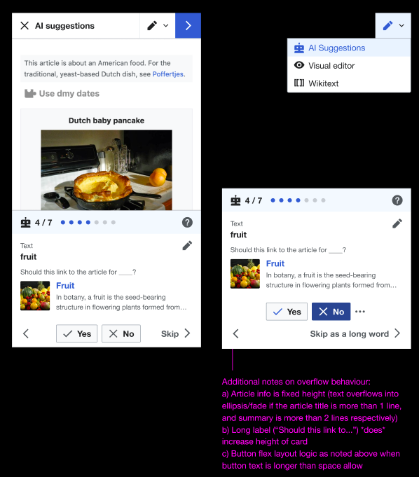 | Desktop mockups as of 2021-01-12: 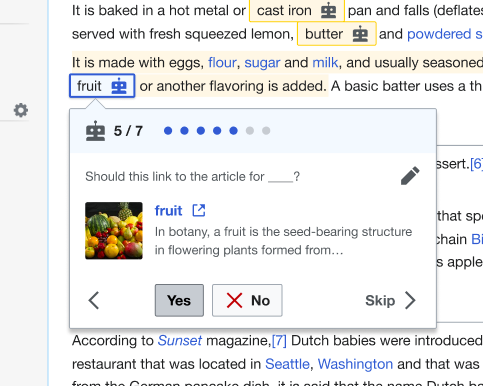 |
NOTE: Refer to Figma for up-to-date detailed redline mocks and specs:
Mobile: https://www.figma.com/file/2SONd8P1tsexIB5coMOp8h/Growth-Structured-tasks?node-id=181%3A65
Desktop: https://www.figma.com/file/2SONd8P1tsexIB5coMOp8h/Growth-Structured-tasks?node-id=112%3A0
Instrumentation
See T278116: Instrumentation: Link inspector for details.