Page MenuHomePhabricator

Add a link: [Mobile] Provide compact responsive view of link inspector on smaller devices
Closed, ResolvedPublic

Assigned To
Authored By
RHo
Jun 8 2021, 8:46 PM
Referenced Files
F34938676: image.png
Jan 31 2022, 11:02 PM
F34597698: Screen Shot 2021-08-16 at 9.21.36 AM.png
Aug 16 2021, 4:26 PM
F34597465: image.png
Aug 16 2021, 9:08 AM
F34575082: compact_linkInspector_overflow.png
Aug 3 2021, 8:43 PM
F34575080: compact_linkInspector.png
Aug 3 2021, 8:43 PM
F34552023: image.png
Jul 15 2021, 11:10 AM
F34551174: image.png
Jul 14 2021, 5:17 PM
F34551179: image.png
Jul 14 2021, 5:17 PM

Description

Problem

On mobile, the link inspector can take up a big part of the viewable area which makes it harder to read the text around a link suggestion. This is particularly an issue for smaller devices.

image.png (1×784 px, 247 KB)
(relatively limited scrollable article content area highlighted in magenta)

Background

Two leading and compatible proposals came out of the initial explorations for a similar problem on Desktop on discussed in T281185.
This task describes the first proposal for a responsive compact view, and another task T287404 has been created for the second proposal discussed.

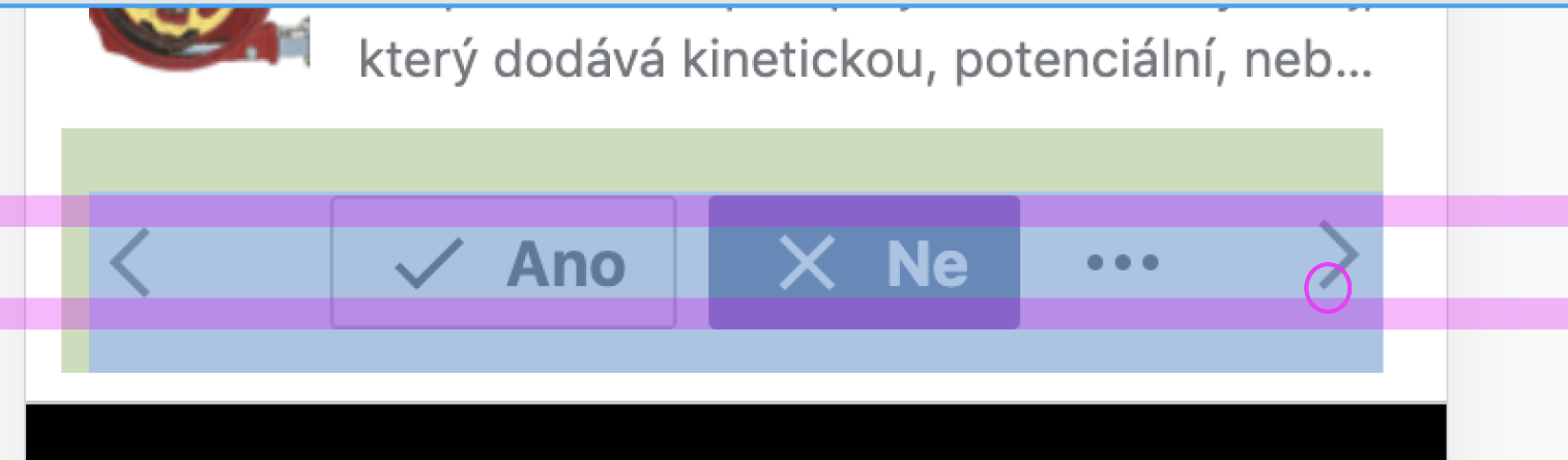
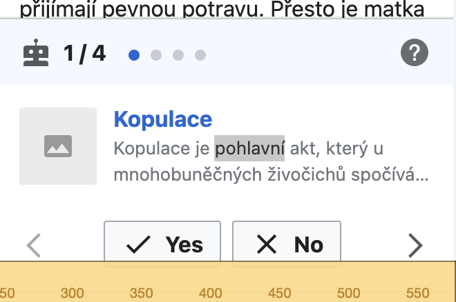
Proposal A. Responsively compact: Show a more compact link inspector on smaller devices where the width is less than 360dp.
Regular device inspector
image.png (1×868 px, 263 KB)
Small device link inspector
image.png (640×360 px, 55 KB)

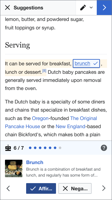
Smaller device layout differences:
(i) No text label and content fields
(ii) No text label on "Next" arrow
(ii) Yes and No buttons do not wrap but the text label overflows when the button labels are long. This could be by making both buttons a fixed equal width in the UI.

  • Pros
    • User doesn’t have to take any action at all as size adjusts for their device restrictions
    • Maintains context with the link inspector connected to the link text
    • No potential for users to ‘lose’ the card
    • No additional cognitive load as there is no UI addition to the inspector
  • Cons
    • Potential for reduced understanding of the task without the button labels and text labels linking the suggestion to the text.
    • Reduced consistency with VE link cards (which have the the Text label and field about the link)
View mocks on Figma

Event Timeline

kostajh renamed this task from Edit Task: Add a link: [Mobile] Link inspector make article less easy to read to Add a link: [Mobile] Link inspector make article less easy to read .Jun 21 2021, 11:11 AM

@MMiller_WMF - I recommend moving this forward with both proposals as part of the Add links improvements epic. Can you confirm or disagree with this approach?

Similarly, I recommend the same for the Desktop task T281185, but this mobile version seems more urgent (as it is more likely to occur for more people).

kostajh triaged this task as Medium priority.Jul 2 2021, 8:34 AM
RHo renamed this task from Add a link: [Mobile] Link inspector make article less easy to read to Add a link: [Mobile] Link inspector makes the article harder to read .Jul 14 2021, 5:05 PM

@mewoph -- @RHo and I think this might be a good improvement to work on in the next couple weeks. Could you please reply with a quick assessment of the difficulty of this work and any issues you foresee?

@MMiller_WMF @RHo I have a few more clarifications before coming up w/an estimate.

  • For proposal A, my recollection from our prior discussion re: icon-only accept/reject buttons is that using the icons alone won't be sufficient since there's no universal symbol for accept/reject (granted, the symbols are referenced in the third screen of the onboarding dialog). Is this no longer a concern? Since this UI is based on the screen height and not user-invoked, it's possible that the user may not have seen the full UI and might not deduce the meaning of the buttons in this abbreviated UI.
  • For proposal B, when the link inspector is minimized, is the annotation (link suggestion) de-selected? The current paradigm assumes there is one annotation selected at any given point (since we decided to have the link inspector always open) so we will have to do some audit to make sure that code that relies on this assumption doesn't break.
  • For proposal B, what's the reason for not having the re-open button be in the toolbar? My reasons for preferring this having this be in the bottom are:
    • I think that is more consistent w/existing VE paradigm. When the user goes on to use regular VE, they would already be familiar with the concept of popup edit windows invoked from the top bar.
    • Under the hood, we are already using VE's ToolbarDialog for this, so the implementation should not require any additional hacks.
    • The button won't get covered by the virtual keyboard. I think this could potentially help with add an image as well where we will need the keyboard to appear when adding captions.
    • I wonder if having the button on the bottom would cause some confusion for users who have done other suggested edits before since for other task types, this would open the help panel rather than be part of the workflow.

@MMiller_WMF @RHo I have a few more clarifications before coming up w/an estimate.

  • For proposal A, my recollection from our prior discussion re: icon-only accept/reject buttons is that using the icons alone won't be sufficient since there's no universal symbol for accept/reject (granted, the symbols are referenced in the third screen of the onboarding dialog). Is this no longer a concern? Since this UI is based on the screen height and not user-invoked, it's possible that the user may not have seen the full UI and might not deduce the meaning of the buttons in this abbreviated UI.

Yes, that's a fair point. Even though there is anecdotal evidence that the and are well recognised, we did want to play it safe and have a visible label always. One way to get more information would be to A/B test with the existing feature and see edits by those who do not see Yes/No labels suffers in reverts or productivity, but it seems expensive – @MMiller_WMF do you have opinions on whether this would be worthwhile?
For the time being, I propose we can keep the labels in this compact mode, but for the buttons to not wrap when the labels are too long, but instead text overflow like so:

image.png (640×360 px, 55 KB)

  • For proposal B, when the link inspector is minimized, is the annotation (link suggestion) de-selected? The current paradigm assumes there is one annotation selected at any given point (since we decided to have the link inspector always open) so we will have to do some audit to make sure that code that relies on this assumption doesn't break.

Yes in that the visual styling of the link 'tag' is in the deselected state, so from the user's perspective it is deselected. But perhaps from the system's perspective that link is still selected but just hidden? So when the user taps on the same link again it remains selected but the link inspector re-appears.

  • For proposal B, what's the reason for not having the re-open button be in the toolbar? My reasons for preferring this having this be in the bottom are:
    • I think that is more consistent w/existing VE paradigm. When the user goes on to use regular VE, they would already be familiar with the concept of popup edit windows invoked from the top bar.
    • Under the hood, we are already using VE's ToolbarDialog for this, so the implementation should not require any additional hacks.
    • The button won't get covered by the virtual keyboard. I think this could potentially help with add an image as well where we will need the keyboard to appear when adding captions.
    • I wonder if having the button on the bottom would cause some confusion for users who have done other suggested edits before since for other task types, this would open the help panel rather than be part of the workflow.

I did consider this in the design, but decided against mainly as it is against design principles of proximity and synchrony to have the bottom pane disappear and the reopening of it be so far away as a button at the very top of the screen. Additionally for mobile, the top toolbar is harder to physically to reach to re-open and then go back to selecting actions on the bottom panel.
As for the button being covered by the virtual keyboard, I don't think this is an issue because a user would not need to access the inspector card and type at the same time. And while I would not put too much weight on the add image caption screen exploration, that is also a case where the show inspector button and the inspector card is not needed once the user has got to the step of typing in a caption for an accepted image suggestion.

@MMiller_WMF In terms of effort, I think realistically this would take about 2 weeks. Here's a breakdown of the tasks involved:

  1. Remove article text & "Should this link to..." label for shorter devices
  2. Hide the link inspector when tapping outside it (except for tapping on the annotation)
  3. Show robot icon on the bottom right when the link inspector is hidden
  4. Ensure nothing breaks when no annotation is selected
  5. Apply proper truncation to Yes/No/Ellipsis buttons
  6. Instrumentation updates? --- still need requirements for this

1—3 are fairly straightforward and can probably be done in under a week.

For 4, this could end up being a somewhat significant change since we are operating under the assumption the link inspector is always open and w/that, one annotation has to be selected (per T269644: Add a link: link inspector, T267706: Add a link in VE: Use a permanent context instead of VE's built-in context , T281774: Ensure link suggestion stays highlighted).

For 5, the challenges for properly truncating the buttons are outlined here T280277#7015020.

RHo renamed this task from Add a link: [Mobile] Link inspector makes the article harder to read to Add a link: [Mobile] Provide compact responsive view of link inspector on smaller devices.Jul 26 2021, 6:54 PM
RHo updated the task description. (Show Details)

hi @MMiller_WMF and @mewoph - I've created a separate task T284609 for the toggle link inspector proposal. I've also updated this task description with the responsive width as <360dp.
However @MMiller_WMF, I wanted to bump this part of the discussion @mewoph and I were having about the not showing the labels at all on the compact view, versus having long labels overflow for your thoughts.

@MMiller_WMF @RHo I have a few more clarifications before coming up w/an estimate.

  • For proposal A, my recollection from our prior discussion re: icon-only accept/reject buttons is that using the icons alone won't be sufficient since there's no universal symbol for accept/reject (granted, the symbols are referenced in the third screen of the onboarding dialog). Is this no longer a concern? Since this UI is based on the screen height and not user-invoked, it's possible that the user may not have seen the full UI and might not deduce the meaning of the buttons in this abbreviated UI.

Yes, that's a fair point. Even though there is anecdotal evidence that the and are well recognised, we did want to play it safe and have a visible label always. One way to get more information would be to A/B test with the existing feature and see edits by those who do not see Yes/No labels suffers in reverts or productivity, but it seems expensive – @MMiller_WMF do you have opinions on whether this would be worthwhile?
For the time being, I propose we can keep the labels in this compact mode, but for the buttons to not wrap when the labels are too long, but instead text overflow like so:

image.png (640×360 px, 55 KB)

  • For proposal B, when the link inspector is minimized, is the annotation (link suggestion) de-selected? The current paradigm assumes there is one annotation selected at any given point (since we decided to have the link inspector always open) so we will have to do some audit to make sure that code that relies on this assumption doesn't break.

Yes in that the visual styling of the link 'tag' is in the deselected state, so from the user's perspective it is deselected. But perhaps from the system's perspective that link is still selected but just hidden? So when the user taps on the same link again it remains selected but the link inspector re-appears.

  • For proposal B, what's the reason for not having the re-open button be in the toolbar? My reasons for preferring this having this be in the bottom are:
    • I think that is more consistent w/existing VE paradigm. When the user goes on to use regular VE, they would already be familiar with the concept of popup edit windows invoked from the top bar.
    • Under the hood, we are already using VE's ToolbarDialog for this, so the implementation should not require any additional hacks.
    • The button won't get covered by the virtual keyboard. I think this could potentially help with add an image as well where we will need the keyboard to appear when adding captions.
    • I wonder if having the button on the bottom would cause some confusion for users who have done other suggested edits before since for other task types, this would open the help panel rather than be part of the workflow.

I did consider this in the design, but decided against mainly as it is against design principles of proximity and synchrony to have the bottom pane disappear and the reopening of it be so far away as a button at the very top of the screen. Additionally for mobile, the top toolbar is harder to physically to reach to re-open and then go back to selecting actions on the bottom panel.
As for the button being covered by the virtual keyboard, I don't think this is an issue because a user would not need to access the inspector card and type at the same time. And while I would not put too much weight on the add image caption screen exploration, that is also a case where the show inspector button and the inspector card is not needed once the user has got to the step of typing in a caption for an accepted image suggestion.

@RHo -- I do not think we'll be able to A/B test whether these buttons have labels. I don't think the decision is important enough to spend the analytics and engineering resources on splitting the variants. I think we'll just need to use our best design knowledge. One off-the-wall idea I had is the potential use of colors, like maybe green and red mean "yes" and "no".

@RHo -- I do not think we'll be able to A/B test whether these buttons have labels. I don't think the decision is important enough to spend the analytics and engineering resources on splitting the variants. I think we'll just need to use our best design knowledge. One off-the-wall idea I had is the potential use of colors, like maybe green and red mean "yes" and "no".

Per the original design intention, both buttons should have equal weight so we don't want to suggest that the "Yes" is the preferred "go" button with green and "no" red. Also, it's not considered best practice to use colour as an indicator/differentiator for accessibility reasons, so it's not necessarily solving having icon-only by introducing colours into the picture. Finally, buttons in our style guide have a specific palette, with blue for progressive/primary actions and red for destructive/delete actions, so it would not be appropriate to add different colours here.

If we are not resourced to test a icon-only button, let's go with stay with text buttons but have the button text overflow and wrap in the design if it's long.

Change 709819 had a related patch set uploaded (by MewOphaswongse; author: MewOphaswongse):

[mediawiki/extensions/GrowthExperiments@master] Add a link: hide label preview & next button label for device widths narrower than 360px

https://gerrit.wikimedia.org/r/709819

Compact view:

compact_linkInspector.png (976×520 px, 148 KB)

Compact view w/reopen rejection dialog button:

compact_linkInspector_overflow.png (980×516 px, 136 KB)

Change 709819 merged by jenkins-bot:

[mediawiki/extensions/GrowthExperiments@master] Add a link: hide label preview & next button label for device widths narrower than 360px

https://gerrit.wikimedia.org/r/709819

I think this task should get design review from @RHo. I'm reopening and moving to that column.

Hi @mewoph - there appears to be a minor vertical misalignment on the prev and next buttons whereby the prev is 2px higher than expected:

image.png (444×1 px, 96 KB)

LGTM - apologies for long turnaround!

image.png (1×1 px, 327 KB)