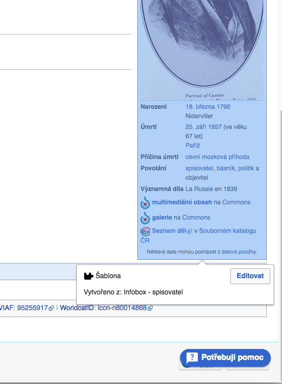
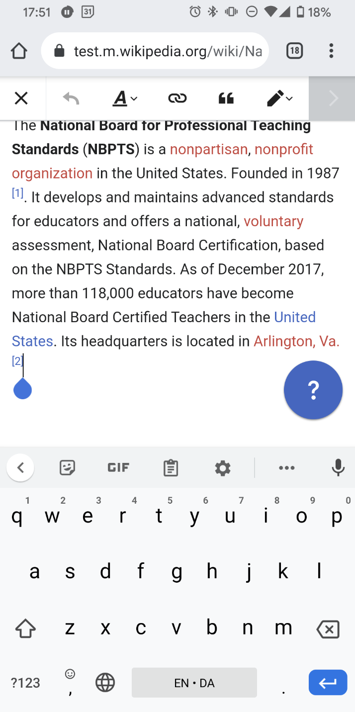
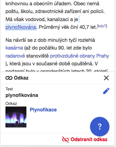
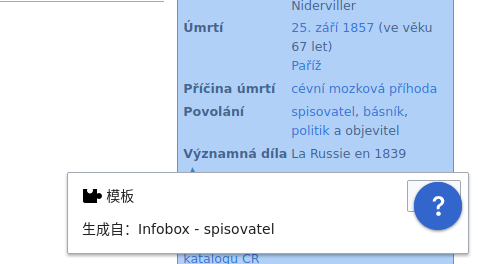
Steps to reproduce
- Enable Help Panel at cs.wikipedia
- Go to https://cs.wikipedia.org/wiki/Astolphe_de_Custine and open the page in the visual editor
- Click on the infobox
- Happened: The edit button is hidden by infobox, see screenshot.
Screenshots
Desktop 2019 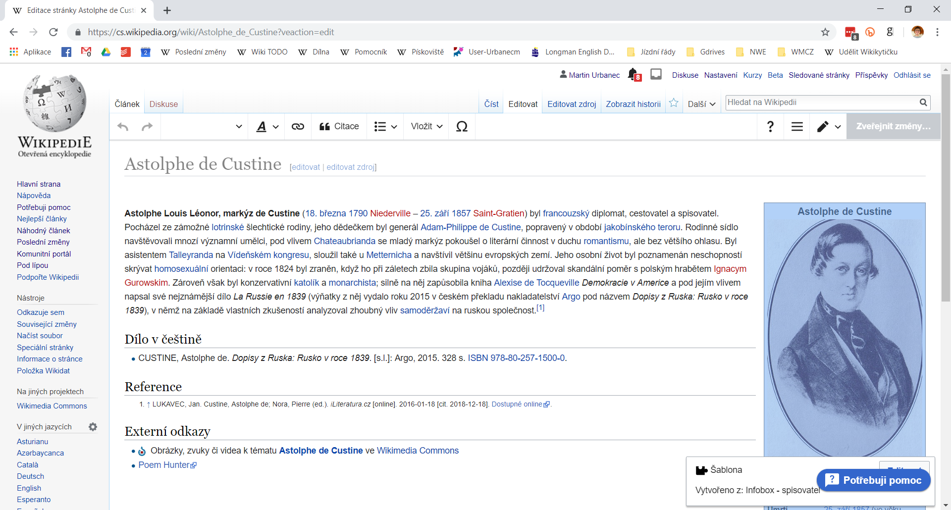 | Desktop July 2021  | Mobile 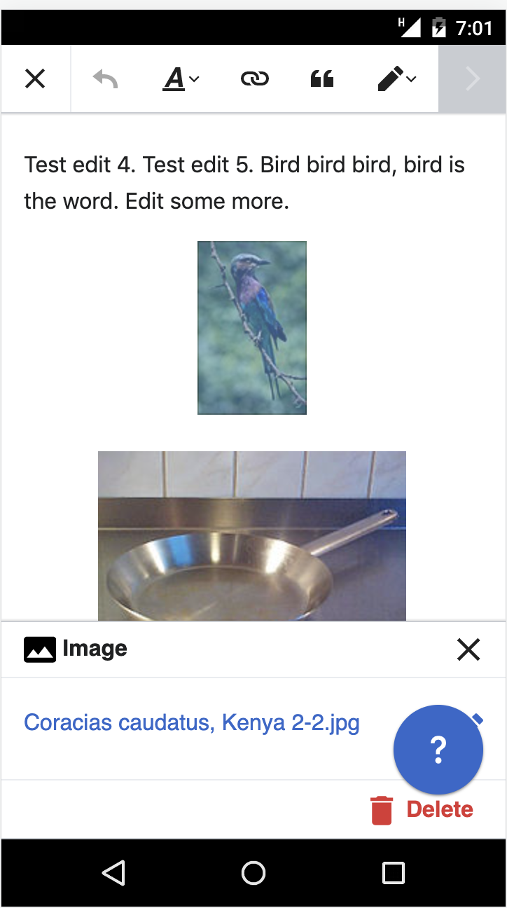 |
Proposed solution
Fixe for mobile only, by hiding the floating help button when an edit card is selected. For desktop, leave as is, since the issue is mostly mitigated by the reduced size of help icon-only button (see new screenshot about).
Previous proposed solutions
We might make the edit button show higher for all users, so it won't be hidden by Help panel.
– @RHo: This doesn't work well for mobile scenario, and would still occur in some cases so long as the help buttons z-index layer is above the edit cards.
Alternatively, we can play with z-indexes, so the button will hide the help panel and not vica versa.
- @RHo: I vaguely recall discussing this with engineers as this being very hard/unreliable and infringe on VE as it may mean adding z-indexes to every element that is an edit card as well as the button. Happy to leave this as a proposal if I'm misremembering.