Page MenuHomePhabricator

Collapse main menu (fka sidebar) by default for logged-out people
Closed, ResolvedPublic2 Estimated Story Points

Description

Background

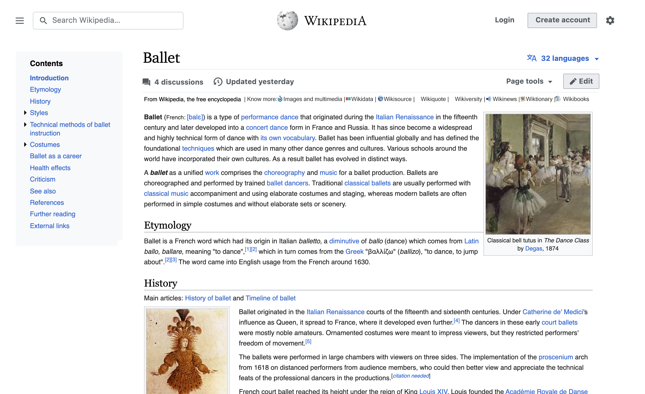
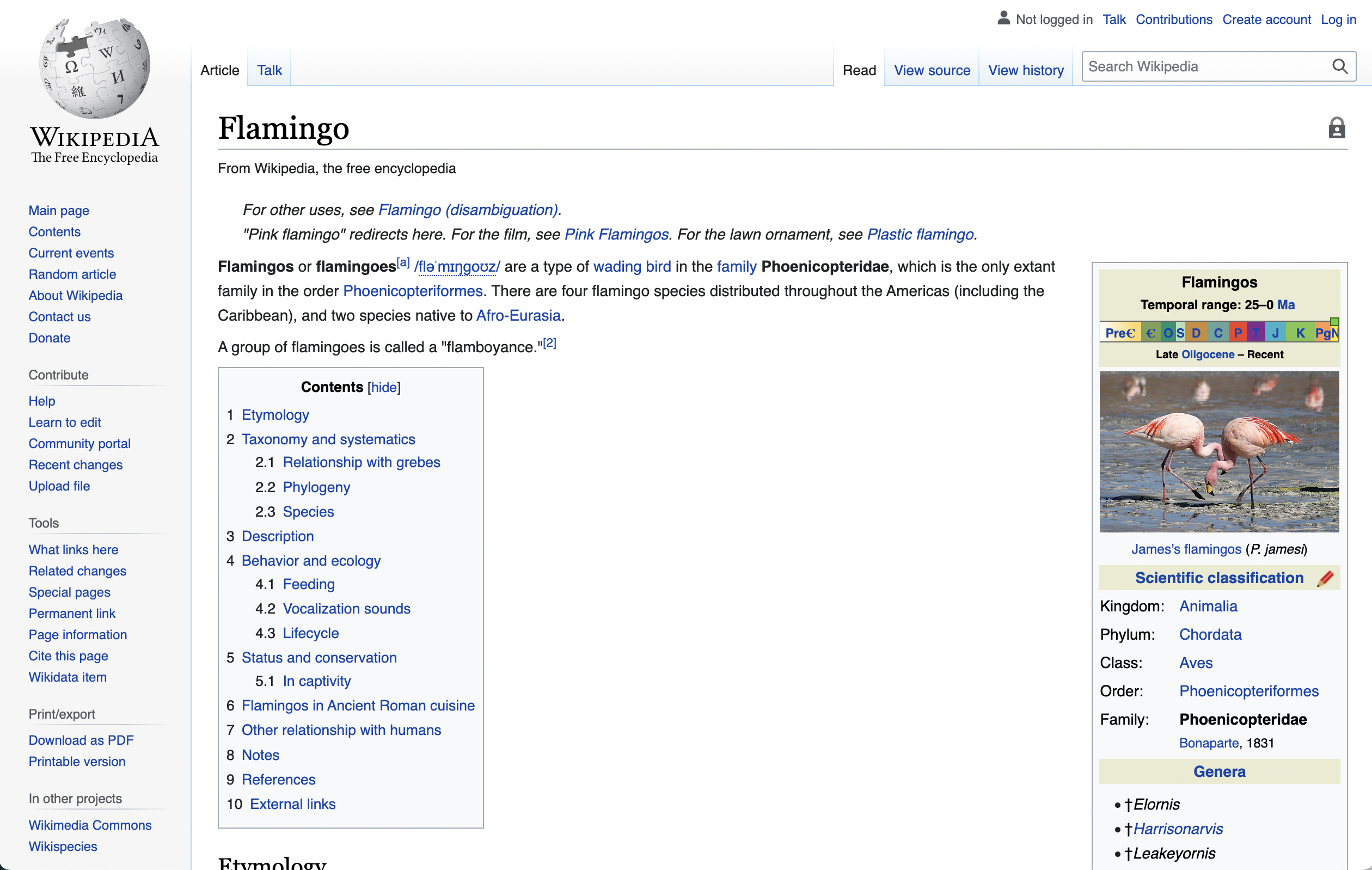
The collapsible sidebar allows for increased focus on the page content. For logged-out users who are more likely to focus on reading, we would like to collapse the sidebar by default. Details on our research and motivation are available at https://www.mediawiki.org/wiki/Reading/Web/Desktop_Improvements/Features/Collapsible_sidebar

Description

With the language switcher moved out of the sidebar we can now safely collapse the sidebar by default for logged-out people

Acceptance criteria

  • Collapse sidebar by default for logged-out users

QA Results - Beta

ACStatusDetails
1T287609#8110698

QA Results - Prod

ACStatusDetails
1T287609#8118121

Event Timeline

There are a very large number of changes, so older changes are hidden. Show Older Changes
ovasileva triaged this task as Medium priority.Jul 28 2021, 8:28 PM
ovasileva moved this task from Incoming to Not ready to estimate on the Web-Team-Backlog board.

@Theklan: For which specific and common actions would you want to see a sidebar by default as a logged-out person?

Links to our other projects are there, and there's no plan to move them to a more relevant place. Link to the PDF creator is there, and there's no plan to give it a more relevant place. Links to Village Pump and recent changes are also there, a good place to know how we work. Link to help page is there, a newbie may want to find a help page explaining how Wikipedia works.

If we hide all our sister projects from any given project... how should non logged users discover us?

And now the opposite question is still unanswered: why would we do this?

If I recall correctly this task was suggested because of data that clearly showed that very few anonymous users ever interact with the sidebar. The task description should be updated with that context.

It may be true that very few anonymous users interact with the sidebar. If we hide it completely, where are we going to move all the links there in order to make them more relevant? The 2030 Strategic direction is clear about this:

Our infrastructure will enable us and others to collect and use different forms of free, trusted knowledge.

We will build the technical infrastructures that enable us to collect free knowledge in all forms and languages. We will use our position as a leader in the ecosystem of knowledge to advance our ideals of freedom and fairness. We will build the technical structures and the social agreements that enable us to trust the new knowledge we compile. We will focus on highly structured information to facilitate its exchange and reuse in multiple contexts.

Those different forms of knowledge must gain relevance, never lose it.

Hi @Theklan - thank you for your comment here. As @Jdlrobson mentioned, this change is based on usage data of individual links. While I agree that these links are helpful in certain use cases (which is why we are keeping them on the page and easily accessible by opening the sidebar), they are not the most high priority items on the page. When thinking about relevance, one thing that is important to consider is that certain items lose relevance if too many options are available. We have to make decisions here on which items to draw attention to based on not only the current data, but also the expectations we have around the user flow on a page. By having some of the options on a per-usage basis, we allow for an improved reading experience while still making sure that all users have access to the links when they need them. I will update the task with the relevant data.

In terms of your earlier question on discovery, a framework that we are introducing here is the separation between article navigation and global navigation. While reading the article, users can look at different things related to the article itself (like editing the article, checking it's history page, changing a language) or click on a blue link to explore other content. Selecting the sidebar button then becomes a slightly different action that opens the window to the larger scope of Wikipedia - going to a different project, or accessing a page like recent changes. I hope that makes sense in terms of an explanation and answers your question. Let us know if not.

Thanks @ovasileva for the idea beneath this decision. I agree that separation between the article navigation and the global navigation should be a good idea in terms of the user experience, but I disagree on some of the outputs. If our main strategic goal is to give different forms of free knowledge and our current layout doesn't help on that, we can't just make it even more difficult to find this knowledge. What we should do is think on how to show users that our ecosystem is larger than the page they are currently reading. Let me suggest a (really fast and badly done) mockup of this idea:

irudia.png (1×2 px, 1 MB)

If we show our family just with the tagline, then users will know that they can '''know more''' (I think this idea is catchy and aligned with our strategic goals). Adding this extra information in the tagline makes the tagline relevant (currently it doesn't add any extra information, because you know that you are in Wikipedia without reading it).

I personally would add also the download to PDF and the book creator (that currently doesn't work) into the Page tools section, I don't know where this feature should go instead.

And once you get the sister projects in the tagline and the pdf/book creator in the page tools, you can make a really minimalist sidebar when expanded that would be really about our project: Village pump, help pages... and maybe the Nearby feature that can be found in the mobile app.

260 days gone, and still no clear idea on where to put the links to our sister projects. Is there any proposal to show who we are?

What is the rational of adding other projects (is to say, the main goal of our strategic vision) into a menu called "tools", if those are not tools?

Hi, whatever you did broke desktop view on my tablet in Vector 2022. Now I have to click PC version in desktop mode, so that TOC will hide and not take half of page on the left! Please fix desktop view! My tablet is galaxy Tab S4, 1600x2560 (that means in album orientation).

Why is the desktop view different in mobile mode and PC mode of the browser anyway?

@VZpolodov - we are currently working on making the new ToC collapsible. More info available in T306660: [Goal] Table of contents on narrow screens in vector-2022

It may be true that very few anonymous users interact with the sidebar. If we hide it completely, where are we going to move all the links there in order to make them more relevant? The 2030 Strategic direction is clear about this:

Our infrastructure will enable us and others to collect and use different forms of free, trusted knowledge.

We will build the technical infrastructures that enable us to collect free knowledge in all forms and languages. […]

Those different forms of knowledge must gain relevance, never lose it.

[…] this change is based on usage data of individual links. While I agree that these links are helpful in certain use cases […], they are not the most high priority items on the page. When thinking about relevance, one thing that is important to consider is that certain items lose relevance if too many options are available.

Relevance and importance, to my knowledge, do not correlate to click frequency.

Apart from CTR not representing importance, hiding the sidebar seems different from hiding a less important individual link. Perhaps we could progressively identify and de-emphasize individual features more generally from the sidebar for everyone. Noting that we have many hundreds more special pages and tools available that we already don't promote in the sidebar. I don't think people are claiming that no single link must be added or removed, only that removal of the sidebar seems - at this time - not informed by platform and ecosystem understanding or statistics, but predetermined by a design choice looking for retroactive justification. It comes across that way. I'm happy to learn otherwise.

Overall it feels as though we expect extraordinary events to happen by optimising for the ordinary.

Our ecosystem is deeply dependant on extraordinary actions. Do we believe exposure to the sidebar harms the qualitative experience for non-contributors? If so, by how much? Does it outweigh its value in offsetting the unbalanced ecosystem? Wikipedia is itself extraordinary event. Given the 1% rule of extraordinary actions, I expect the interface to emphasize what we value and need more of, not what most people actually click.

I believe design and layout do influence choice. Completing a task, possibly for a reward, in an lab setting is (mostly) irrelevant. Virtually everything humans do is decided by effort and micro decisions and uncertainty. It reminds me of hiding sections on mobile. People can't casually browse an article on mobile Wikipedia, or get a sense of what and how much is there, or discover an interesting table or image. One must instead choose and expand individual sections. The iOS or Android apps found this years ago, but we have yet to apply that finding.

Perhaps we believe people will still explore and find the same links. That's a reasonable theory. In that case - do we consider it a failure if the click rate of sidebar links decreases as a result of this design change? How much before it is worth reversing the design?

I'll end with my Toilet Dilemma that some of you heard in-person at conferences:

And then there's the landlord who removed the bathroom during a renovation, for the landlord observed the toilet is used by the tenant less than 1% of their time, and thus couldn't be essential to their overall quality of life.

The toilet, in our case, is learning as a reader about community guidelines, or contacting the village pump or admin notice board, or as admin to protect a page or (un)block an account.

If we extend the metaphor, we could include: Edit button (T55069), article references, learning about community guidelines and village pump (sidebar), page actions like protect and delete (page tabs), account preferences, account actions like email and promoting user groups (sidebar), special pages, community-specific interfaces via gadgets and site-specific MW extensions. Sadly, the entirety of this list was artifically excluded from mobile. A decade later much of it still is unavailable by default. The mobile site is operating on borrowed time from the "real" community, open only to those who can join from the desktop site. I worry that we're repeating this on desktop now.

@Krinkle Thank you for your comment. It gives us the opportunity to go into a bit more detail on our main motivations and provide more context. Apologies for causing confusion and not adding more of this to the task description as a whole. I’ll add some links to our research, process, and findings to make this clearer. We generally keep the documentation for the project as a whole available on MediaWiki https://www.mediawiki.org/wiki/Reading/Web/Desktop_Improvements. We'll be working on our on-wiki documentation in the next few weeks as well, so it's easier to read and navigate.

Just to clarify in a quick tldr: Clickthrough rate is only one of a series of motivators for this change. The change itself has been discussed since 2020, and has the support of various rounds of qualitative and quantitative testing. The change will not remove the sidebar, but rather collapse it by default for logged-out users only. We're working with other Product teams to make all related changes part of a broad integral improvement to the desktop experience.

The main motivators for the change are:

  • Optimizing for different experiences. As you’ll notice in the task description, this change is for logged-out users only. Overall, logged-out users are not likely to use the tools in the sidebar and value the ability to focus on reading. This conclusion is drawn from the following:
    • Qualitative testing with readers and editors on the usefulness of the sidebar and our navigation. Our conclusion here was that the number of different tools provided on the page by default was found to be overwhelming by readers and actively discouraged them from reading, but also from exploring the functionality within the page, an effect opposite of what the exposure of multiple tools aims to do. More details can be found on our feature page for the collapsible sidebar (https://www.mediawiki.org/wiki/Reading/Web/Desktop_Improvements/Features/Collapsible_sidebar#User_testing), as well as within the original report (https://www.mediawiki.org/wiki/Reading/Web/Desktop_Improvements/Repository/Hureo_User_Research_Report)
    • Quantitative testing on the usage behavior of the sidebar itself, in both its open and collapsed states (https://www.mediawiki.org/wiki/Reading/Web/Desktop_Improvements/Features/Collapsible_sidebar#Results). When using the sidebar, logged-out users are much more likely to collapse it and, once collapsed, to keep it collapsed. In addition, the rate of uncollapsing also indicated that users are aware that, were they to need to navigate to an item in the sidebar, that option was available to them.
    • I would like to gently push back against the statement that this is a retroactive change. We have been studying this behavior in some detail since early 2020, and published our recommendation to proceed with collapsing the sidebar by default in early 2021. Our time since then has been spent, similar to your suggestion, ensuring that individual features from the sidebar that deserve greater prominence are moved (such as language switching, for example, or access to wikidata links) and that logged-out users, for whom the change will be made, are able to easily find the items within the sidebar if necessary.
  • Promoting intuitive exploration of the page for new and casual users, and potential editors. The studies above showed us that many users were feeling unwelcome by the excess of tools provided on the page by default, making them unlikely to explore these tools. Within the context of wanting to grow our communities equitably, it is important for us to be able to provide an interface that is easier to use for potential new readers and editors. Our theory of change here is that by emphasizing certain points of contribution interaction, such as the edit button, or access to the talk page, we will provide a less confusing experience for those who do want to try to edit, explore the complexities of MediaWiki, and opportunities for involvement. This is what we work on as part of the Core Experiences group: https://www.mediawiki.org/wiki/Core_Experiences, along with the Growth and Editing teams. Once again, I’d like to mention that we’re only talking about default open and collapsed states. We are not removing any links or functionality from the page, and not making any changes for logged-in users. Logged-out users still have the ability to uncollapse the sidebar and access all of their tools.
  • Improving navigational hierarchy - we have been exploring different configurable options for navigation hierarchy and customization of navigation tools. This change will be followed up by a restructuring of the items within the sidebar itself. Currently, there is no distinction between tools acting upon the page and tools acting upon the global navigation as a whole. Please see https://www.mediawiki.org/wiki/Reading/Web/Desktop_Improvements/Features/Page_tools for our plans to make these easier to distinguish.

There's no explanation on what happens to sister projects in the motivation. Noting that sister projects are an essential part of our free-knowledge ecosysten, and this decision will make them even more difficult to find, iw there any explanation on how are we going to make them more visible?

Overall it feels as though we expect extraordinary events to happen by optimising for the ordinary.

@Krinkle can you clarify what you mean by "extraordinary events", and what your primary concern here is? My understanding of your comment is: you're concerned that with the sidebar collapsed logged-out people will have a more difficult time discovering how Wikipedia works, and therefore be less likely to contribute to the project. Is that right?

I think there are several paths one can take from casual reader, to informed reader, and eventually to contributor. I think of the sidebar links as a sort of scattershot approach: offer people a bunch of links, some people will click on some of them, and then maybe, with persistent curiosity, they will figure things out. Another approach, which I assume will more effectively help people become informed readers (and eventually contributors), is creating a limited number of optimally inviting entry points to the "behind the scenes" experiences. This approach has a major benefit of allowing us, as the developers of the website, to focus our energy on the chosen entry points, and make sure that if people click through those entry points they have a good experience. To allow for a more concrete discussion consider these two versions of Wikipedia:

more entry points directly exposedfewer entry points directly exposed
Screen Shot 2022-07-11 at 3.13.48 PM.png (1×2 px, 1 MB)
image.png (1×2 px, 1 MB)

In the second version page history, discussions, edit, create account, and about wikipedia stand out more than in the first version. We can focus our energy on those entry points, and ensure that people are welcomed if they choose to follow those links.

Also I'm not sure I follow your toilet analogy. A toilet is critical, if infrequently used. The sidebar links are not critical for regular reading, and are not the primary way people get involved with Wikipedia.

Lastly your comment:

removal of the sidebar seems - at this time - not informed by platform and ecosystem understanding or statistics, but predetermined by a design choice looking for retroactive justification

does not come across to me as if you are assuming good faith. As far as I am aware we are all on the same team, working towards the same goals. What do you imagine our design choices are guided by if not an attempt to improve the website experience for all people using it, and the health of the projects & movement?

I see again the mockup of the "final" (?????) iteration and I wonder how can a visitor KNOW that our knowledge ecosystem is more than an Encyclopedia (again, this is our vision for 2030, not a curious think someone will eventually discover).

Jdlrobson raised the priority of this task from Medium to High.Jul 14 2022, 4:20 PM

This is a configuration change. (wgVectorDefaultSidebarVisibleForAnonymousUser)

@ovasileva while testing the grid, I realized we likely want to do this deployment at the same time as the grid, given for grade C browsers, the sidebar appears on top of the content. Without this change IE11 anonymous users will be having to close the sidebar every time they want to look at content (see T311793#8076838).

Change 814865 had a related patch set uploaded (by Jdlrobson; author: Jdlrobson):

[operations/mediawiki-config@master] Collapse sidebar by default for anonymous users

https://gerrit.wikimedia.org/r/814865

Change 814865 merged by jenkins-bot:

[operations/mediawiki-config@master] Collapse sidebar by default for anonymous users

https://gerrit.wikimedia.org/r/814865

Mentioned in SAL (#wikimedia-operations) [2022-07-18T20:18:16Z] <urbanecm@deploy1002> Synchronized wmf-config/InitialiseSettings.php: 415c4ef44d9bf1abab6942fbbc552990a8e992c8: Collapse sidebar by default for anonymous users (T287609) (duration: 02m 41s)

Test Result - Beta

Status: ✅ PASS
Environment: beta
OS: macOS Monterey
Browser: Chrome
Device: MBP
Emulated Device:NA

Test Artifact(s):

QA Steps

✅ AC1: Sidebar should be collapsed by default for logged out users.

Screen Shot 2022-07-27 at 6.20.41 PM.png (406×1 px, 98 KB)

Screen Shot 2022-07-27 at 6.21.02 PM.png (645×1 px, 287 KB)

Edtadros subscribed.

Test Result - Prod

Status: ✅ PASS
Environment: frwiki
OS: macOS Monterey
Browser: Chrome
Device: MBP
Emulated Device:NA

Test Artifact(s):

QA Steps

✅ AC1: Sidebar should be collapsed by default for logged out users.

Screen Shot 2022-07-27 at 6.19.18 PM.png (501×1 px, 163 KB)

Screen Shot 2022-07-27 at 6.20.16 PM.png (838×1 px, 461 KB)

Looks good, resolving

It doesn't look good. Now people who is not logged in doesn't have access to sister projects, going AGAINST our strategic goals.

@Theklan: That's not true. "Dans d’autres projets" still exists on French Wikipedia for non-logged in users. You can see it after one click, to show the side bar.
If you had a different experience, then https://www.mediawiki.org/wiki/Talk:Reading/Web/Desktop_Improvements is the place to bring up stuff instead. Thanks.

After one click. Not directly. That's the point, and it has been all the time. But, as usual, when someone makes a point aligned with the Wikimedia Strategy, then it is ignored.

@Theklan: If the Strategy Goals state that certain complexity must be exposed to the user immediately, then please point out so on the Talk page, not here. Thanks.

As @Aklapper mentions it would be best to start a treat about this on the talk page (also since this task will be closed soon).

@Theklan as we've discussed in the past: with each improvement comes a tradeoff. We cannot offer people every link at all times — we know from research that this decreases the quality of the overall reading experience. So yes, the links in the sidebar are more difficult to access now. We are already aware of this, and we've heard you flagging this issue multiple times – you do not need to keep telling us. But the overall improvement to the reading experience makes this tradeoff worth it. This is the conclusion we have arrived at through data collection and testing. These decisions are not easy to make, and we know that certain people will be upset by them. I am sorry if you disagree with the conclusion we have come to.

I see that there are certain templates that promote sister projects within the article itself. Perhaps we should collect data on clicks to these templates/links, and maybe start discussions within the editing community to move them higher up in the article if other people agree they are important:

example 1example 2
Screen Shot 2022-08-01 at 3.58.54 PM.png (766×1 px, 279 KB)
Screen Shot 2022-08-01 at 3.59.14 PM.png (766×1 px, 329 KB)

I'm sure that you will continue to criticize me for doing everything wrong, and that's fine. But honestly I, and the other people on this project, are just trying our best to improve the interface.

@Theklan: If the Strategy Goals state that certain complexity must be exposed to the user immediately, then please point out so on the Talk page, not here. Thanks.

.
Exactly, here (https://meta.wikimedia.org/wiki/Strategy/Wikimedia_movement/2018-20/Recommendations/Improve_User_Experience):

Tools to connect cross-project and cross-language functionalities to provide an enhanced experience of the knowledge contained in the Wikimedia ecosystem for a particular interest, informational need, or inquiry.

The bold text is mine.

This decision goes against the recommendations made in the Wikimedia movement. And, if someone wants to argue that hiding cross-project connections will be better, it should be stated how. I haven't read anything about that.

Edit: Alex, I'm not discussing about aestethics. I'm discusing about a main point in our mission. Is not like breaking the book creator that the same team made, is deeper than that.

Exactly, here (https://meta.wikimedia.org/wiki/Strategy/Wikimedia_movement/2018-20/Recommendations/Improve_User_Experience):

Tools to connect cross-project and cross-language functionalities to provide an enhanced experience of the knowledge contained in the Wikimedia ecosystem for a particular interest, informational need, or inquiry.

Thank you for your concern and for keeping us on our toes. To clarify: the idea behind the goal that you've quoted is is to build systems and tools (such as structured data) that allow us to incorporate content from sister projects within Wikipedia. As we know from data collection simply linking to sister projects does not work effectively. So I respectfully disagree that we're are going "against the Wikimedia Movement recommendations".

That's not true, Alex. The recommendation is not about incorporating content from sister projects within Wikipedia, because we have more projects that are not Wikipedia. There's no recommendation saying that WikiPedia should be the center of our project and all the others are hidden. Discoverability, cross-project links and diversity of content is essential. And I say this because I was in that discussion. I don't know if you were there, but I was. We discussed this for hours (https://meta.wikimedia.org/wiki/Strategy/Wikimedia_movement/2018-20/Recommendations/Iteration_2/Diversity/3)

This obscuring of sister projects goes against all logic. It goes against our projects, it goes against our products and it goes against diversity, usability, findability and user experience. The strategy says CLEARLY that we need to do the opposite.

And now that this is clear (and written down, and approved): what will be the design steps to increase diversity, usability and findability of sister projects? Has the team talked about this in any moment?

@Theklan: Please use the Talk Page for general questions. This is an issue tracker to plan work, not some general discussion forum. Thanks.

As stated in the conversation, once we know that there is no data to know if the cross-wiki links are clicked or not, and noting that this was the main and only argument to hide the sidebar, a wise movement should be to just undo this change and propose one that respects the cross-wiki links and make them more prominent.

@Theklan - please see T287609#8069403, T287609#8070438, as well as the task description for the goals of this change and the arguments for why collapsing the sidebar is important for our readers. We can continue the conversation on improved ways to connect cross-project and cross-language functionalities on the talk page.

Now we know that there's no data to support this change. Still, the main question remains unanswered. I made it one year ago, but again last month. https://phabricator.wikimedia.org/T287609#8070494

What is the proposal to make this "improvement" (sic) move along our strategy? I.e. how are you going to make the cross-project links more prominent, instead of hiding them?

@Theklan - I would like to refer you again to the comments I linked to in T287609#8142459 which include data on sidebar usage, as well as the report on the quantitative testing done for the feature available on the project page (also linked above). Our main metric here was the frequency at which logged-out users use the sidebar, once the sidebar is collapsed. As you will see, only 0.84% of users uncollapse the sidebar once it is collapsed.

There's no data about the usage of the cross-project links in those measurements. So, you can't know if this is used or not. Anyway, it doesn't matter if it is used or not, YOUR job is to make them more evident, because that is a main goal in our strategy. Hiding them is not the goal. Making them more evident if no one is clicking on them is. Hiding the problem makes it worse. Solving the problem (trying to, at least) makes it better.

And indeed, if you hide it, only 0,84% will uncollapse it. And if you just change the typeface to comic sans and put a button inside a menu that goes to another place so you can return to the usual typography, very few people will click on it. It doesn't make Comic Sans better, this only gives us a clue about most of the readers being unaware of how to make things.

Again: the strategy is pretty clear. You are going against it. And if this doesn't go against the strategy, it will be a good point to show how this is helping the strategy.

alexhollender_WMF renamed this task from Collapse sidebar by default for logged-out people to Collapse main menu (fka sidebar) by default for logged-out people.Sep 9 2022, 9:31 PM

Just for comment on this: in these last days I have been again showing how Wikipedia works to professors and students at the University. As the sidebar is now hidden, the general view of how Wikipedia works is reduced to the things happening inside the article. No menu is shown, so I have to show it on purpose to teach other features (recent changes, Wikimedia Commons link...) and students need an extra step to figure out what I'm talking about.

We don't have data on usage, we know that this goes against the Wikimedia Strategy... but it also breaks any attempt to make sense of our ecosystem and working procedures.

And indeed, if you hide it, only 0,84% will uncollapse it.

Just to clarify, unless I'm misreading Olga's comment I think that's the rate of logged out users uncollapsing the sidebar after manually collapsing it themselves, which (at least from my perspective) indicates that the sidebar as-is isn't really that helpful for logged out users.

Today I learnt that this discussion, that was asked to move into Meta, was archived and hidden without even trying to solve it. Sad.