Page MenuHomePhabricator

Explore iterations of current language button implementation: Make language button progressive
Closed, ResolvedPublic2 Estimated Story Points

Description

Background

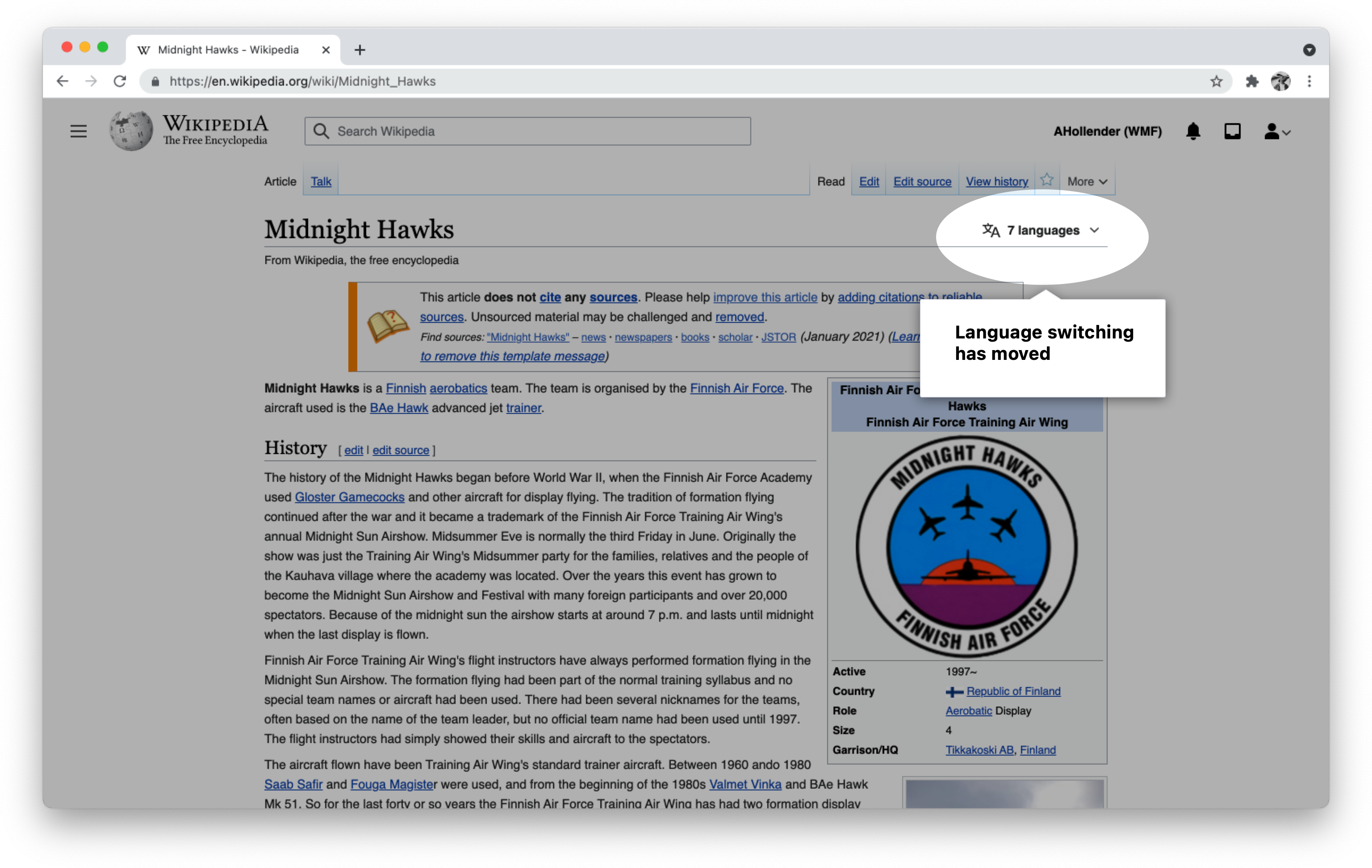
The results from T289200: Analyze behavior change on logged-out users before/after turn-on new language switch suggest a high learning curve of discovering the new location of the language switching button. This task contains interventions in the styling of the new language button to make it more obvious to people.

Open questions

  • are newcomers having an easier time switching languages than people who are previously familiar with the site? (i.e. is it a learning issue, or a pure discoverability issue?)

Ideas

We are hoping to test one or more of these ideas to see how they impact language switching. Please feel free to add more ideas, either as sketches or just written out.
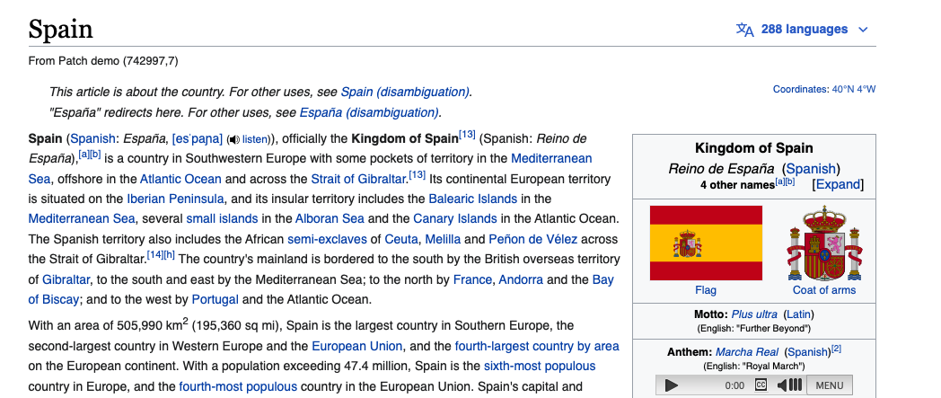
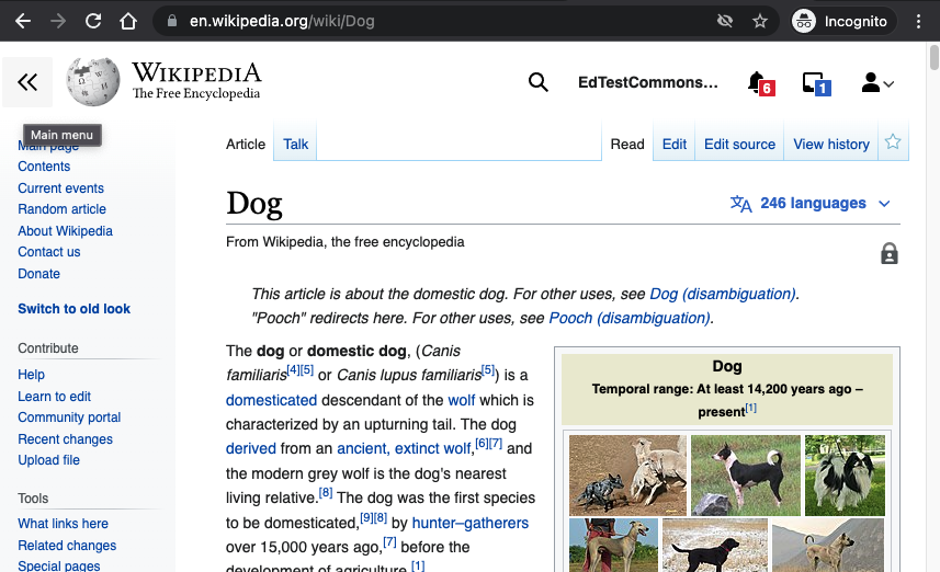
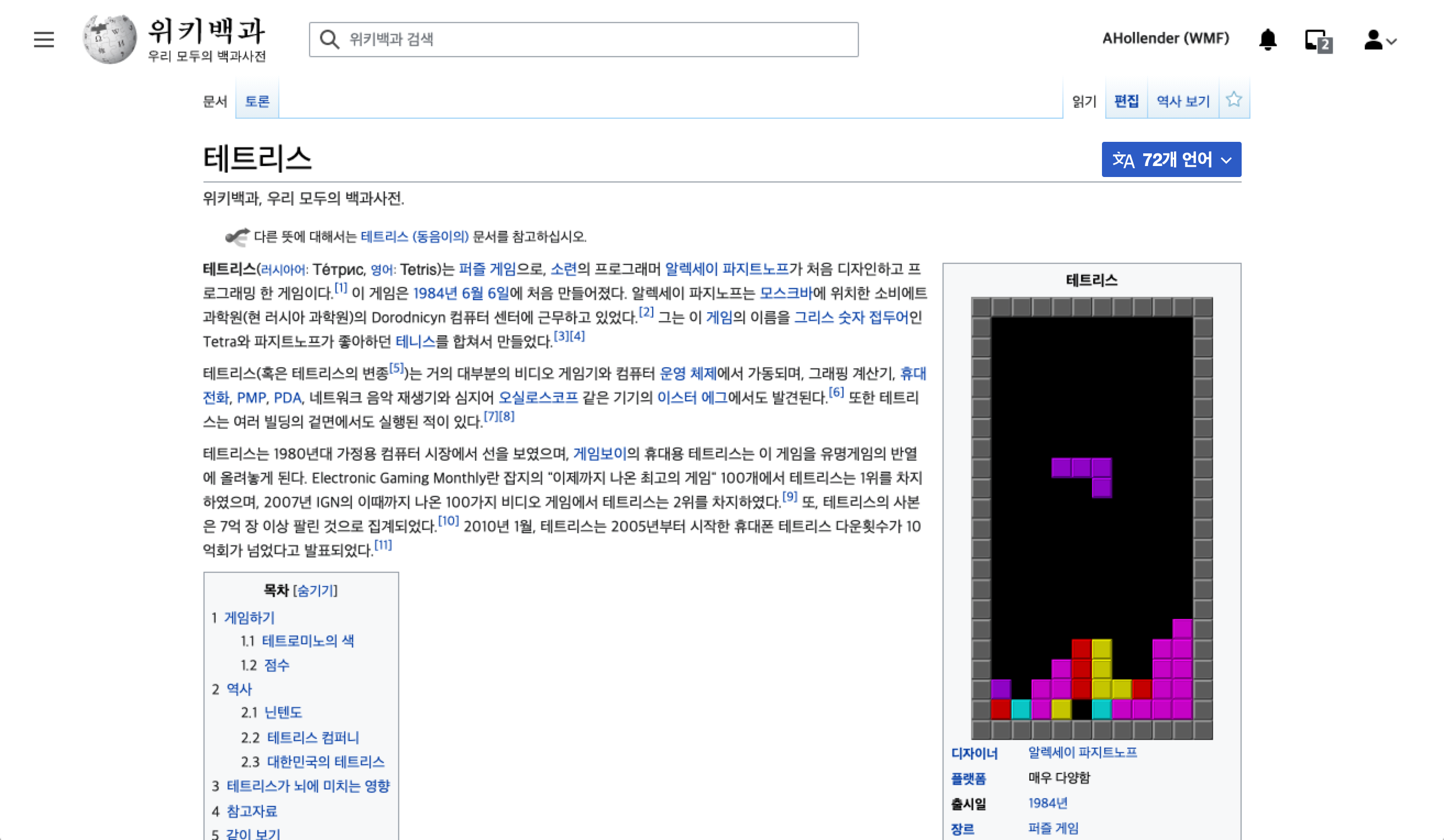
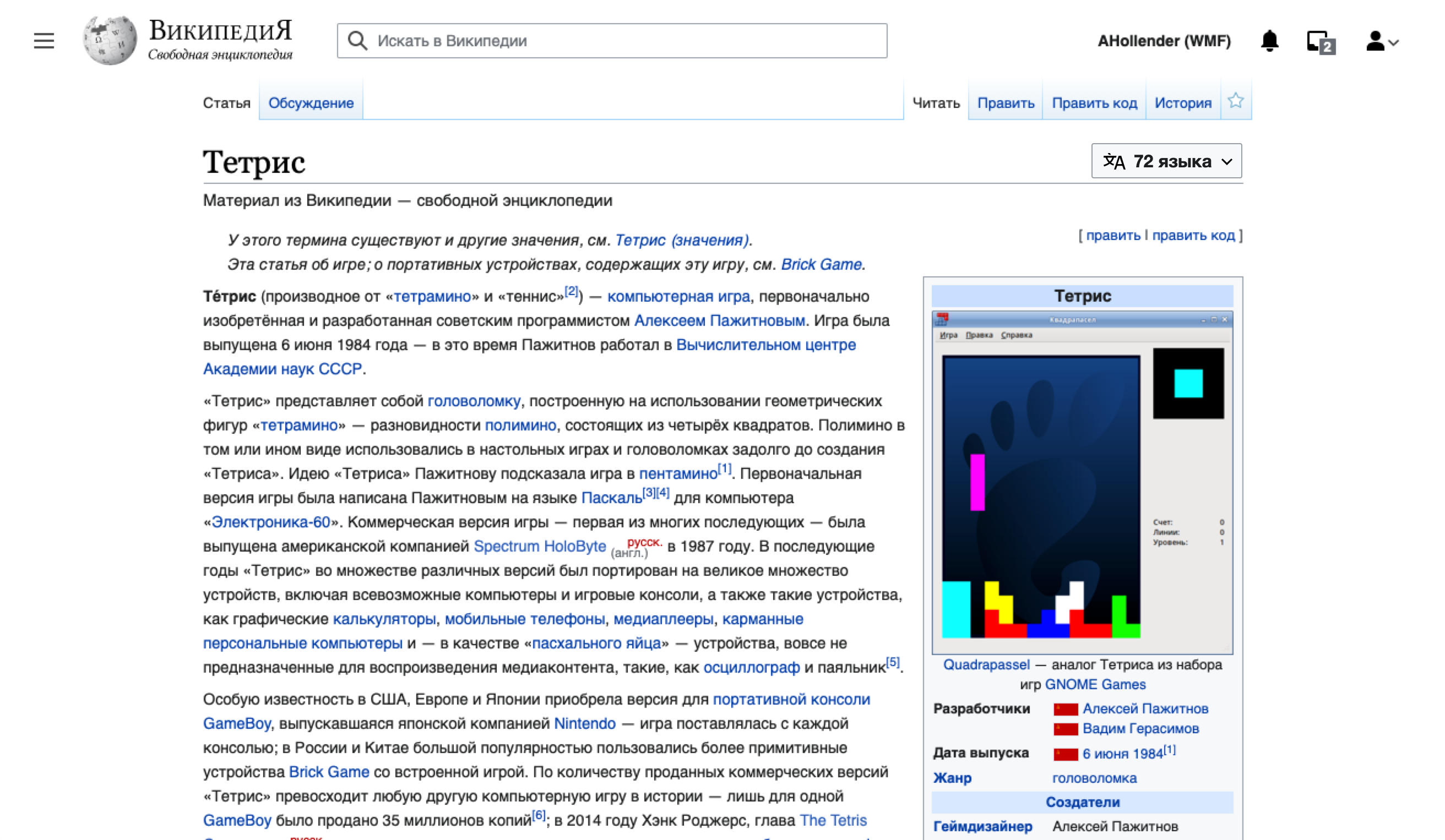
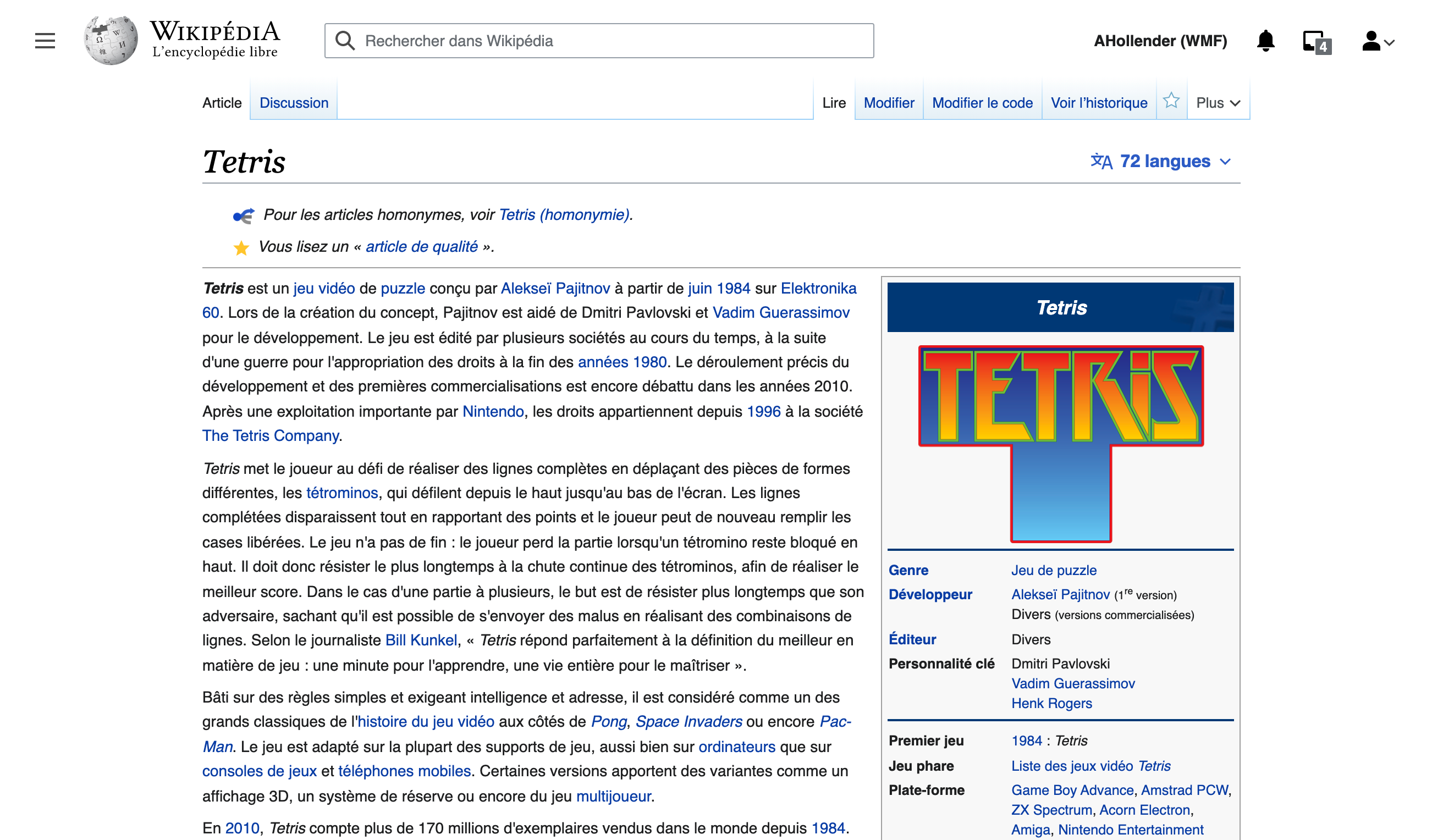
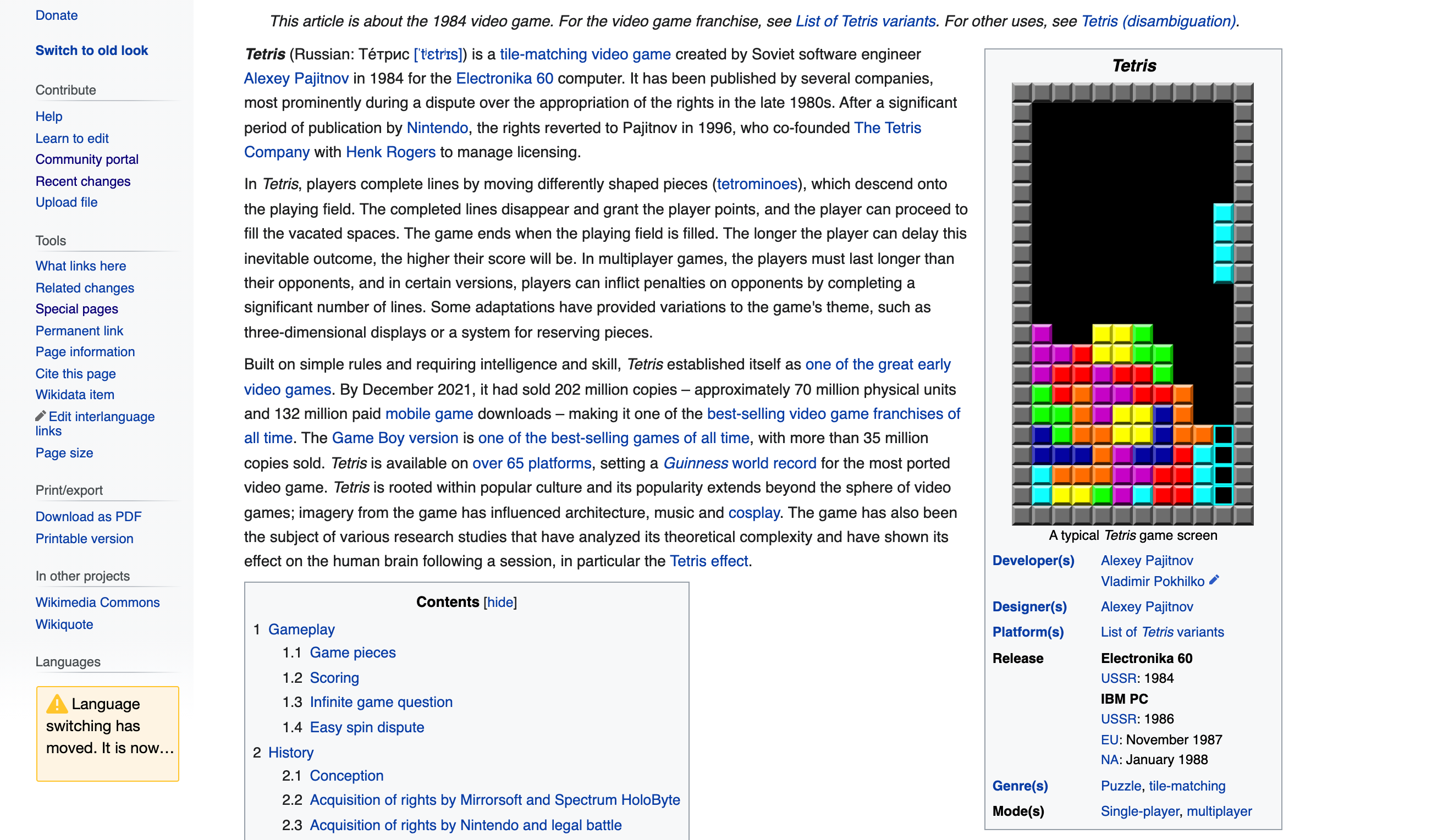
More obvious button

We could add the progressive or normal button styling in order to make it more obvious. Once people have learned the new location of the button we could drop the additional styling.

ProgressiveNormalQuiet progressive
image.png (1×2 px, 745 KB)
image.png (1×2 px, 1 MB)
image.png (1×2 px, 721 KB)
Onboarding/guided tour

image.png (1×3 px, 1 MB)

Breadcrumb from old location

image.png (1×2 px, 854 KB)

Acceptance criteria

  • Change current button styling to quiet progressive button:
    image.png (1×2 px, 721 KB)

Developer notes

  • Agree with early comment that this should be a trivial change to update styles for the language button

Developer notes

  • Should be a relatively trivial change. Update this line to use the mw-ui-progressive class instead of mw-ui-quiet
  • You will also need to update the icons to the inverted variants since the background has now changed.

https://github.com/wikimedia/Vector/blob/5e7dc81e38471b54fee26788e90342bfafd9fb26/includes/SkinVector.php#L650

QA Results - Beta

ACStatusDetails
1T291286#7579286

QA Results - Prod

ACStatusDetails
1T291286#7579314

Related Objects

Event Timeline

There are a very large number of changes, so older changes are hidden. Show Older Changes
ovasileva triaged this task as High priority.

Seems like a trivial change. Do we want to A/B this or just make it and compare before and after?

Seems like a trivial change. Do we want to A/B this or just make it and compare before and after?

We're expecting a large enough change to be able to see the before and after effects. That said, it would be interesting to A/B test in the future on a wiki that has not already seen the new version of the language switcher. Perhaps one of the wikis from T290091: Create logos and prepare new set of pilot wikis for deployment could be appropriate for an A/B test

alexhollender_WMF updated the task description. (Show Details)
alexhollender_WMF added subscribers: Volker_E, RHo.

@ovasileva to clarify the plan for this test (or tests)

@alexhollender - we will begin with a before/after comparison for the new button vs the old version of the button. Currently, this is blocked on receiving the updated data for changes since the first deployment.

@ovasileva I wonder if experimentation on the main page would make sense to include here...do you think it would be possible to include a title+language switcher on the main page of whatever wiki we're going to test the blue language button on, and also collect data on % of language switching from main page vs. article pages?

@alexhollender @ovasileva note about main page, there is a heading on all main pages by default. It's hidden by community members:
If you turn off styles you'll see it: https://en.wikipedia.org/wiki/Main_Page?safemode=1

We could edit the MediaWiki:Common.css page to reveal it on wiki for testing quite easily if that was wanted but that would likely need community buy in.

@sgrabarczuk - perhaps we can reach out to a few of the pilot wikis to see if they're interested in experimenting with the title.

@ovasileva it is okay if I assign you to the analysis? It doesn't look ready for an engineer to look at right now.

@ovasileva it is okay if I assign you to the analysis? It doesn't look ready for an engineer to look at right now.

That sounds good - we're just waiting on some updated data on this one

ovasileva updated the task description. (Show Details)
cjming updated the task description. (Show Details)
cjming subscribed.
Jdlrobson renamed this task from Explore iterations of current language button implementation to Explore iterations of current language button implementation: Make language button progressive.Nov 29 2021, 4:39 PM
Jdlrobson updated the task description. (Show Details)

Change 742997 had a related patch set uploaded (by Bernard Wang; author: Bernard Wang):

[mediawiki/skins/Vector@master] Make ULS in header progressive button

https://gerrit.wikimedia.org/r/742997

bwang removed bwang as the assignee of this task.Dec 1 2021, 7:56 PM
bwang moved this task from Doing to Code Review on the Web-Team-Backlog (Kanbanana-FY-2021-22) board.
bwang subscribed.

Hi all, I've just noticed this task for the first time (no surprise having all the focus and progress on Codex over last couple of weeks).
Late comments therefore: From a design system perspective the quiet progressive button with dropdown seems the preferable choice here.
The primary progressive button would be a wrong treatment as those buttons are aimed to signify the single, primary action in a view.

+1 to this take.

I also support the onboarding/user-education tooltip, and would suggest using the existing GuidedTour extension for this part.

@RHo - I really like the guided tour idea for this! Do you know what the limitations are here? Does it show for every pageview? The main concern is that if we have it on for logged-out users we would like to avoid showing it on every pageview if possible.

@ovasileva GuidedTour uses cookies to keep track of which tours a user has seen. So if a logged-out user sees the tour and isn't using Private Browsing and doesn't switch browsers, they shouldn't see that tour again. Beyond that, when and where a tour is shown is something you have control over.

alexhollender_WMF updated the task description. (Show Details)

I apologize for the back and forth here, we've decided to go with a quiet progressive button. I've updated the task description.

Test wiki created on Patch demo by Jdlrobson using patch(es) linked to this task:

https://patchdemo.wmflabs.org/wikis/a49fe25483/w/

Hi all, I've just noticed this task for the first time (no surprise having all the focus and progress on Codex over last couple of weeks).
Late comments therefore: From a design system perspective the quiet progressive button with dropdown seems the preferable choice here.
The primary progressive button would be a wrong treatment as those buttons are aimed to signify the single, primary action in a view.

+1 to this take.

I also support the onboarding/user-education tooltip, and would suggest using the existing GuidedTour extension for this part.

@RHo - I really like the guided tour idea for this! Do you know what the limitations are here? Does it show for every pageview? The main concern is that if we have it on for logged-out users we would like to avoid showing it on every pageview if possible.

@ovasileva GuidedTour uses cookies to keep track of which tours a user has seen. So if a logged-out user sees the tour and isn't using Private Browsing and doesn't switch browsers, they shouldn't see that tour again. Beyond that, when and where a tour is shown is something you have control over.

Thanks for the info @kostajh, that will work for our use case! I've opened T297368: Add guided tour to improve discoverability of language switching functionality to track the implementation of the guided tour here.

@Jdlrobson - I was discussing the analysis of the impact of these changes yesterday with @alexhollender and we determined that it would be best to be able to look at the impact of this change and the change introduced in T295555: Language switching: put an alert in the sidebar about where the language links are in isolation. Would it be possible to feature flag either/both of these?

Change 742997 merged by jenkins-bot:

[mediawiki/skins/Vector@master] Make ULS in header quiet progressive button

https://gerrit.wikimedia.org/r/742997

@Jdlrobson - I was discussing the analysis of the impact of these changes yesterday with @alexhollender and we determined that it would be best to be able to look at the impact of this change and the change introduced in T295555: Language switching: put an alert in the sidebar about where the language links are in isolation. Would it be possible to feature flag either/both of these?

It's a bit late to add feature flags, but we can delay the merging of T295555 by moving it to blocked if that works.

Edtadros subscribed.

Test Result - Beta

Status: ✅ Pass
Environment: beta
OS: macOS Monterey
Browser: Chrome
Device: MBP
Emulated Device:NA

Test Artifact(s):

QA Steps

✅ AC1: Change language button styling to quiet progressive button as shown in task description

Screen Shot 2021-12-18 at 1.55.16 PM.png (522×857 px, 246 KB)

Test Result - Prod

Status: ✅ Pass
Environment: enwiki
OS: macOS Monterey
Browser: Chrome
Device: MBP
Emulated Device:NA

Test Artifact(s):

QA Steps

✅ AC1: Change language button styling to quiet progressive button as shown in task description

Screen Shot 2021-12-18 at 1.55.16 PM.png (522×857 px, 246 KB)

Test wiki on Patch demo by Jdlrobson using patch(es) linked to this task was deleted:

https://patchdemo.wmflabs.org/wikis/a49fe25483/w/