Page MenuHomePhabricator

Updates to theme bottom sheet
Closed, ResolvedPublic

Assigned To
Authored By
scblr
Dec 6 2021, 5:57 PM
Referenced Files
F34923593: current_behavior.mp4
Jan 19 2022, 8:24 PM
F34923596: option3.mp4
Jan 19 2022, 8:24 PM
F34923594: option2.mp4
Jan 19 2022, 8:24 PM
F34922880: Custom experience 03.png
Jan 19 2022, 9:43 AM
F34922883: Screenshot_20220119-103736.png
Jan 19 2022, 9:43 AM
F34922878: Screenshot_20220119-101257.png
Jan 19 2022, 9:43 AM
F34922893: icon-reading-focus-mode.svg
Jan 19 2022, 9:43 AM
F34922885: Screenshot_20220119-103736 copy.png
Jan 19 2022, 9:43 AM

Description

01020304
Custom experience 01.png (1×720 px, 100 KB)
Custom experience 02.png (1×720 px, 507 KB)
Custom experience 03.png (1×720 px, 92 KB)
Custom experience 04.png (1×720 px, 110 KB)

👉 Please check out the original designs on Figma with the latest updates. The screenshots below might have been updated in the meantime.

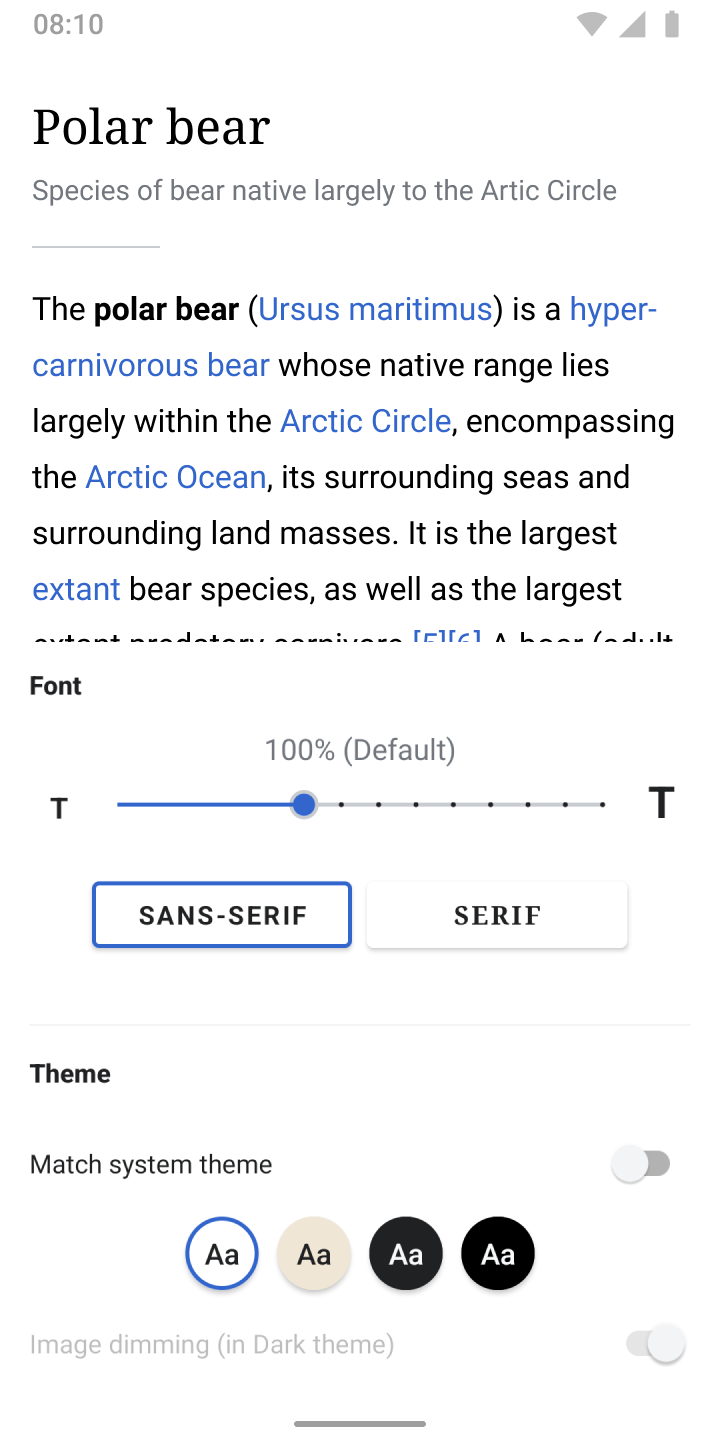
01) This is the current experience
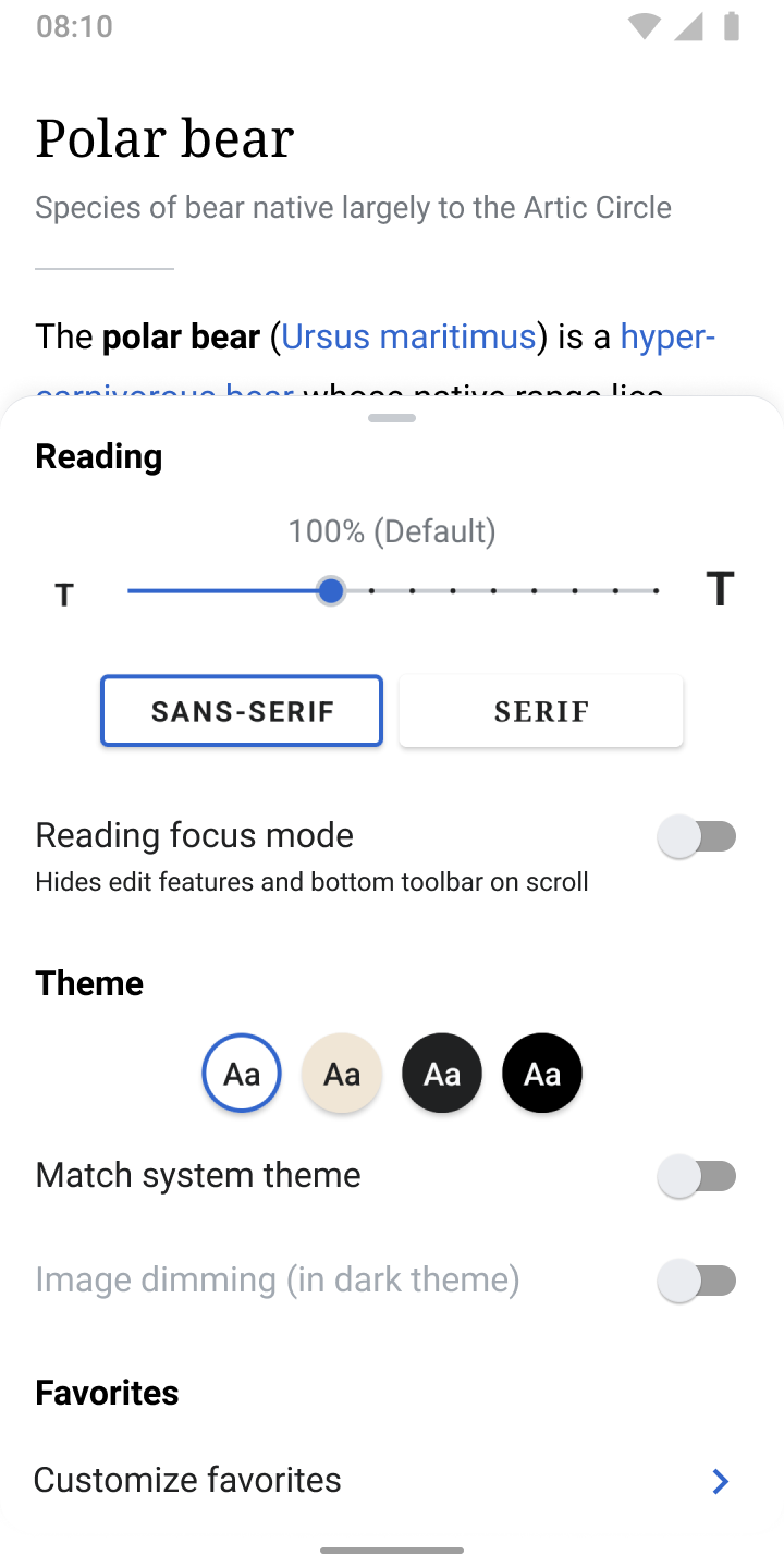
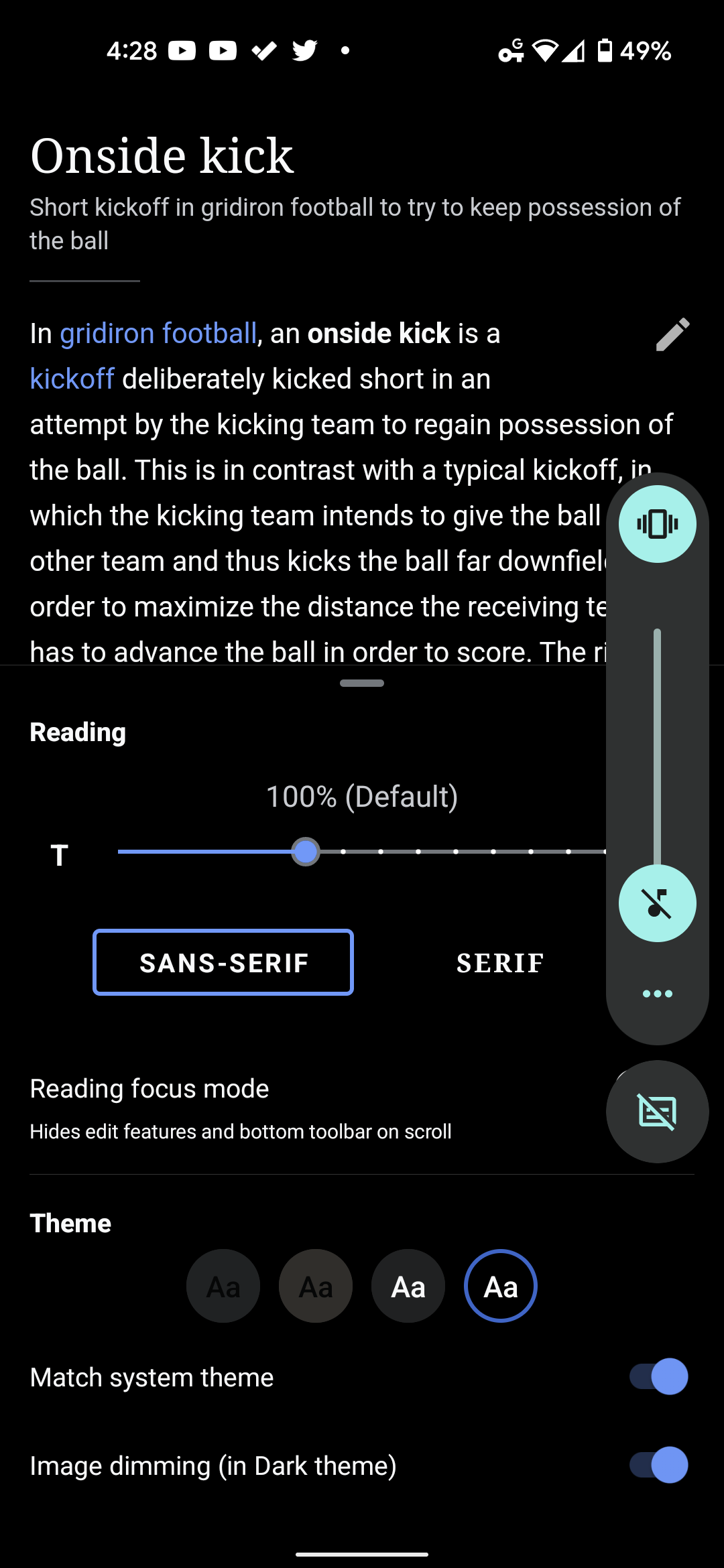
We’re enhancing Theme options with:

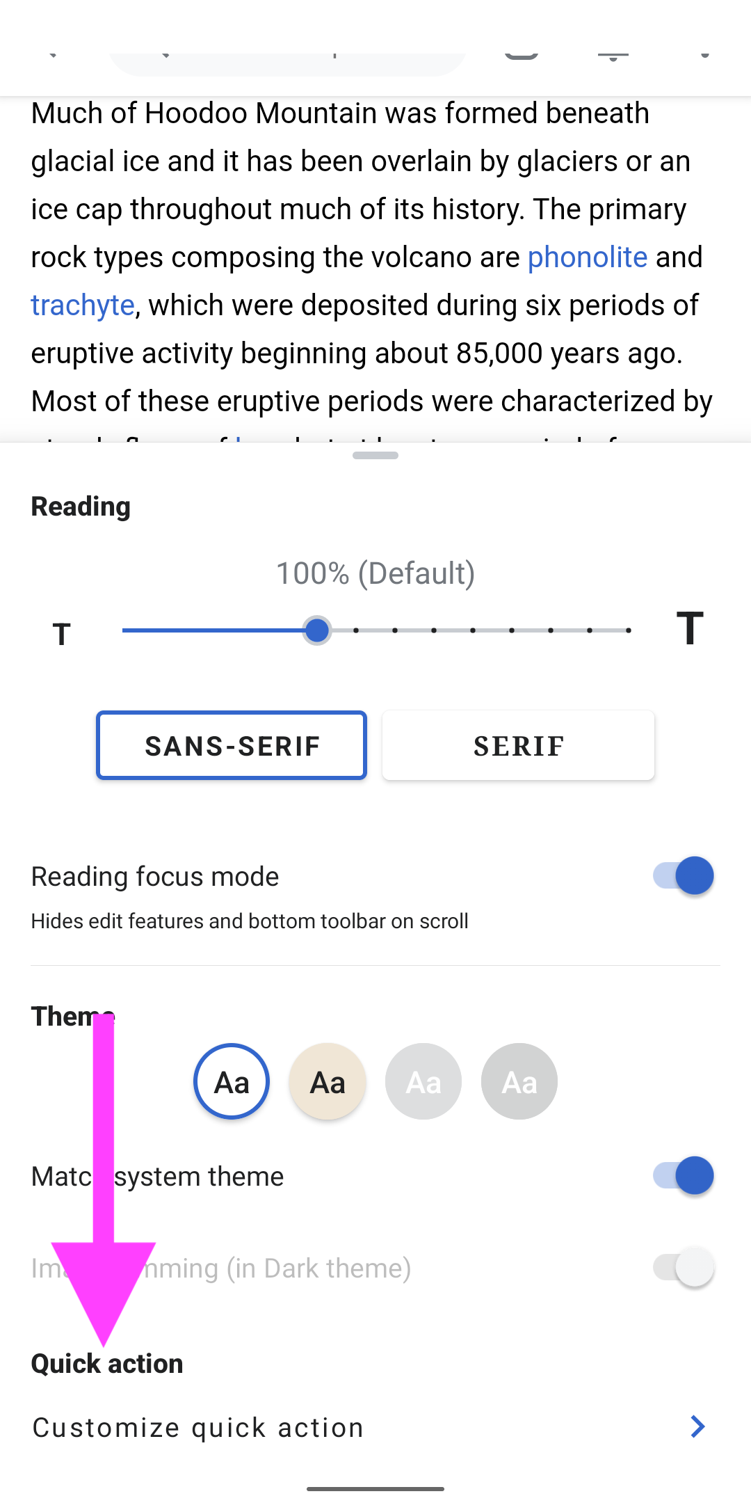
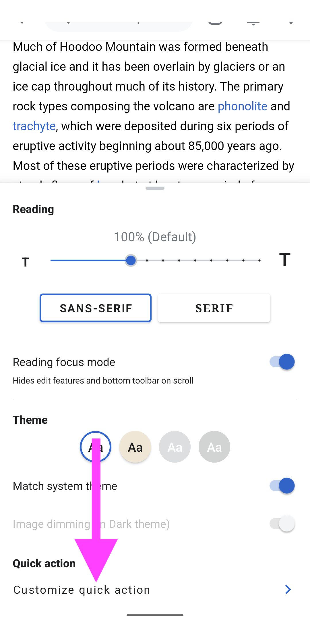
  • Reading focus mode: Hides all functionality related to editing and hides the toolbar on scroll
  • Customize favorites: Lets users choose their favorite toolbar options
  • A draggable bottom sheet: due to more settings in the bottom sheet, we risk that the sheet overlaps the entire article on smaller screens. Previewing manipulations in the article is crucial, a draggable bottom sheet makes sure to not break the existing flows.

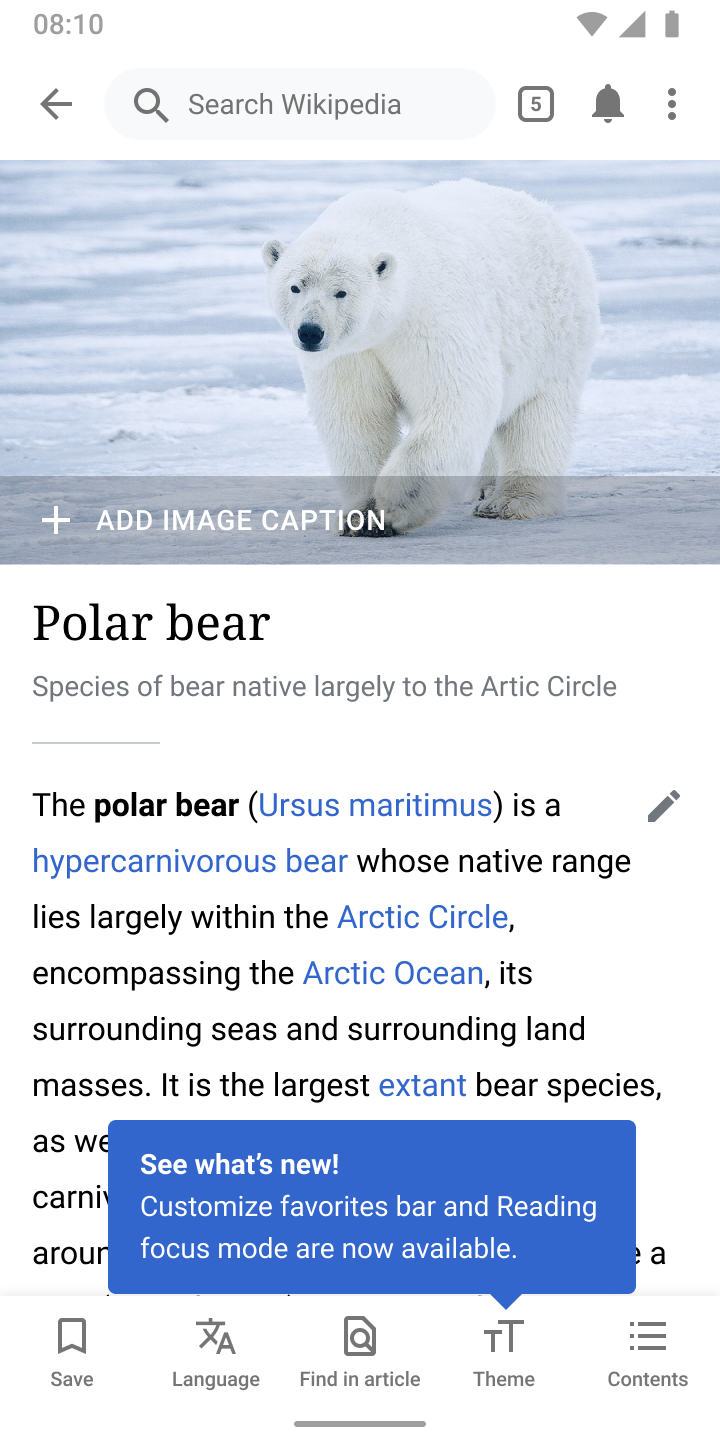
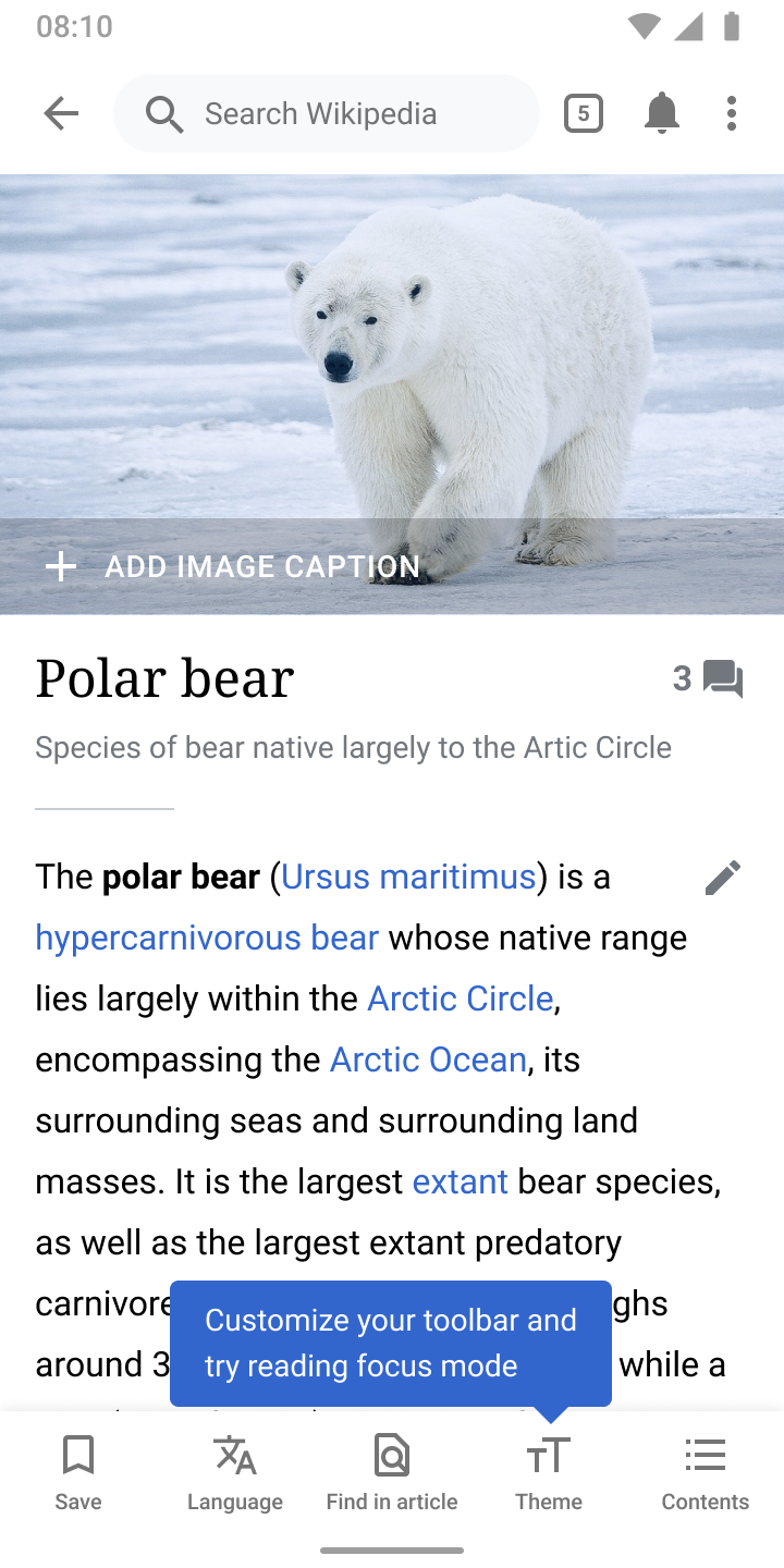
02) A tooltip to onboard new users
This is TBD Behavior. @JTannerWMF will determine this flow later

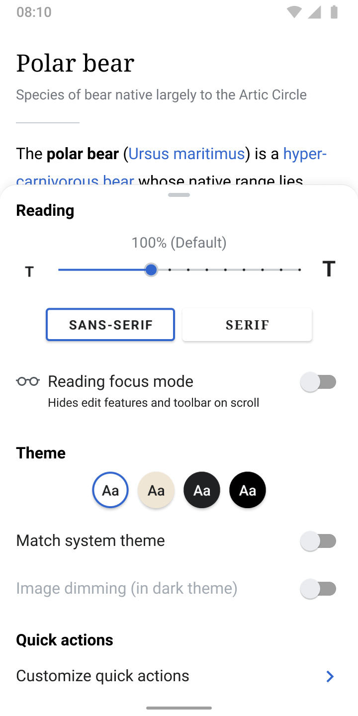
03) Tapping Theme opens the bottom sheet

  • The bottom sheet should take over no more than 2/3 of the vertical screen estate
  • It’s grouped into three categories: Reading, Themeand Favorites

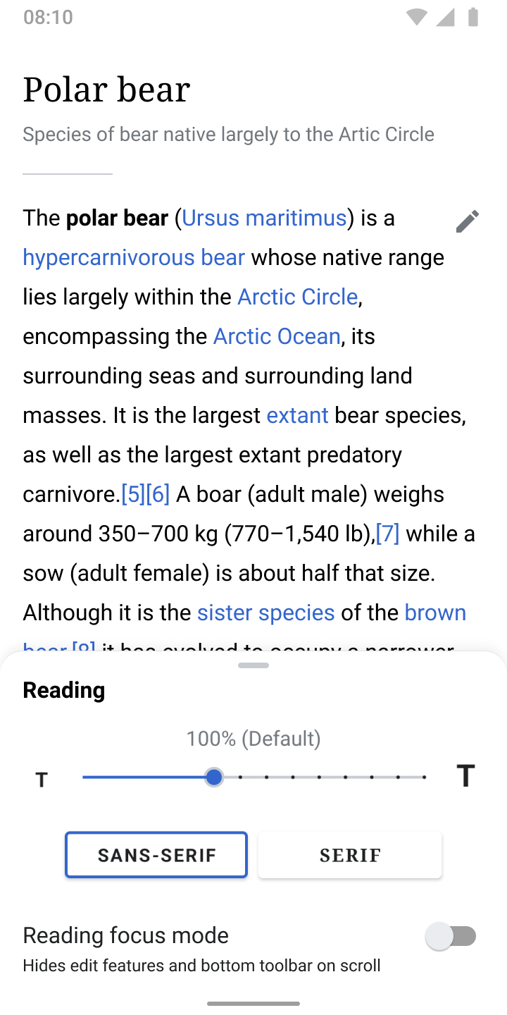
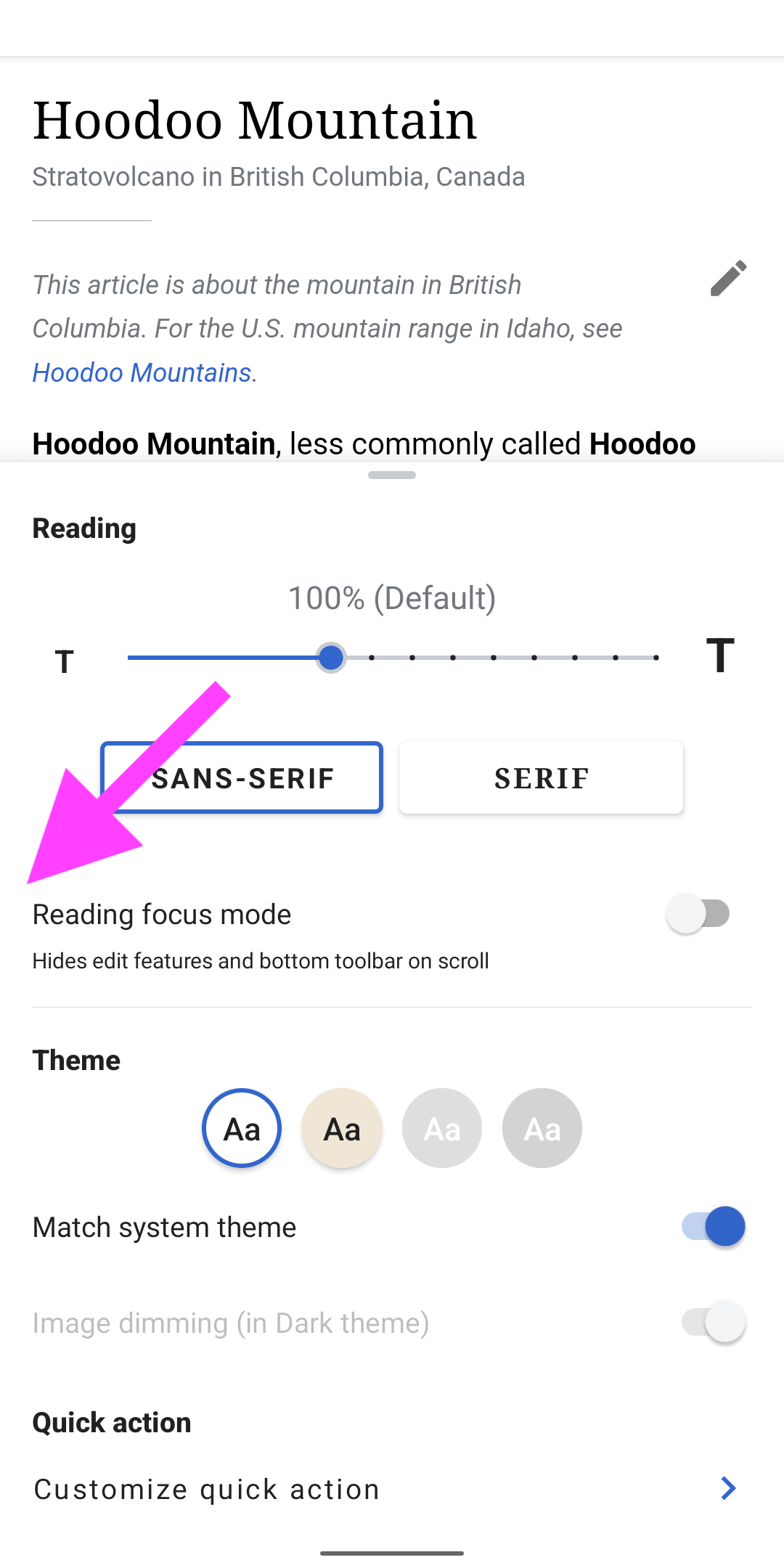
04) Dragging the sheet

  • Dragging the sheet down allows for previewing the settings made by the user.
  • If possible, the sheet should snap to 1/3 of the screen estate (can be discussed according to technical possibilities)

APK: https://github.com/wikimedia/apps-android-wikipedia/pull/3060/checks

Event Timeline

Lets figure out the tool tip later. Right now the default should be reading mode off and toolbar as our default settings. We will do more indepth thinking of onboarding then decide the tooltip at that time

@JTannerWMF

Lets figure out the tool tip later. Right now the default should be reading mode off and toolbar as our default settings. We will do more indepth thinking of onboarding then decide the tooltip at that time

Sounds good to me!

Just to note that certain items from this task are handled as part of T254771:

  • Changing the "Font" heading to "Reading".
  • Adding the "Reading focus mode" checkbox.
  • Adding the grabby shape at the top of the bottom-sheet.

Hi @JTannerWMF @schoenbaechler I implemented the tooltip by detecting behind the scenes where the theme button is. Please take a look at this and let me know your thoughts:
https://youtu.be/jqjMnRvjR7A
The top tooltip is aimed to point at the overflow icon... looks a few pixels off. I will look into fixing it if you feel this solution is ok. You can also use the apk to play around:
https://github.com/wikimedia/apps-android-wikipedia/pull/3060/checks

This works and looks good to me @Sharvaniharan. If you can look into the “few pixels off” aspect, it will be great!

What do you think @JTannerWMF ?

So the tooltip went away for me because it conflicts with watchlist. I saw the watchlist one and then I clicked it away and then the toolbar one came and i accidentally clicked it away before being able to read it, what is the current logic of when we show it?

Also, I am in dark mode and I am not seeing the link for the customizable toolbar?

Screenshot_20220111-162843.png (2×1 px, 239 KB)

Otherwise Reading Mode looks great.

Reviewed in the latest Alpha as of this time stamp

I need the APK for the tooltip, but going by the video, will it always say "See whats new"? I ask because what if a year from now a new user creates an account, it will say "see whats new", technically it is new to that person but maybe not a new feature? Sorry if I'm being too pedantic.

What about "Optimize your experience by customizing your toolbar and trying out Reading Focus Mode" @schoenbaechler

I need the APK for the tooltip,

Same here!

but going by the video, will it always say "See whats new"? I ask because what if a year from now a new user creates an account, it will say "see whats new", technically it is new to that person but maybe not a new feature? Sorry if I'm being too pedantic.

Good point @JTannerWMF, how about something even less wordy, like Customize your toolbar and try reading focus mode (without the 'See what’s new' title) ?

Custom experience 02.png (1×720 px, 509 KB)

Hi @JTannerWMF @schoenbaechler Please review the latest version here: https://github.com/wikimedia/apps-android-wikipedia/pull/3060/checks
I have also made copy changes..

Hi @schoenbaechler
Wanted to discuss this here:
https://phabricator.wikimedia.org/T296753#7625615 #3

03) Currently, users have to scroll down in order to see 'Customize toolbar' (it’s below the fold) . Can we reveal more of the bottom sheet so people see 'Customize toolbar' right away (without having to scroll the sheet)?

I feel it belongs to this task... and I have currently set the height of the bottom sheet to be 2/3 of the screen as mentioned in the task description. So, we can either have that restriction or we can be able to expand all the way to show the customize button without scrolling, but not both.. :-)

Hey @Sharvaniharan, thanks for the work on this so far! Here are a few things to optimize:

01)

Screenshot_20220118-191619.png (2×1 px, 100 KB)

The bottom sheet doesn’t use 2/3 of the screen, it’s more in the area of 1/3. I’d say we should completely show the bottom sheet if the space allows for it. Can you think of a smart logic to achieve this? We had a similar logic for the draggable bottom sheet in the image recommendations project (that @cooltey developed as far as I can remember)

02) Icon for reading focus mode is missing

Implementation | vs | Design

Screenshot_20220119-101257.png (2×1 px, 226 KB)
Custom experience 03.png (1×720 px, 97 KB)

Icon:

03) Change 'Quick action' to 'Toolbar'

Screenshot_20220119-103736.png (2×1 px, 251 KB)

04) Change copy: 'Customize quick action' to 'Customize toolbar'

Screenshot_20220119-103736 copy.png (2×1 px, 250 KB)

05) The font style is off for the label, it uses letter spacing but it shouldn’t. Please use the same style used for the other labels in the sheet.

Screenshot_20220119-103736 copy.png (2×1 px, 250 KB)

Hi @schoenbaechler
Thank you for the review.

I have fixed 02) through 05)

For 01),

Currently I am setting the peekHeight, which is the initial height that the bottom sheet "peeks out" at, to be 1/3 the screen height. Incidentally, this also is the same height at which the bottom sheet snaps back to, when lowered. That is how the bottomsheet is engineered internally. So if you want the bottomSheet to snap back at 1/3 the screenHeight, we will need to set the initial peekHeight to 1/3. The second parameter we can set is to restrict how far the bottomSheet can be expanded/dragged, which I have set to 2/3 the screen height. So if we have content more than that, the bottom sheet height will snap at the top to 2/3 and the remaining content will have to scroll.

So current behavior is, open 1/3, expand to 2/3 and snap back at 1/3 when lowered:

Option#2 is to only set the 1/3 peekHeight, which means it will open at 1/3, and I have set no restriction on expansion, which means it can be expanded to screenSize, and when lowered, snaps back to 1/3 [ Which is what we have on image captions.]:

Option#3 is to set the peekHeight to screenSize, which means the bottom sheet will fully open to screenSize, but when we lower it, it cannot snap at 1/3, and will just disappear. Like this:

What we cannot do : Open at full screen size, but snap back to 1/3

Please let me know which one you prefer.

@Sharvaniharan

02) to 05) are all still unchanged for me?


For 01)

Can we do this:

If the sheet does not cover the entire article in the background (which is important to preview theme changes):
Open and expand at 2/3 without snapping
Else
Open and expand at 1/3 without snapping (to make sure users can preview the changes they make on smaller devices)

@schoenbaechler the 0.75 * screenHeight worked perfectly! Please re-install, take a look again and lmk what you feel :)

@Sharvaniharan the height is perfect now. Also the other issues are fixed. Thanks for being open to experimentation! 👩‍🚀 Moving this to Code review.