Page MenuHomePhabricator

Implement Customizable Toolbar and update PageActivity
Closed, ResolvedPublic

Description

User Story
When reading Wikipedia in English and editing in Hindi, I want to customize my bottom toolbar to optimize for the workflows of my current experience.

The Task
Implement the screens below (T296087)

Custom experience 07.png (1×720 px, 64 KB)
Custom experience 09.png (1×720 px, 256 KB)

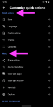
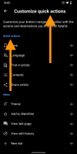
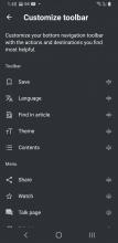
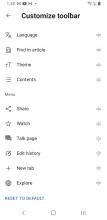
05) Tapping customize quick actions in the bottom view leads to this view.

  • This is the default view for all users. It’s important to not break the experience of existing users. By offering a way to customize the toolbar we are targeting all users.
  • Dragging and dropping elements from the lower area (Menu) to the top area (Quick actions) adapts the link in the bottom toolbar.
  • The number of quick actions is not variable, there will be always 5 items.
  • List items are only draggable when touching on the drag icon, and the behavior should be aligned with the behavior as customize Explore feed.
  • Use a shorter version of texts for bottom toolbar.

APK: https://github.com/wikimedia/apps-android-wikipedia/pull/3022/checks

Event Timeline

JTannerWMF triaged this task as Medium priority.Nov 30 2021, 3:59 PM
JTannerWMF created this task.
JTannerWMF updated the task description. (Show Details)

To be very clear: Navigation to this screen may change, but the idea of using some screen to customize the toolbar will not. We can create the customizable toolbar and this placeholder screen to change the buttons now.

cooltey updated the task description. (Show Details)

@schoenbaechler The APK is available to review, please download the APK in the task description, thanks!

@cooltey, what can I say — this is perfect! It feels super natural to use... 😍

I guess this APK is about the interaction, as it doesn’t update menu and toolbar options yet (on my device). More details to be found in T296087:

  • Actual overflow menu and quick actions don’t change yet when moving things around
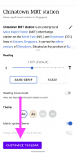
  • Button to access it via 'Theme' isn’t styled yet
  • Some copy updates are missing, see Figma (source of truth)
  • Minor: use letter spacing from buttons for the 'Reset to default' action at the bottom
cooltey renamed this task from Create Customizable Toolbar to Implement Customizable Toolbar and update PageActivity.Dec 15 2021, 5:28 PM
cooltey updated the task description. (Show Details)

Wow thanks for doing this @cooltey , I need to spend some time playing with it but one thing I am certain about is maintaining the original scope that I put in the task about having 5 things in quick actions at all time.

We haven't explored what does it mean for users to not access quick actions at all. We also haven't sorted out if its better for it to be centered, right aligned or left. In a future iteration we can explore an empty state but for now lets please stick with the original product decision of not making the number of quick actions variable.

scblr updated the task description. (Show Details)

Hi @schoenbaechler
The APK is ready for review.

Screenshot_20211217-123454_Wikipedia Dev.jpg (2×1 px, 774 KB)

One this may need your attention: some texts are too long and it will show as multiple lines. We may need to create a shorter version of the text for Quick actions tabs. (the same thing applies to Menu, which may need a longer version of the text.

This is great @cooltey , the purple button will become like the original design I imagine?

When I first used the tool I thought if I dragged the name it would move it but then I discovered I have to drag the actual icon to the far right of the name of each quick action. Is this deliberate? Is it problematic to drag and drop from the name of the quick action and the far right icon that indicates it can be moved?

@schoenbaechler do you think maybe the "Reset to Default" should look a bit different? In dark mode it looks like another title instead of a button to click?

Also, @schoenbaechler, check out the following steps:

-Go to the polar bear article 
- Move theme from your bottom toolbar
- Go to whatever the mainpage is for that day
- Try to access themes in the overflow menu

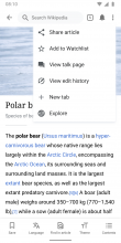
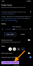
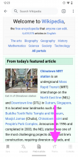
What you will find is that themes isn't in the overflow menu because it is disabled. During our normal design where themes is in the toolbar, when you go to mainpage, it is greyed out to indicate you can't access that action on that page. However, here it just disappears, we should talk about if this is ok or if we should do something about it.

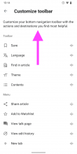
Finally, @cooltey can we update the language "Customize your bottom toolbar links to your favorite Wikipedia actions and destinations." to read "Customize your bottom navigation toolbar with the actions and destinations you find most helpful."

@schoenbaechler : I wonder if we should have the link in the bottom sheet read: Customize Toolbar (instead of favorites), where it says "Customize quick actions" we should write "Customize Toolbar", and where it says quick actions we should write "Toolbar" or "Navigation Toolbar" or "Bottom Toolbar". I say this because it isn't consistent right now.

This is great @cooltey , the purple button will become like the original design I imagine?

The purple button was for testing only, the actual implementation is T297134.

When I first used the tool I thought if I dragged the name it would move it but then I discovered I have to drag the actual icon to the far right of the name of each quick action. Is this deliberate? Is it problematic to drag and drop from the name of the quick action and the far right icon that indicates it can be moved?

This is the same behavior like the one in Explore feed setting, in which you'll need to drag the icon to drag the whole item.

Finally, @cooltey can we update the language "Customize your bottom toolbar links to your favorite Wikipedia actions and destinations." to read "Customize your bottom navigation toolbar with the actions and destinations you find most helpful."

Yes I can do it!

Thanks both! Replies below 👇


01)

@schoenbaechler do you think maybe the "Reset to Default" should look a bit different? In dark mode it looks like another title instead of a button to click?

@JTannerWMF The issue here is that the section titles use accent50, which is reserved for links only:

Screenshot_20220114-122030.png (2×1 px, 152 KB)

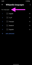
Since the title uses the link color, the RESET TO DEFAULT button is de-emphasized and perceived as another section title. We’re doing this already within languages, so I suggest that @cooltey applies the same style to Quick actions and Menu:

Screenshot_20220114-122912.png (2×1 px, 107 KB)

→ This feedback is emphasized by the design team, namely @bmartinezcalvo @cmadeo @Volker_E


02)

This is great @cooltey , the purple button will become like the original design I imagine?

The purple button was for testing only, the actual implementation is T297134.

👍


03)

When I first used the tool I thought if I dragged the name it would move it but then I discovered I have to drag the actual icon to the far right of the name of each quick action. Is this deliberate? Is it problematic to drag and drop from the name of the quick action and the far right icon that indicates it can be moved?

This is the same behavior like the one in Explore feed setting, in which you'll need to drag the icon to drag the whole item.

@JTannerWMF has a point here. I also suggest to change the behavior so the entire list item is draggable. Btw. in the Customize the feed view, *it is possible to drag the entire item*, not only the icon itself.

Screenshot_20220114-122610.png (2×1 px, 136 KB)


04)

Finally, @cooltey can we update the language "Customize your bottom toolbar links to your favorite Wikipedia actions and destinations." to read "Customize your bottom navigation toolbar with the actions and destinations you find most helpful."

Yes I can do it!

👍


05)

Also, @schoenbaechler, check out the following steps:

-Go to the polar bear article 
- Move theme from your bottom toolbar
- Go to whatever the mainpage is for that day
- Try to access themes in the overflow menu

What you will find is that themes isn't in the overflow menu because it is disabled. During our normal design where themes is in the toolbar, when you go to mainpage, it is greyed out to indicate you can't access that action on that page. However, here it just disappears, we should talk about if this is ok or if we should do something about it.

@JTannerWMF you’re getting into UX master territory here, nice! 👏I completely agree, we should make sure the overflow menu and bottom toolbar are exactly the same as in the article view. If the feature is not available (e.g. Theme, we need to grey it out).


06)

@schoenbaechler : I wonder if we should have the link in the bottom sheet read: Customize Toolbar (instead of favorites), where it says "Customize quick actions" we should write "Customize Toolbar", and where it says quick actions we should write "Toolbar" or "Navigation Toolbar" or "Bottom Toolbar". I say this because it isn't consistent right now.

Sounds good @JTannerWMF. @cooltey can you make the following two changes then:

A) Change to Customize toolbar

Screenshot_20220114-124036.png (2×1 px, 252 KB)

B) Change to Customize toolbar and Toolbar

Screenshot_20220114-124240.png (2×1 px, 166 KB)

Hi @schoenbaechler

All done and the APK with updated changes is ready for download.

In T296753#7622157, @schoenbaechler wrote:

Thanks both! Replies below 👇

Since the title uses the link color, the RESET TO DEFAULT button is de-emphasized and perceived as another section title. We’re doing this already within languages, so I suggest that @cooltey applies the same style to Quick actions and Menu:

Screenshot_20220114-122912.png (2×1 px, 107 KB)

→ This feedback is emphasized by the design team, namely @bmartinezcalvo @cmadeo @Volker_E

@schoenbaechler's proposal looks harmonious and great to me!

Since the title uses the link color, the RESET TO DEFAULT button is de-emphasized and perceived as another section title. We’re doing this already within languages, so I suggest that @cooltey applies the same style to Quick actions and Menu:

Screenshot_20220114-122912.png (2×1 px, 107 KB)

→ This feedback is emphasized by the design team, namely @bmartinezcalvo @cmadeo @Volker_E

@schoenbaechler I was reviewing your proposal (which seems great and harmonious to me too) and I was thinking that also the numbers should be gray like the title "Your languages". I would try to use the blue for link items only.

Thanks @Volker_E and @bmartinezcalvo for the replies! 🙌

I was thinking that also the numbers should be gray like the title "Your languages". I would try to use the blue for link items only.

I like that too @bmartinezcalvo@cooltey can you change the numbers on the left too from color_group_3 to color_group_30 as well? Thanks!

@cooltey

All done and the APK with updated changes is ready for download.

Thanks for all the changes, four more questions / issues 👇


01) When dragging and dropping items from 'Menu' to 'Toolbar' (or vice versa), the menu label flickers (it disappears quickly):

~~https://www.dropbox.com/s/1ruc4vobf2uf82m/screen-20220117-122026.mp4?dl=0~~

Can this be optimized?

We’ll leave it for now. Would not be an issue anymore with the changes in T297821.


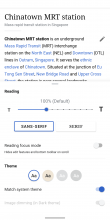
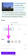
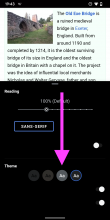
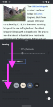
02) When opening a new tab, 'Theme' options are greyed out — would it be possible to still allow users to customize their toolbar from here? Namely, allow people to tap 'Theme' in the toolbar and 'Customize toolbar' but grey out other options that are not available when a new tab’s been opened?

Screenshot_20220117-122307.png (2×1 px, 618 KB)
Screenshot_20220117-122340.png (2×1 px, 246 KB)

(also: dreaming of a main page in 4 different themes someday) ✨


03) Currently, users have to scroll down in order to see 'Customize toolbar' (it’s below the fold) . Can we reveal more of the bottom sheet so people see 'Customize toolbar' right away (without having to scroll the sheet)?

Screenshot_20220117-123024.png (2×1 px, 208 KB)
Screenshot_20220117-122340.png (2×1 px, 246 KB)

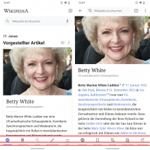
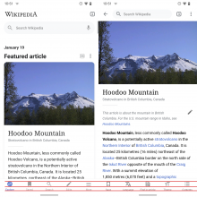
04) I noticed that the labels in the main navigation 'Explore' and the 'Article' toolbar use different spacing. Can you adjust the labels in the article to use the same spacing as on 'Explore'? Thanks!

Artboard.png (1×1 px, 1 MB)

Hi @schoenbaechler

In T296753#7625615, @schoenbaechler wrote:

02) When opening a new tab, 'Theme' options are greyed out — would it be possible to still allow users to customize their toolbar from here? Namely, allow people to tap 'Theme' in the toolbar and 'Customize toolbar' but grey out other options that are not available when a new tab’s been opened?

Screenshot_20220117-122307.png (2×1 px, 618 KB)
Screenshot_20220117-122340.png (2×1 px, 246 KB)

(also: dreaming of a main page in 4 different themes someday) ✨


Done

03) Currently, users have to scroll down in order to see 'Customize toolbar' (it’s below the fold) . Can we reveal more of the bottom sheet so people see 'Customize toolbar' right away (without having to scroll the sheet)?

Screenshot_20220117-123024.png (2×1 px, 208 KB)
Screenshot_20220117-122340.png (2×1 px, 246 KB)

I have discussed this with @Sharvaniharan, and she will be working on this in T297134.

04) I noticed that the labels in the main navigation 'Explore' and the 'Article' toolbar use different spacing. Can you adjust the labels in the article to use the same spacing as on 'Explore'? Thanks!

Artboard.png (1×1 px, 1 MB)

Done.

Please download the APK from the link in the ticket description.

@JTannerWMF

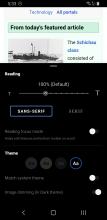
Screenshot_20220119-101448.png (2×1 px, 154 KB)

I’m a bit late to the copywriting party, but I think we should enhance the copy with the amount of actions or destinations (five) users can add to the toolbar so it’s more clear.

Old:

Customize your bottom navigation toolbar with the actions and destinations you find most helpful.

New:

Customize your bottom navigation toolbar with five actions and destinations you find most helpful.

What do you think?

Thanks @cooltey

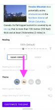
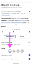
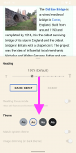
01) Seems like Sepia theme is still displayed as active in 'New tab' 👇

Screenshot_20220119-104712 copy.png (2×1 px, 399 KB)

02) Also the light theme selection’s got an odd active state in 'New tab' ?

Screenshot_20220119-104712.png (2×1 px, 400 KB)

This is how it usually looks in articles:

Screenshot_20220119-104847.png (2×1 px, 245 KB)

03) Alignment is way better but there’s a 1px difference (the label sits a bit lower in the article page)

Artboard Copy.png (1×1 px, 1 MB)

(please don’t kill me for 🙈😅)

In T296753#7631473, @schoenbaechler wrote:

Thanks @cooltey

01) Seems like Sepia theme is still displayed as active in 'New tab' 👇

Done!

02) Also the light theme selection’s got an odd active state in 'New tab' ?

Done

03) Alignment is way better but there’s a 1px difference (the label sits a bit lower in the article page)

(please don’t kill me for 🙈😅)

😅 Done!

Please download the APK to see the changes.

@cooltey

In T296753#7631473, @schoenbaechler wrote:

Thanks @cooltey

01) Seems like Sepia theme is still displayed as active in 'New tab' 👇

Done!

02) Also the light theme selection’s got an odd active state in 'New tab' ?

Done

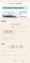
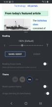
Seems like this is also the case when accessing it in Sepia, Dark and Black theme:

Screenshot_20220120-194531.png (2×1 px, 462 KB)
Screenshot_20220120-194302.png (2×1 px, 433 KB)
Screenshot_20220120-194622.png (2×1 px, 459 KB)

Also, there’s some strange things going on with the labels (e.g. Reading focus mode) in the 'New tab' page? It’s using black color. Can this be updated as well?

03) Alignment is way better but there’s a 1px difference (the label sits a bit lower in the article page)

😅 Done!

Looks good to me now! 🎯

Hi @schoenbaechler

Seems like this is also the case when accessing it in Sepia, Dark and Black theme:

Done. Here are the screenshots from my devices, not sure why it didn't apply on your device 🤔

Screenshot_20220120-173426_Wikipedia Dev.jpg (2×1 px, 300 KB)
Screenshot_20220120-173448_Wikipedia Dev.jpg (2×1 px, 293 KB)
Screenshot_20220120-173358_Wikipedia Dev.jpg (2×1 px, 307 KB)

Please download the APK again and let me know if you see something different on your device, thank you!

Hi @schoenbaechler and @JTannerWMF

Per code review comments from @Dbrant, here are two things that need discussion:
https://github.com/wikimedia/apps-android-wikipedia/pull/3022#pullrequestreview-863787636

  1. The current build enables the whole list item draggable, but it will also make the list slightly difficult to be scrolled up and down (you'll need to touch the edge of the list to scroll). Our suggestion is to make it consistent with the language list screen, which only allows dragging the item if touch on the drag icon.
  1. Some items have longer text, such as "View edit history" or "Find in article". Would it be possible to provide a short version of the text for each item so that we can show them in the bottom toolbar?

note: @schoenbaechler will look into updating the icon color in dark mode

hey @cooltey — just checked the designs re: this 👇

In T296753#7657034, @schoenbaechler wrote:

note: @schoenbaechler will look into updating the icon color in dark mode

Are we using color_group_13 for these icons currently?

Custom_experience_07.png (1×720 px, 94 KB)

If yes, I think they should be visible in dark mode as well? It’s a helper element. If you think they don’t have enough contrast from an accessibility standpoint, we can change it to color_group_11 — ok?

@cooltey re: shortening text strings — could we update the following strings per discussion with @JTannerWMF 👇

Add to Watchlist → Watch
View talk page → Talk page
View edit history → Edit history
Share article → Share

Hi @schoenbaechler

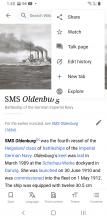
Done. Not sure if you need to update the text generally or separately. Now it will show the shorten version of texts on both bottom toolbar and overflow menu.

Screenshot_20220201-134026_Wikipedia Dev.jpg (2×1 px, 688 KB)
Screenshot_20220201-134037_Wikipedia Dev.jpg (2×1 px, 193 KB)
Screenshot_20220201-134019_Wikipedia Dev.jpg (2×1 px, 159 KB)

Per discussion on Slack, changing the labels both for toolbar and overflow menu is the way to go. So this is perfect @cooltey, thanks.