Page MenuHomePhabricator

[Style guide] Color usage guidelines and Figma library
Closed, ResolvedPublic

Description

What are we doing?

We would like to define all of the colors used in the app (on all reading themes) as well as identify where we might need new colors. We will also complete an accessibility audit of current designs with recommendations for improvements. Finally we will create guidelines for when colors should be used.

Figma file

https://www.figma.com/file/bgDCK2F4Km6nJvgKzDyl5J/iOS-Component-Audit?node-id=682%3A40112

Proposed designs

image.png (6×2 px, 640 KB)

Color name changes

HexColor nameOld name
#000blackbase0
#101418gray800darkBase05
#202122gray700base10
#27292Dgray675darkBase10
#2E3136gray650darkBase20
#54595Dgray600base20
#72777Dgray500base30
#A2A9B1gray400base50
#C8CCD1gray300base70
#EAECF0gray200base80
#F8F9FAgray100base90
#fffwhitewhite
#2A4B8Dblue700accent30 or blue30
#3366CCblue600accent50 or blue50
#6699FFblue300accent70 or blue70
#EAF3FFblue100accent90 or blue90
#B32424red700red30
#DD3333red600red50
#FEE7E6red100red90
#00AF89green600green50
#D5FDF4green100green90
#FFCC33yellow600yellow50
#E1DAD1beige400sepiaBase85
#F0E6D6beige300sepiaBase90
#F8F1E3beige100sepiaBase100
#646059taupe600sepiaGray40
#CBC8C1taupe200sepiaGray80
#6b4ba1purplepurple50
#FF9500orangeorange50
#EEF2FBgray150paleNavy
#8E8E93gray450darkSearchFieldBackground

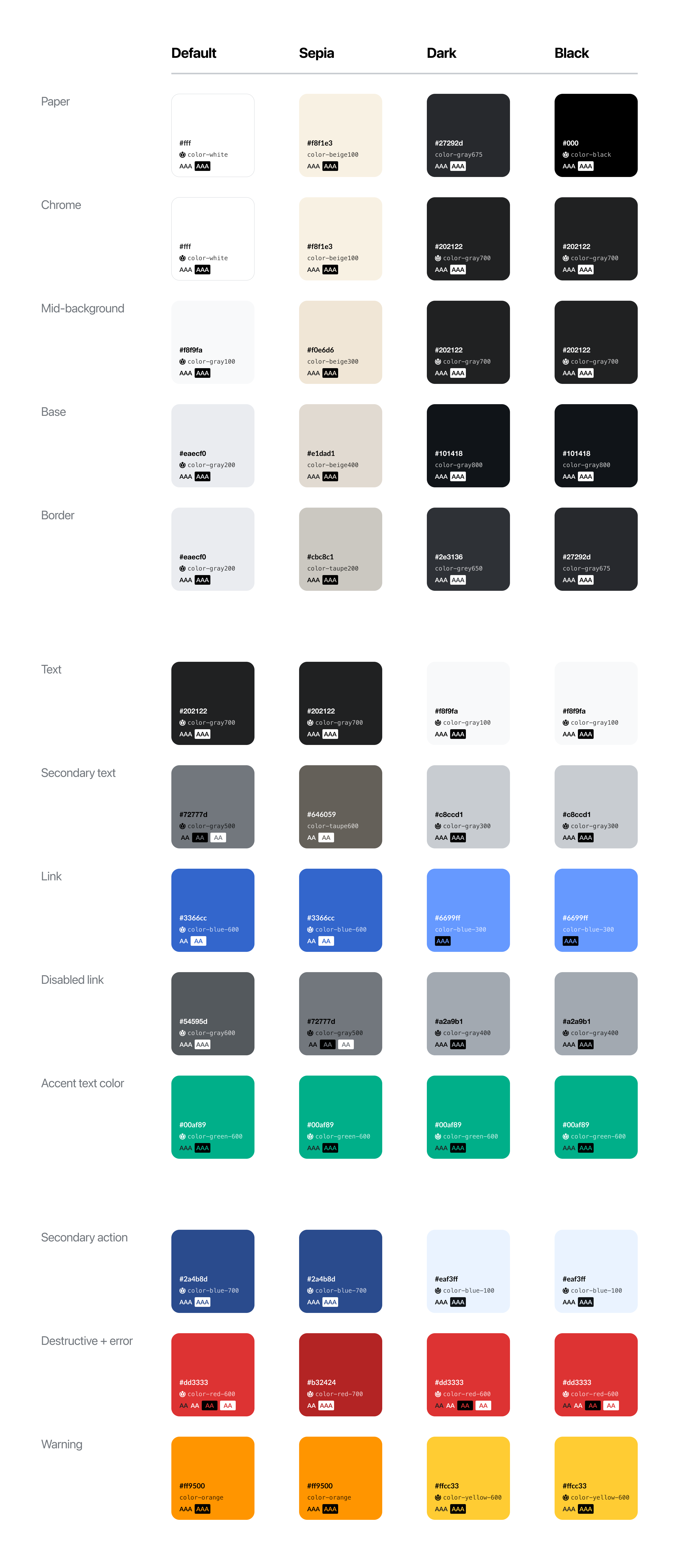
Color changes by theme

Default
  • DiffStrikeThrough changed to #202122 / color-gray700
  • Disabled link changed to #54595d / color-gray600
  • Tertiary text and disabled text changed to #72777d / color-gray500
  • Diff context item background changed to #eaecf0
  • Card border, Card button background, Diff context item background, Diff move paragraph background changed to #f8f9fa / color-gray100
Sepia
  • Disabled link text changed to #72777d / color-gray500
  • diffCompareChangeHeading changed to #f8f1e3 / color-beige100
  • Border, Diff context item border changed to #cbc8c1 / color-taupe200
Dark
  • Base, Popover background abd Shadows change to #101418 / color-gray800
  • Mid-background and Chrome change to #202122 / color-gray700
  • Paper changes to #27292d / color-gray675
  • Border, card button background, diff move paragraph background change to #2e3136 / color-grey650
  • Disabled link text changes to #a2a9b1 / color-gray400
  • Secondary action changes to #eaf3ff / color-blue-100
  • Destructive, error, diff text delete, diff text strike through change to #dd3333 / color-red600
Black
  • Border and card button background change to #27292d / color-gray675
  • Disabled link text changes to #a2a9b1 / color-gray400
  • Secondary action changes to #eaf3ff / color-blue-100
  • Destructive, error, diff text delete, diff text strike through change to #dd3333 / color-red600

Event Timeline

@Tsevener or @Dmantena would you mind helping me track down where some of the elements from this page show up in the app? or do you know a way I can investigate myself? Thanks for your help!

  • popoverBackground
  • animationBackground
  • tertiaryText
  • cardBackground
  • selectedCardBackground
  • blurEffectStyle
  • distanceBorder
  • descriptionBackground
  • inputAccessoryBackground
  • inputAccessoryButtonTint
  • depthMarker
  • overlayText

EDIT: also curious about secondaryAction

@cmadeo The most straightforward way would be to use project search, either in Xcode or just on the web with Github. Generally, searching for one of these theme attributes surfaces the file name and UI element it's used within, so it should be fairly clear how it's being used in the app but if a particular one isn't clear let us know.

On Github:

With Xcode:

  • Open the project in Xcode
  • In the Xcode menu bar, tap Find > Find in Project
  • Enter the theme element name in the selected search box, and in the sidebar all the uses of it will be displayed. Tap one you're interested in.
  • You can even change the color here (to say UIColor.red if it's a Swift file or [UIColor redColor] if it's an Objective-C file) and run it in the Simulator if it's not entirely clear by name what it's being used for.

Hope this helps.

ElementScreenshots
popoverBackground
simulator_screenshot_2B1F751F-23E8-4756-87B5-72707F39C1EB.png (1×828 px, 241 KB)
Simulator Screen Shot - iPhone 11 - 2022-05-10 at 16.30.59.png (1×828 px, 281 KB)
animationBackgroundCould not locate
tertiaryText
Simulator Screen Shot - iPhone 11 - 2022-05-10 at 16.56.29.png (1×828 px, 780 KB)
cardBackground
Simulator Screen Shot - iPhone 11 - 2022-05-10 at 17.03.46.png (1×828 px, 248 KB)
selectedCardBackgroundColor when card animates after click from feed
blurEffectStyleCould not locate
distanceBorder
Simulator Screen Shot - iPhone 11 - 2022-05-10 at 17.11.31.png (1×828 px, 353 KB)
descriptionBackgroundCould not locate (looked in article description feature + onboarding)
inputAccessoryBackgroundCould not locate
inputAccessoryButtonTintCould not locate
depthMarker
simulator_screenshot_F11E9DF2-4149-4FF6-BE91-1203F6963875.png (1×828 px, 150 KB)
overlayTextIn the widgets
secondaryAction
LGoto removed cmadeo as the assignee of this task.Jul 7 2022, 7:16 PM

Hi @cmadeo! Thanks for breaking this down into a list of colors and placements that need to be changed, that's very helpful! We had a question from engineering sync. I was hoping we'd be able to delete some colors that we no longer need - are the colors listed here under changes and the "Proposed designs" screenshot considered an exhaustive list? We just wanted to make sure we were referencing the correct thing before attempting to delete colors in Theme.swift.

cmadeo updated the task description. (Show Details)

Talk page engineering work needing updates after this work is implemented:

  • Coffee roll container background color
  • Talk page view background color

Currently, they are using special case values.

Hi @cmadeo! Thanks for breaking this down into a list of colors and placements that need to be changed, that's very helpful! We had a question from engineering sync. I was hoping we'd be able to delete some colors that we no longer need - are the colors listed here under changes and the "Proposed designs" screenshot considered an exhaustive list? We just wanted to make sure we were referencing the correct thing before attempting to delete colors in Theme.swift.

Oh gosh, Toni I'm sorry I missed this! We should be good to delete any colors that are not shown in the screenshot.

Talk page engineering work needing updates after this work is implemented:

  • Coffee roll container background color
  • Talk page view background color

Currently, they are using special case values.

Noted, @OTichonova and I can update the Figma file / this ticket :)

@cmadeo @OTichonova Hi y'all -

I'm taking another look at this stuff, and had a question for you. As I understand it, the ask is to update the color names, delete any colors no longer used, and change which colors our semantic names (diffStrikethroughColor, etc) point to.

While we're here, would it be possible to reduce the number of semantic names we have? These are the ones we currently have named things like baseBackground, cardBorder, depthMarker, diffHighlightAdd, diffStrikethroughColor, etc. We spin up a new one for each unique combination of theme colors , and often they seem hyper-specific to the feature, which feels incorrect.

I currently can count about 65 semantic names that we have in Theme.swift. Your Proposed Designs screenshot has 13 (using the row names a semantic names). I'm not sure how to go about this, but if we could finish this task by reducing those semantic names in Theme.swift down to your 13, that would be great.

Let me know what you think. If you agree, I think what we would need from y'all in that case is which of the 13 semantic names an old semantic name should be instead, like:

Requirement:
Delete diffMoveParagraphBackground semantic name, and use Mid-background from Proposed designs screenshot instead in its place

Execution:
We would delete diffMoveParagraphBackground from Theme.swift, and change this line to shadedBackgroundView.backgroundColor = theme.colors.midBackground.

(diffMoveParagraphBackground is only used once throughout the whole app, so it is an excellent candidate for deleting).

@OTichonova could we have another name for the new colors named orange and purple? As there are iOS system colors with the same names, it can get a little confusing.

Sorry to jump in! @Mazevedo we could call these colors: color-orange and color-purple (sorry I should have put these in the table instead to match Codex). Alternatively we could use color-orange-600 / color-purple-600 or orange600/purple600

Sorry to jump in! @Mazevedo we could call these colors: color-orange and color-purple (sorry I should have put these in the table instead to match Codex). Alternatively we could use color-orange-600 / color-purple-600 or orange600/purple600

Thanks Carolyn!

Hi @OTichonova and @cmadeo 👋 We have an Experimental build with this color update - Wikipedia Experimental 7.2.0 (2) from last Friday, March 03. A lot of stuff changed, so feel free to bring up anything that looks off. Let me know if you can't find this version, and I'll create a new build.

Thank you so much @Mazevedo! I'll start reviewing tomorrow!

Hi @cmadeo! I got a new build with the updates from design feedback -Wikipedia Experimental 7.3.0 (15). Let me know if there's something else I can update! (CC @OTichonova in case she wants to check as well)

Hi @Mazevedo so sorry for the delay! The updates are looking great. The one outstanding update would be to utilize 'base background' instead of 'mid background' on default and sepia for filled button backgrounds (please see the spreadsheet for more details)

Hi @cmadeo! Thanks for reviewing it. Let me know if this is how the button backgrounds should look like (here using 'base background')

base-back-sepia.png (2×1 px, 177 KB)
base-backgroud-button.png (2×1 px, 176 KB)

@cmadeo design has already tested this quite a bit, but assigning to you in case you want one final look (in TestFlight 7.3.0). I don't think we need @ABorbaWMF to look at this explicitly since we only changed colors, but feel free to assign him if you think we should.