What are we testing?
junior edits ⟶ senior visits Junior's empty user talk to share guidance
This script tests for:
- Starting a new discussion using the new empty state
- @- Mentioning
- Formatting
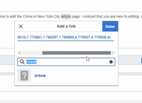
- Linking
- Posting
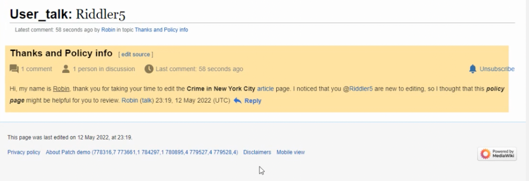
- Being able to identify their post in context after posting
Who is being tested?
a Senior Contributor
What page are we testing
an Empty User Talk Page
Findings
Average amount of time to correctly recognize that this page is some sort of message board is 7.6 seconds for desktop and 9.2 seconds for mobile testers.
Discovering Add topic button
✅ 3 of 5 desktop users discovered and then click the "add a discussion" button
✅ 5 of 5 mobile users were able to follow a notification
🗒️ The 2 desktop testers who did not use the button used the tab for adding a topic
⚠️ Several testers clicked the "user name" that links to the user page (not user talk page) and so they were thrown out of the workflow.
Writing new topic and discussion
✅ 5 of 5 desktop testers successfully added a new topic
✅ 4 of 5 mobile testers successfully added a new topic
@mentioning users who commented on page
✅ 4 of 5 desktop testers successfully @- Mentioned users who had already commented on the page
✅. 4 of 5 mobile testers successfully @- Mentioned users who had already commented on the page
⚠️ Testers struggled to @mention from source mode. One tester attempted to @mention in the page title.
Formatting text
✅ 5 of 5 desktop testers successfully formatted text
✅. 5 of 5 mobile testers successfully formatted text
Linking text
✅. 5 of 5 desktop testers successfully linked to an article from text within a reply
✅. 4 of 5 mobile testers successfully linked to an article from text within a reply
⚠️Mobile testers struggled a bit with this task.
Identified post in context after posting it
✅. 5 of 5 desktop testers successfully identified their post in context after posting
✅.4 of 5 mobile testers successfully identified their post in context after posting
Miscellaneous observations and/or comments
**//The design feels outdated/ unfinished://**
"I was expecting something that had more polish" UT-7
""I feel like there is no eye on the design which makes me not want to use the website again."" ut-6
"I didn’t really like that there was so much going on on the page itself. There where no bullet points and no good overview and the design seemed quite outdated. Especially on the small phone screen I was a little overwhelmed by all that information on the first page. I wouldn’t like to use the website again because I was confused by all the fields and it didn’t seem like the website was made with a good Ux. Some colors, text boxes and white space would have been great ." UT-6
**//The experience is obvious://**
"I thought the app itself was user friendly and intuitive. It looks very familiar to the Wikipedia editing that I'm used to doing. I understand the purpose of the page, I understand I can link off the page, I understand how to add users to it. I thought it was very clear." ut-8
"This feels very easy to use, very intrinsic... This is second nature to me. I don't think that anything is too complicated to follow. Everything is smooth and minimal which is very good. Just kind of the bare bones of what you need out of a tool like this. It's totally workable and sort of the Wikipedia style of being bare bones and just getting to the point of things. " UT-5
**//Some unexpected layout://**
The updated patch for mobile empty state was not applied here.
Several mobile testers expectedd to be able to highlight and right click to activate styling/editing tools.
? Are we informing the. tester in too many ways of the last edit (considering the green banner at bottom)?
Icons
Several testers were unable to guess what the visual editor "pencil" in the editing toolbar was for
Bugs
- obtrusive horizontal scroll in link editor UT-4
- unexpected post edit highlight (it's a big funky in terms of what it bits of text it covers)

