User story:
As an editor unfamiliar with Thanks, I want sending Thanks to be easy and follow modern UX standards, because the current confirmation message is easy to miss and the message is easy to misinterpret.
As an editor, I want a way to confirm or cancel sending Thanks, because sometimes I accidentally click Thanks (In other words, there should either be a confirmation step or a temporary window to cancel sending thanks. )
Background:
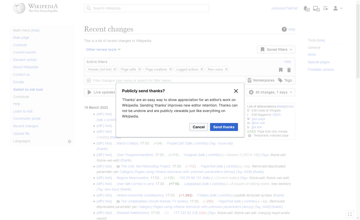
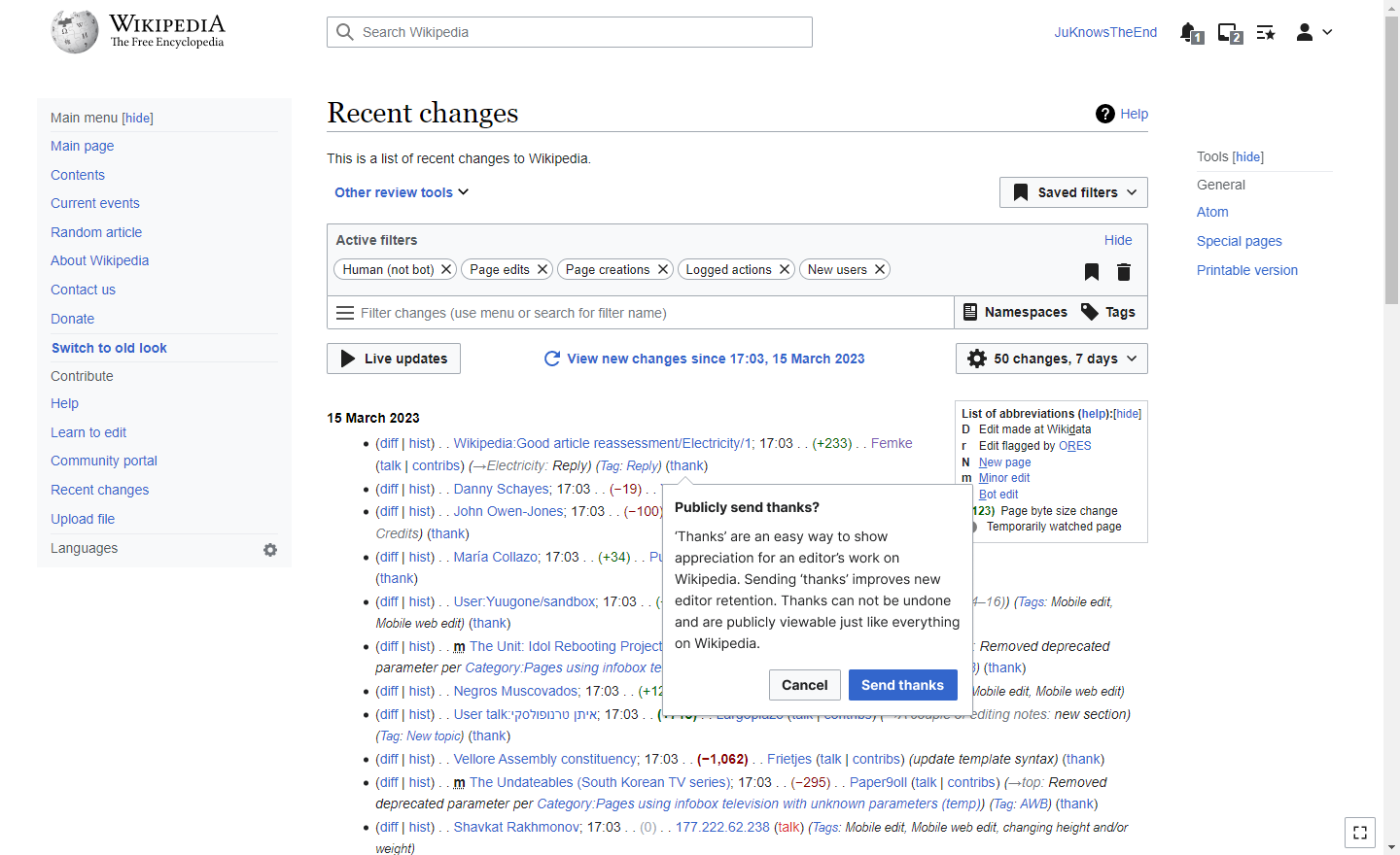
The thanks link confirmation UX is subtle and the language is confusing:
| Mobile | before click 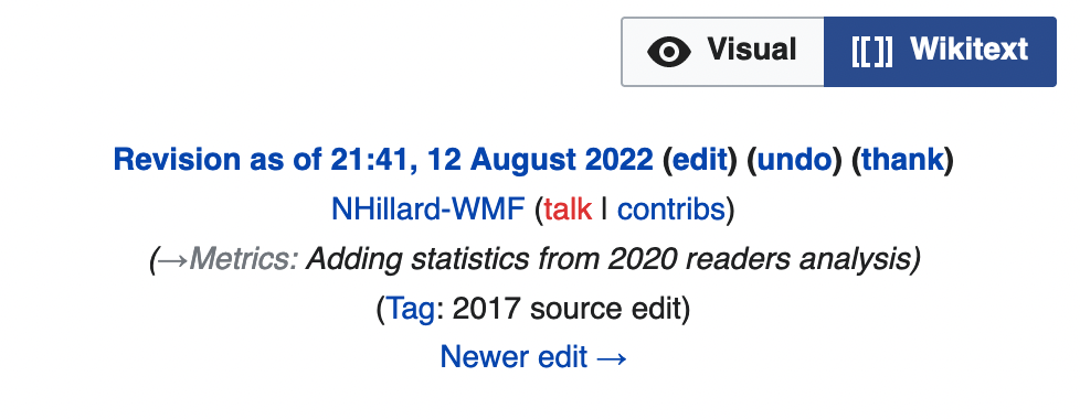 | after click 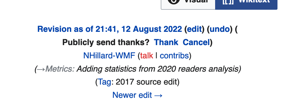 | after confirming click 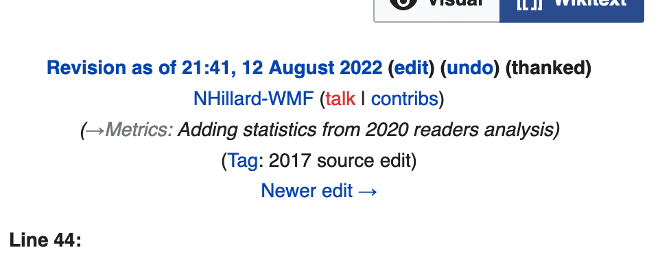 |
| Desktop | |||
Some people never confirm because they think they already sent "private" thanks or because they simply miss the confirmation message that appears inline.
Maybe we could borrow the UX from Minerva/MobileFrontend, where tapping thank gives you the opportunity cancel within a few seconds.
If not that, maybe there's something we could do to adjust the weight, or to present a dialog to the user asking them to confirm, rather than the inline, quite subtle text that is the same weight/color.
- Meet with Rita and Kirsten to review and refine
- Share with Design teams at review to iterate
- Get feedback from Growth CRS and Ambassadors, as appropriate (who can help share ideas for community feedback)
- Share with Growth team in design "deep dive"
Further details:
There are several other tasks that relate to this request:
- T71804: Thanks: add instrumentation to Thanks
- T325383: Improve Thanks confirmation step on mobile
- T229168: Add a help link to Thanks confirmation & remove the confusing word "publicly"
- T322218: Create API to allow retrieving detailed information about Thanks log items for my own user account
Some other relevant feedback from T229168:
This request was prompted by this discussion at enwp, in which the OP said:
It wasn't clear to me whether my thanks had been sent already and if it was asking me if I wanted to publicly thank the editor on top of that, or if publicly thanking was the only way to go.
Which is precisely the same concern/confusion that the OP of T159302, which resulted in changing the confirmation message from "Send public thanks?" to "Publicly send thanks?", had:
The message "Send public thanks for this edit?" is confusing. People have been known to misinterpret it it as giving the user a choice of "Send public thanks" vs. "Send private thanks". Actually the choice is "Send public thanks" vs. "Don't send thanks".
So the rephrasing has hardly helped.
The word "public(ly)" has been nothing but a source of confusion. I understand it was added out of concern for the feature being construed as something private (T90486), but it's steered people too far in the other direction. Pdebee said in the aforementioned thread:
A few years ago, a new joiner wanted to thank me for my initial help with her first steps as an editor, but changed her mind because she thought that “publicly” meant that tens of millions of other registered editors were going to see what she’d hoped would be a simple, private signal of personal appreciation.
...when in fact only who thanked whom when, not even for which edit or on which page, is visible—and only on Special:Log, not on any diff or history page or anyone's watchlist.
Current Design Explorations:
Improving thanks confirmation designs
Options:
| Dialog | Pop up |
 |  |
Acceptance Criteria:
Create one or more design prototypes showing how we can improve the Thanks confirmation UX.