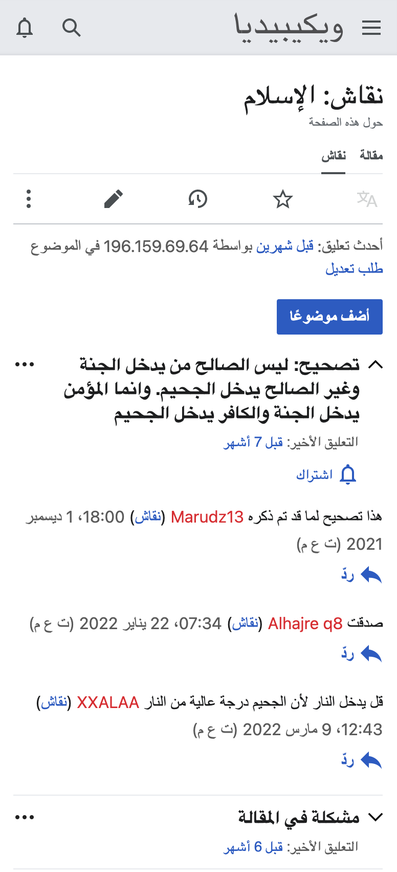
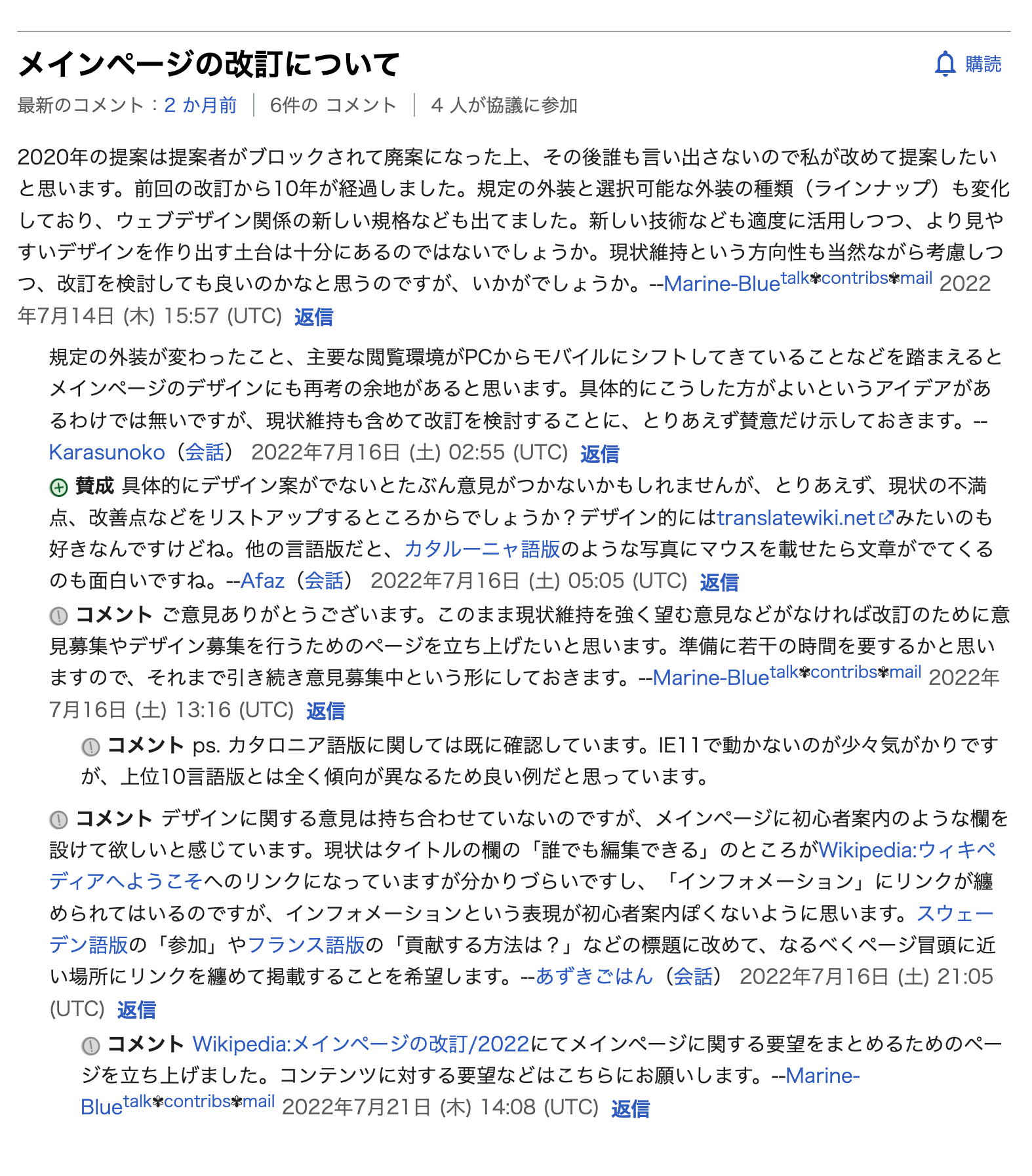
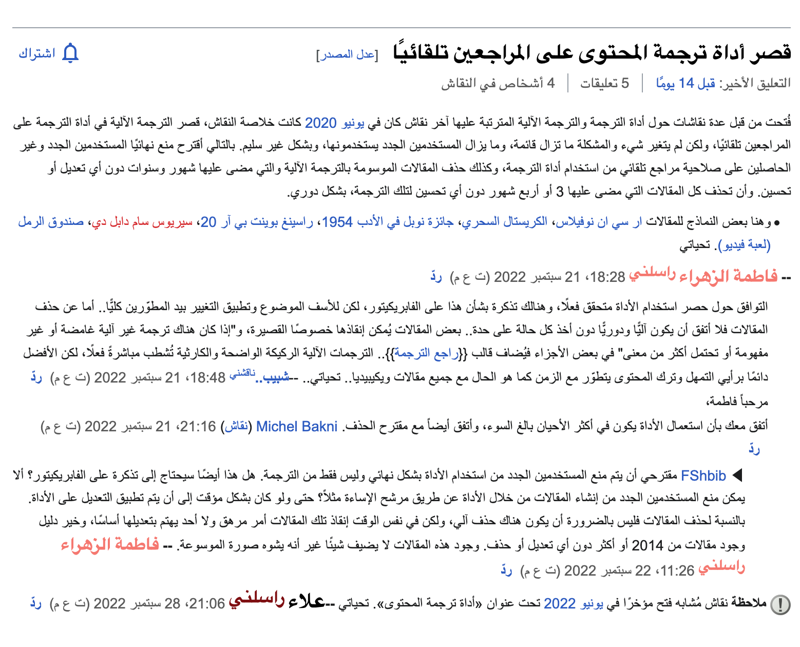
This task involves the work of revising how the desktop Reply button is styled in languages where the word "reply" is short enough that it can be difficult for people to notice it:
| ja.wiki (desktop) | ar.wiki (desktop) |
|---|---|
 |  |
| https://w.wiki/5ouX | https://w.wiki/5ouY |
Thank you to @Dyolf77_WMF for first spotting this issue.
Requirements
Meta
- Platform: Desktop
- Assumption: the arrows that prefix the Reply buttons on mobile make it possible for people to locate the affordance despite it containing relatively few characters. [i]
- Languages:
- ar: ردّ
- nod: ᨲᩬᨷ (nod.wikipedia is in the Incubator)
- zh: 回复
- ja: 返信
- yue: 覆
- Per-wiki configuration: wikis ought to be able to decide for themselves whether they would like to enable the revised appearance of the Reply buttons this task will introduce.
User experience
As we currently have arrows on ar.wiki mobile, we can increase the affordance of the "Reply" buttons on desktop by adding them as well.
It seems like the font-weight varies, or optically the body on ja.wiki seems lighter than on ar.wiki – hence the contrast between the boldness of the reply button on ja.wiki is more noticeable than on ar.wiki for instance.
Approaches
On scripts with a small number of characters for the word "reply", users will be able to quickly find the button thanks to the "reply" icon in the button.
i. Mobile ar.wiki talk page: