Page MenuHomePhabricator

Update Message component colors
Closed, ResolvedPublic3 Estimated Story Points

Description

Background

Captura de Pantalla 2022-11-04 a las 17.46.10.png (170×1 px, 65 KB)

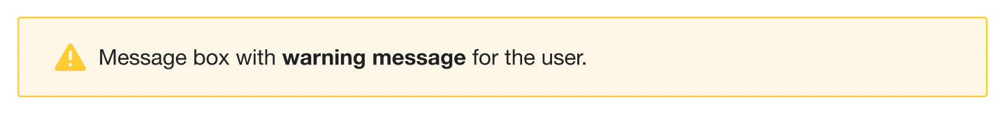
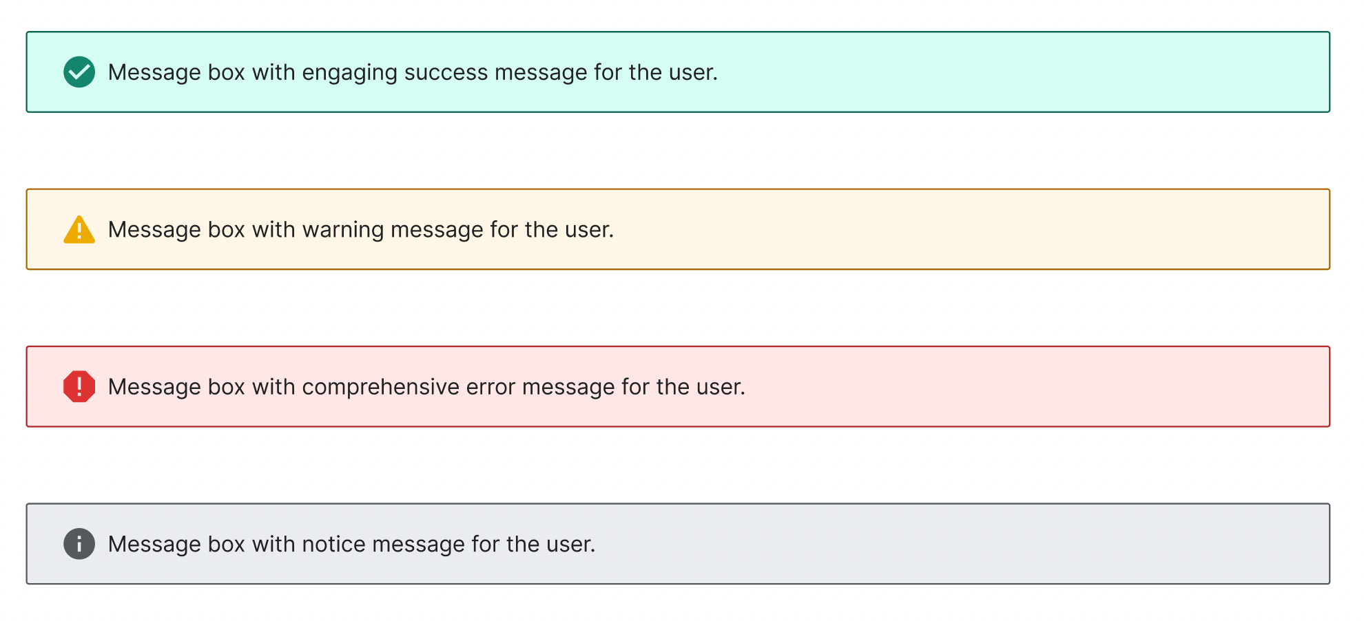
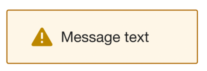
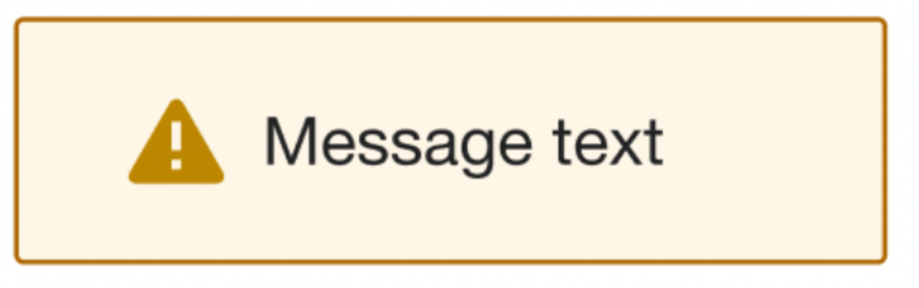
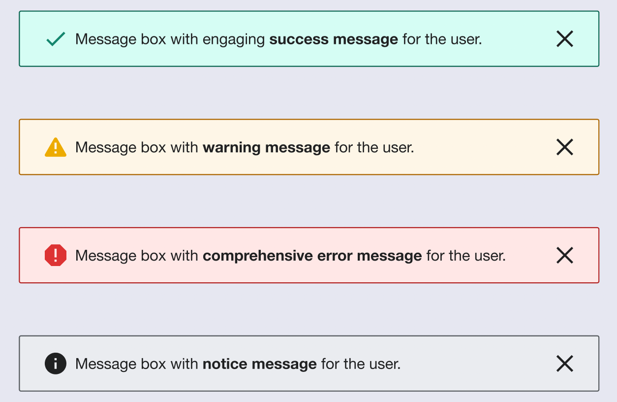
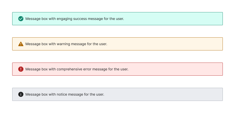
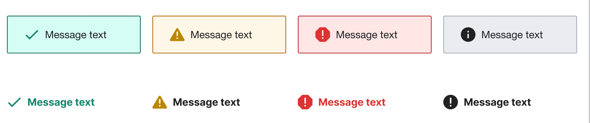
  • Description: current warning message #fc3 color is not contrasted enough for both border and icon. We should update it or use other more contrast yellow so the icon is at least readable. We should implement the same systematic solution for all our messages (error, success, warning and notice)
  • History: describe or link to prior discussions related to this component
  • Known use case(s): in almost all the cases the warning message (and rest of states) appears on white background but in some cases it could appear on light gray or blue backgrounds.
  • Considerations: we need all message states to be contrasted enough. Also we should follow the DSG if we finally redesign the message component.

User stories

  • As a user I need the message box to be visible enough.
  • As a user I need the feedback icon in the message to be visible enough.

Previous implementations

Open questions

Add here the questions to be answered in order to design and implement the component

Possible solutions

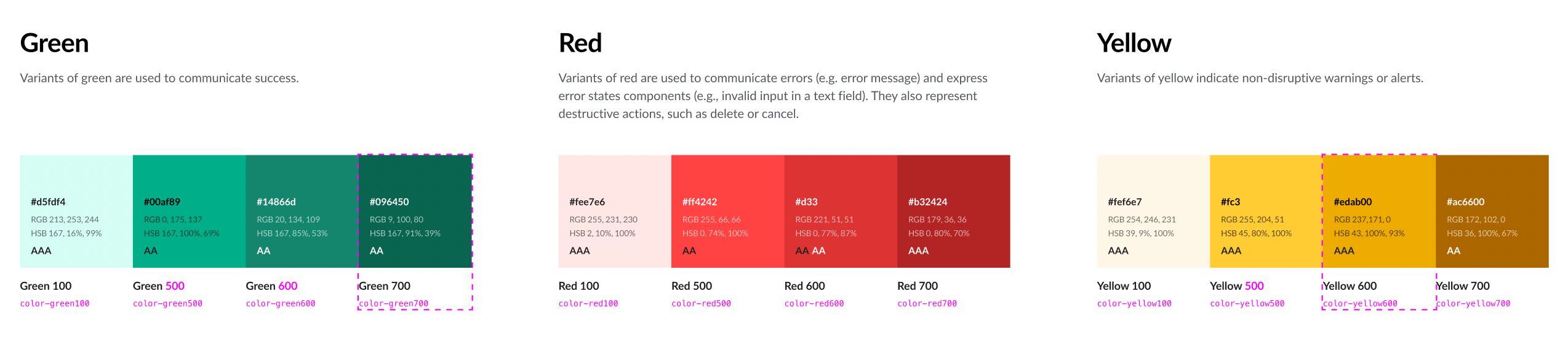
Some explorations to improve the warning (and the rest of message states) have been created in this Figma file. The ones more aligned with the DSG are the following:

Icons with feedback colors.png (448×925 px, 19 KB)
Icons with feedback colors-1.png (448×926 px, 18 KB)
Darker border color.png (448×926 px, 19 KB)
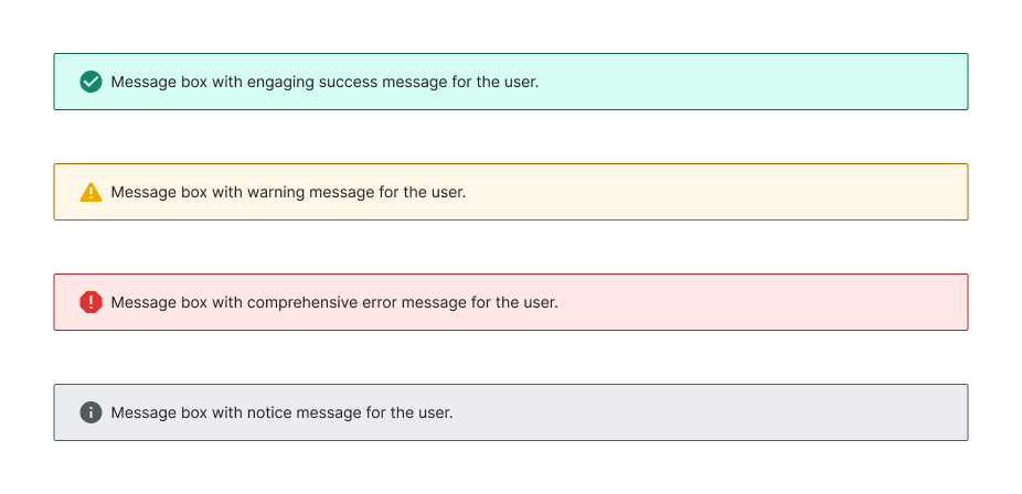
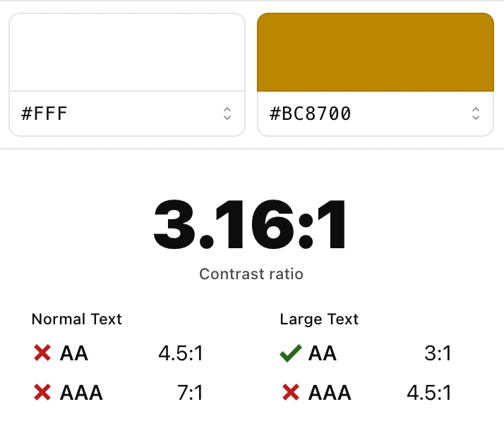
Option1: use #ac6600 for border and icon colorsOption2: use a new yellow color (e.g. #edab00) although it's not enough contrast (2.02:1)Option3: use #ac6600 for border and the new #edab00 for the icon
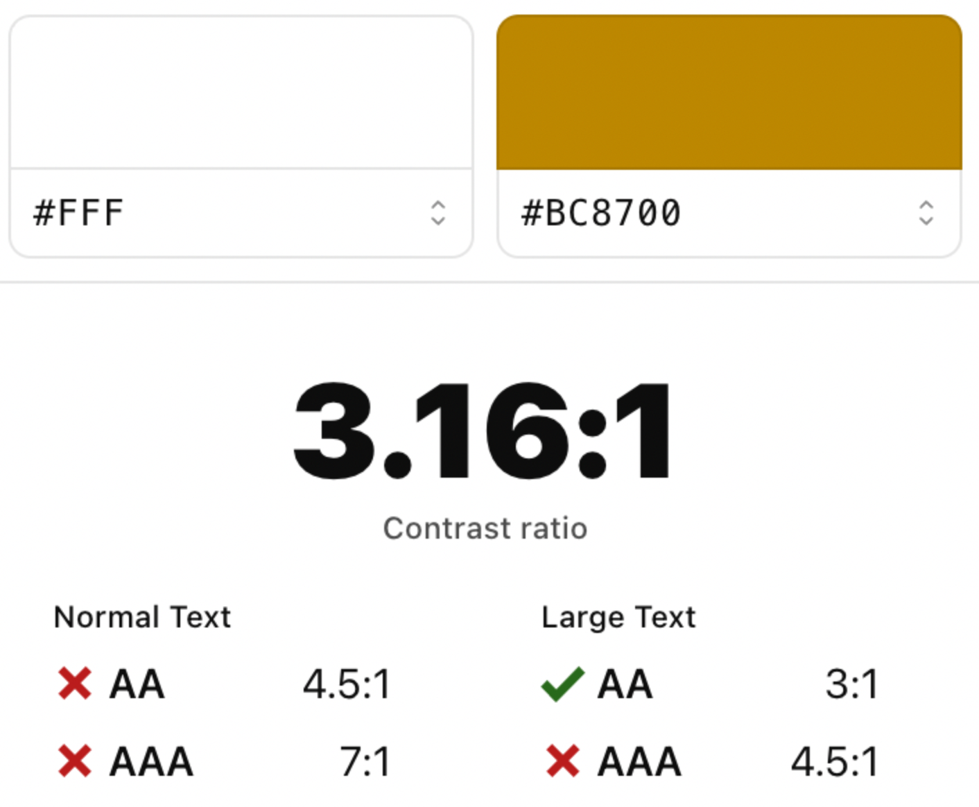
NOTE: to get at least 3.1. contrast with yellow we should use #bc8700 but it's too dark (brown).

Captura de Pantalla 2022-11-04 a las 14.45.28.png (624×714 px, 150 KB)

Captura de Pantalla 2022-11-04 a las 14.45.52.png (418×1 px, 256 KB)


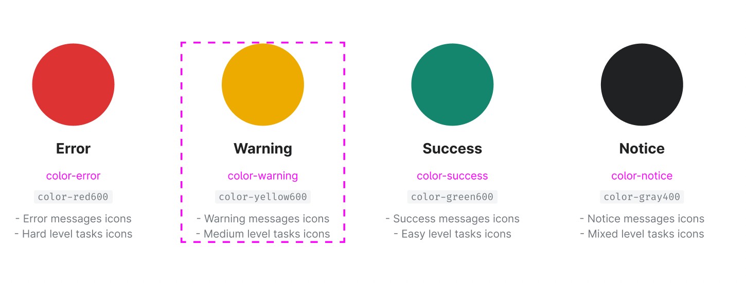
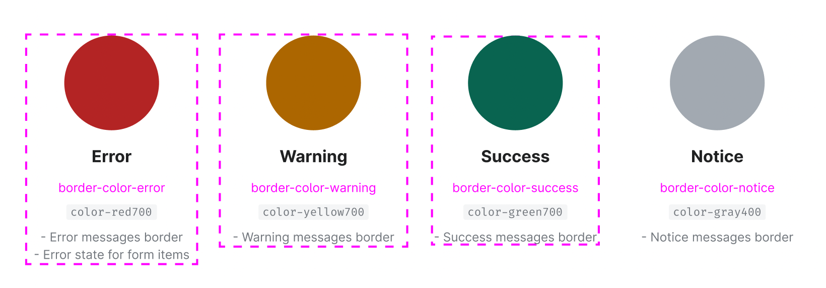
Proposal chosen to be implemented

Darker border color.png (448×926 px, 19 KB)
Option3: use #ac6600 for border and the new #edab00 for the icon

Design spec

Acceptance criteria (or Done)

Design

  • Add new warning color in T322833
  • Update border color tokens in the library to the darkest tone T324449
  • Update the Message spec sheet and add it in this task
  • Update the message component in the Figma library and publish the library:

Code

  • Update message in Codex
    • New #edab00 for Yellow600 warning
    • Update border colors to the darkest tones T324449
      • Add new #096450 for Green700
  • Update message in OOUI
    • Update colors in WikimediaUI Base
    • Make new WikimediaUI Base release and pull-through
NOTE: message component will be updated in both Codex and OOUI to maintain consistency.

Event Timeline

I really like Option 3!
Just with one small thing to reconsider, the use of the checkmark on non-filled background is actually beneficial as all things that need my attention (notice, warning, message) are featuring filled backgrounds, the success which is just a relief, doesn't need the filled, it could be set apart from the other three.
Also the icon here is not crucial for contrast as the message itself is achieving the contrast requirements. The icon is only supportive.

Change 848595 had a related patch set uploaded (by VolkerE; author: VolkerE):

[design/codex@main] tokens: Amend Yellow 600 color decision token

https://gerrit.wikimedia.org/r/848595

Also the icon here is not crucial for contrast as the message itself is achieving the contrast requirements. The icon is only supportive.

+1 to what @Volker_E says here. We're already meeting multiple semantic layers, hence the icon is only supportive.

I, too, find option 3 to be the most effective!

Also the icon here is not crucial for contrast as the message itself is achieving the contrast requirements. The icon is only supportive.

+1 to what @Volker_E says here. We're already meeting multiple semantic layers, hence the icon is only supportive.

I think the icon is necessary in all the states (success, warning and error) since it reinforces the feedback message for the user and makes it more accessible. Considering that some users could have problems to differentiate the message colors, we need to reinforce each message state with a clear and easy to understand feedback icon.

Captura de Pantalla 2022-11-08 a las 16.17.23.png (902×1 px, 386 KB)

Since the rest of warning, error and notice icons are solid (the exclamation mark is inside a geometric shape) I think we should introduce this new icon (or a similar one) in our system to follow the same geometric solid solution for our success message icon.

Captura de Pantalla 2022-11-08 a las 16.17.48.png (368×338 px, 121 KB)

Regarding option 3 as favorite, if we want to implement this improvement in our messages we will do the following:

  1. Use the darkest color (color700) for the error, warning and success message borders
  2. Use the previous darkest color (color600) for the error, warning and success icons

We would add these new option tokens:

color-green700 #096450 (the previous “Green 700” will be renamed to “Green 600”, and the previous “Green 600” will be renamed to “Green 500”)
color-yellow600 #edab00 (the previous “Yellow 600” will be renamed to “Yellow 500”)

Captura de Pantalla 2022-11-08 a las 16.29.13.png (552×2 px, 502 KB)

Then we will use the following color decision tokens for the icons:

Captura de Pantalla 2022-11-08 a las 16.33.42.png (550×1 px, 266 KB)

And the following color decisions for the borders:

Captura de Pantalla 2022-11-08 a las 16.33.56.png (572×1 px, 330 KB)

@Volker_E check the Figma proposal with the new color tokens

NOTE: keep in mind that this new #EDAB00 is not enough 3.1 contrast and that we should use #BC8700 if we want a 3.1 contrast and this would be almost brown again. We can use #EDAB00 to make the warning icon more readable but it will only be contrasted enough with #BC8700
Captura de Pantalla 2022-11-08 a las 16.40.26.png (236×686 px, 191 KB)

I like option 3 as well, but wonder if there would be a separate future case to add a different colour or treatment so that there is a yellow/ tone color that is 3:1 compliant for icons when it is not in used in warnings?
Relatedly, if #edab00 is replacing #ffcc33 for the warnings icon colour, is there a need for #ffcc33 still. or would it make sense to remove it?

I like option 3 as well, but wonder if there would be a separate future case to add a different colour or treatment so that there is a yellow/ tone color that is 3:1 compliant for icons when it is not in used in warnings?

@RHo as I commented above the only way to get a 3.1 contrast for warning icon is to use #BC8700 color instead, but this color would be too brown and not sure if it makes sense to add a new yellow color that would be too similar to our current darkest yellow (brown) #AC6600 color.

Captura de Pantalla 2022-11-09 a las 10.25.58.png (420×1 px, 634 KB)

Captura de Pantalla 2022-11-09 a las 10.26.10.png (1×1 px, 534 KB)

Relatedly, if #edab00 is replacing #ffcc33 for the warnings icon colour, is there a need for #ffcc33 still. or would it make sense to remove it?

#ffcc33 is being used for illustrations so if we finally add a new yellow color in our palette we could maintain #ffcc33 for illustrations (as primitive color or option token).

Captura de Pantalla 2022-11-09 a las 10.28.38.png (564×1 px, 242 KB)

Also this current #ffcc33 yellow is a relevant color in our DSG palette so I would maintain it. Maybe in the future we want to use it for solid yellow background.

I like option 3 as well, but wonder if there would be a separate future case to add a different colour or treatment so that there is a yellow/ tone color that is 3:1 compliant for icons when it is not in used in warnings?

@RHo as I commented above the only way to get a 3.1 contrast for warning icon is to use #BC8700 color instead, but this color would be too brown and not sure if it makes sense to add a new yellow color that would be too similar to our current darkest yellow (brown) #AC6600 color.

Captura de Pantalla 2022-11-09 a las 10.25.58.png (420×1 px, 634 KB)

Captura de Pantalla 2022-11-09 a las 10.26.10.png (1×1 px, 534 KB)

Fair enough.

bmartinezcalvo renamed this task from Evaluate Warning message color to Evaluate Message colors.Nov 10 2022, 11:17 AM
bmartinezcalvo updated the task description. (Show Details)
bmartinezcalvo moved this task from Inbox to Needs Refinement on the Design-System-Team board.

@Volker_E as it seems that we have an agreement with Option 3 I've created this new Figma version of the Message component using the darkest color for message borders and the new #edab00 for the warning icon. As explained in the task description, we need to update first our color tokens in T322833 and these new colors will be added in both Codex and OOUI messages to maintain the consistency.

Captura de Pantalla 2022-11-10 a las 12.28.29.png (816×1 px, 242 KB)

bmartinezcalvo renamed this task from Evaluate Message colors to Update Message component colors.Nov 21 2022, 2:09 PM

Please consider that we (several teams) need to update all occurrences of #fc3 throughout our projects for consistency (DST, Growth, TwoColConflict(WMDE?), Language: CX, …):
https://codesearch.wmcloud.org/search/?q=%23fc3&i=nope&files=&excludeFiles=&repos=

Change 862239 had a related patch set uploaded (by VolkerE; author: VolkerE):

[wikimedia-ui-base@master] tokens: Amend Yellow 600 (Yellow50) color decision token

https://gerrit.wikimedia.org/r/862239

Change 848595 merged by jenkins-bot:

[design/codex@main] tokens: Amend Yellow 600 color option token and add Yellow 500

https://gerrit.wikimedia.org/r/848595

Change 862239 merged by jenkins-bot:

[wikimedia-ui-base@master] Amend Yellow 600 (Yellow50) color decision token

https://gerrit.wikimedia.org/r/862239

Change 865151 had a related patch set uploaded (by Eric Gardner; author: Eric Gardner):

[mediawiki/core@master] Update Codex from v0.3.0 to v0.4.0

https://gerrit.wikimedia.org/r/865151

Change 865151 merged by jenkins-bot:

[mediawiki/core@master] Update Codex from v0.3.0 to v0.4.0

https://gerrit.wikimedia.org/r/865151

ldelench_wmf subscribed.

Moving to sprint board as it looks like this work is in progress - please lower to medium priority if our target completion is more than 1 month from now. Thanks!

ldelench_wmf lowered the priority of this task from High to Medium.Feb 13 2023, 5:30 PM

Change 908494 had a related patch set uploaded (by VolkerE; author: VolkerE):

[design/codex@main] tokens: Add 'Green 500', shuffle value of 'Green 600' and new 'Green 700'

https://gerrit.wikimedia.org/r/908494

Change 908524 had a related patch set uploaded (by VolkerE; author: VolkerE):

[mediawiki/core@master] mediawiki.ui: Apply darker Message border colors

https://gerrit.wikimedia.org/r/908524

Restricted Application raised the priority of this task from Medium to High. · View Herald TranscriptApr 13 2023, 11:38 AM

Change 908494 merged by jenkins-bot:

[design/codex@main] tokens: Add 'Green 500', shuffle value of 'Green 600' and new 'Green 700'

https://gerrit.wikimedia.org/r/908494

Volker_E changed the task status from Open to In Progress.Apr 13 2023, 4:44 PM

Change 908524 merged by jenkins-bot:

[mediawiki/core@master] mediawiki.ui: Apply darker Message border colors

https://gerrit.wikimedia.org/r/908524

Change 911932 had a related patch set uploaded (by VolkerE; author: VolkerE):

[mediawiki/core@master] Update Codex from v0.9.0 to v0.9.1

https://gerrit.wikimedia.org/r/911932

Test wiki created on Patch demo by ATomasevich (WMF) using patch(es) linked to this task:
https://patchdemo.wmflabs.org/wikis/9a9f20a61d/w

Change 911932 merged by jenkins-bot:

[mediawiki/core@master] Update Codex from v0.9.0 to v0.9.1

https://gerrit.wikimedia.org/r/911932

Test wiki on Patch demo by ATomasevich (WMF) using patch(es) linked to this task was deleted:

https://patchdemo.wmflabs.org/wikis/9a9f20a61d/w/

Volker_E updated the task description. (Show Details)
Volker_E set the point value for this task to 3.