Page MenuHomePhabricator

Mock up a 100% Codex front end for PageTriage
Open, Needs TriagePublic

Description

Myself and other patrollers convinced the Moderator Tools team to keep the PageTriage user interface (Special:NewPagesFeed and the Page Curation toolbar) the same visually during their recent rewrite from Backbone.js to Vue.js. T335074: Rewrite PageTriage front-end in Vue.js, T208256: Pick PageTriage JavaScript/front end rewrite frameworks

I think this was the right decision at the time. There are some benefits to splitting the front end rewrite into two parts (a code update which the Moderator Tools team did, and then a visual update which volunteers will explore doing with Codex). The benefit is an ability to stop or rollback visual changes if there is controversy, and less decision paralysis / quicker patch merging since the code modernization patches are separated from the visual changes patches.

However, there are a few folks (mainly WMF developers but also one patroller) that dislike the old UI. Concerns include...

  • gray, jquery.ui ish look does not match the look of modern MediaWiki
  • not using all Codex components is less maintainable
  • not responsive

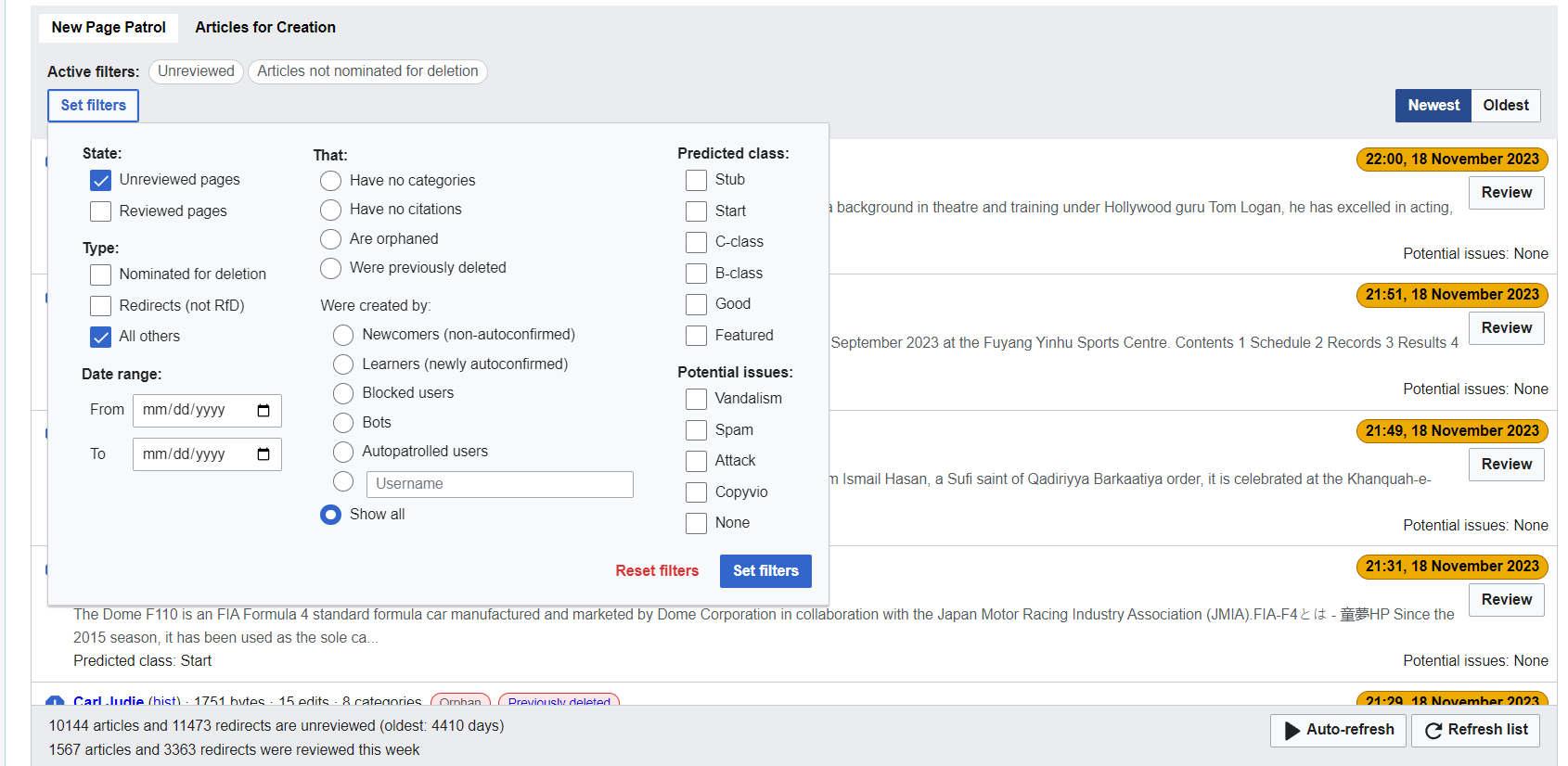
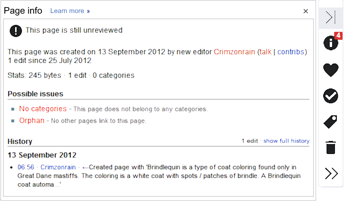
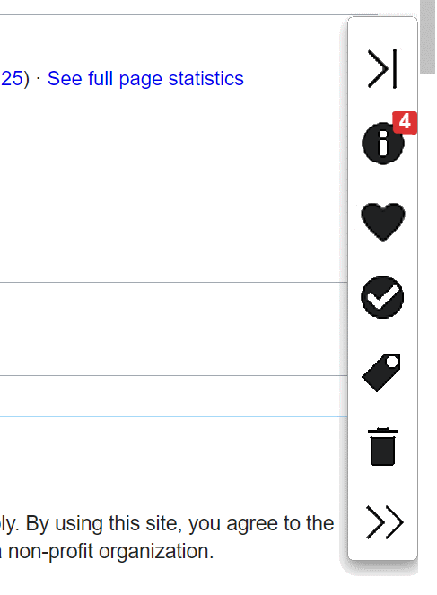
This ticket is to explore redesigning Special:NewPagesFeed and the Page Curation toolbar in Codex.

Let's proceed carefully. Visual changes should look good and be fairly minimal / faithful to the old design.

Note: If we need to add any components or icons into Codex (upstream), we can make a Phabricator ticket and tag it Design-Systems-Team.

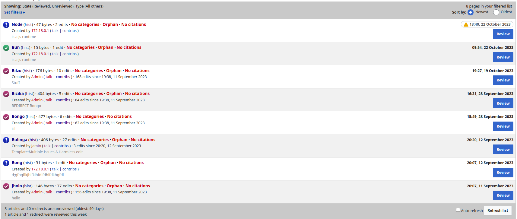
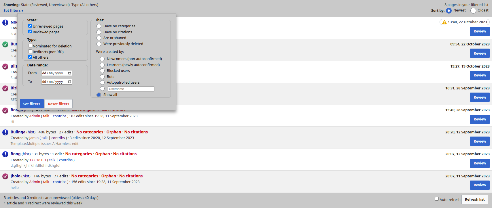
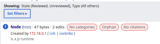
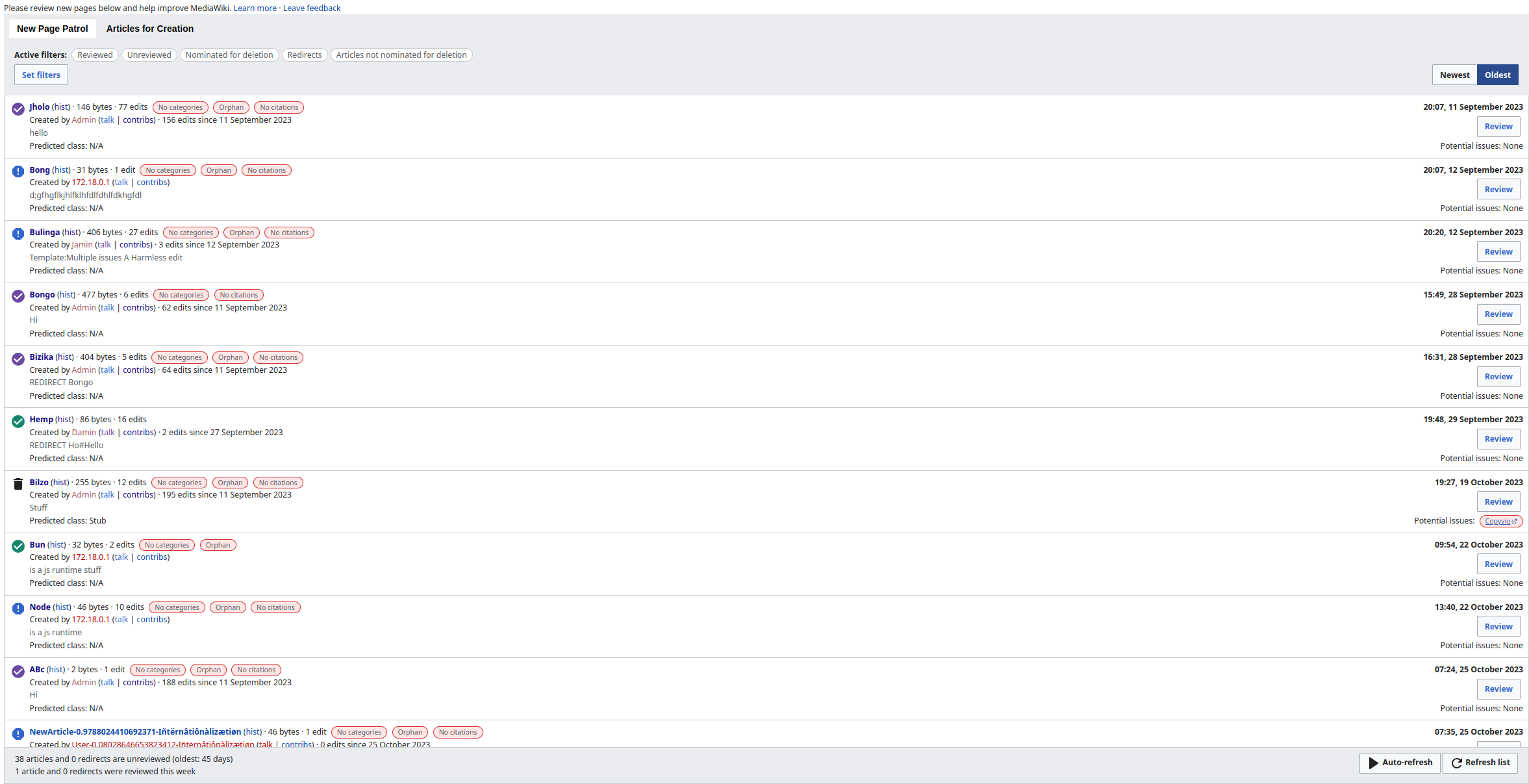
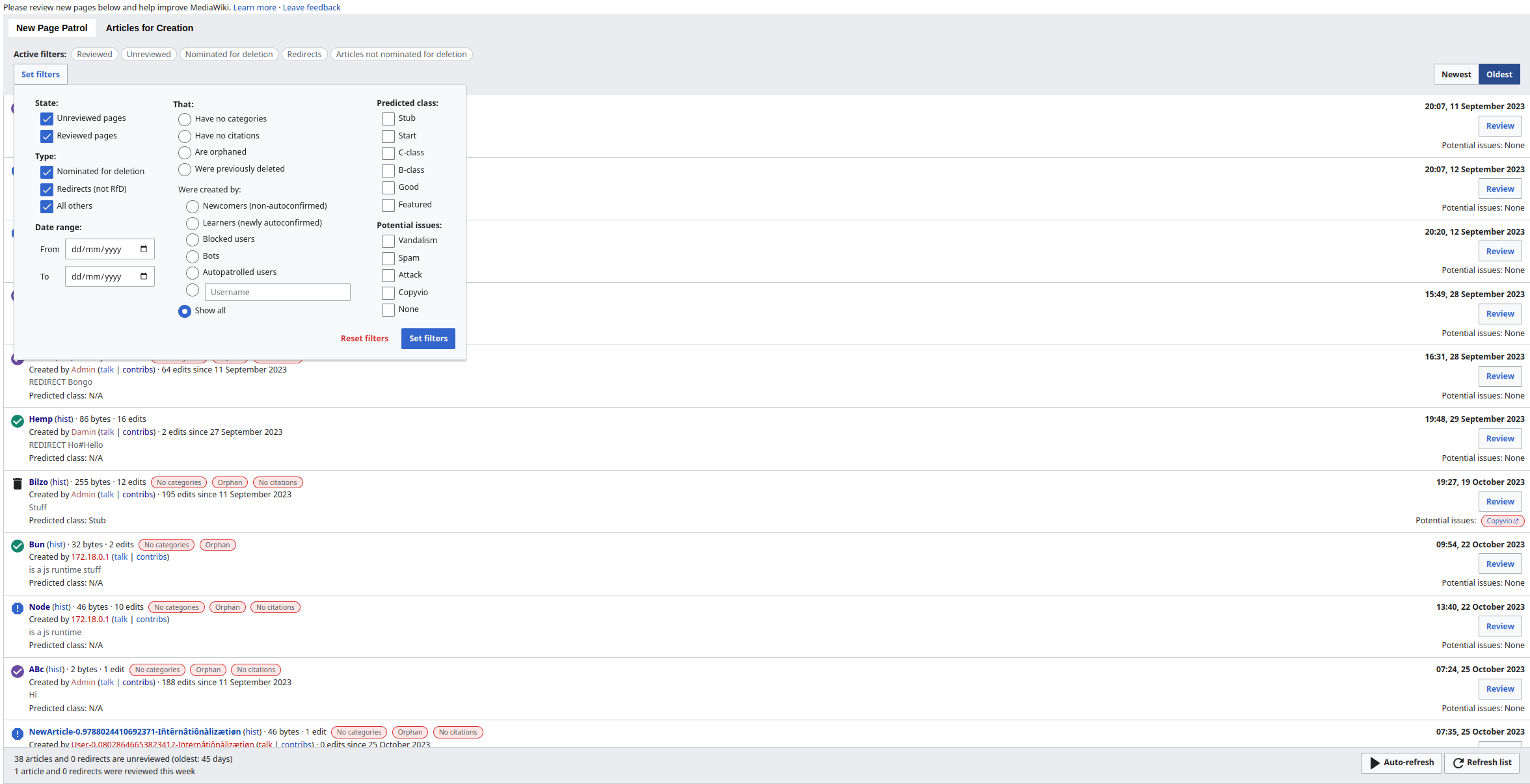
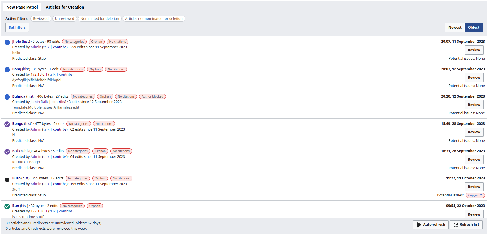
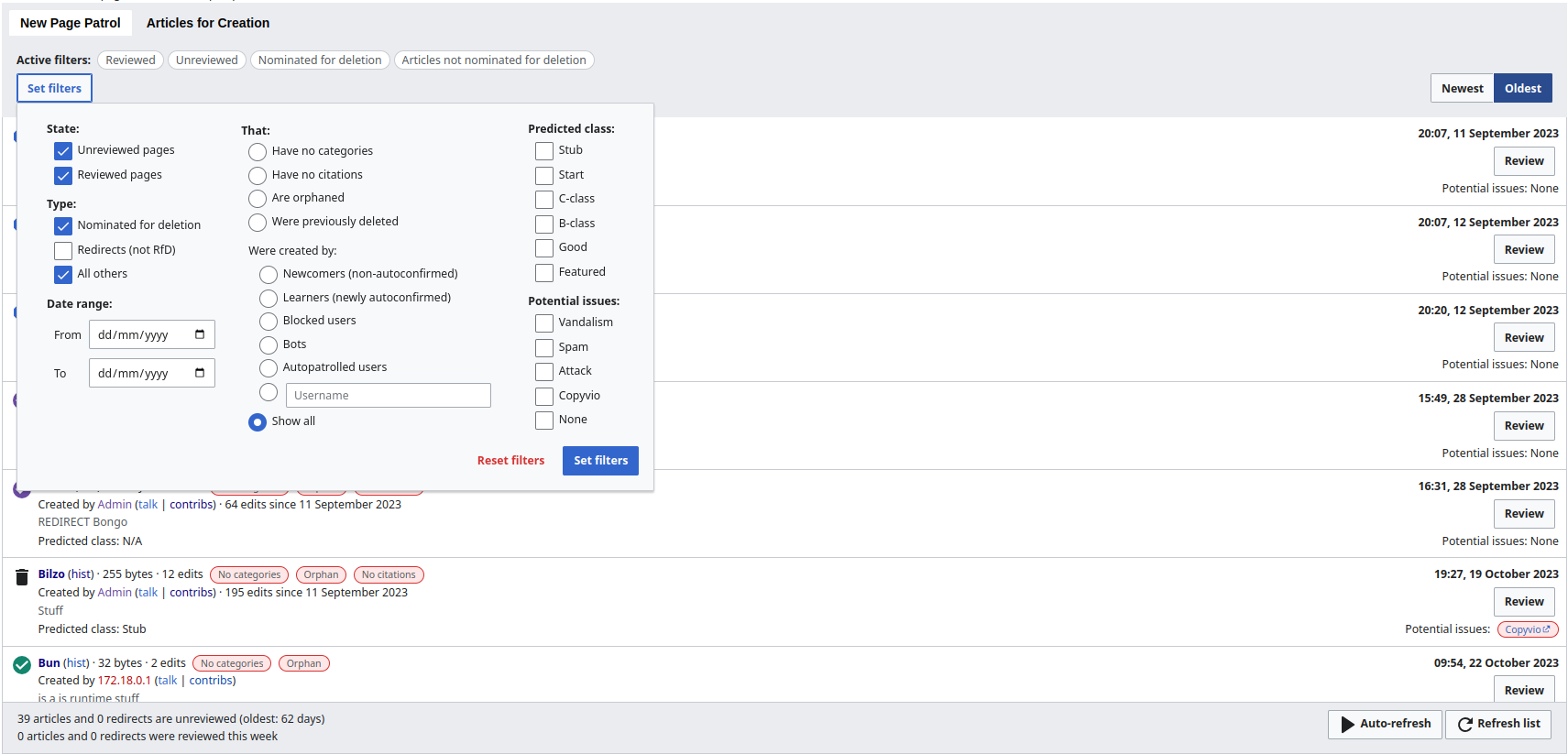
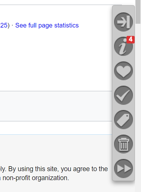
Old visual appearance

image.png (768×1 px, 182 KB)

image.png (663×487 px, 46 KB)

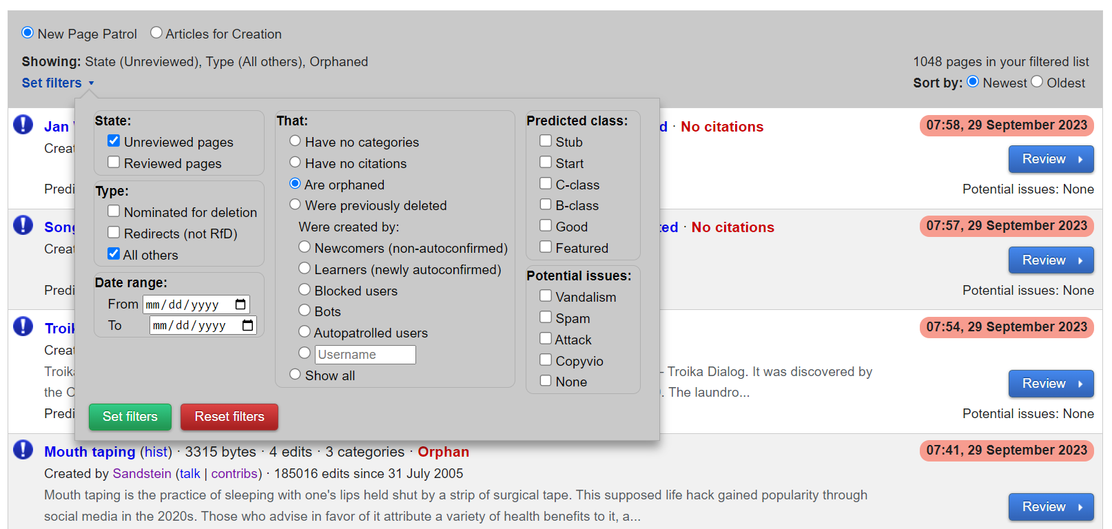
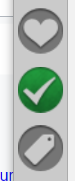
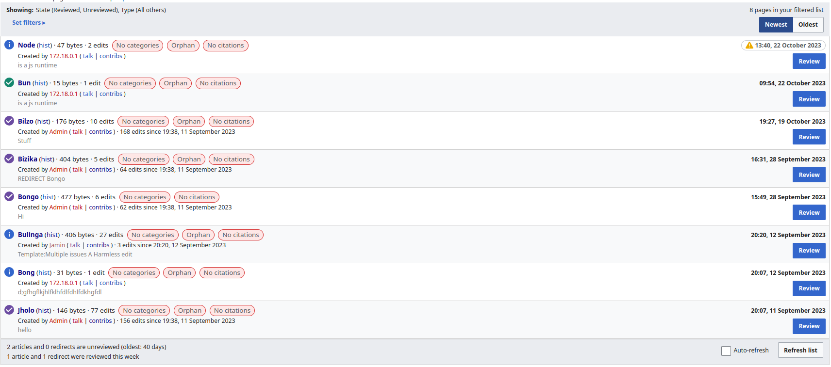
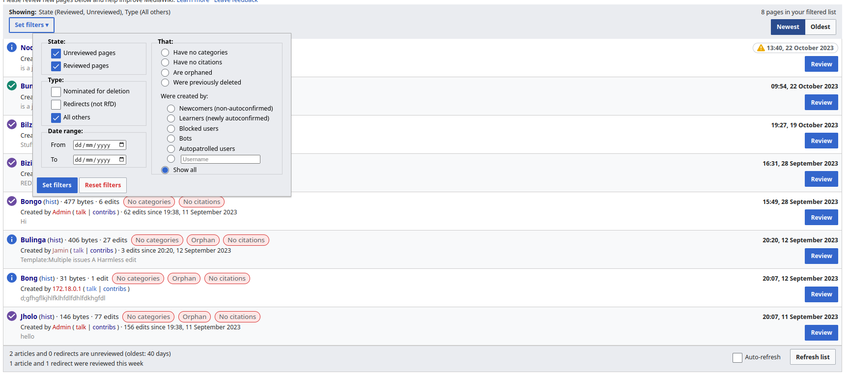
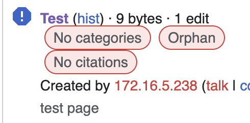
New visual appearance

image.png (826×1 px, 89 KB)

Event Timeline

There are a very large number of changes, so older changes are hidden. Show Older Changes

Things missing (probably not exhaustive):

  • Green button in "Set filters" under the "Set filters" link on the special page - or decide to use a blue one
  • Date picker for "Set filters" under data range - T91148

Design idea:

page triage curation toolbar selected8.png (650×1 px, 47 KB)

page triage curation toolbar deselected8.png (663×487 px, 14 KB)

I could live with something like this. Looks better than a couple of our previous attempts.

What are next steps? Are the icons you use in your screenshot in Codex? (https://doc.wikimedia.org/codex/latest/icons/all-icons.html) Should we get them added there first?

The check mark icon indicates review status based on color. So we would probably want the ability to color that button green for reviewed, and purple/pink-ish for autopatrolled.

image.png (260×108 px, 16 KB)

image.png (268×99 px, 16 KB)

The trash can icon also needs to convey status based on color. If an article is tagged for deletion, it needs to be indicated somehow.

image.png (273×117 px, 12 KB)

I did some exploratory conversion to mediawiki styling using some of the Codex design tokens and here are the results:

BeforeAfter
Screenshot from 2023-10-22 15-50-41.png (726×1 px, 180 KB)
Screenshot from 2023-10-22 15-42-52.png (757×1 px, 178 KB)
Screenshot from 2023-10-22 15-53-20.png (727×1 px, 178 KB)
Screenshot from 2023-10-22 15-45-01.png (765×1 px, 181 KB)

I've tried to keep most changes to a minimum here

Thanks Soda. I like all those changes too, except the blue information icon, which hopefully we can change to a blue exclamation mark.

Thanks Soda. I like all those changes too, except the blue information icon, which hopefully we can change to a blue exclamation mark.

Definitely, I don't think we have a round icon, but I think the error icon should work:

Screenshot from 2023-10-22 16-57-15.png (152×553 px, 20 KB)

Seems like a good compromise. Looks good to me. Feel free to code it up.

Change 967661 had a related patch set uploaded (by Sohom Datta; author: Sohom Datta):

[mediawiki/extensions/PageTriage@master] [WIP] Bring NewPagesFeed inline with Codex/Wikimedia styling

https://gerrit.wikimedia.org/r/967661

Test wiki created on Patch demo by Sohom Datta using patch(es) linked to this task:
https://patchdemo.wmflabs.org/wikis/d624fa1751/w

Test wiki on Patch demo by Sohom Datta using patch(es) linked to this task was deleted:

https://patchdemo.wmflabs.org/wikis/d624fa1751/w/

Test wiki created on Patch demo by Sohom Datta using patch(es) linked to this task:
https://patchdemo.wmflabs.org/wikis/24413b3b03/w

Thanks for your work on this, I think it looks great! I have some observations for things that might warrant changes:

'That...' items seem to be slightly misaligned from the radio buttons:

Screenshot 2023-10-23 at 13.22.07.png (208×402 px, 27 KB)

When first opening the feed, neither Newest or Oldest appear visually to be selected - I think Newest should be selected by default?

Screenshot 2023-10-23 at 13.24.44.png (212×512 px, 17 KB)

At small screen widths the issues tags butt right up against each other and the text above.

Screenshot 2023-10-23 at 13.26.17.png (242×490 px, 38 KB)

Sohom's UI suggestion looks good.

Thanks for your work on this, I think it looks great! I have some observations for things that might warrant changes:

'That...' items seem to be slightly misaligned from the radio buttons:

Screenshot 2023-10-23 at 13.22.07.png (208×402 px, 27 KB)

Yeah that is a good catch, I'll try to do some pixel pushing to see if I can get smaller radio buttons to work.

When first opening the feed, neither Newest or Oldest appear visually to be selected - I think Newest should be selected by default?

Screenshot 2023-10-23 at 13.24.44.png (212×512 px, 17 KB)

This seems to a be a bug in the underlying storage mechanism, I will submit a patch seperately for this :)

At small screen widths the issues tags butt right up against each other and the text above.

Screenshot 2023-10-23 at 13.26.17.png (242×490 px, 38 KB)

I've fixed this in a later revision of the patch :)

I did some exploratory conversion to mediawiki styling using some of the Codex design tokens and here are the results:

BeforeAfter
Screenshot from 2023-10-22 15-50-41.png (726×1 px, 180 KB)
Screenshot from 2023-10-22 15-42-52.png (757×1 px, 178 KB)
Screenshot from 2023-10-22 15-53-20.png (727×1 px, 178 KB)
Screenshot from 2023-10-22 15-45-01.png (765×1 px, 181 KB)

I've tried to keep most changes to a minimum here

Hey @Soda, great to see your exploration, it looks well-done from a number of angles already!
Quick design guidelines input – having more than one primary button per view is not recommended in order to help users navigate the interface. If there are several equal-weighted important actions, then normal progressive buttons should be used instead. I'm clear that this would mean a change for the interface, but it would really mean a win for consistency and user expectations compared to all our interfaces.

Just noting this because it tickled my brain: I did previously take a look at possible toolbar icons here:
T342051#9064115
T342051#9064127

Someone has added a new grey bar to the bottom of the new pages feed, which has a couple of UI switches on it and some stats. It's an abomination. Please get rid of it.

If you have to give us more controls, put them in the grey bar at the top. If you have to give us more statistics (hint: you do not), put them in the grey bar at the top.

Do not presume to annex 7% the screen real estate for your new UI controls. Do not put something unwanted, persistently, in my field of vision. I want to scan the list of new pages. I do not want to have an ugly grey thing obscuring the bottom of the list. I want to see the list. This is not difficult.

This is **really bad** UI design, as rotten as any I've seen in a long time. UI controls should not get in the way of whatever it is that the user wants to do. These controls are completely in the way and yet they provide trivial functionality. Whoever put them together has lost sight of the task: the page it not there to demonstrate your ability to provide unwanted controls. The page is there to allow us to scan a list. Get your tank off our lawn.

@Tagishsimon: Hi, please read and follow https://www.mediawiki.org/wiki/Bug_management/Phabricator_etiquette and https://www.mediawiki.org/wiki/Code_of_Conduct if you would like to be active here. Thanks for using a respectful tone and keeping discussions technical and not personal.

Someone has added a new grey bar to the bottom of the new pages feed, which has a couple of UI switches on it and some stats. It's an abomination. Please get rid of it.

If you have to give us more controls, put them in the grey bar at the top. If you have to give us more statistics (hint: you do not), put them in the grey bar at the top.

Do not presume to annex 7% the screen real estate for your new UI controls. Do not put something unwanted, persistently, in my field of vision. I want to scan the list of new pages. I do not want to have an ugly grey thing obscuring the bottom of the list. I want to see the list. This is not difficult.

This is **really bad** UI design, as rotten as any I've seen in a long time. UI controls should not get in the way of whatever it is that the user wants to do. These controls are completely in the way and yet they provide trivial functionality. Whoever put them together has lost sight of the task: the page it not there to demonstrate your ability to provide unwanted controls. The page is there to allow us to scan a list. Get your tank off our lawn.

The floating bottom bar has always been there. I don't like floating stuff so I wrote a custom ad blocker thing to get rid of it in my particular browser years ago. But it's always been there. This is the wrong ticket.

I actually don't mind exploring the option of getting rid of the bottom bar. Although I would suggest that you use a nicer tone and not call things "abominations", "rotten", etc. Let's discuss more at https://en.wikipedia.org/wiki/Wikipedia_talk:New_pages_patrol/Reviewers#Floating_footer and T349886: Delete Special:NewPagesFeed floating footer, and move all its stuff into the header

having more than one primary button per view is not recommended in order to help users navigate the interface.

Are you referring to the blue "Review" buttons? The fix would be to make those non-blue, right? That sounds fine.

I did some exploratory conversion to mediawiki styling using some of the Codex design tokens and here are the results:

BeforeAfter
Screenshot from 2023-10-22 15-50-41.png (726×1 px, 180 KB)
Screenshot from 2023-10-22 15-42-52.png (757×1 px, 178 KB)
Screenshot from 2023-10-22 15-53-20.png (727×1 px, 178 KB)
Screenshot from 2023-10-22 15-45-01.png (765×1 px, 181 KB)

I've tried to keep most changes to a minimum here

Hey @Soda, great to see your exploration, it looks well-done from a number of angles already!
Quick design guidelines input – having more than one primary button per view is not recommended in order to help users navigate the interface. If there are several equal-weighted important actions, then normal progressive buttons should be used instead. I'm clear that this would mean a change for the interface, but it would really mean a win for consistency and user expectations compared to all our interfaces.

I've gone ahead and changed the button types + made a few a changes to the top bar, this is how it looks :)

BeforeAfter
Screenshot from 2023-10-22 15-50-41.png (726×1 px, 180 KB)
Screenshot from 2023-10-27 14-12-44.png (1×2 px, 272 KB)
Screenshot from 2023-10-22 15-53-20.png (727×1 px, 178 KB)
Screenshot from 2023-10-27 14-13-06.png (1×2 px, 269 KB)
MPGuy2824 moved this task from Backlog to Code Review on the PageTriage board.

Thank you for quickly following-up @Soda and @Novem_Linguae! One more refinement question: The view in T347732#9287142 currently shows “Set filters” and “Review” buttons as progressive normal buttons. I'd suggest to make the Review buttons just normal buttons. Progressive normal buttons from a general use case should be more less limited if there are 2 or max 3 possibly equal high-level decision paths for the users to choose from (unlike the primary buttons which represent the one most important path).
Think @Novem_Linguae was already pointing into this direction as well, that normal buttons seem fine to use for “Review”.

Implementing the feedback here :)

BeforeAfter
Screenshot from 2023-10-22 15-50-41.png (726×1 px, 180 KB)
Screenshot from 2023-11-13 11-49-55.png (823×1 px, 175 KB)
Screenshot from 2023-10-22 15-53-20.png (727×1 px, 178 KB)
Screenshot from 2023-11-13 11-50-06.png (823×1 px, 170 KB)

Change 967661 merged by jenkins-bot:

[mediawiki/extensions/PageTriage@master] Bring NewPagesFeed inline with Codex/Wikimedia styling

https://gerrit.wikimedia.org/r/967661

Change 974103 had a related patch set uploaded (by Sohom Datta; author: Sohom Datta):

[mediawiki/extensions/PageTriage@master] Make the feed gracefully handle long snippets and urls

https://gerrit.wikimedia.org/r/974103

Change 975028 had a related patch set uploaded (by Sohom Datta; author: Sohom Datta):

[mediawiki/extensions/PageTriage@wmf/1.42.0-wmf.5] Make the feed gracefully handle long snippets and urls

https://gerrit.wikimedia.org/r/975028

I'm getting some formatting wierdness caused by the padding-right in this CSS rule:

.mwe-vue-pt-snippet {

color: #54595d;
padding-right: 14em;

}

I'm getting some formatting wierdness caused by the padding-right in this CSS rule:

.mwe-vue-pt-snippet {

color: #54595d;
padding-right: 14em;

}

That's probably T351463: mwe-vue-pt-snippet is way too narrow. We will try to fix today :)

Change 974103 merged by jenkins-bot:

[mediawiki/extensions/PageTriage@master] Make the feed gracefully handle long snippets and urls

https://gerrit.wikimedia.org/r/974103

Change 975028 merged by jenkins-bot:

[mediawiki/extensions/PageTriage@wmf/1.42.0-wmf.5] Make the feed gracefully handle long snippets and urls

https://gerrit.wikimedia.org/r/975028

Mentioned in SAL (#wikimedia-operations) [2023-11-16T21:50:37Z] <dr0ptp4kt@deploy2002> Started scap: Backport for [[gerrit:975028|Make the feed gracefully handle long snippets and urls (T347732 T351463)]]

Mentioned in SAL (#wikimedia-operations) [2023-11-16T21:51:50Z] <dr0ptp4kt@deploy2002> dr0ptp4kt and soda: Backport for [[gerrit:975028|Make the feed gracefully handle long snippets and urls (T347732 T351463)]] synced to the testservers (https://wikitech.wikimedia.org/wiki/Mwdebug)

Mentioned in SAL (#wikimedia-operations) [2023-11-16T22:00:27Z] <dr0ptp4kt@deploy2002> Finished scap: Backport for [[gerrit:975028|Make the feed gracefully handle long snippets and urls (T347732 T351463)]] (duration: 09m 50s)

MPGuy2824 subscribed.

Moving back, as this ticket includes the toolbar migration too.

Soda removed Soda as the assignee of this task.Dec 7 2023, 3:29 PM

Test wiki on Patch demo by Sohom Datta using patch(es) linked to this task was deleted:

https://patchdemo.wmflabs.org/wikis/24413b3b03/w/

Test wiki on Patch demo by Novem Linguae using patch(es) linked to this task was deleted:

https://patchdemo.wmflabs.org/wikis/3e3a040d71/w/