Background
Through our user research we've learned how critical communication is with reverts. To improve communication when reverts to other people's edits are made, our team can improve the diff view. One way of making this improvement is encouraging users to leave a detailed, but respectful summary of the edit they've made (including reverts). This is aligned with Wiki policy.
User stories
Our current summary experience can be improved to achieve the following user stories:
- When my edit has been reverted, I want a clear distinction between the edit summary and the diff itself, so that I can process information more efficiently.
- When editing Wikipedia, I want the interface to give me clear direction for crafting helpful summaries in line with Wiki policies, so that patrollers and other users understand why I made the change that I did to an article.
- When accessing the Watchlist, I want to review a diff and clearly understand why an edit was made, so that I have the proper context to agree or dispute the change.
The Task
- If someone selects other, provide some guidance from the edit summary policy and the reverting guidance
- Make it less likely that users publish without an edit summary
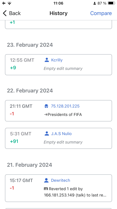
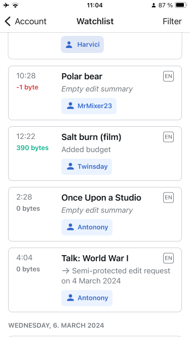
- Create parity for watchlist view and revision history view, to clearly call out when the edit summary is blank
Designs
1. Edit summary flow
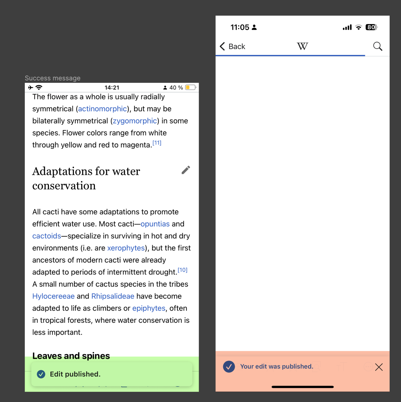
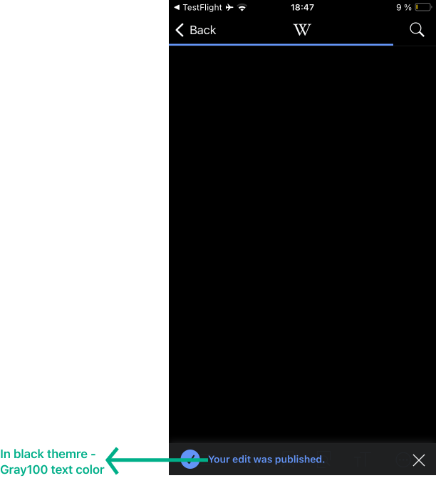
| 1) Scrolls to section | 2) Taps edit | 3) Makes edit | 4) Previews edit | 5) Edit summary | 6) Type summary | 7) Finalize summary | 8) Success message |
 |  |  |  |  |  |  |  |
Annotations
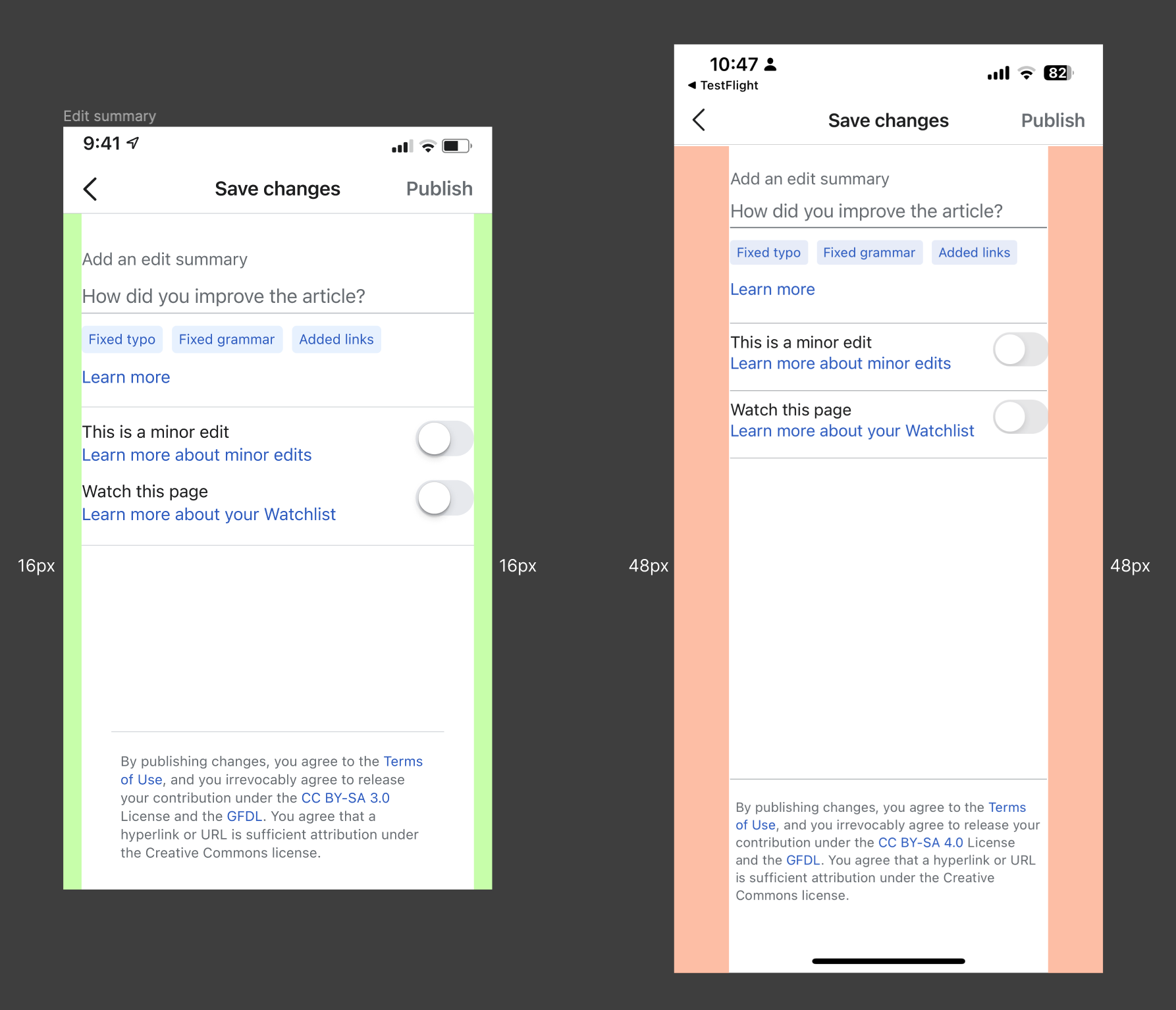
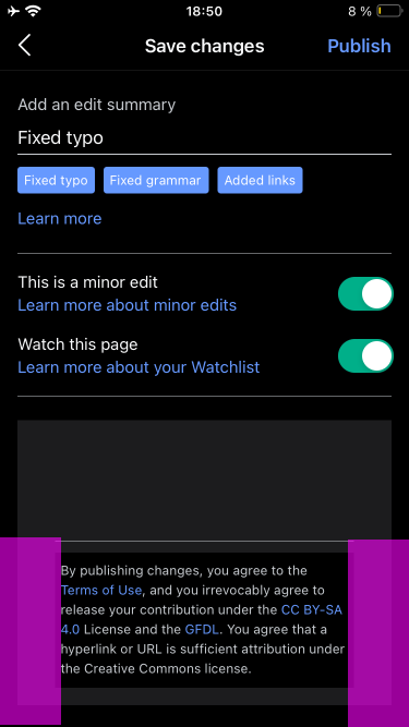
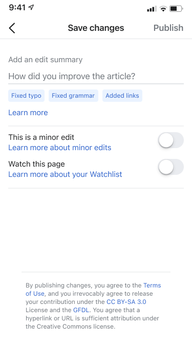
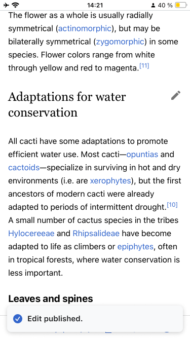
5) Edit summary
- Keyboard is active when users arrive on this screen to reduce steps.
- Will not be included at this time, see T354219#9616387
- PUBLISH button can be tapped at any time but is visually de-emphasized to encourage publishing with a summary.
- The color of the de-emphasized 'PUBLISH' button is 'gray500'
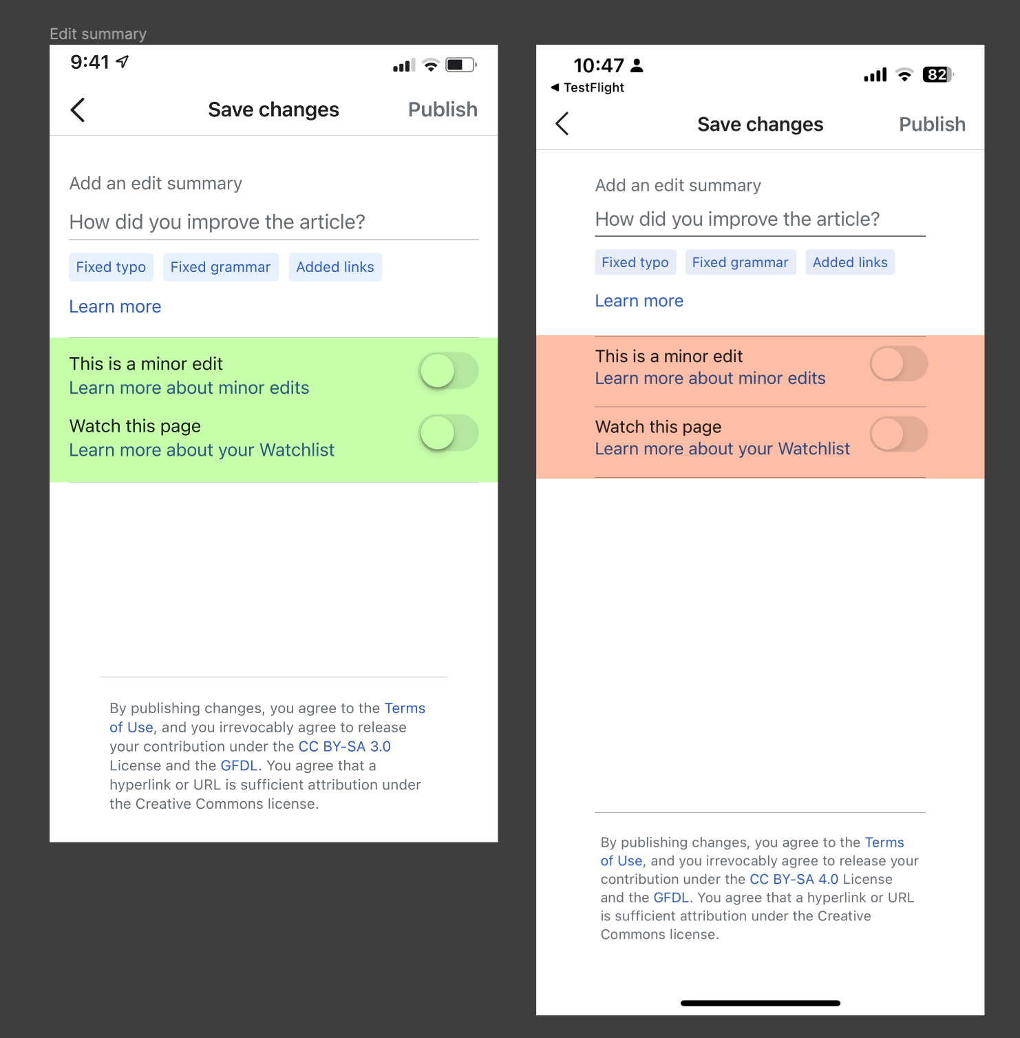
- If the article is on the user’s Watchlist, the Watch this page toggle is 'ON'
- Links
- Learn more about minor edits info button/icon link: https://en.wikipedia.org/wiki/Help:Minor_edit
- Learn more about your Watchlist info button/icon link: https://en.wikipedia.org/wiki/Help:Watchlist
- Learn more link: https://en.wikipedia.org/wiki/Help:Edit_summary
- Chips pre-fill the input field with plain text. Tapping a chip always clears the input field first.
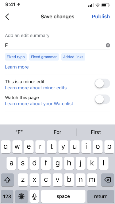
6) Suggestions:
 Will not be included at this time, explanation in comment below.
- This feature exists already and might help users prepopulate the field if tasks are done repeatedly. We will keep it to respect existing user flows.
- Suggestions should match the edit just completed (if they just added an image and caption, “Added Image and Caption” should appear, if they added Alt text, “Added Alt text” should appear, etc. (For T358923 and other future suggested edits)
- After publishing a custom edit summary, the contents of it (e.g., “Formatting") are stored.
- Once users start typing, the previously stored custom edit summary is presented as an autocomplete suggestion.
- Tapping the suggestion fills the input field and takes users to 7)
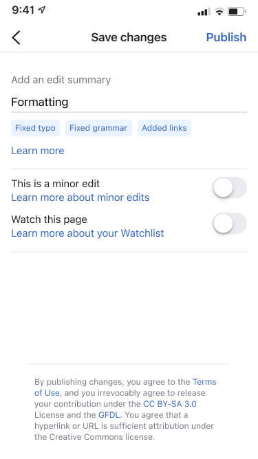
7) Finalizes summary: PUBLISH button turns into blue600 once the input field is populated with text.
2. Optimize the Watchlist screen
Please add Empty edit summary copy/info from Revision history to the Watchlist for consistency:
| Revision history | Watchlist |
 |  |
3) Requirement before release:
- Signoff from Shay on what is recorded to properly instrument new additions
References
Testing Notes
Please test in TestFlight Wikipedia app 7.5.0 (3509).
In addition to testing requirements in this task description, please also regression test captcha appearance on the edit summary view. There are some old testing steps for that here, but they didn't work for me. -TS