Page MenuHomePhabricator

Improve edit summaries
Closed, ResolvedPublic

Assigned To
Authored By
JTannerWMF
Dec 2 2021, 5:03 PM
Referenced Files
F35511958: Screenshot_20220907-123915.png
Sep 7 2022, 10:41 AM
F35509925: Screenshot_20220905-193039.png
Sep 5 2022, 5:32 PM
F35509921: Screenshot_20220905-192239.png
Sep 5 2022, 5:32 PM
F35509919: Screenshot 2022-09-05 at 19.24.16.png
Sep 5 2022, 5:32 PM
Restricted File
Sep 5 2022, 12:56 PM
Restricted File
Sep 5 2022, 12:56 PM
F35509754: Screenshot_20220905-143154.png
Sep 5 2022, 12:51 PM
F35509749: Screenshot_20220905-143253.png
Sep 5 2022, 12:51 PM
Tokens
"Mountain of Wealth" token, awarded by cmadeo.

Description

Background

Through our user research we've learned how critical communication is with reverts. To improve communication when reverts to other people's edits are made, our team can improve the diff view. One way of making this improvement is encouraging users to leave a detailed, but respectful summary of the edit they've made (including reverts). This is aligned with Wiki policy.

User stories

Our current summary experience can be improved to achieve the following user stories:

  • When my edit has been reverted, I want a clear distinction between the edit summary and the diff itself, so that I can process information more efficiently.
  • When editing Wikipedia, I want the interface to give me clear direction for crafting helpful summaries in line with Wiki policies, so that patrollers and other users understand why I made the change that I did to an article.
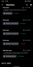
  • When accessing the Watchlist, I want to review a diff and clearly understand why an edit was made, so that I have the proper context to agree or dispute the change.
The Task
  • If someone selects other, provide some guidance from the edit summary policy and the reverting guidance
  • Do not allow people to publish without an edit summary
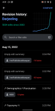
  • Create parity for watchlist view and revision history view, to clearly call out when the edit summary is blank
Designs (Figma ↗)
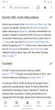
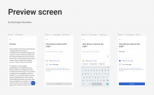
1. Edit summary flow
1) Scrolls to section
edit-summary-1.png (1×720 px, 607 KB)
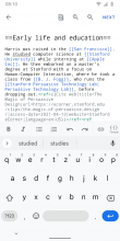
2) Taps edit
edit-summary-2.png (1×720 px, 220 KB)
3) Makes edit
edit-summary-1.png (1×720 px, 182 KB)
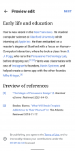
4) Previews edit
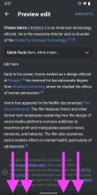
edit-summary-4.png (1×720 px, 185 KB)
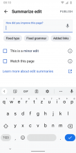
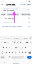
5) Summarizes edit
edit-summary-5.png (1×720 px, 80 KB)
6) Suggestions
edit-summary-6.png (1×720 px, 73 KB)
7) Finalizes summary
edit-summary-7.png (1×720 px, 82 KB)
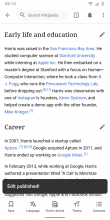
8) Success message
edit-summary-8.png (1×720 px, 204 KB)
Annotations

4) Previews edit:

  • Preview is now separated from the preview (per @Moshtagh.maveddat’s excellent suggestion).
  • It also includes the legal disclaimer as a sticky (position: fixed) element at the bottom of the screen.

5) Summarizes edit:

6) Suggestions:

  • This feature exists already and might help users prepopulate the field if tasks are done repeatedly. We will keep it to respect existing user flows.
  • After publishing a custom edit summary, the contents of it (e.g., “Formatting") are stored.
  • Once users start typing, the previously stored custom edit summary is presented as an autocomplete suggestion.
  • Tapping the suggestion fills the input field and takes users to 7)

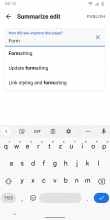
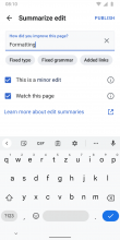
7) Finalizes summary: PUBLISH button turns into colorAccent once the input field is populated with text.

2. Optimize the Watchlist screen

Please add Empty edit summary copy/info from Revision history to the Watchlist for consistency:

Revision historyWatchlist
Screenshot_20220815-163137.png (2×1 px, 145 KB)
Screenshot_20220815-163202.png (2×1 px, 142 KB)

3) Requirement before release:

  • Signoff from Shay on what is recorded to properly instrument new additions
  • Determine if data should be recorded in MobileAppEdit or EditAttemptStep

APK: https://github.com/wikimedia/apps-android-wikipedia/pull/3536
Event Timeline

There are a very large number of changes, so older changes are hidden. Show Older Changes
scblr updated the task description. (Show Details)

Hi, My name is Moshtagh, I'm a Product Designer from Iran. I followed the tasks here to find a way to help the project, I saw this task and thought it could be a point for starting.

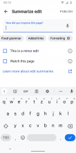
I believe if we want not to allow people to publish without an edit summary, then we should lead the user to type sth by default instead of offering some ready options. That's why I think it's a good idea to have a text field and use the "Fixed typo", "Fixed grammar" & "Added links" as some ready-to-use texts which can help the user to type faster.

here's my suggestion for the edit summary:

Screen Shot 1401-02-24 at 3.02.44 AM.png (1×1 px, 222 KB)

Figma file

I used the Material design and our type guidelines

Please feel free to tell me about edits in case I can continue working on it.

Hi Dear @JTannerWMF

How can I make it ready to develop?

JTannerWMF added subscribers: Mostafameraji, scblr.

Wow thank you so much for this feedback and the work you've done @Mostafameraji , we will draw inspiration from it to implement these changes. Our team's lead designer @scblr will add just a few more guided notes for the engineers, but I hope you stay engaged on this task to provide input and reviews as we build

As it relates to the point about consistency of watchlist and edit history, please see the images

Screenshot_20220815-163137.png (2×1 px, 145 KB)

Screenshot_20220815-163202.png (2×1 px, 142 KB)

Added more definitions on how to handle custom text input storage to the task, per @JTannerWMF’s question from yesterday.

8) Chip is stored
edit-summary-8.png (1×720 px, 81 KB)
  • This feature exists already and might help users prepopulate the field if tasks are done repeatedly. We will keep it to respect existing user flows.
  • After publishing an edit summary with custom text, the contents of the custom text (e.g., “Formatting") are saved as a chip below the input field.
  • Chips appear in a horizontally scrollable list, per Material’s definition.
  • Chips with custom text can be removed by tapping the “remove” icon.

CC @cooltey @Dbrant

@scblr @Dbrant and I talked about this and will get rid of the "Other" chip or custom stored chip but keep the "Fixed Grammar", Added Link", "fixed typo" and when someone types their summary in the bar what they've written before will show up in the input field as a drop down option.

I have completed the designs per our discussion @Dbrant @JTannerWMF. Check out the task’s description and especially step 6) Suggestions: 👇

edit-summary-6.png (1×720 px, 73 KB)

  • This feature exists already and might help users prepopulate the field if tasks are done repeatedly. We will keep it to respect existing user flows.
  • After publishing a custom edit summary, the contents of it (e.g., “Formatting") are stored.
  • Once users start typing, the previously stored custom edit summary is presented as an autocomplete suggestion.
  • Tapping the suggestion fills the input field and takes users to 7)

And I moved the task to the next column (Needs analytics). I suggest measuring if the changes in the task’s description lead to more (valuable) edit summaries written in the Android app (CC @SNowick_WMF).

Hi @scblr

The implementation is completed. Please download the APK from the ticket description. Thanks.

BTW, I found the following things that would like to discuss with you:

  1. I tried to reduce the margins between summary tags but looks like the last item will be pushed to the next line in a small screen device. (I am using Samsung S9).

Screenshot_20220829-172208_Wikipedia Dev.jpg (2×1 px, 294 KB)

  1. About the "Watch this page" checkbox, I found the desktop version also provides an option to change the expiry. Should we follow that?

1661818773901.jpg (200×788 px, 51 KB)

Hi @scblr

The implementation is completed. Please download the APK from the ticket description. Thanks.

BTW, I found the following things that would like to discuss with you:

  1. I tried to reduce the margins between summary tags but looks like the last item will be pushed to the next line in a small screen device. (I am using Samsung S9).

Screenshot_20220829-172208_Wikipedia Dev.jpg (2×1 px, 294 KB)

Can we use horizontal scrolling for these “chips” instead of stacking?

  1. About the "Watch this page" checkbox, I found the desktop version also provides an option to change the expiry. Should we follow that?

1661818773901.jpg (200×788 px, 51 KB)

To not overwhelm users with settings – I think it’s fine to keep it a simple checkbox.

Hi @scblr

Can we use horizontal scrolling for these “chips” instead of stacking?

Yes and done.

To not overwhelm users with settings – I think it’s fine to keep it a simple checkbox.

👍

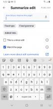
Excellent work so far @cooltey – I noticed some other issues:

1) Change color of status bar in the Preview to color_group_50 (same as in the article)

Screenshot_20220905-142739.png (2×1 px, 369 KB)

2) Tapping the chips below should move the cursor to the end, not the beginning

Screenshot_20220905-143416.png (2×1 px, 175 KB)

Video explanation: https://www.dropbox.com/s/20auz1j8bfut0xw/screen-20220905-143640.mp4?dl=0

3) There are color / theme issues:

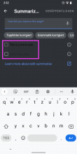
Screenshot_20220905-143253.png (2×1 px, 166 KB)

  1. Use color_group_3 for the checkbox (to increase affordance when empty, per designs)
  2. Use [[ color_group_5 | color_group_5 ]] for the label
  3. For disabled elements (e.g. Watch this page when not available), use the same definitions as in 1. and 2. but reduce the opacity to 50%

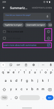
4) Open all these pages in-app, not in the browser:

Screenshot_20220905-143154.png (2×1 px, 166 KB)

5) Chip style: use the same colors for the label and background from the results in reading lists:

Edit summary {F35509760}vsReading lists: {F35509758}
This comment was removed by scblr.

Excellent work so far @cooltey – I noticed some other issues:

1) Change color of status bar in the Preview to color_group_50 (same as in the article)
2) Tapping the chips below should move the cursor to the end, not the beginning
3) There are color / theme issues:
4) Open all these pages in-app, not in the browser:
5) Chip style: use the same colors for the label and background from the results in reading lists:

@scblr
All done! Please download the updated APK from the ticket description. Thanks!

Perfect @cooltey – one last issue before moving it to QA signoff.

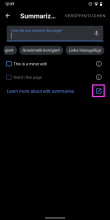
1) Due to the fact that links are now opened in-app (🥳) – we can remove the external link icon here:

Screenshot_20220907-123915.png (2×1 px, 114 KB)

Hi @scblr,

  1. Due to the fact that links are now opened in-app (🥳) – we can remove the external link icon here:

Done!

Great! Moving it to the next column! 🎯

Hi @scblr

Based on @Dbrant's code review comment here: https://github.com/wikimedia/apps-android-wikipedia/pull/3536#pullrequestreview-1100817361

The Wikipedia URLs will bring up the app-chooser when the user clicks on the links and it will break the current edit session. It would be better if we use the previous approach, which opens the URL in an external browser. Does that make sense to you?

Ok, but isn’t the app-chooser an edge case for us who work on the app and have multiple Wikipedia app versions installed (Production, Beta, Alpha, Dev)? What happens if you only have production installed– will it (breaking the current edit session) also happen? If the answer is yes, then it makes sense to use the previous approach (open in browser and add the external link icon again)

Scriblr, the answer is yes, if I'm understanding the context right. Before today, I only had the production version of the app installed and when editing on the mobile browser and trying to click publish, it would open up the app.

Ok, but isn’t the app-chooser an edge case for us who work on the app and have multiple Wikipedia app versions installed (Production, Beta, Alpha, Dev)? What happens if you only have production installed– will it (breaking the current edit session) also happen? If the answer is yes, then it makes sense to use the previous approach (open in browser and add the external link icon again)

@scblr

It will still pop up the app chooser that allows you to pick either your browsers or the Wikipedia app since the Wikipedia URLs are supported by browsers AND the Wikipedia app.

Thanks @cooltey & @Clovermoss, then please apply this:

If the answer is yes (app chooser pops up), then (...) use the previous approach (open in browser and add the external link icon again)

Actually moving this back to ensure we are being inclusive of languages. I will make a separate task for this.

I think we borrowed the links from iOS and when I click on the links for iOS it takes me to EN Wiki, but I am also testing with my device being in English for both Android and iOS was wondering if there was thought put into what help links people see on varying language wikis for edit summaries when iOS built this.

On Desktop it varies by language. On EN it takes people to the page we are directing people to, on AR it has no help links, on FR it sends it to the relevant help page for French. On Mobile Web on FR there aren't help links.