Page MenuHomePhabricator

Revision Slider clutters mobile UI
Open, Needs TriagePublicBUG REPORT

Description

Steps to replicate the issue (include links if applicable):

  • Visit on a mobile device (make sure you are logged in)

What happens?:

Screenshot 2024-02-05 at 4.54.10 PM.png (1×1 px, 268 KB)

What should have happened instead?:

The revision slider takes up A LOT of space at the top of the page, particularly when open. Could it perhaps be moved to the bottom of the page or hidden at lower resolutions?

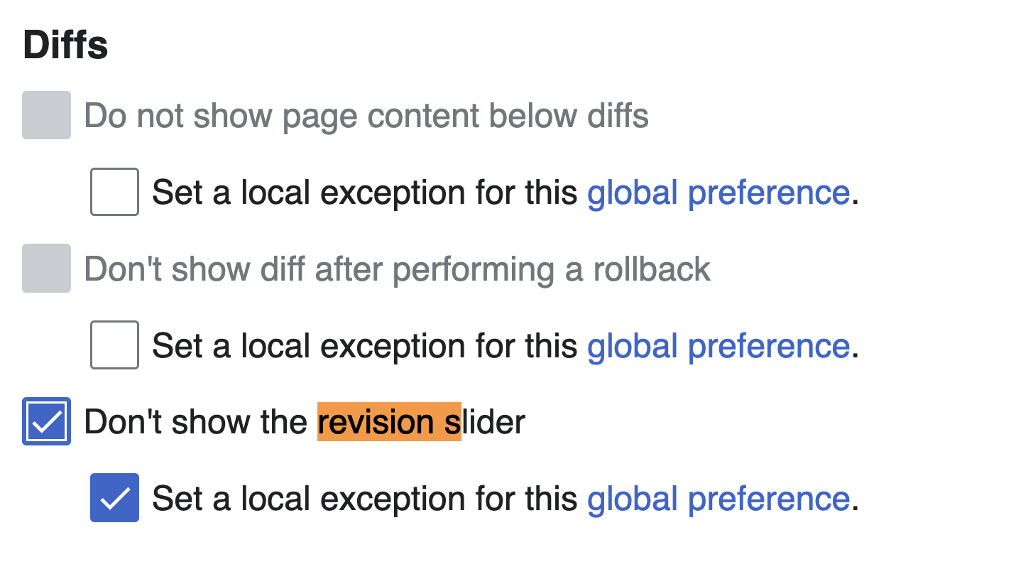
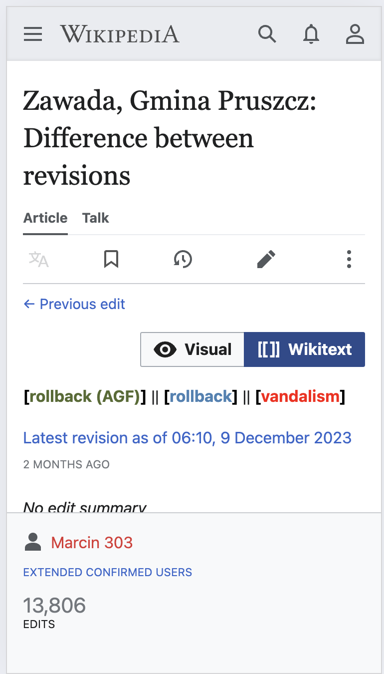
When the revision slider is open (which seems to sometimes be default for me) the diff is pushed off the bottom of the screen:

Screenshot 2024-02-05 at 5.08.47 PM.png (1×764 px, 106 KB)

Compare with the slider disabled:

Screenshot 2024-02-05 at 5.09.27 PM.png (822×1 px, 150 KB)

Screenshot 2024-02-05 at 5.10.04 PM.png (1×770 px, 130 KB)

Software version (skip for WMF-hosted wikis like Wikipedia):

Other information (browser name/version, screenshots, etc.):

Event Timeline

Honestly the slider is a pain to use on mobile (prior experience in Timeless and V22 mobile experiment) and could use some TLC from that direction.

That said, I notice in one of your images that you have selected the pin in the top right of the bar. That pins the state to open by default. Otherwise, it defaults to closed. One closed line is not all that much; while not particularly useful on mobile, it is usable.

I'm afraid I don't fully understand what the issue is. Is this about the light gray button with the label "Browse history interactively" at the top? Why is this a problem but all the other UI elements that take up the same amount of space (notably the row with the "Visual/Wikitext" buttons) are not?

From which device(s) are the screenshots?

I can indeed see us making a few changes:

  • Would it help to make the button a bit thinner?
  • Is it possible to make the button part of the toolbar above?
  • Is there a sensible breakpoint where we can hide the RevisionSlider entirely when a screen is so extremely narrow that the slider can't be used anyway?
  • What about ignoring the sticky setting on very small screens so the slider is never expanded by default, but still is on larger screens?
  • …?

We can try to come back to this product the next months with WMDE-Design involved, but no promises.

I'm afraid I don't fully understand what the issue is. Is this about the light gray button with the label "Browse history interactively" at the top? Why is this a problem but all the other UI elements that take up the same amount of space (notably the row with the "Visual/Wikitext" buttons) are not?

Yes. I would argue the primary purpose of this page is viewing the diff so anything that takes focus away from the diff should be given less prominence in the mobile UI.

From which device(s) are the screenshots?

This is from the Chrome emulator for iPhone.

I can indeed see us making a few changes:

  • Would it help to make the button a bit thinner?
  • Is it possible to make the button part of the toolbar above?
  • Is there a sensible breakpoint where we can hide the RevisionSlider entirely when a screen is so extremely narrow that the slider can't be used anyway?
  • What about ignoring the sticky setting on very small screens so the slider is never expanded by default, but still is on larger screens?
  • …?

We can try to come back to this product the next months with WMDE-Design involved, but no promises.

Thanks!

For reference: I just learned that the mentioned diffmode buttons disappear below a breakpoint of 1000px. This was implemented via T240624 using the (deprecated) @width-breakpoint-desktop. Personally I'm not sure if the slider should behave the exact same. While the slider becomes more and more useless the smaller the screen is it's still usable with no problem at 1000px. A better fit for the slider might be the @max-width-breakpoint-mobile at 639px. To be discussed.

I also learned that the issue here is probably an unexpected effect of T305113. RevisionSlider always had a line of code to hide it from Special:MobileDiff. The reason it appears on mobile now is apparently because Special:MobileDiff isn't used anymore. We know what to do instead. 😇️