Page MenuHomePhabricator

Fix insufficient difference between background colors for un/read notifications in the Echo flyout
Closed, ResolvedPublic

Description

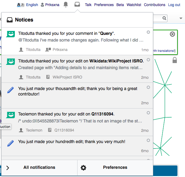
The difference between the White and Very-Light-Grey (#F1F1F1) backgrounds, that appear for read and unread notifications in the Echo flyout, is hard to see.

An editor at https://en.wikipedia.org/w/index.php?title=Wikipedia_talk:Notifications&oldid=638151935#Notification_didn.27t_work_for_.7B.7Bu.7D.7D says he "wouldn't have noticed it if you hadn't mentioned it to me".

Coupled with the way that Echo Alert Notifications all get marked as read when the flyout is opened, this is probably leading to some people missing notifications.

See T78363: Special:Notifications does not mirror the read/unread statuses from the echo flyout.


To fix this let us use the Base80 color that is #eaecf0 instead of #f1f1f1in mw.echo.ui.NotificationItemWidget.less and increase the @opacity-low variable to 0.6.

Repo - https://gerrit.wikimedia.org/r/#/admin/projects/mediawiki/extensions/Echo

Event Timeline

Quiddity raised the priority of this task from to Medium.
Quiddity updated the task description. (Show Details)
Quiddity changed Security from none to None.
Quiddity subscribed.

What colors should we use instead?

I think changing this to Base80 from the styleguide, that is #eaecf0 should make it better, I tested it with a good screen in the sun so YMMV. @Pginer-WMF
what do you think.

Once we agree on a color we could put up this task for Google-Code-in-2017.


Testing with colors from the styleguide.

CurrentBase 90Base 80Base 70
#f1f1f1#f8f9fa#eaecf0#c8ccd1
f1f1f1 - current.png (584×611 px, 111 KB)
f8f9fa - base90.png (586×608 px, 110 KB)
eaecf0 - base80.png (585×611 px, 111 KB)
c8ccd1 - base70.png (586×610 px, 111 KB)
With other corrections
Screen Shot 2017-11-09 at 10.23.44 AM.png (582×614 px, 112 KB)
Screen Shot 2017-11-09 at 10.23.51 AM.png (584×608 px, 112 KB)

Reminder, that we've also got read/unread indicators in the top. How important is that difference with the additional notification badges that have to be interacted with before that dialog is presented to make the difference visually stronger?
Also, I'd like to put a word of caution about using a background-color with lower luminosity than Base80 with the secondary contents like user or date, which would fall below level AA accessibility then.

The read notification color is still #f1f1f1, the :hover color was changed to #f8f9fa. @Pginer-WMF your input, please.

Reminder, that we've also got read/unread indicators in the top. How important is that difference with the additional notification badges that have to be interacted with before that dialog is presented to make the difference visually stronger?

…the number in the little red background square was "2". I'm not sure how this number works, but if it goes to "0" with a gray background when someone just views the list without going to all the new diffs, here's what might have happened…

The act of clicking the red counter resets it to zero and grey regardless of what you then do.…If you exit and go back in, the top two have also become grey - as far as the notifications system is concerned, you've acted on them all.

I received 2 new notices, as indicated by the red counter, and went to my list. I saw the white background for the two messages, but it was very subtle and I wouldn't have noticed it if you hadn't mentioned it to me…

I made some tests and I'd go with Base80 in this case.

The lighter alternative (Base90) makes it hard to identify when the read section starts as you scroll, and darker alternatives give the completed items too much weight.

As Volker pointed out, using Base80 reduces the contrast with the text. Currently the secondary actions are shown initially at 50% opacity, we may want also to adjust them to be shown at 60% at least to increase the contrast a bit.

Thanks for your inputs @Volker_E and @Pginer-WMF, Base80 it is! I'll update the task description :)

Florian subscribed.

Imported as: https://codein.withgoogle.com/dashboard/tasks/5636109377732608/

@Prtksxna I haven't found you as a mentor in the GCI site, can I ask, if you want to register as a mentor? Otherwise I'll happily co-mentor the task with you for the communication on the GCI platform :) Thanks for your effort investing in getting the task finished with one of our students this year! :)

Aklapper renamed this task from Echo flyout, insufficient difference between background colors for un/read notifications to Fix insufficient difference between background colors for un/read notifications in the Echo flyout.Nov 20 2017, 1:55 PM

Change 396554 had a related patch set uploaded (by Albert221; owner: Albert221):
[mediawiki/extensions/Echo@master] Better color to represent read notifications

https://gerrit.wikimedia.org/r/396554

Change 396554 merged by jenkins-bot:
[mediawiki/extensions/Echo@master] Better color to represent read notifications

https://gerrit.wikimedia.org/r/396554

Checked in betalabs - the background colors (read/unread with hover on states) work as expected.