Page MenuHomePhabricator

B1. Move Flow board header to side rail, with responsive width and full-width toggle
Closed, ResolvedPublic5 Estimated Story Points

Assigned To
Authored By
He7d3r
Jan 30 2015, 1:59 PM
Referenced Files
F157865: side_rail_basic.jpg
Apr 27 2015, 10:22 PM
F157871: side_rail_tiny_width.jpg
Apr 27 2015, 10:22 PM
F157867: side_rail_full-width.jpg
Apr 27 2015, 10:22 PM
F157869: side_rail_responsive_width.jpg
Apr 27 2015, 10:22 PM
F101907: about-collapsed-notification.png
Mar 20 2015, 1:51 PM
F101918: about-collapsed-notification-simple.png
Mar 20 2015, 1:51 PM
F101860: rail-scroll-after.png
Mar 20 2015, 1:37 PM
Tokens
"Like" token, awarded by Kghbln."Like" token, awarded by Florian."Like" token, awarded by Sunpriat.

Description

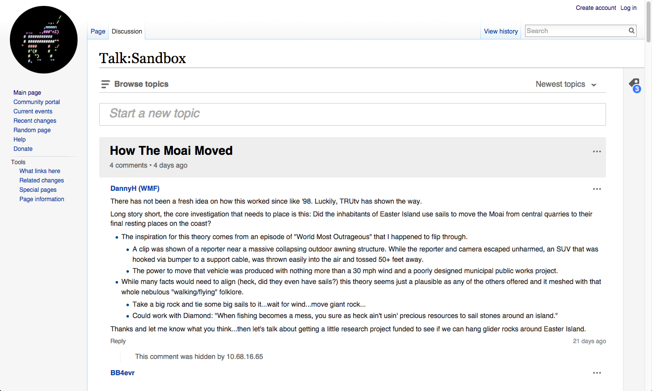
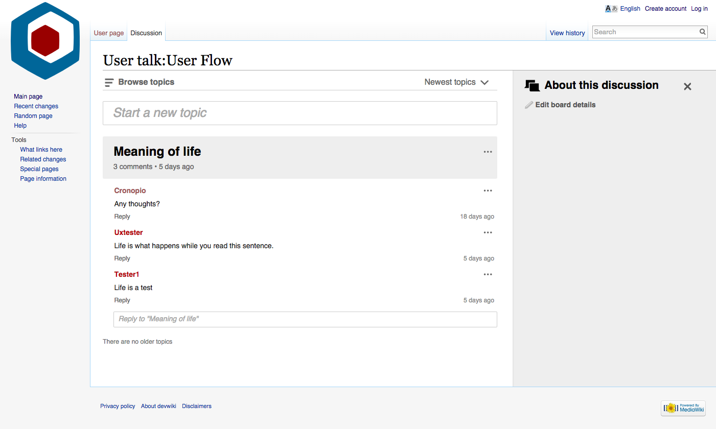
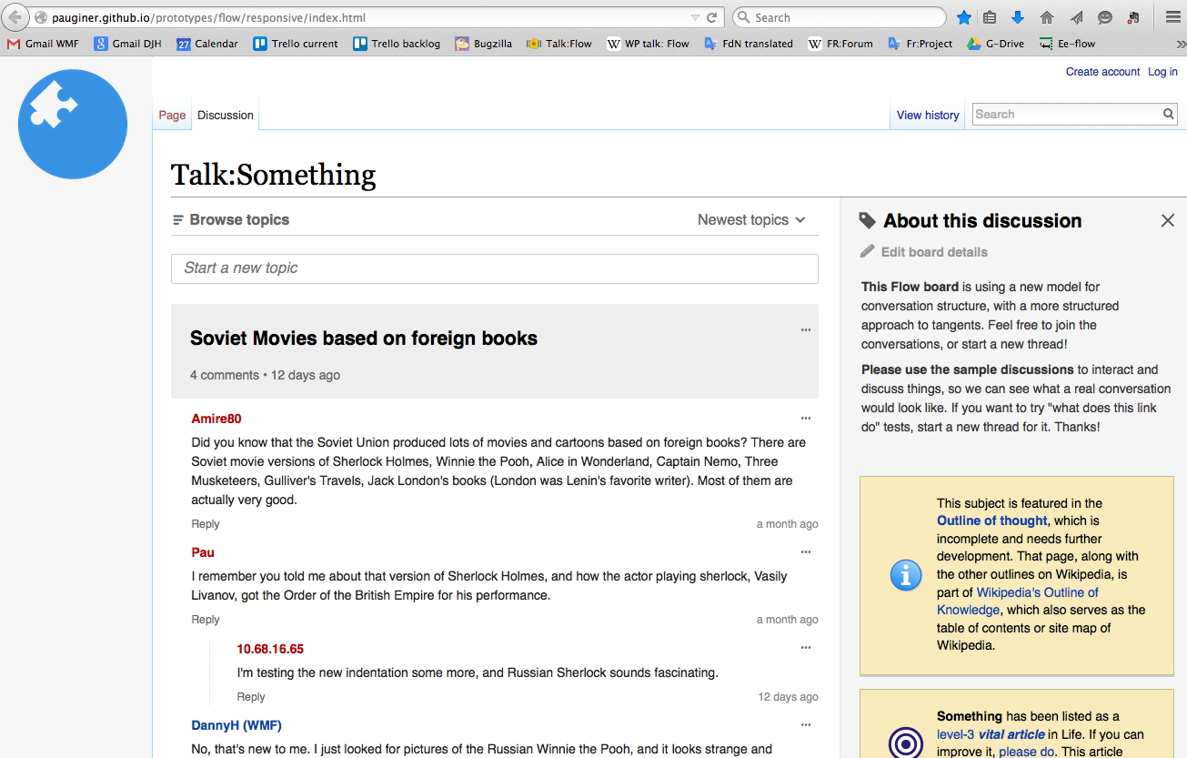
Clickable prototype here: http://pauginer.github.io/prototypes/flow/responsive/index.html

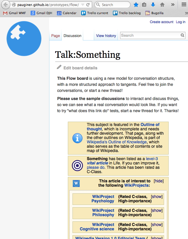
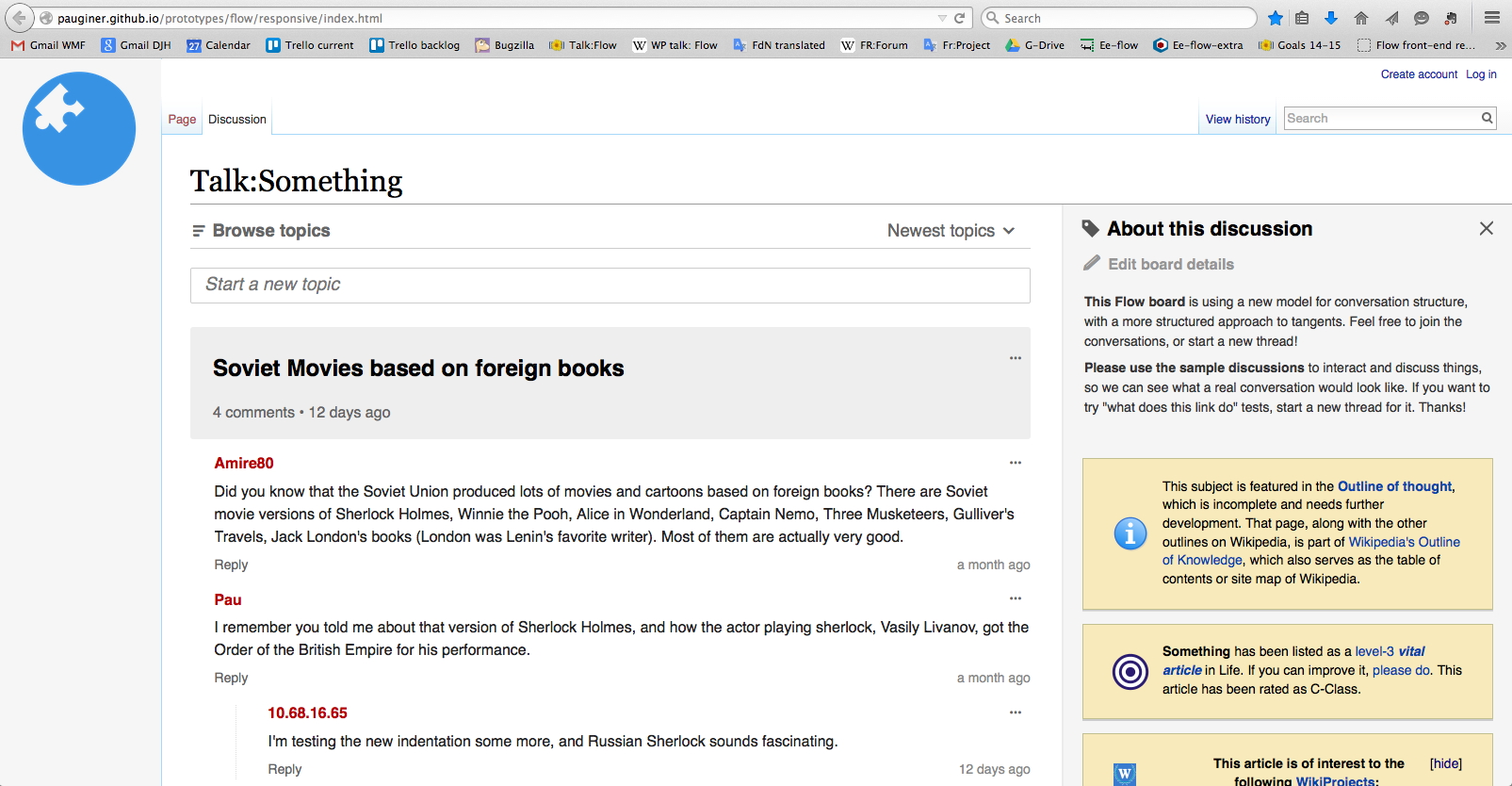
  • Move the wikitext that was in the Flow board header to the side rail. See prototype & mocks/screenshots for styling.
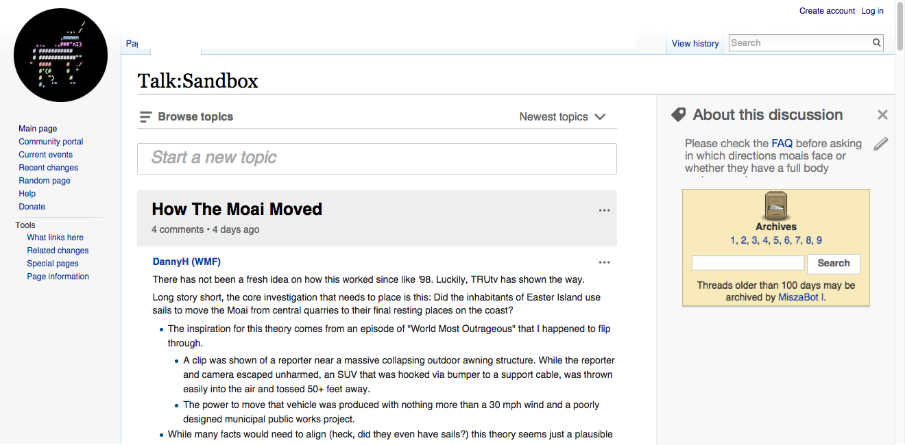
  • The side rail has a title, which is not editable per page: "About this discussion page"
  • There is an edit pencil icon at the top of the side rail wiki content. When the user clicks the icon, an entry field appears in that location, with the content represented in VE or wikitext (as determined by the user's sticky pref). This should follow the same model as editing an existing post -- replacing the content with the editing field, with Cancel link and Save changes button.
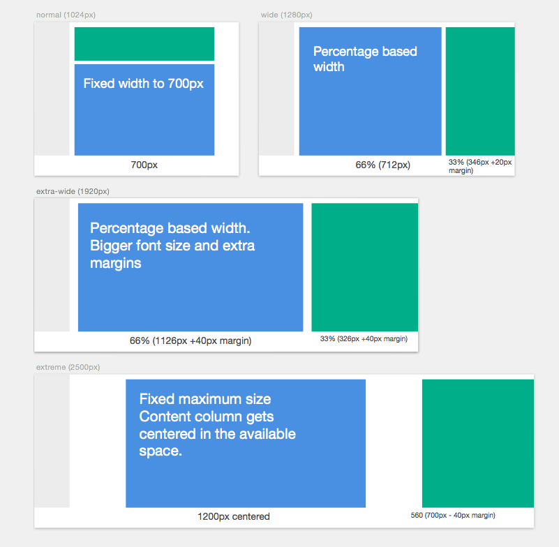
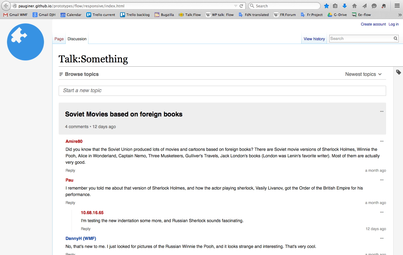
  • Responsiveness: As the browser window gets bigger/smaller, the width of the content and the side rail change. There are breakpoints for minimum width and maximum width. When the browser window hits the minimum width, the side rail content pops to the top of the page.
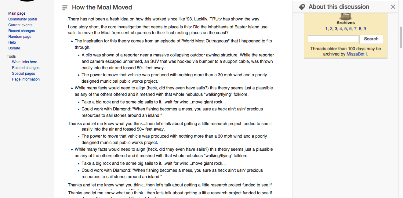
  • Collapse toggle: The open side rail has an X at the top right. Clicking on the X collapses the side rail to a thin border, and the Flow content fills the rest of the browser window. Clicking on the icon in the border re-opens the side rail. The default is open. (See separate ticket for sticky user preference.)

Notes:

There are separate tickets for some of the elements seen in the prototype/mocks. This ticket is limited to the elements defined above.

Do we need a mockup for editing the side rail, with cancel/save changes?

Add definition of responsive width breakpoints?

Is the full-width (collapsed rail) also responsive? What's the maximum width?

The text at the top of the side rail is still in dispute -- current suggestion is "About this discussion page". Does that work, or is there something better?

In the prototype, if you have the side rail collapsed and then make the browser window smaller, the side rail content jumps to the top anyway. Do we want a "collapsed" small-width state? There's a separate ticket for phones -- whatever decision we make there will probably work for small desktop widths as well.

Content with side rail:

side_rail_basic.jpg (833×1 px, 568 KB)

Full-width content with side rail collapsed:

side_rail_full-width.jpg (830×1 px, 395 KB)

Responsive layout allows both columns to get bigger:

side_rail_responsive_width.jpg (834×1 px, 626 KB)

Browser window is too small; side rail jumps to the top:

side_rail_tiny_width.jpg (827×651 px, 397 KB)

Related Objects

Event Timeline

There are a very large number of changes, so older changes are hidden. Show Older Changes
DannyH renamed this task from Move Flow "header" to right rail, add toggle for full-width to Move Flow "header" to right rail, add toggle for full-width + link to archives.Mar 19 2015, 10:43 PM

As per the last design discussion, I provide more details on how we can accommodate different screen sizes. The idea is to make the best use of the available space by adjusting several factors (fixed/percentage width, font size and margins).

  • Width < 1050px. The header is not shown as a right rail, it is shown at the top of the page as usual. Flow content has a fixed 700px width.
  • Width between 1051 and 1250. The right-rail is shown. Flow content has a fixed 700px width, and the right sidebar uses the remaining space (keeping 20px of separation from the flow content).
  • Width between 1251 and 2000. Flow content takes 66% of the available space and the right-rail 33%. If the viewport width is bigger than 1500px, the font size and the margins are increased to keep a reasonable line length.
  • Width > 2000px. Flow content is kept at 1200px and the right-rail at 600px with increased font-size and additional margins. The flow content is kept centered in the available space so that extra space is distributed equally.

    The values provided assume that the standard Mediawiki left sidebar takes 201px, and they have been calculated in a way that the size for the content at the end of a breaking point and the next is the same. We may want to adjust some of the numbers, but it would be great to keep the above into account (e.g., to make it easy to fix if Mediawiki removes the left sidebar one day).

The diagrams below are representations at scale of some viewport sizes following the above approach (blue for the flow discussion and green for the right rail):

flow-viewport-sizes.png (784×801 px, 79 KB)

Scrolling or fixed? Does the rail scroll with you, so that it disappears as you scroll down the page & becomes a blank space? Or is it fixed, with its own scroll?

I'd consider the following criteria:

  • Avoid distractions. Most of the content of the right rail is general information, that once the user starts reading the content is not that relevant to justify keeping it visible all the time (currently it has not been an issue to have it at the very top of the page).
  • Simplicity. A single scroll bar to control is better than two.
  • Quick operation. The need to expand the flow content may happen in the middle of the page (e.g., when you find a post with an embedded table. Thus, it will be convenient for those cases to keep a way to close the sidebar accessible all the time.

Considering the above, I propose the following solution: Keep the sidebar as a fixed part of the page but make it's header to become sticky once you scroll (size of the header should meet the size of the sticky ToC bar). The header will provide a quick way to close the right rail available all the time (clicking on the title will scroll to the top for quick access to the header info).
Mockups to illustrate the idea below:

rail-scroll-before.png (650×1 px, 208 KB)

rail-scroll-after.png (649×1 px, 253 KB)

Sticky or not? For a user who really wants full-width display every time, it would be a pain to have to click to collapse the rail every pageview, or even once for each unique page. On the other hand, keeping "closed" sticky for all pages means that the user might miss something that's unique to a board that they've never visited before.

I considered keeping the preference persistent for each page. I think users would understand that they are shown some new information specific for the current page that is easy to dismiss.

If we want to make the preference persistent for all pages, we need to surface that there is information the user has not seen. for that, we can show highlight or even indicate how many pieces of information are there (if the volume can suggest that some page is worth looking):

about-collapsed-notification-simple.png (793×1 px, 207 KB)

about-collapsed-notification.png (793×1 px, 207 KB)

I created a quick prototype to illustrate the right rail toggling and templates. I still need to adjust the breakpoints for the responsive adjustments, but feel free to provide some feedback.

I should add that the (full-)width toggle is also useful for Flow history pages (which do not have any header).

I should add that the (full-)width toggle is also useful for Flow history pages (which do not have any header).

That issue is purely a bug, T93028: Topic History pages should be full-width to match Board History

A wide template of a header easier to make narrower than the narrow long template stretch in a wide header. Need to try.

I have updated the prototype with some changes:

  • Adjust breakpoints. I adjusted the small (1165px), medium (1300px) and large (2000px) breakpoints to make the size of elements to be more gradual, and avoid the right-rail to be shown when it is too narrow.
  • Adjust the "edit action" below the right-rail header to avoid it conflicting with the right-rail close action.
  • Categories. A new card is shown for categories with an action to add new categories and another one to edit the existing ones (which would turn the links into tag elements that you can remove.
  • Font size consistency. Since the prototype html structure is different from the real sites, I adjusted the font sizes to specific pixel sizes taken from the computed values of the equivalent elements in wikipedia.
  • Copyright text added at the end of the right-rail.

For different elements (such as categories) we need to specify their design details and discuss them separately (e.g., are we able to improve the way categories are dealt with, or just display them in the initial iterations?), but the prototype should provide now a better overall view of the proposed approach for anyone to comment on.

I like this a lot. :) The breakpoints feel natural to me, and it feels like I have a good amount of control over my display. I like having the "About this board" header with its own ToC-style fixed placement, so I can switch back and forth even if I'm lower on the page.

I think it would be good to show this to users at Mediawiki, and another community where they're asking about this -- maybe Portuguese or Russian, if Helder or Sunpriat think it's a good idea? :)

I have a few notes, which could be incorporated in the prototype or just in the spec.

  • When I make my browser window smaller, there's a point where the side rail jumps to the bottom of the page. If I continue to make it smaller, it jumps to the top.
  • I think at least for now, the whole side rail will be one big editable area, rather than a set of modules. We're just moving the content from the top to the side -- so the edit window would show the text, the templates for the WikiProject & archives boxes, and the category tags. Most (if not all) of the categories on talk pages come from the templates anyway -- the "Level 3 vital article" box adds the "Level 3 vital article" category. So we don't need to create a new interface for adding or editing categories.
  • "About this discussion" should be "About this board" or "About this Flow board"?
  • Icons for About this discussion and Edit board details -- it's one icon above the other, and they're pointing in opposite directions. :) I would suggest we live without the "About this discussion" icon, but we're displaying that icon when the siderail is collapsed, and it's helpful to have continuity, so you know that you can open the rail again. So I don't really have a suggestion atm.
  • Open question: Do we include the board's siderail on the Topic pages? I think yes, because the header might have important guidelines to be aware of, as we saw on the enwiki Homeopathy talk page. So if someone follows a link to a topic on that board, they should have access to those guidelines too. What do you think?
  • "About this discussion" should be "About this board" or "About this Flow board"?

Maybe. "About this board" would be good, but not if it's displayed on the topic page.

  • Open question: Do we include the board's siderail on the Topic pages? I think yes, because the header might have important guidelines to be aware of, as we saw on the enwiki Homeopathy talk page. So if someone follows a link to a topic on that board, they should have access to those guidelines too. What do you think?

This would be another thing to re-visit when we allow topics to be displayed on multiple boards. Also, "About this board" would need to be different here.

When I make my browser window smaller, there's a point where the side rail jumps to the bottom of the page. If I continue to make it smaller, it jumps to the top.

That was not intended. I checked that this issue happens in Firefox but not on Chrome. For the prototype I used the flexbox model of layout for fast prototyping which may have some inconsistencies across browsers. I didn't expect it to work on old versions of IE, but at least I expected it to work consistently in latest modern browsers.

I think at least for now, the whole side rail will be one big editable area, rather than a set of modules.

Makes sense. Thanks also for the clarification on categories in this context.

"About this discussion" should be "About this board" or "About this Flow board"?

I proposed "about this discussion" because "discussion" seemed to represent the main concept (matching the "discussion" tab in Mediawiki and places other than English Wikipedia where "talk" is used instead). The content is the discussion, and while the place where it happens (a board) or the technology supporting it (Flow) are related, just referring to the discussion avoids the user to figure out additional concepts. I think is better to refer to the content as much as possible. Ideally, the label of the tab, the way the user understand the content and the label describing it should be as aligned as possible.

Icons for About this discussion and Edit board details

I''l check with @violetto about the icons. The tag icon may work in both directions. I'll give it a try.

Open question: Do we include the board's siderail on the Topic pages?

I'm more inclined to not including the board's siderail for Topic pages. I think that a specific post already frames the conversation enough and the link to see the full conversation should cover the cases when more context is needed (e.g., checking if there are similar posts or the FAQ). Including general information of the wider conversation can be confusing at this level (i.e., the user thinking that the info refers to that specific piece of conversation). Having said that, I'll look for examples where this info can be helpful to think on this in context.

DannyH renamed this task from Move Flow "header" to right rail, add toggle for full-width + link to archives to Move Flow board header to side rail, with responsive width and full-width toggle.Apr 27 2015, 10:12 PM
DannyH updated the task description. (Show Details)
DannyH edited a custom field.
DannyH updated the task description. (Show Details)
DannyH renamed this task from Move Flow board header to side rail, with responsive width and full-width toggle to B1. Move Flow board header to side rail, with responsive width and full-width toggle.May 6 2015, 8:45 PM

Change 209807 had a related patch set uploaded (by Sbisson):
WIP: Responsive side rail

https://gerrit.wikimedia.org/r/209807

Change 209807 had a related patch set uploaded (by Sbisson):

Great progress @SBisson.

Some details to consider:

  • Right rail height. The right rail should reach the footer at the bottom. Without using flexbox, this is not trivial.
  • Right rail separation. In the image below I added a shadow ( "box-shadow: -2px 0 0 0 rgba(0,0,0,0.10)" ) to separate the discussion and the right rail making it convey the idea of being notes at the margin.
  • Close control. The "X" to close should be closer to the right edge and do not overflow at small sizes (making the header text smaller will also help).
  • Right rail header. The text needs to be smaller so that the overall height is the same as the TOC height. In that way, when both stick on top, they will look as a single bar.

A screenshot below illustrating the border box and side rail height:

screencapture-127-0-0-1-8080-wiki-User_talk-User_Flow-1431433501873.png (840×1 px, 127 KB)

I also have no templates in my local wiki to check how those would look on a realistic setting.

Thanks for the feedback @Pginer-WMF

I think I have addressed all your points. Please let me know if you have any other feedback. When we're down to the small details, let's just get together to polish it.

IE8 does not support media queries out of the box so the board description is always on top (never on the right). Do you think I should investigate a polyfill or just leave it like that?

What should happen on the topic page?

  • full-width board
  • fixed-width board (same as before)

What a good question. I think we should provide the same side rail/toggle experience, so people can see the topic the same way that they do on a board.

However, I don't really know what to put in that side rail. Just having "About this discussion" and an edit pencil makes it look like a scratchpad space releated to that topic. If somebody adds some text in the side rail of the topic page, then where does that content go when people are on the Flow board?

IE8 does not support media queries out of the box so the board description is always on top (never on the right). Do you think I should investigate a polyfill or just leave it like that?

Leave it, in my opinion.

What a good question. I think we should provide the same side rail/toggle experience, so people can see the topic the same way that they do on a board.

But do we really have the same problem? On the board, we have long descriptions ('description' being new name for 'header'), so it's moving to a toggleable rail on the side. Are topic summaries long enough that we have the same problem?

However, I don't really know what to put in that side rail. Just having "About this discussion" and an edit pencil makes it look like a scratchpad space releated to that topic. If somebody adds some text in the side rail of the topic page, then where does that content go when people are on the Flow board?

Only choices are description and summary. Description probably doesn't make sense (should edit that on the board page; could be confusing to do so here because you don't have the full board as context). If we want to move the summary to the side rail (but see above), 'Summary of this topic' would be clearer.

Regarding old IE support, I think it is ok to present an experience that is not broken even if it is not the ideal, and invest that time in making the default experience even better for the rest of the standard-compliant browsers. In any case, I'm not sure which is the level of support for old browsers we want to provide so the above is just my personal opinion.

Regarding topic pages, I would leave them as fixed-width without a right rail for now.
Trying to look for what to add in the right rail just to fill the gap will not bring us to the optimal experience. Rearranging existing pieces of information (such as moving the summary) will make the topic representation inconsistent across views with no apparent reason.

We need to think on which are the needs when users are in this context (and then, when we need some room for the info, the right-rail will probably be useful). Some possible ideas (we need to verify those needs exist):

  • Navigate topics in the board. Navigation controls (prev/next) or a short excerpt of the ToC may be helpful for users that want to focus on a single conversation at a time but want to check the recent ones in a board.
  • List of participants with related information. For long conversations, you may want to jump to the comments that Cronopio did, contact him with a direct message in his talk page, or check former conversations both have participated recently.
  • Search in this conversation. For long conversations, we may benefit from the context knowledge (e.g., autocomplete usernames) to make search to be more useful than the default browser text search.
  • Quick filters/highlights. Help finding recent comments, the comments you made, or comments by a given user.
  • Activity. A visual timeline showing the evolution of the conversation can be useful to identify comments added in a given period of time.
  • Index of the scratchpads. When there are shared documents to collaborate on, it makes sense to provide a quick access to them (in addition to have them in the context of the conversation).

As we provide better support for finding topics (search and filters) and collaboration (scratchpads) in Flow, we'll have a better idea of the user needs in this context.

My conclusions from the discussions above are:

  • IE8 will have the default non-responsive experience
    • the board description is always on top
    • the board's width takes 100% up to ~700px and then fixed-width
  • The topic page will stay as it is for now

To achieve the tight layout from Pau's prototype, I had to hide #contentSub (a div just below the h1) on the board page. I have never seen anything in it (on the board page) but if it is used in any way we'll have to accommodate it.

See T60763 for what you'll find inside of the #contentSub.

I'm okay with leaving the topic page as is right now. We can come back to it later if we need to.

See T60763 for what you'll find inside of the #contentSub.

Also, T99033: No breadcrumb when a Flow board is on a subpage (just filed). We could leave it hidden for now. Shouldn't take too long to figure out it needs to be un-hidden if we add that info.

Change 209807 merged by jenkins-bot:
Responsive side rail

https://gerrit.wikimedia.org/r/209807

Out on Mediawiki.org now...