Since this is JS-only functionality (and most of it will have to be, especially once search is added), it's a good use case for OOJS-UI. First we need to port over the existing functionality.
Description
Description
Details
Details
Event Timeline
Comment Actions
Change 209671 had a related patch set uploaded (by Mooeypoo):
[WIP] Create an OOUI ToC widget
Comment Actions
beta
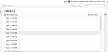
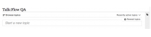
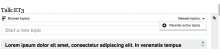
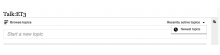
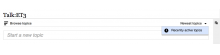
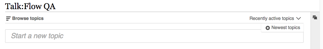
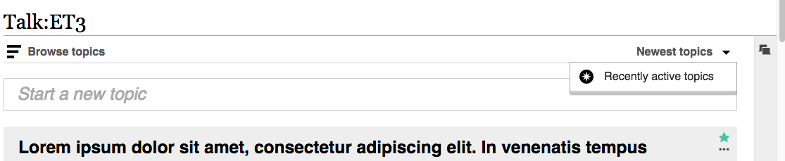
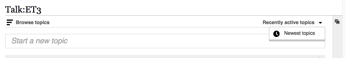
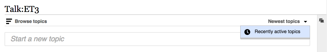
Checked http://en.wikipedia.beta.wmflabs.org/wiki/Talk:ET3 and compared with https://www.mediawiki.org/wiki/Talk:Flow_QA in Chrome 43.
Note: In screenshots, Talk:Flow QA refers to mediawiki; Talk:ET3 refers to beta.
- mediawiki
- 'Newest topics' label is not bold
- hovering over topics make topics blue on the grey background
- selected/viewed topic is indicated in bold; in beta - in blue
- down-pointing arrow is different

beta

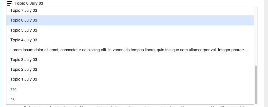
- mediawiki displays tooltips for 'Newest topics' & 'Recently active topics' - beta does not display them.
- mediawiki: icons for 'Newest topics' & 'Recently active topics'
beta swaps the icons for 'Newest topics' & 'Recently active topics'
- After selecting a different sort order
mediawiki does not change the background for a previously selected option.
beta indicates the previously selected order by changing the background color and providing the same icon for both options 'Newest topics' & 'Recently active topics'

- mediawiki - when a selection is made from 'Browse topics' - no page scrolling is noticeable.
beta - the scrolling is present. Note: checked in the Chrome(Mac) browser.
Comment Actions
Change 223072 had a related patch set uploaded (by Catrope):
Follow-up a16357b8c5: fix order icons
Comment Actions
Fixes #3 and #4 from Elena's comment.
Re #1: the style is a bit different, but I believe that's intended
Re #5: I believe this is intended too, but I'm not sure
Re #2: good point
Comment Actions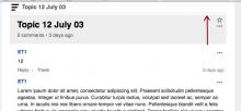
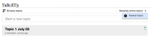
There are two things that still need to be corrected.
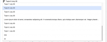
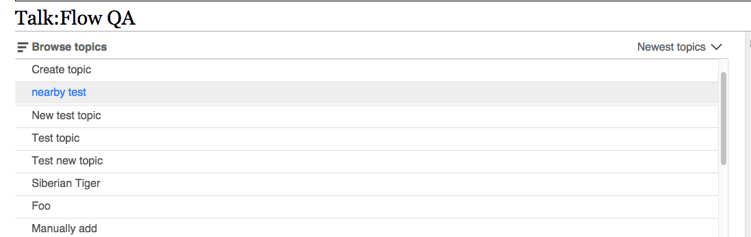
#1 - When you choose an item in the ToC, it should bring you to a point that's just a little above the top of the topic header. Right now, depending on which item you choose, you get a few different results. The screenshot shows the correct spacing:
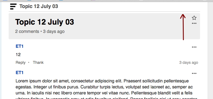
#2 - The ToC item that you're currently on needs to be in bold, so that it's easy to keep track of where you currently are while you're scrolling up and down in the ToC. The item needs to stay bold while you scroll. It should also line up under the floating bar, to indicate that the bar is showing ToC items as you scroll.
Comment Actions
Change 223472 had a related patch set uploaded (by Mooeypoo):
Correct placement of the scroll when we scroll to topic
Comment Actions
Change 223472 merged by jenkins-bot:
Correct placement of the scroll when we scroll to topic