Page MenuHomePhabricator

Add OpenStreetMap to Nearby in non-production builds.
Closed, ResolvedPublic3 Estimated Story Points

Description

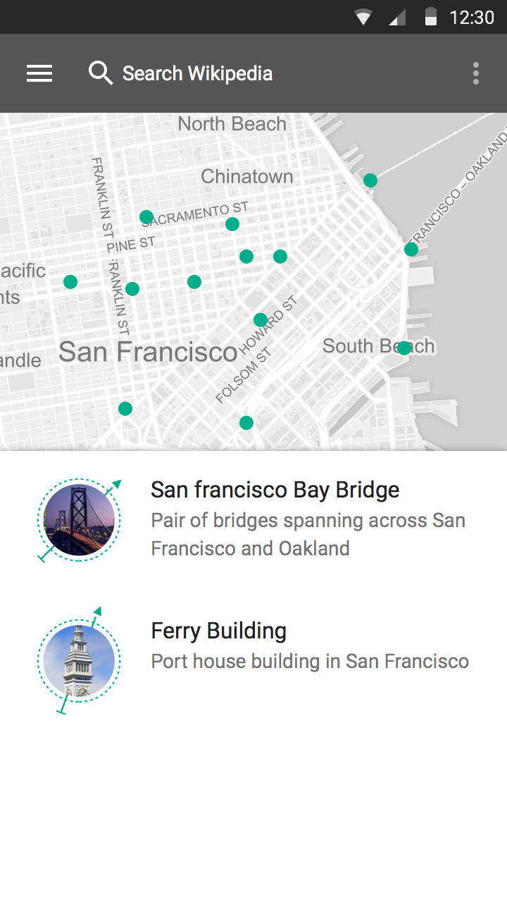
The server-side OSM maps are in place, and are ready for stress-testing. One experiment we'd like to perform is to deploy this functionality to the Beta app, and see what kind of load it produces on the server.

Things to cover in this task:

  • Add non-production only feature flag
  • Productize it/code cleanup
  • Remember state, so it goes back to the map view automatically when rotating the device. This might require some more caching since the Map code needs the lastLocation and results.
  • Add ProGuard rules for the new library, to avoid blowing up the apk size for a feature that doesn't even get to production.

Related Objects

Event Timeline

Dbrant raised the priority of this task from to Needs Triage.
Dbrant updated the task description. (Show Details)
Dbrant subscribed.
bearND set Security to None.
bearND added a subscriber: aude.

(this is not yet ready for production, we only have 2 varnishes + 4 backend - relatively low traffic only) you can now use https://maps.wikimedia.org/osm/{z}/{x}/{y}.png or browse it at http://maps.beta.wmflabs.org

@Dbrant, I think we said this was supposed to be "not prod". So dev, alpha, and beta would see maps. Any objection to my changing the title and description?

Dbrant renamed this task from Add OpenStreetMap to Nearby in Alpha build. to Add OpenStreetMap to Nearby in non-production builds..Sep 3 2015, 9:08 PM
Dbrant updated the task description. (Show Details)

Here's how the interaction will work

  1. list & map view together

This is the default view where you see half map and half list, at this point if you scroll the list it goes over the map and you can see the list and use it as list.

  1. When you tap on a pin (green circle) on the map

If you are interested in maps, you can interact with map and once you tap on any of the pins on the map (shows intent of map user), the circle turns into a pin and the list goes down, maps becomes fullscreen. the bottom part of list shows the list item which you have selected.

I am not sure this is a good approach - having tons of points on the map is not very informative - instead it looks like the map has Chicken Pox. I think the approach chosen by Daniel of the WikiMiniAtlas fame is much better -- it shows either images or the name of the article as text blobs, instead of any map labeling. We can easily introduce the no-label map style if required.

instead it looks like the map has Chicken Pox

It depends on the zoom level. with things like "around you" you need to have a good zoom level (street level) then it takes care of having good enough distance between points even for populated areas.
The counter argument would be, "you see less of the points if you are zoomed in" but panning (to see more points) on map is much easier than zooming on the map. so you don't have to worry about showing few points at a time. also few things at a time is easier to digest.
We can also look into pin clustering.

it shows either images or the name of the article as text blobs, instead of any map labeling. We can easily introduce the no-label map style if required.

can you please share an example, difficult to understand what is the approach. the page on meta doesn't talk about listview<>mapview interactions

I was referring to this example of WikiMiniAtlas. So basically WMA shows a base map without any labels, and overlays it with the article title, plus an arrow pointing to the location. From what I recall of Daniel's lecture, he is using the grid technique - where for each virtual "square" he orders all available articles by the number of other articles that link to it, and picks the first.
P.S. Of course his approach is fairly complex, and we could simplify it by showing numbers (similar to how Yelp shows restaurants)

the first mockup by @Nirzar is kind of what I was thinking we should do.

I'm not sure about the second, but perhaps worth experimenting with.

I get the point that Yurik makes about how to handle a lot of pins. We can cluster them like done in the map view: https://newyork.craigslist.org/search/aap or with cirrus, maybe filter and show just the most 'popular' / highly ranked.

The problem with the first mockup is that unlike the list view, it provides almost no information until touched (expensive on mobile). So instead of seeing all data at once - such as images from commons or a textual description, users will see points that they must click all in turn to get the info. Thus, I suspect people will quickly switch back to the list-only view, as it provides more data. I think that we should use the Yelp's approach (see map on the right) - with the numbered icons and a list next to or below it (scrollable)

@Yurik the markers can have labels, although it gets somewhat complicated to resolve label conflicts (e.g. when the overlap, then choose one). numbered icons could work too.

Checking in to see when we plan to have this live for our alpha and beta users. I know we have some design back and forth but i'm curious if we have a time that were targeting to get this out for testing. thanks

@aude clustering and filtering are both good options

although it gets somewhat complicated to resolve label conflicts

+1

@Yurik labels take up more space than map markers (dots) on the map. If the map looks like Chicken Pox if there are too many map markers, in the same case if you replace map markers (8px by 8px) with labels (at least 15px by 40px) you won't see the map at all. it will be just labels :)

@Tfinc, @Dbrant, correct me if I'm wrong, it sounds like the Discovery guys would like to test the backend. If maps still has some design cycles left, should we release in alpha at least so they can get a tiny bit of traffic? Maybe after we say goodbye to GB?

@Niedzielski I think the Discovery team are looking for more than just a little traffic. For testing the backend, anyone can simply go to https://maps.wikimedia.org.

For releasing to Beta in our app, this needs quite a bit more UX work. At a minimum, I would like to see the following:

  • Panning or zooming the map should refresh the collection of markers.
  • The user's location should be represented on the map as a special marker, preferably with magnetic orientation.
  • A floating action button to jump to the user's location from anywhere else on the map.

(cc @Tfinc, this will likely be another sprint's worth of work; optimistically, we might have something by the beginning of next month)