A couple people on Wikidata reported that they couldn't figure out how to switch to source mode. The conversation's here:
https://www.wikidata.org/wiki/Topic:Si2agcqqqvbfqn0b
There's also lots of other feedback, on all kinds of things.
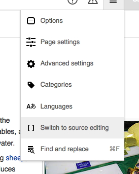
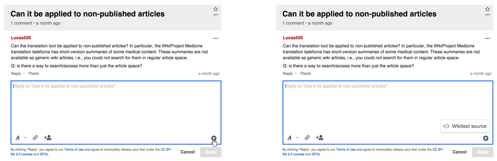
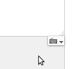
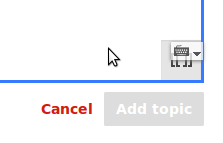
One thing that Filceolaire said struck me as a good point -- VE currently uses a different icon for switching to source mode, and our toggle might be more visible if it was consistent with that. I'll attach a shot of that below.
I'm hoping to get some more time from design research so that we can find out how people respond to this stuff in a more structured and intentional way... Right now, it's still "hey, a couple people said this", which is helpful but not as thorough as we really ought to be. :)