Page MenuHomePhabricator

Consider reader v. contributor view on mobile
Open, Needs TriagePublic

Description

Hi @Wittylama and @Fuzheado, I am the lead product manager for 'reading' at the foundation. I am sorry you felt rebuffed on ticket T117970 and I agree that the mobile development has been working in relative obscurity. Most of that has had to do with little engagement from outside, but we can ramp up as appropriate

Regarding this:

Clearly the WMF has decided that it is sick of having no influence on design in the desktop environment (and it should have a lot more than it does), and instead has created a community-free-zone in mobile.

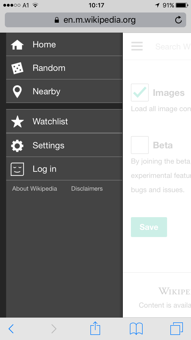
I want to challenge this notion and put forward a potentially equally upsetting one that has at least driven my thinking to date, but would benefit from your thoughts: A separate experience for reading. To date, the mobile experience has not been geared towards editors. And as a result, it is actually a very clean reading experience with no 'wormhole links' (disorienting jumps to confusing pages). Try to imagine being a non-editor clicking the 'wikidata item' link from the left-hand nav of an article or featured content.

As editors migrate to mobile, we can and should promote and accommodate that transition. However, I am very reluctant to lose the sanctuary we have created for readers and the simplicity of the left-hand menu. Wikipedia is at the least two different sites crammed into one and while reading-->editing-->admin feel like a natural funnel, there is no real need for 99% of our readers to see admin tools. In the past 6 months we have eplored two interesting ways to accomplish this:

  • including an easy link to talk pages in mobile if a user has more than 5 edits: T54165
  • Creating a notice page for users who click on red links (instead of dumping them into a blank editor (more blank on mobile) described in the comments here: T100256

I don't know if 'admin' or 'advanced' mode is what we should be aiming for or what, but I do think we need to figure out a way to put the tools editors and admins need into a mobile device without overwhelming our readers on a tiny screen and enabling new users to discover and get hooked on volunteering.

What do you think?

Event Timeline

JKatzWMF raised the priority of this task from to Needs Triage.
JKatzWMF updated the task description. (Show Details)
JKatzWMF renamed this task from Consider reader view on mobile to Consider reader v. editor view on mobile.Nov 19 2015, 10:38 PM
JKatzWMF renamed this task from Consider reader v. editor view on mobile to Consider reader v. contributor view on mobile.
JKatzWMF set Security to None.

@Mike_Peel @Risker @Wittylama @Tnegrin this was the task I was referring to during our coffee chat. It sounds like there was some agreement that logged in/logged out + even some other triggers for feature visibility (such as # of edits) would be welcome.

As a meta issue, I am not sure if this is the right place to have this discussion. Any ideas?

Hi Moushira -- would love your feedback on this. Thanks!

-Toby

I think this is a broad discussion, and there's lots of potential elements...

But as a very specific starter... This is a screenshot of the mobile sidebar when logged OUT. I would suggest that having the 'watchlist' tab there is useless since all it does when you click on it is ask you to log in. Equally, some of the 'settings' are useless for logged-out users (e.g. "beta").

Creating the system for the 'watchlist' option appear in the sidebar once you're logged in (and, as per T117970, I'd suggest also a 'contributions' option) would be simple, obvious and practical a starting place for differentiating the logged-in and logged-out interfaces.

IMG_0973.png (1×750 px, 87 KB)

I believe @Wittylama is raising a good point with this specific example, that already aligns with what JKatz WMF says.

Maybe we are not in a good shape right now, but the important question is: What exactly do we want to achieve for the system as a whole, to better grow? If we approached the problem bearing in mind that our readers "deserve" another wikiwand on their native platform, then I don't know where do we go from there. My questions would be:

  • Do we want to completely isolate readers from how Wikipedia works?
  • Do we want to offer a clean reading experience, where people can acess and browse information faster, and where hints on what further happens beyond reading are also welcomed?
  • Do we want to support readers become casual editors if they want, or not necessary?
  • Do we want editors to enjoy reading Wikipedia, or it should all be about editing tools and gadgets?

I can't agree more with @JKatzWMF, that naturally, editors, readers, and admins have different behaviors on Wikipedia. While offering different experiences for each group, might help in the short term with enhancing their experience, I, however, can't see how do we grow from this model? If not dealt with care, it might harm Wikipedia's natural ecosystem :). Focusing on enhancing the experience for each user group needs to be coupled with focusing on the interactions between the different groups, imo.

Florian subscribed.

I believe @Wittylama is raising a good point with this specific example, that already aligns with what JKatz WMF says.

So, the contributions link should be in the side menu? It would be a relatively easy change, just say it ;)

Additionally: I think, that this task would be interesting for Contributors-Team, too, and would benefit from the input of them.

This is quite relevant: https://medium.com/@ninanjira/taking-free-basics-in-kenya-for-a-spin-87d2a6e9e5a0#.9rhsvxu9e
In a discussion of free apps in Kenya, the author reviews the Wikipedia app and says:

"Over at the Wikipedia app, I couldn’t even see the option to edit a news article, let alone it redirecting me to the paid-for Internet. My hypothesis: it creates the notion that Wikipedia is to be consumed, and not necessarily contributed to. Imagine that carried across to Wikipedia as many of us know it!"

Note - I'm not sure if he's talking about the "Wikipedia Zero" concept here, or the standard version (others might be able to determine this from a closer reading of his description) and this might make a difference to the reading experience.

Personally, I would think the easiest way to differentiate between the 'reading' and the 'editing' modes of the app/mobile would be through the use of the log-in feature. If you're NOT logged in, then you get 'reading mode' and if you ARE logged in then you get 'editing mode' which makes for [probably] a more cluttered interface due to a whole bunch more tools/features. This allows all users to access those features if they want (rather than having a separate 'reading only' app. However, the obvious flaw in this model is that it does not deal well with anonymous editing which (anecdotally at least) is how most active editors got their start.

I think we can find a balance between a power user's IDE view of editing
with lots of tools versus and relatively simple editing experience for
newbies/anons. I'd like to think of the two experiences as 80/20 rather
than 100% either way.

I'd like to think of the two experiences as 80/20 rather than 100% either way.

Agreed. If "logged in" is the trigger for accessing extra features (which I'm thinking it should be) then we could use those features as enticements for new mobile editors to create an account. So, say they've made 5 edits as an Anon (e.g. fixing typos), then then could receive a popup listing some of extra features they would have if they registered. e.g. "Thanks for making your 5th Wikipedia contribution. Did you know, if you create a free user account you can easily track your own editing history, interact with other editors, and make a personal watchlist <link to signup page>". It might be interesting to see the conversion rate there (the text could be A/B tested) and it would be an intellectually honest way of differentiating between the anon and the logged-in feature-set.

I believe @Wittylama is raising a good point with this specific example, that already aligns with what JKatz WMF says.

Maybe we are not in a good shape right now, but the important question is: What exactly do we want to achieve for the system as a whole, to better grow? If we approached the problem bearing in mind that our readers "deserve" another wikiwand on their native platform, then I don't know where do we go from there. My questions would be:

  • Do we want to completely isolate readers from how Wikipedia works?
  • Do we want to offer a clean reading experience, where people can acess and browse information faster, and where hints on what further happens beyond reading are also welcomed?
  • Do we want to support readers become casual editors if they want, or not necessary?
  • Do we want editors to enjoy reading Wikipedia, or it should all be about editing tools and gadgets?

I can't agree more with @JKatzWMF, that naturally, editors, readers, and admins have different behaviors on Wikipedia. While offering different experiences for each group, might help in the short term with enhancing their experience, I, however, can't see how do we grow from this model? If not dealt with care, it might harm Wikipedia's natural ecosystem :). Focusing on enhancing the experience for each user group needs to be coupled with focusing on the interactions between the different groups, imo.

Thank you for putting this so well. I'd like to know these answers before continuing down any path.

The stance traditionally with the mobile site has always been to try to turn readers into editors and to get readers to sign up for accounts. Are we saying we want to class readers as anonymous and that there is no legitimate reason to log in if you are not patrolling or doing some other editing activity (e.g. features such as Gather, Books should go away)?

Whilst I truly understand the motivation and desire to surface editor tools to edits I worry that this pushes new potential users away. My concern is the left menu is already becoming a dumping ground of links. If we add a contributions link for logged in users... this is a stepping stone to adding Recent Changes... then to Special:SpecialPages (there have already been many requests previously).... then to Special:AllPages.. etc... until we have say 20 or so links...
The problem is that tacking features on to products makes them harder to use [1]. Studies show that having too many options often leads to decision paralysis and frustration. The fact Twitter users celebrated the new feature for wikipedia that has been around since its conception (random) illustrates quite well that Vector's menu has a problem and the prominence of the mobile menu is its strength.

Frankly the idea of just adding these links to the left menu for logged in users seems like a cop-out and I urge us to think bigger and better.

To be honest, I think the amount of special pages we have for tasks is a failure. We should be looking to integrate these into one experience. We should be looking at ways to reduce the number of tools an editor has to use (why isn't recent changes/watchlist/contributions one big tool for example?)

I'm not a designer, but I would hazard a guess what editors would actually appreciate is some new kind of menu (maybe replacing the Echo notifications icon) that only appears when logged in. Alternatively we might want to think about an editor dashboard link in the left menu that provides access to all the tools.

I should note however that I feel uncomfortable that the editing team is not steering this conversation. We are the reading team and we can't make big decisions like this on our own.

[1] https://hbr.org/2006/02/defeating-feature-fatigue

Whilst I truly understand the motivation and desire to surface editor tools to edits I worry that this pushes new potential users away. My concern is the left menu is already becoming a dumping ground of links.

With regards to the specific issue of 'too many links in the sidebar (on desktop, but probably applicable to mobile too), you might be interested in a proposal I made for the Community Wishlist survey...
https://meta.wikimedia.org/wiki/2015_Community_Wishlist_Survey/Miscellaneous#Cite_:_Share_:_Export
It is an attempt to merge, and make more usable, a series of related actions that are either spread across the sidebar in different ways, or aren't included at all - all due to accidents of history rather than by design.

It is an attempt to merge, and make more usable, a series of related actions that are either spread across the sidebar in different ways, or aren't included at all - all due to accidents of history rather than by design.

Previously filed as T45170: Sidebar toolbox is too crowded (tracking), T66314: "Cite this page" sidebar link should always be next to "Printable version", e.g. under "Print/export" where available.

A separate experience for reading. To date, the mobile experience has not been geared towards editors.

Artificial distinction.

And as a result, it is actually a very clean reading experience with no 'wormhole links' (disorienting jumps to confusing pages).

Disputable. (See Liam's examples above; and don't even get me started with abhorrent lack of WhatLinksHere, talk pages, categories, interproject and interlanguage links and other things which are totally necessary for an informed usage of our wikis as well as for an immersive experience.)

Try to imagine being a non-editor clicking the 'wikidata item' link from the left-hand nav of an article or featured content.

Sounds fantastic! Easy access to microcontribution opportunities. A success proven by the number of active editors not formerly active on any other project. But yes, doesn't fit in that specific position IMHO: T66315: Move "Data item" link outside of sidebar toolbox.