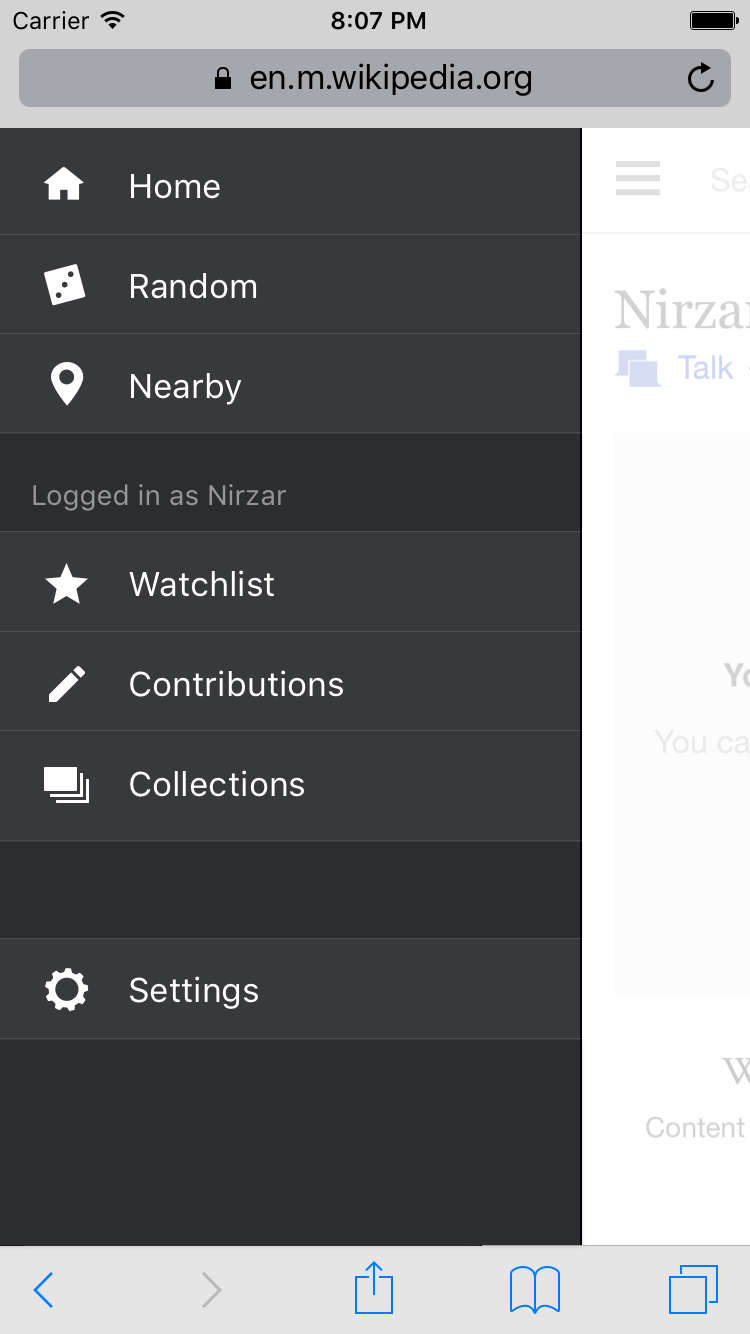
Page MenuHomePhabricator

Add a 'contributions' tab to mobile web beta channel
Closed, ResolvedPublic2 Estimated Story Points

Description

Community Request
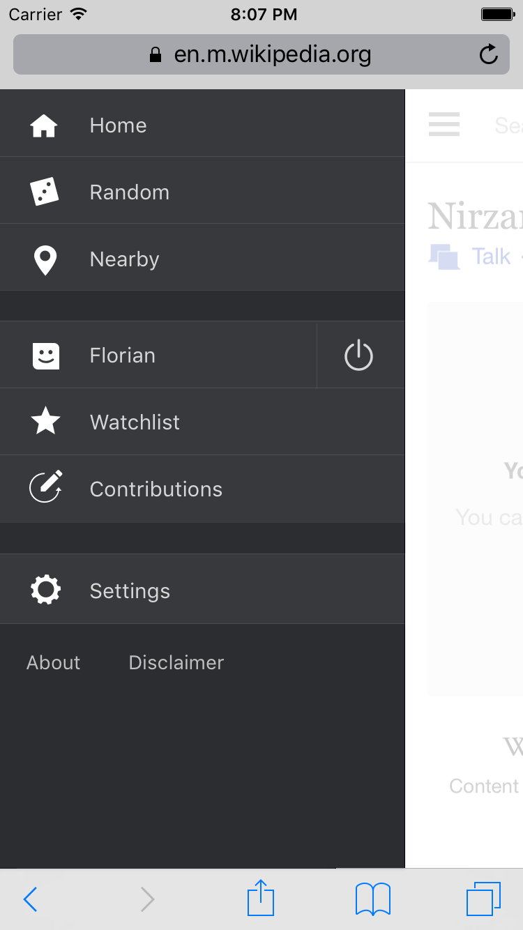
When logged-in on mobile, the interface provides a 'watchlist' tab (thank you), but no 'contributions' tab.
This is one of the core options available for users on the desktop version of media wiki (alongisde userpage, talkpage, preferences) and always has been. Please add it to the mobile view too. You've got a mobile version of the contribs page, but no ability to easily find it.

Goal

  • Add easy access to user contributions from side drawer
  • Raise awareness around "everyone can edit"

Solution
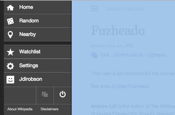
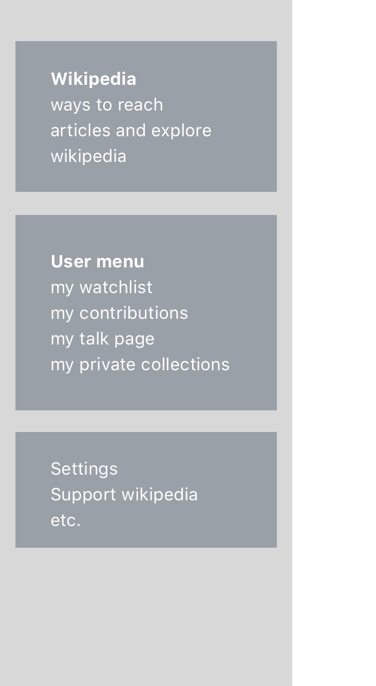
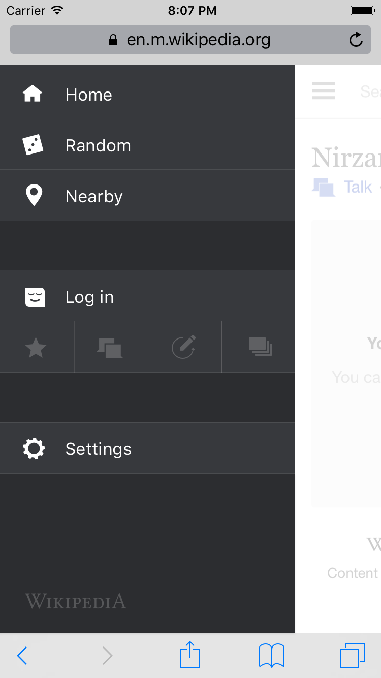
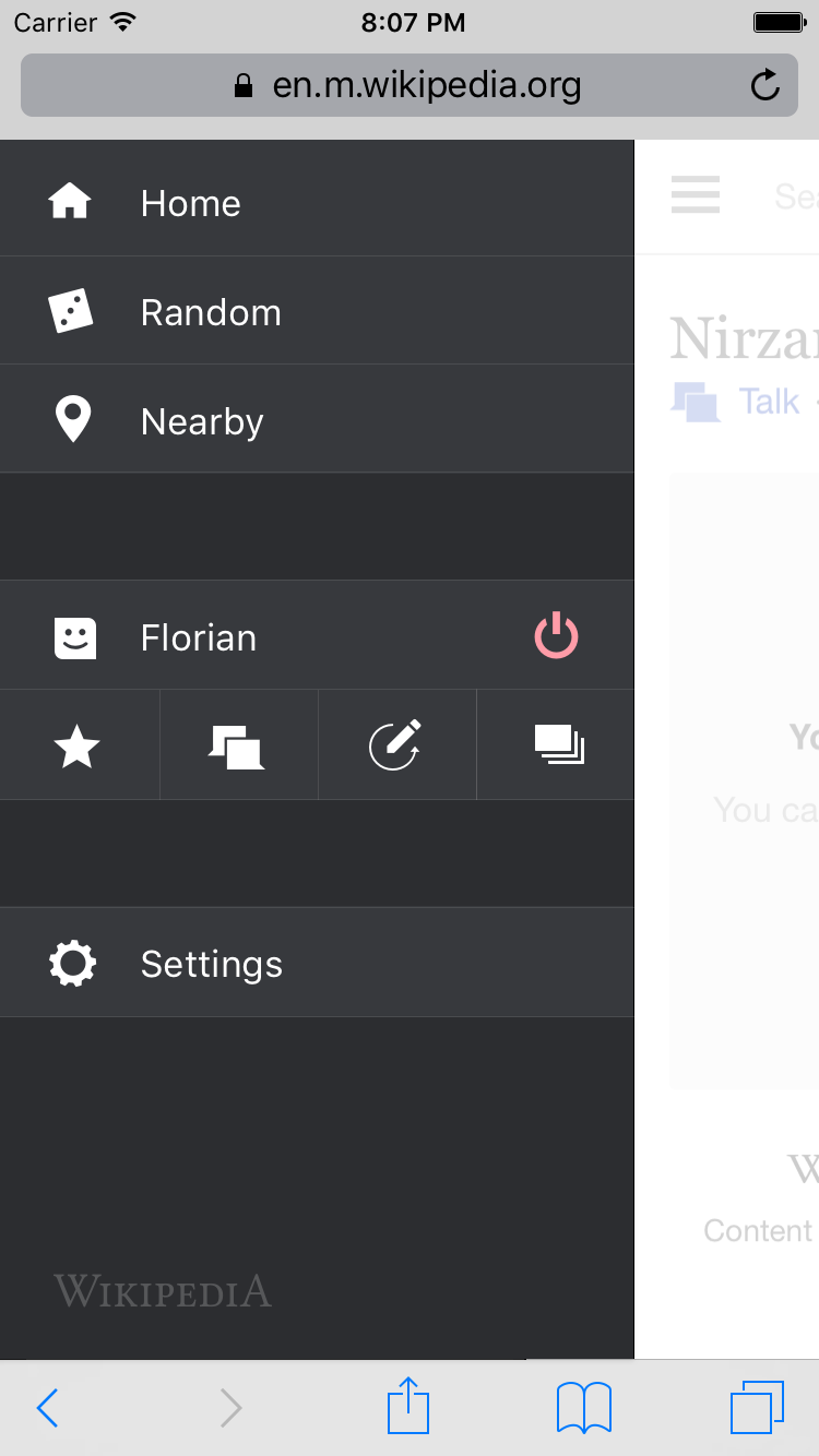
Split the navigation drawer options into 3 groups

  1. Exploring articles - Main page, nearby, random
  2. Your stuff - User log in, (log out) watchlist, contributions
  3. Settings

Mocks

contributions.png (1×750 px, 84 KB)

Asset
Edit history icon -

AC

  • The menu items are arranged per the mock above
  • The Watchlist and Contributions menu items only appear when you are logged in (T117970#2513384)

Suggested testing, RTL+LTR, portrait+landscape:

  • Android 2.3 Browser phone form factor
  • Android 4.x or higher Chrome phone form factor
  • Android 4.x or higher Chrome tablet form factor
  • iOS 9.3 iPhone Safari
  • iOS 9.3 iPad Safari
  • Opera Mini non-compressed (not extreme mode) Android 4.x or higher phone form factor
  • Opera Mini compressed ("Opera Mini" mode on iOS, "Extreme" mode on Android, inbuilt functionality on older devices like J2ME Opera Mini)
  • UC browser (not mini with compression) Android 4.x or higher phone form factor
  • UC Mini (with compression) Android 4.x or higher phone form factor
  • Windows 7.5+ Phone IE
  • Desktop Firefox
  • Desktop Chrome
  • Desktop Safari
  • Internet Explorer 11
  • Edge

Event Timeline

There are a very large number of changes, so older changes are hidden. Show Older Changes

I recall once finding that "feature" by accident (clicking on one's edit-count), but haven't used it more than that because it's so obscure that I never remember how to get there. As you probably know from UX101, I revert to what's familiar and predictable vs hunting for obscure features even if the former is more complex.

I agree this experience is not ideal. If the button was more prominent do you think it would be logical to find?

The article history and the last editor's userpage (actually, it's not the userpage, it's special:userProfile, but that's a different problem[1]) and are accessible by clicking on the words "last edited <time> ago" and "by <username>" respectively.

The reason that this is obscure is because this format is not consistent with how the website behaves on the desktop mode. It is actually much more like an experiment called "timestamp position modification" that was successfully on desktop in 2012 but then mysteriously never made it to production:
Documentation: https://meta.wikimedia.org/wiki/Research:Timestamp_position_modification
Blogpost: http://blog.wikimedia.org/2012/07/06/wikipedia-revision-history-experiment/

For starters, putting that feature through the Beta testing interface (which didn't exist then) would be a good way to get some consistency between mobile and desktop on this issue.

The second point is that on mobile there is nothing to indicate that the phrase "Last edited <time> ago by <username>" has a link in it - let alone two.
It is dark grey text on a light grey background (not blue, as Wikipedia users have come to expect of all things clickable) and there isn't even an underline (which is the other common way of indicating a link). On the desktop there is an underline when you 'hover' over the text, but it's not possible to hover on mobile...

The only way that you'll know it's a link is if you click it by accident and, based on the feedback that you've been taken to an article history page, become aware of what you did and consciously learn that those words are secretly links.

[1] Why is the username linked to Special:userProfile, by the way?? I mean, I like it - the info is quite useful, but people put a lot of effort into their userpages because it REPRESENTS them. It's basically the only piece of personal space that we have and therefore the primary "humanising" part of the whole project. But on mobile, a user's "public face" is hidden behind a series of statistics. Useful statistics, but dehumanising nonetheless. Couldn't these stats - if they're that important for the mobile interface to display (I'm not sure why, since if they were then they should be made more prominent on the desktop version too) - then couldn't they just be put at the top of the userpage, rather than forcing the user to go through a second click to find the actual userpage?

I recall once finding that "feature" by accident (clicking on one's edit-count), but haven't used it more than that because it's so obscure that I never remember how to get there. As you probably know from UX101, I revert to what's familiar and predictable vs hunting for obscure features even if the former is more complex.

I agree this experience is not ideal. If the button was more prominent do you think it would be logical to find?

The article history and the last editor's userpage (actually, it's not the userpage, it's special:userProfile, but that's a different problem[1]) and are accessible by clicking on the words "last edited <time> ago" and "by <username>" respectively.

The reason that this is obscure is because this format is not consistent with how the website behaves on the desktop mode. It is actually much more like an experiment called "timestamp position modification" that was successfully on desktop in 2012 but then mysteriously never made it to production:
Documentation: https://meta.wikimedia.org/wiki/Research:Timestamp_position_modification
Blogpost: http://blog.wikimedia.org/2012/07/06/wikipedia-revision-history-experiment/

For starters, putting that feature through the Beta testing interface (which didn't exist then) would be a good way to get some consistency between mobile and desktop on this issue.

The second point is that on mobile there is nothing to indicate that the phrase "Last edited <time> ago by <username>" has a link in it - let alone two.
It is dark grey text on a light grey background (not blue, as Wikipedia users have come to expect of all things clickable) and there isn't even an underline (which is the other common way of indicating a link). On the desktop there is an underline when you 'hover' over the text, but it's not possible to hover on mobile...

Note when comparing mobile to desktop it's important to recognise that studies show mobile behaviour is actually very different to desktop so we're always keen to test things out rather than assume just because X is here on desktop it should be in the same place on mobile. I remember a few tweets a while back asking for the random feature on desktop because they'd used it on mobile (and had found it more discoverable :-)). Sadly there are thousands or so things we need to get done for a good mobile experience and few from my perspective there are not enough developers who are caring about it.

We click tracks to the last modified bar luckily:

Screen Shot 2015-12-03 at 2.24.52 PM.png (587×1 px, 138 KB)

http://mobile-reportcard.wmflabs.org/

Interestingly we moved the bar to the bottom of the page at the start of October and links to user profile dropped drastically but history links increased. Not sure how to interpret that :)

The only way that you'll know it's a link is if you click it by accident and, based on the feedback that you've been taken to an article history page, become aware of what you did and consciously learn that those words are secretly links.

[1] Why is the username linked to Special:userProfile, by the way?? I mean, I like it - the info is quite useful, but people put a lot of effort into their userpages because it REPRESENTS them. It's basically the only piece of personal space that we have and therefore the primary "humanising" part of the whole project. But on mobile, a user's "public face" is hidden behind a series of statistics. Useful statistics, but dehumanising nonetheless. Couldn't these stats - if they're that important for the mobile interface to display (I'm not sure why, since if they were then they should be made more prominent on the desktop version too) - then couldn't they just be put at the top of the userpage, rather than forcing the user to go through a second click to find the actual userpage?

Yes this is a separate issue we recognise and are keen to fix - would love your opinions in T119412 to help us build the right thing (currently we are discussing removing stats all together).

Note when comparing mobile to desktop it's important to recognise that studies show mobile behaviour is actually very different to desktop so we're always keen to test things out rather than assume just because X is here on desktop it should be in the same place on mobile.
...
Interestingly we moved the bar to the bottom of the page at the start of October and links to user profile dropped drastically but history links increased. Not sure how to interpret that :)

The only way that you'll know it's a link is if you click it by accident and, based on the feedback that you've been taken to an article history page, become aware of what you did and consciously learn that those words are secretly links.

I get that user behaviour on mobile is different from user behaviour on desktop... What I guess I'm saying is:

  • At the least, can the fact that the 'user' and 'history' links in the mobile interface be made obviously links (either by colour, or by underlining them? Currently there is no way to know that they are links without accidentally clicking on them.
  • The point about the comparison with the 'timestamp position modification' experiment was not about the location, but the fact that it changed the text to a user-relative time - "last modified 6 hours ago by xxxx". THIS is the same as the mobile interface is now. But, and I never understood why, this change never came to the desktop version (regardless of the location of the notification on the screen).

We seem to be mixing bugs and this is getting confusing - apologies if I've missed anything.

  • adding a contributions link to the left menu (this one) OR making contributions link more prominent on user profile - T119412 - not sure if the latter is the same as this bug?
  • Apply a relative timestamp to desktop - T32857
  • Changing last modified bar links colour (needs design input)

Can you please comment on the existing bug and create one best describing the issue you see with the colour as they are important points and now hidden within a discussion about the first bullet point so not seen by the people that are pushing back on those ideas for whatever reasons.

We seem to be mixing bugs and this is getting confusing - apologies if I've missed anything.

Yeah, sorry. this became more of a conversation and less of a bug report.

  • adding a contributions link to the left menu (this one) OR making contributions link more prominent on user profile - T119412 - not sure if the latter is the same as this bug?

No, that's different. That bug is about making it easier to see other people's userpages. The original purpose of this bug report was to ask to make it easier to see one's own contribution history. If that can't/won't be done by adding a link to the sidebar (alongside 'watchlist'), then some other method that is more clearly signposted than clicking on the username in the sidebar, which takes you to your own 'special:userprofile', then clicking the editcount number.

  • Apply a relative timestamp to desktop - T32857

Yep. That's the one ;-)

  • Changing last modified bar links colour (needs design input)

Can you please comment on the existing bug and create one best describing the issue you see with the colour as they are important points and now hidden within a discussion about the first bullet point so not seen by the people that are pushing back on those ideas for whatever reasons.

OK, i'll create a new specific bug for the 'last modified' stuff.

@Wittylama @Fuzheado do you think the new user pages help solve this problem?
https://en.m.wikipedia.org/wiki/User:Wittylama
https://en.m.wikipedia.org/wiki/User:Fuzheado

Also please note I'm #notadesigner but I was thinking about this today and I wondered if we could expand the user link in the left menu to have lots of small icons relating to a user without text underneath it like this mock up I made (just as we currently use a logged out link). Just an idea but it alleviates my earlier concern with space in the menu:

Screen Shot 2016-02-04 at 4.29.11 PM.png (390×591 px, 47 KB)

@Jdlrobson - I do indeed the new direct link to the userpage with the 'contribs' link at the top helps a LOT. Thank you.

The idea you propose in that mock-up works for me. I'm interested to see it developed further :-)

By the way - T120677 hasn't been triaged yet, and it was based on the conversation here in this thread. Can you have someone take a look at it please?

Change 269740 had a related patch set uploaded (by Florianschmidtwelzow):
[WIP] Beta: Add userlinks to mobile main menu

https://gerrit.wikimedia.org/r/269740

The result of the change I uploaded (in the current, WIP, status):

Unbenannt.PNG (223×306 px, 9 KB)

@Florian I like the horizontal tiles and think they make good visual sense underneath the user.

But I am confused about the upload and the different talk icons. I actually think this is something we should run by @Nirzar (the reading web UX designer). @Nirzar, do you have time to explore treatments.

In another ticket (I can't find now), we changed the trigger from 5 edits, to logged in/logged out. The problem with such a low-experience trigger is that we have to make sure a newly created account can figure out what is going on (perhaps a walk-through is necessary?)

@Florian @JKatzWMF I agree with the need for this.

here's a rough try at solving this.

I created a structure we can follow

structure.png (1×732 px, 70 KB)

Based on the structure, here's a mockup of how it would look like

not logged in.png (1×750 px, 77 KB)

logged in.png (1×750 px, 79 KB)

[[ https://dl.dropboxusercontent.com/spa/tuyaic6q75gkcv4/Exports/drawer/drawer.html

And here's an interactive prototype.

]]

  1. Tap on Log in
  2. See the talk page notification (sorry for scope creep but i thought it would be cool)

https://dl.dropboxusercontent.com/spa/tuyaic6q75gkcv4/Exports/drawer/drawer.html

Pros

  • Very concise and helps surface all user related items
  • We can surface talk page notifications and other minor notifications here
  • Saves vertical space for small phones
  • only two rows
  • Shows what features are available if you are logged in

Cons

  • The icons without can be ambigious at times. recall is a difficult thing.
  • less scalable

To get rid of the ambiguity i worked on a backup option but it has it's cons.
Here

option 2.png (1×750 px, 84 KB)

Pros

  • Very obvious "user menu"
  • More scalable

Cons

  • Vertical space will make it difficult to view on smaller phones.
  • I will have to add tappable username for userpages and that will add more vertical space + talk page
  • 5 total items

@Florian as @Jdlrobson suggested, an alternative to all of this is the new userpages perhaps? tap on your username and you have all the links you need on top.

youdonthaveuserpage.png (1×750 px, 136 KB)

But I am confused about the upload and the different talk icons. I actually think this is something we should run by @Nirzar (the reading web UX designer). @Nirzar, do you have time to explore treatments.

The uploads link should be removed in another commit (I enabled the uplaod feature locally, so it will not be there for wmf wikis :)), iirc Jon already uploaded such a commit to remove the uploads function completely. But so far: just ignore it, sorry for the confursion :)

The icons I used are different, yes. The reason: I haven't thought about that :P I just needed some icons to show how it coult look like, this is only a very early prototype :)

In another ticket (I can't find now), we changed the trigger from 5 edits, to logged in/logged out. The problem with such a low-experience trigger is that we have to make sure a newly created account can figure out what is going on (perhaps a walk-through is necessary?)

I'm not sure, I think that the user will know what a button does if it's a well known one (the talk icon has something to do with "Talk", communication, so I think this will not be a problem. A link to the contributions page is a bit harder and currently I'm not sure, if announcing the function of each button in a short pointer overlay or something is a really good idea, that could be more annoying as helpful.

@Florian as @Jdlrobson suggested, an alternative to all of this is the new userpages perhaps? tap on your username and you have all the links you need on top.

youdonthaveuserpage.png (1×750 px, 136 KB)

I would disagree: As a "power user" or someone who knows Wikipedia already, I wouldn't assume this links on my userpage. Furthermore I would think that they're simply missing, because I don't see them on every page (or in the menu) like I would expect as a desktop user. Also: I don't want to open my user page whenever I want to access the user links section (that's my personal opinion), especially on a slow network :)

@Florian @Wittylama @Fuzheado

What do you folks think about @Nirzar 's interactive prototype here: https://dl.dropboxusercontent.com/spa/tuyaic6q75gkcv4/Exports/drawer/drawer.html

mentioned (with pros and cons) here: https://phabricator.wikimedia.org/T117970#2017834

I think it solves a lot of problems and probably got lost in the shuffle, which is totally understandable these days.

I think it's reasonable to change the menu drawer in this way, and as far as I can tell, it doesn't look so difficult to implement it (if @Nirzar could provide the svg's used in the mockup :P), @Jdlrobson: correct me, if I'm wrong :P, so I let the decide the community, if this is acceptable :)

@Nirzar: Where do you plan to put the "About ..." and "Disclaimers" links to? I think they're missing in the prototype :)

Where do you plan to put the "About ..." and "Disclaimers" links to? I think they're missing in the prototype :)

@Florian Yeah I can add that and give SVGs and CSS for this.

@Florian here's the alternate version fleshed out
Logged in

drawer-2.png (1×750 px, 92 KB)

Logged out

drawer-2-out.png (1×750 px, 73 KB)

We have to make following choice

Very obvious labels to avoid ambiguity VS Saving vertical space

in the earlier option, i had icons side by side thus saving a ton of vertical space. but icons like contributions and collections are not self-explanatory. in this version the names are very obvious but the height of the drawer once logged in is 480px. if we are sure the scroll wont be an issue on screen sizes below 3.5inch we can think of the vertical menu.

In my opinion, the horizontal one is more concise and the learning curve is a bit higher but it's meant for experience users.

Let me know which one you think works better. Let's get this moving!

BONUS: if we can get the Beta tag on settings and/or new message count on talk page that would be amazing.

Let me know which one you think works better. Let's get this moving!

Difficult, I would prefer the vertical one, but the problem is: I know what the icons mean :/ It could be very confusing (like you said) for an user to know, where the "Contributions" icon link to, same with Collections (I assume Gather is meant). So I hope we get some input from the community on this task? :)

BONUS: if we can get the Beta tag on settings and/or new message count on talk page that would be amazing.

The Talk page notifications count could be achieved easily (I hope my way I have in the head, works :P), but wouldn't this be doubled with the notification bell at the top right of the page? What is the use of the beta badge?

@Alsee @SSneg @Ruud_Koot @TheDJ
Hey new community friends + 1 old one :). I'd like to bring some more voices in to this discussion, because it's important.

The topic is how do we start putting more editor features into mobile web experience without cluttering a much-more limited interface (and with minimal collateral damage to what is a very clean reading experience).

What do you folks think about @Nirzar 's interactive prototype here: https://dl.dropboxusercontent.com/spa/tuyaic6q75gkcv4/Exports/drawer/drawer.html

mentioned (with pros and cons) here: https://phabricator.wikimedia.org/T117970#2017834

This is I think it solves a lot of problems and probably got lost in the shuffle, which is totally understandable these days.

Change 269740 abandoned by Florianschmidtwelzow:
[WIP] Beta: Add userlinks to mobile main menu

Reason:
currently not working on it

https://gerrit.wikimedia.org/r/269740

@Florian @JKatzWMF

Hey, @bmansurov and I worked on it today and here's a result of the patch

pasted_file (553×337 px, 58 KB)

This patch resolves this task. in addition we grouped the menu items to be more aligned to the structure I proposed in this task above.

@Florian it would be wonderful if you get time to review this

Change 282417 had a related patch set uploaded (by Bmansurov):
Add 'contributions' link to the primary navigation

https://gerrit.wikimedia.org/r/282417

Icon only interface elements are definitely dangerous, so I'm liking the horizontal a lot better. If we really fill up too much, we will have to start rethinking at a much higher level, but let's tackle one problem at the time. This is a good improvement, we should test it in the wild, and just take it from there.

@Nirzar: Reviewed and commented on the gerrit change :)

Change 282417 abandoned by Bmansurov:
Add 'contributions' link to the primary navigation

Reason:
Resurrect if needed.

https://gerrit.wikimedia.org/r/282417

MBinder_WMF set the point value for this task to 2.Jul 25 2016, 4:41 PM

@Nirzar a clarification is needed on this card before it is worked on. The menu in current form can only take 6 items on most mobile browsers without introducing scrolling or reducing the height of menu items:

For example on iPhone 4s

Screen Shot 2016-08-01 at 9.43.49 AM.png (509×325 px, 46 KB)

What should engineers do?
Note that generally when we've introduced scrolling items below the fold have not been discoverable.

dr0ptp4kt renamed this task from Add a 'contributions' tab to Mobile interface to Add a 'contributions' tab to mobile web beta channel.Aug 1 2016, 4:48 PM
dr0ptp4kt raised the priority of this task from Medium to High.Aug 1 2016, 4:53 PM

pasted_file (324×741 px, 59 KB)

We can think of it as a landscape mode where the whole page is scrollable. not individual scroll for only the drawer.

Just another note: we need to more careful from now on about drawer because i think it has reached the maximum limit. we need to figure out what we can take out or how to minimize space in order to improve it.

we can also try and show watchlist and contributions only if you are logged in. it's not quite good to get more people interested in it but it will clean up the drawer for readers.

This comment was removed by Jdlrobson.

Change 302964 had a related patch set uploaded (by Phuedx):
[Hygiene] Further generalise main menu rendering

https://gerrit.wikimedia.org/r/302964

Change 302965 had a related patch set uploaded (by Phuedx):
[Hygiene] Break apart SkinMinerva#getPersonalTools

https://gerrit.wikimedia.org/r/302965

Change 302966 had a related patch set uploaded (by Phuedx):
[Beta] Add Contributions menu item

https://gerrit.wikimedia.org/r/302966

^ Per the integration test failure and inline question from @Jdlrobson.

Change 302964 merged by jenkins-bot:
[Hygiene] Further generalise main menu rendering

https://gerrit.wikimedia.org/r/302964

is there a place i can see this live? can we put this on reading-web-staging?

Change 302965 merged by jenkins-bot:
[Hygiene] Break apart SkinMinerva#getPersonalTools

https://gerrit.wikimedia.org/r/302965

Change 302966 merged by jenkins-bot:
[Beta] Add Contributions menu item

https://gerrit.wikimedia.org/r/302966

Do I understand if we wait about an hour this will show up while logged into https://en.m.wikipedia.beta.wmflabs.org/ in Beta mode?

Signing off from my side, although @Nirzar, please provide your signoff and update the Status to Resolved if it matches your expectation. If there are further modifications to this work product on this task, I ask that someone please test on as many of the configurations as possible in LTR+RTL and portrait+landscape.

Checked on desktop FF, Opera, Chrome, Safari. Checked on iPhone iOS 9 Safari, tablet simulator iOS 9 Safari, Samsung Wave II (SamsungMobile), Android 5 Chrome, Android 5 Opera Mini (no compression), UC Browser (no compression) on both orientations (also, LTR continues to look fine in addition to RTL), Windows Mobile 7.5 (IEMobile), Android 5 Opera Mini (extreme compression mode), UC Mini (compression).

As before, the hamburger doesn't display nor, where it would be located, work in UC Mini (compression) so nothing to learn there.

Note that whereas RTL-ness for the magnifying glass icons (and the magnifying glass alignment) is off for UC Browser, in this case, the menuing system was accurately portrayed in RTL. Windows Mobile 7.5 IE continues to face problems of garbled rendering on RTL (not tofu, the blocks are scrambled 8-bit video game style), so that wasn't testable in a truly RTL presentation...additionally the browser doesn't like something about the beta labs cert or mixed-mode cross-site requests so it's hard to get it to work anyway...that said it seemed functional on LTR just fine.

@dr0ptp4kt Just for info: Yes, all *.beta.wmflabs.org domains get updated every 10 minutes, so you see any merged change there (if anything goes well) directly after merging them (with a delay of up to 10 minutes) :) You can follow the deployment cycles here: https://integration.wikimedia.org/ci/view/Beta/job/beta-scap-eqiad/ :)

@Wittylama the contributions link in the drawer is on beta and will be on stable soon.