Page MenuHomePhabricator

Mobile interface should expose first 2-3 categories
Closed, DuplicatePublic

Assigned To
Authored By
Gryllida
Feb 26 2016, 12:32 AM
Referenced Files
F4685639: 2.png
Nov 1 2016, 7:25 PM
F4685642: 13.PNG
Nov 1 2016, 7:25 PM
F4685641: 4.png
Nov 1 2016, 7:25 PM
F4685640: 3.png
Nov 1 2016, 7:25 PM
F4334828: footer - old edited copy 2.png
Aug 3 2016, 11:41 PM
F4334826: footer - old edited copy.png
Aug 3 2016, 11:41 PM
F4334830: footer - old edited.png
Aug 3 2016, 11:41 PM
F4286070: pasted_file
Jul 18 2016, 5:58 PM
Tokens
"Orange Medal" token, awarded by Krinkle.

Description

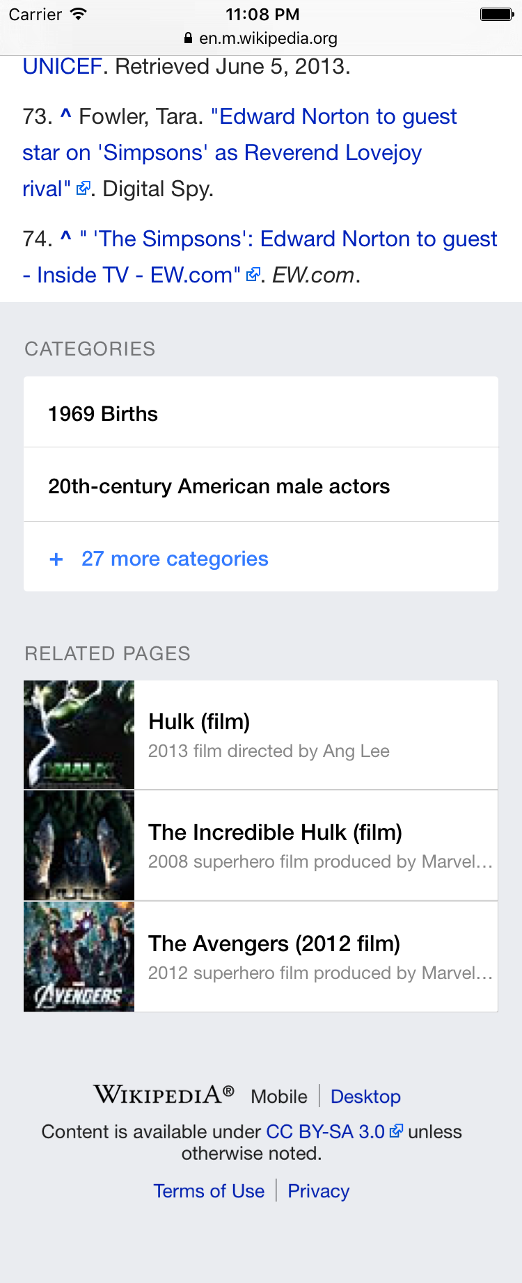
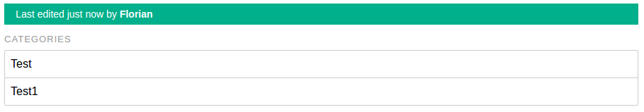
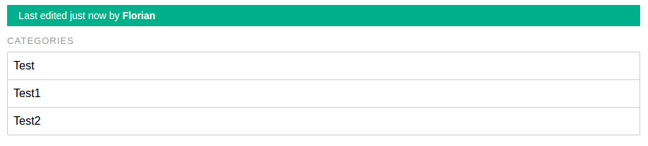
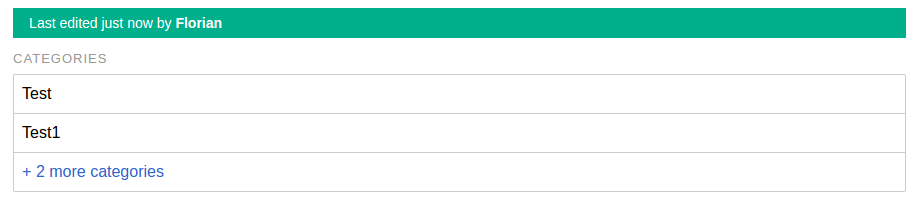
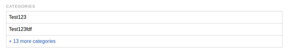
In the Mobile interface beta there is a categories button but I think this is not very intuitive, most people will be just too lazy to explore it. Instead, please, we could try to expose the first 2-3 categories with a 'More...' button next to them.

Instead of this one line (with the categories button bringing up a popup which hides the page):

[Read in another language] [Categories]

Put these two lines (in any order):

[Read in another language]
<Equations> <Thermodynamic equations> [More categories...]

Event Timeline

This is a very good idea. Here's how it could look like

categories.png (1×750 px, 351 KB)

bd808 triaged this task as Medium priority.Feb 29 2016, 6:01 PM

@Nirzar I like that design ! I'd support trying that out.

Florian subscribed.

I'll create a first prototype :)

My change (which I'll upload in some minutes) will result in something like this:

pasted_file (730×412 px, 41 KB)

@Nirzar: I choosed a similar layout like the Cards extension (RelatedArticles), as we don't have a gray background for the footer (which, btw. looks good, maybe we should try to implement it? :D)

Change 298029 had a related patch set uploaded (by Florianschmidtwelzow):
Change Categories button to a list of categories

https://gerrit.wikimedia.org/r/298029

BTW. gray on white and gray on gray text... Please remember accessibility...

@Florian's patch looks pretty cool btw:

Screen Shot 2016-07-12 at 12.02.54 PM.png (208×932 px, 24 KB)

How are the top three generated? Right now this looks a little arbitrary /technical and not what I'd expect.

@Jdlrobson those categories are generally marked as "hidden" by users on wikipedia, but are not hidden by default, so probably you don't have them set as hidden.

Order should be the order in which the parser added the categories to the page as far as I know.

Thanks for the clarification @TheDJ
@Nirzar are you happy with us just showing the top 3 non-hidden categories and iterating from there?

@Jdlrobson Like @TheDJ said: In production these categories shouldn't be visible, as long as they're marked as hidden categories (so only these categories are used, which are displayed in desktop, too). For ordering I just took the order of the parser, as it's pretty difficult to get the "TOP" categories (I even don't know any metric with which I could say, that a category is "better" as another one :)).

@Florian yup I understand, but my concern is we are promoting the top 3 categories alphabetically in a very prominent way
I think for Barack Obama this would be Barack Obama / Obama family / 1961 births when a user might expect "Presidents of the United States". Would be good to think about ways to promote more useful ones - maybe there's a parser function we could build?

Hmm, I understand your concerns. Maybe we should move this discussion out of this task?

I think it's really difficult to order the categories a page is in. A first step could be to move ctageories, which are named similar to / like the page title, to the end of the categories list. Another thing could be, that a category, which name is written in the first section of a page, is more important as other categories. But, this is only a personal point of view, and doesn't rely on any data. I think, if we want to implement such a feature we should stop only thinking about mobile and make such a service more generic (even don't rely on the parser so much). Hooking into the parser could only be an interface to get a user defined list of categories to sort.

If I think about this a bit more, a really generic service could also be used to suggest categories to the user based on the written text :P

@Florian : Totally! To be clear I don't think this is a blocker for merging your patch. I just want to ensure @Nirzar thinks it's okay as a starting point as our guardian of all things pretty and is in the loop. :)

@Florian the patch looks good.. minor design tweaks around font size. the bigger issue is content.

Hmm, I understand your concerns. Maybe we should move this discussion out of this task?

I think fixing the content issue is very essential in order to implement this feature. I think it's a blocker. it's not only which categories are useful but also what happens when you click on a category. right now mobile rendering of category pages is bad and difficult to navigate.

for e.g.

pasted_file (557×310 px, 80 KB)

That's why this feature is in beta now. And, btw., the current implementation of the categories already works for beta users and redirect them to the category page, as far as I know :) You're right, that the better implementation (presentation) of category pages is important, but I don't think that this is a blocker for this task :)

@Florian Okay... so here's my assessment and proposal.

I don't have problem exposing more people to categories. the problem is what happens when they click on categories. and not only the categories overlay but the actual category page.

for example, as a reader i see categories at the bottom of article, i see 1969 births. lets say i am interested in that and i click on it. the page i see is not usable at all. i don't think we should expose people to this.

I agree the categories overlay page is better to at least see what categories are tagged but that's not the use case here. we want readers to use this as rabbit hole so it needs to have better experience.

Here's my proposal. we break categories problem into three tasks.

  1. expose better categories somehow. some logic behind this
  2. make it easy to browse "categories" and browse "category"
  3. expose categories at the bottom of article -

i want to address at least 2 and 3 here before we ship it to stable. you've almost completed 3. We can come back to 1 later.


Here's a solution for 2 and 3

You can click on "Granite dome" category tag to check "category template" and you can click on 32 more categories to check "categories template"

Footer categories
I realize, I gave slightly different treatment earlier but i think if we are treating them like tags, we should use the tags treatment. it also saves vertical space and won't be an issue on big screens.

footer - old edited.png (1×750 px, 297 KB)


When i was working on VE i had similar prototype for adding categories quickly


Categories template
This is more or less the same with updated look

footer - old edited copy 2.png (1×750 px, 77 KB)

Category template
This is entirely new. I'm not sure if there is a simple api to fetch articles in a particular category. we can render the category nicely. which is easy to browse and articles are presented like we present them in search results and related pages. this is very very important for readers. I strongly believe this is required if we want readers to use categories.

footer - old edited copy.png (1×750 px, 78 KB)

Jdlrobson changed the task status from Open to Stalled.Sep 19 2016, 6:08 PM

Appears to be stalled on the subtasks.

Based on @Krinkle's feedback, I slightly changed the logic for the "show more button", it now is only visible, if more than 2 more cetagories are present:
2 categories:

2.png (159×907 px, 6 KB)

3 categories:
3.png (206×914 px, 7 KB)

4 categories:
4.png (206×921 px, 8 KB)

15 categories:
13.PNG (175×933 px, 6 KB)

Appears to be stalled on the subtasks.

The current subtasks are not blockers. They fall in the realm of debatable appearance tweaks.

Change 298029 abandoned by Jdlrobson:
Change Categories button to a list of categories

Reason:
Bringing conversation back to phabricator - https://phabricator.wikimedia.org/T142124 - let's regroup there.

https://gerrit.wikimedia.org/r/298029