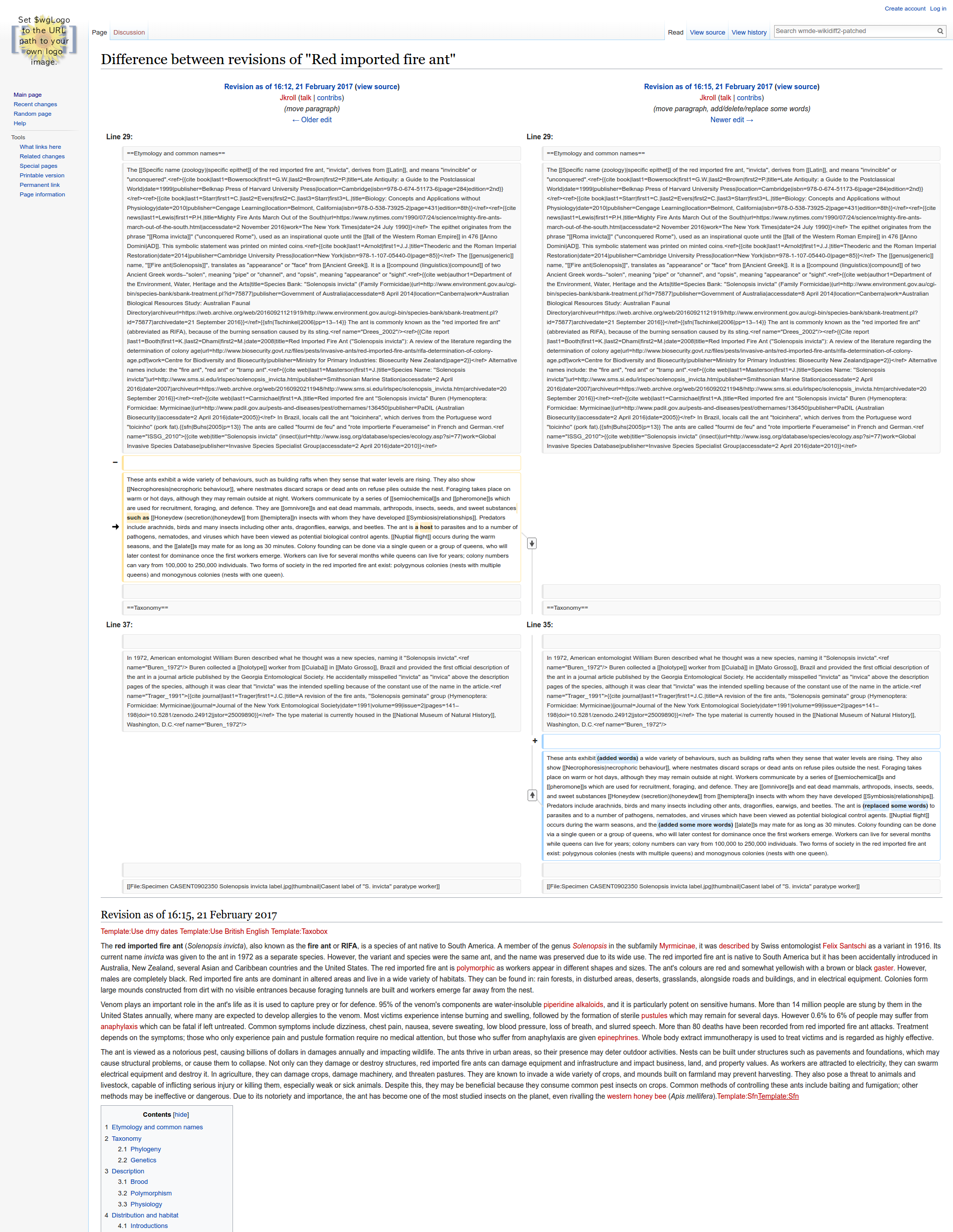
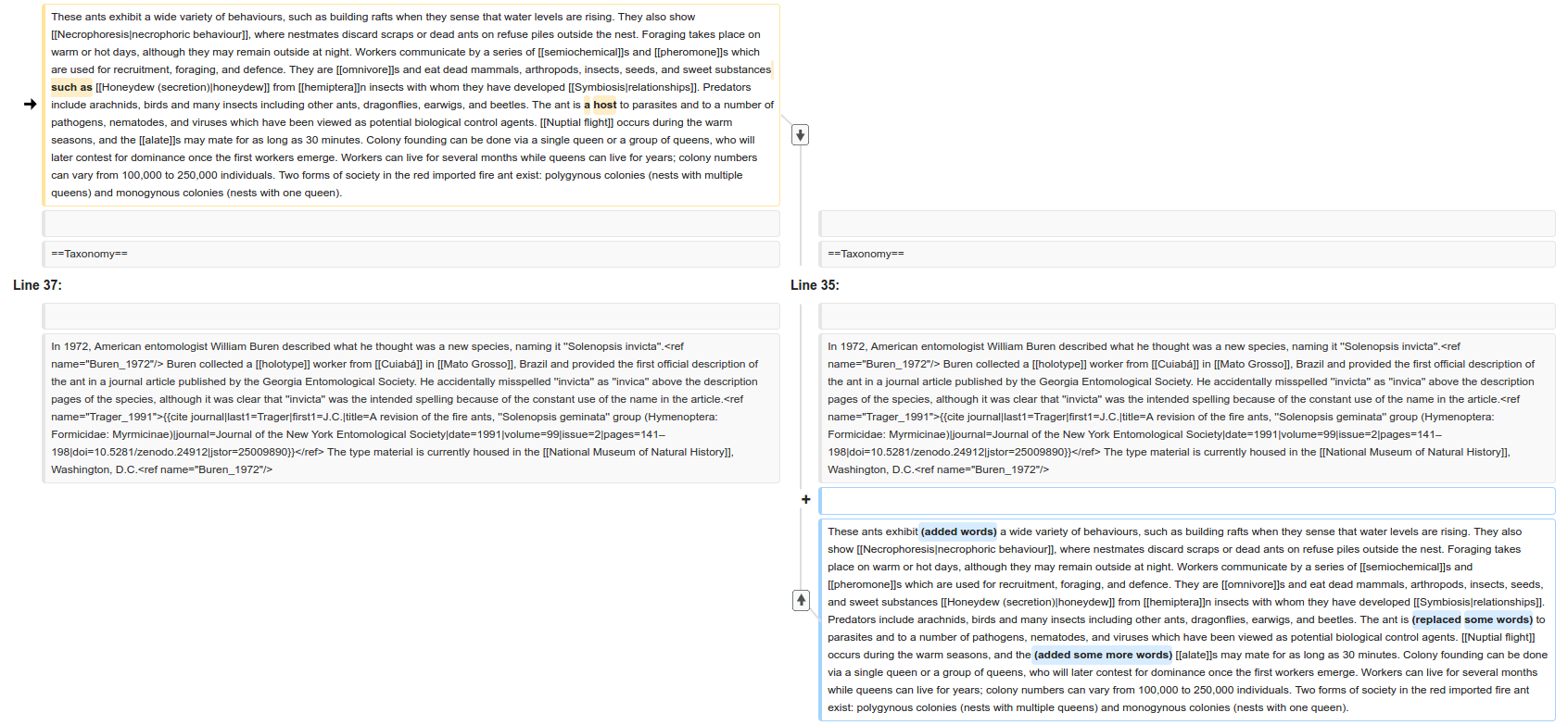
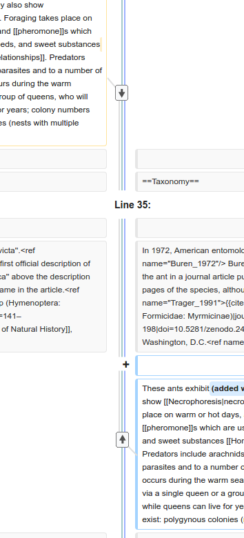
Page MenuHomePhabricator

Connect moved paragraphs by arrows
Open, MediumPublicDesign

Assigned To
None
Authored By
Lea_WMDE
Jul 14 2016, 8:52 AM
Referenced Files
F8796255: arrows are clear buttons.png
Jul 19 2017, 11:10 AM
F8792033: Git history with a lot of parallel branches.png
Jul 18 2017, 12:01 PM
F8580874: arrowDown.svg
Jun 30 2017, 4:10 PM
F8580852: multipleLines.png
Jun 30 2017, 4:10 PM
F8580853: zoomedIn.png
Jun 30 2017, 4:10 PM
F8544284: getting closer v2 (one line).png
Jun 30 2017, 4:10 PM
F8580873: arrowUp.svg
Jun 30 2017, 4:10 PM

Description

Motivation:
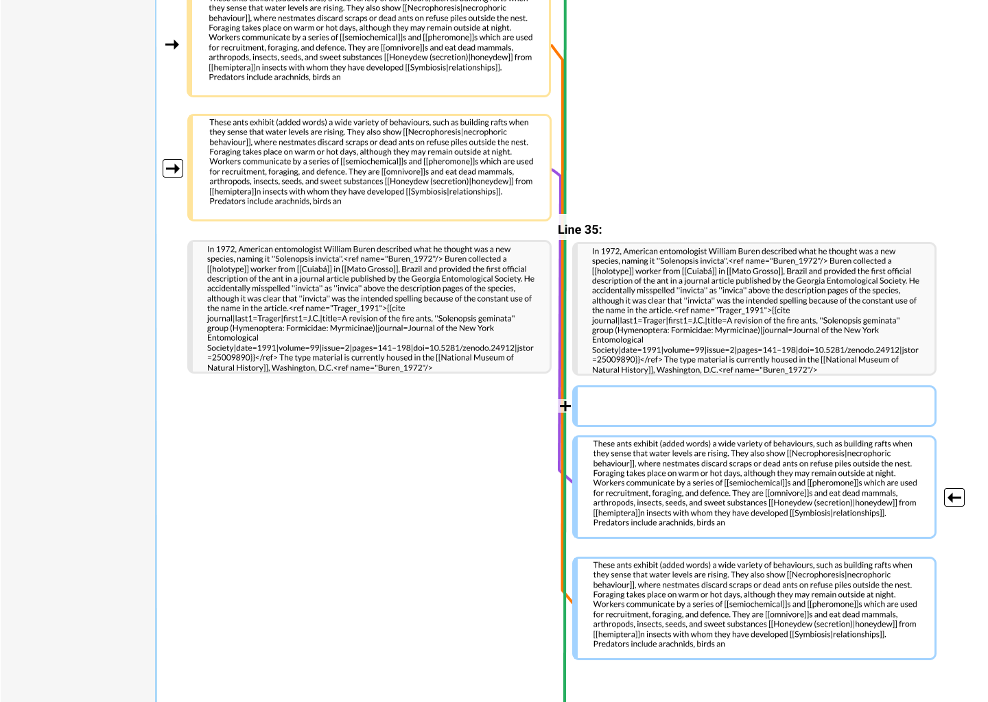
In the wikidiff2 version we are currently developing, moved paragraphs in diffs are indicated by little arrows instead of + or - in front of the paragraph. We would like to make it even more clear which paragraph is moved where, therefore we want to connect them by arrows between the paragraphs as well.

Mockup
To come

Task
On the diff page, connect moved paragraphs by arrows as indicated in the mock

Event Timeline

design one version for a text, where multiple (e.g. 5) blocks of text were moved, crossing each other's moving paths

When analyzing moves of text it was rare that many chunks were moved, and even more rare that they crossed each other’s paths. So, in that light, crossing should work OK, but would not be a major usecase imho.

Lea_WMDE changed the task status from Open to Stalled.Sep 28 2016, 9:31 AM

Right now we are thinking of solving the wish without any new UI elements

Lea_WMDE renamed this task from Mockup for moved text chunks that contain changes to Connect moved paragraphs by arrows.Jun 2 2017, 1:09 PM
Lea_WMDE updated the task description. (Show Details)

Suggestions from yesterdays meeting:

  • Technical implementation would probably be a div-overlay
  • Try to reduce the length or the lines by starting at the bottom of the higher up paragraph and connecting to the top of the one further down
  • To not visually spoil the other elements in the center column, the lines should be lightgray/low opacity
  • To make the lines visible more clearly and be able to distinguish several lines easier, we would have them less transparent when hovering
  • We should be able to have several overlapping lines. This would happen rarely, but it should be possible. One way would slightly shifting the line position towards the right by ~3px if another line is already present.
  • We need to find a way to have lines and a symbol-to-click-on-to-jump coexisting in visual peace :-)
Lea_WMDE changed the task status from Stalled to Open.Jun 30 2017, 11:06 AM

There is a solution from @James_Budday how to support the move visually :)

Current prototype

Interactive Demo

Example Screens:

getting closer v2 (one line).png (2×1 px, 614 KB)
zoomedIn.png (783×1 px, 201 KB)
multipleLines.png (780×354 px, 56 KB)

Arrow Icons:


Arrow on the left side could stay unicode arrow or could be one of those arrow icons rotated depending on technical concerns.

Colors used:
Gray line: #DEDEDE
Green line: #A2C9CA
Blue line: ##9DB1FF

On hover, line sizes double and gray should be darkened.

Button styling: Default OOUI but the arrow icon is made #505050 to make it stand out on the page less.

Let me know if there are any questions, concerns or if you have any feedback!

James_Budday moved this task from Review to Done on the WMDE-Design board.

I like this design, I find it more clear with arrows than without. Some small comments:

  1. First, a graphical detail: I don’t know if it’s possible in CSS, but I find some bluring around the elements "Line 35" , "+" , "-" could be more aesthetic (that’s my opinion, but you’re free to ignore it if you find otherwise).
  2. I thought about a refinement – but you already mentioned it in your comment – about highlighting the arrows on hover (useful in case of visually closed moves) and/or when clicking/touching (useful in case of long-distance moves), which would be particularly useful if there are a lot of moves.
  3. If there are a lot of moves (I see T166571 mentions a maximum of 25 moves), what would be the behaviour?
    1. For some informational comparison, below is an illustration of how Git shows parallel branches (that’s not exactly the same application as here but a similar design – arrows linking points): it was chosen to take a fixed width for each arrow (and hence a variable total width), but in our case the total width is fixed and it’s sensible in our case.
    2. A design choice could be that the lines collapse together. In this case some highlighting would become a great helper to visually distinguish a specific move between the others.
    3. Another design choice could be to only display arrows on hovering/clicking/touching.
    4. It could be also a mix of the second and third points, and for example only short-distance moves are displayed by default and long-distances moves are only displayed on hovering/clicking/touching.

Git history with a lot of parallel branches.png (663×1 px, 68 KB)

  1. That was actually one of my working ideas when I was designing this. A lot of my earlier (and now very outdated) mockups had such an effect. Here is one of those with two different amounts of opacity over the lines.

arrows are clear buttons.png (1×1 px, 138 KB)

I decided against it in order to optimize for glanceability as it made the text less legible and made symbols like the plus stand out less.

  1. You're right that I didn't consider that many moves in this design. Part of the reason for that is that I didn't realize that there was a hard maximum at 25, good find. Another is that @Jan_Dittrich said that, in the research he did for T140376, there were normally not many moves and that he didn't see any more than 3 at a time. This was a verbal conversation and isn't reflected on the ticket so maybe he can weigh in on that.

    That being said, there is space in the design for 3 or 4 more lines before the space for overlapping moves is used up. If there were that many overlapping moves, I think something very like what you have written for B would probably be a good solution, since it would preserve the metaphor and would still allow you to navigate using the arrow if the visuals became very unclear.

This would certainly be cool to have, but how big is the actual need?
In my opinion, we should wait and collect user feedback after deploying the baseline version before investing time into additional UI improvements.

Note, when accompanied with labels, this might also improve accessibility for screenreader users.

The current demo uses curvy arrows pointing right and left. They strike me as kinda weird. I think it would be more natural and more clear if they were basic arrows pointing up or down (toward the other half of the pair.)

@Alsee I thought so too, until I clicked one of the arrows.

thiemowmde changed the subtype of this task from "Task" to "Design".Nov 22 2023, 9:42 AM